Tag Archives: BARCELONA PAVILION

#149: NO BED OF ROSES, PART 4 OF 4: CHALLENGES OF THE HUMAN CONDITION

March 11, 2022

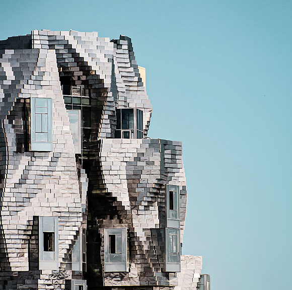
Luma Arles Tower, Arles, France, by Frank Gehry (photo by Baptiste Buisson on Unsplash)

“Host Jeff Haber shares conversations with interesting people from all walks of life, using a positive, uplifting and funny approach,” from the podcast series, No Bed of Roses, brought to you by Kenxus. Edited excerpts below are from the full podcast of episode #1030. Take a look at part 1, part 2, and part 3.

Jeff Haber: Who’s out there that is inspiring you with what they’re doing? Is there anybody that catches your eye?

Bruder Klaus Field Chapel, Mechernich, Germany, by Peter Zumthor (photo by Lisa Therese on Unsplash)

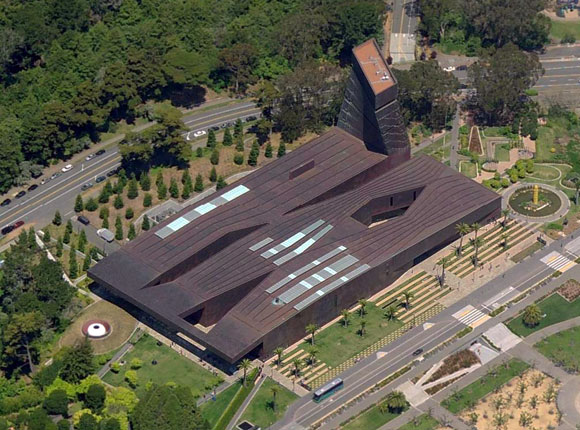
Anthony Poon: There are a lot of influential people. I mean, Frank Gehry—I don’t know who doesn’t admire his work as an architect, artist, sculptor. Peter Zumthor, who is the architect of the new LACMA, the county museum under construction–he’s a Swiss architect, and everything he does is so poetic, so simple and elemental. One of my professors from Harvard is Rem Koolhaas, a Dutch architect who does amazing things, so creative, how he rethinks what the client wants, whether it’s a corporate headquarters or a house. He delivers a unique solution every time.

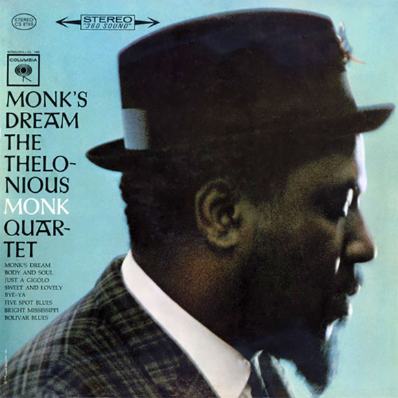
But I also look for inspiration in people that aren’t architects, to inspire my architecture. As an example, I love the music of Thelonious Monk. His music is offbeat; it’s sometimes discordant, sometimes rhythmically off. But at the same time, it’s beautiful, improvisational. I listen and ask, “How can that inspire what I’m writing, what I’m painting, or what building I’m designing?”

Album cover for Monk’s Dream

Jeff: Is there a project that you have where you would walk us through and say, “See this section here, I was listening to this for Monk, or this was inspired by something.” Are there pieces of projects that you could directly relate to a piece of music?

Courtyard of Greenman Elementary School, Aurora, Illinois, by Anthony Poon (w/ A4E and Cordogan, Clark & Associates, photo by George Lambros)

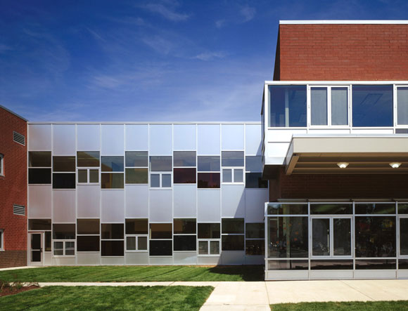
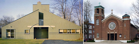
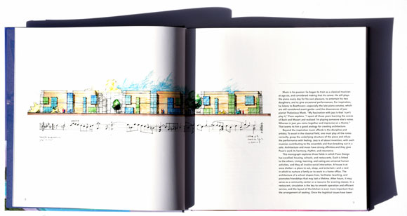
Anthony: A lot of times the relationship to music is abstract. It’s more of a conceptual influence. But there is a school that we designed just outside of Chicago in the city of Aurora. It’s an elementary school with a focus on the performing arts. I took a piece of music by Johann Sebastian Bach, one of his piano Partitas, and studied the score and notations. That helped me lay out the window patterns, inspired me to create a play of window shapes and bays projecting off the brick. The building looks very musical as it rolls down the street. Someone who doesn’t see this metaphor, it’s okay. All they might see is a very interesting building. Or someone might say, “I like how the scale has been broken down—less institutional looking and suits the size of the one- and two-story homes across the street.” The result is there, and people can read into what they will. I know from my standpoint, it started with Bach.

Greenman Elementary School and music of J.S. Bach (drawing by Anthony Poon w/ A4E)

Jeff: Is there a space that you have experienced, that has evoked very strong emotion for you? I’ve been into spaces that have moved me to tears.

Barcelona Pavilion, Spain, by Mies van der Rohe (photo by Tomas Val on Unsplash)

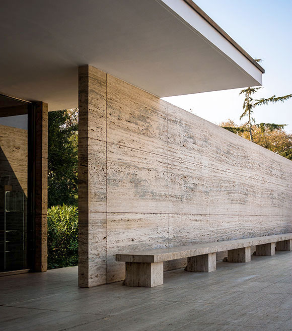
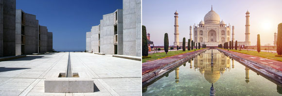
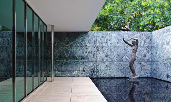
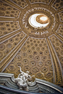
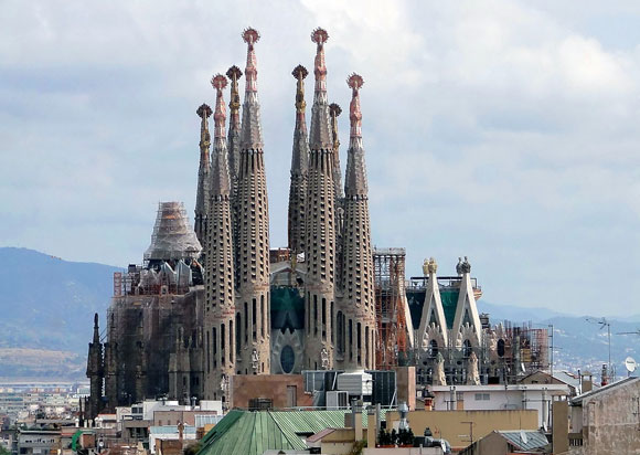
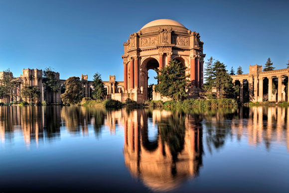
Anthony: Yes, I would say, “yes!”—plenty of times through travels and backpacking through Europe, visiting some of the historic churches, museums, and sculpture gardens—just walking into the Pantheon, or some of the chapels in Rome. A specific example, which may not be an obvious one is in Barcelona. There’s a pavilion, often called the Barcelona Pavilion or the German Pavilion, designed by Mies van der Rohe. It’s just this elegant marble, steel and glass composition, not much bigger than a small house, but it’s so perfectly put together. It was groundbreaking in the way it defined space and didn’t define space, the way you didn’t know whether you’re inside or outside. It’s such a pure piece of architecture.

Jeff: This is part of the human condition. We can be reduced to very base human instincts, and design can make us soar. When I worked as an actor, I had a teacher tell me, “You’re a conduit for something much bigger than you.” I don’t know if you feel that there’s a force bigger greater than you that is just channeling through you or not, as the artist that you are. Man, we have that ability to channel that energy. Design can help elevate all of us. Do you feel like you’ve connected with something bigger? Is there something to it? I might just puffing this up, or…?

(photo by Robert Collins on Unsplash)

Anthony: We definitely acknowledge something bigger. Our thinking is that our skills and talents are used to challenge the human spirit. And if it’s a temple, we’re there to enliven the human spirit. If it’s a school, we’re there the counter the children and say, “Is this the best way to socialize and learn?” We’re constantly asking these bigger picture questions because I think whatever skills or talents that I have, they’re to be used, tested, to take risks, and see if they can be offered to challenge the status quo.

SYMMETRY AND THE LIKE

August 31, 2018

left: Salk Institute for Biological Studies, La Jolla, California (photo from The Architectural Archives, University of Pennsylvania/John Nicolais); right: Taj Mahal, Agra, India (photo by Getty Images

These images are what we commonly think of as symmetry. What you see on one side is mirrored on the other side. Classical architecture relied on symmetry for powerfully balanced compositions. But for a setting as peacefully symmetrical as the Taj Mahal, I find the architecture more interesting when accompanied by the asymmetry of life.

The symmetry of Taj Mahal is made more interesting with visitors and the asymmetry of life of Agra, India (photo by Getty Images)

The 1929 Barcelona Pavilion, by Mies Van Der Rohe  is hailed as one of the most significant contributions to the Modern architecture movement, with the pavilion’s Minimal walls and lines, blurring inside and outside. This structure is rarely mentioned in the conversations about symmetry. But that is only because we think that symmetry is when the right side is the same as the left side.

From what I learned in graduate school, I argue that symmetry can be such that the top half is the same as the bottom half. Top-and-bottom, not right-and-left.

left: Unexpected symmetry at the Barcelona Pavilion, Spain (photo from behance.net); middle: Axonometric drawing of the Barcelona Pavilion, Spain (drawing from handesi.wordpress.com); right: Unexpected symmetry at the Barcelona Pavilion, Spain (photo by Lindsay Koffler)

In challenging traditional symmetry, implied symmetry offers complexity. Here, the balance of symmetry is only suggested, not at all exact. As the eye moves from the vertical axis of symmetry to the right and to the left, the design is forgiving, no longer relentlessly mirrored halves. An architectural feature on one side is not replicated on the other.

left: Vanna Venturi House, Philadelphia, United States (photo by Maria Buszek); right: St. John the Baptist Catholic Church, West Frankfort, Illinois (photo from stjohnchurch-wf.org)

Beyond architecture, film director Peter Greenaway enjoyed applying symmetry as a cinematic device. As a young student of classical paintings, Greenaway employed symmetry not just in the set design, but with how the actors moved into the scene and located themselves. Akin to architecture, the result creates classical balance. But in movies, the experience is progressing over time and not as a static building. Greenaway delivers an experience that is harmonious but also disturbingly artificial. Could such compositions of people and objects exist in real life?

Symmetry in Peter Greenaway films. Upper left, lower right and lower left: A Zed & Two Noughts (1985); upper right: The Cook, The Thief, His Wife & Her Lover (1989)

Symmetry in a person’s face is considered to be an underlying trait of beauty and attractiveness. A balanced composition of facial features supposedly delivers a fetching handsome appeal. But exact symmetry in one’s face is impossible. Consider one of Hollywood’s leading actors, often complimented as being good looking. Digitally creating a face using the left side and mirroring it, then as another composition, using the right side and mirroring it, you will see how even the handsome Brad Pitt is not symmetrical. As above, his face only implies symmetry.

Brad Pitt montage (photo from memoliion.com)
Property Brothers from HGTV

These popular TV twins from HGTV exploit their identical look. But the outcome is like a Greenway scene— a contrived and awkward symmetry. Quite creepy actually, if you binge watch the show.

Lastly, this piano is symmetrical in exterior appearance. But inside, it is not. As with life, even things that strive for symmetry, harmony and balance, such things are often asymmetrical and lop-sided—and enjoyably so.

Schimmel Konzert K132 piano (photo from schimmelpianos.com)

MY FIFTEEN FAVE BUILDINGS

February 3, 2017

Dominus Winery, Yountville, Napa Valley, California (photo by Anthony Poon)

“Hey Anthony, what is your favorite building in the world?” I am often asked.

I might reply obnoxiously but with reason, “What is your favorite painting, favorite book or favorite ice cream?”

Just as there is no one favorite piece of music, there is no one favorite work of architecture. There are hundreds. But here I try. In this list of some of my favorites (in no particular order), I selected different building types and sizes—from a house to a parliament building, from a public plaza to a winery. I have also included a few of The Usual Suspects.

(photo from brownbook.tv)

1: Can a design be both exquisitely silent and majestically heroic? Such is Louis Kahn’s 1982 National Parliament House in Dhaka.

(photo from urbansplatter.com)

2: In 1929, Mies van der Rohe contributed to the pioneering concept known as the Free Plan. Through a few carefully placed walls and columns, the Barcelona Pavilion gently and epically implies space and journey.

(photo from mimoa.eu)

3: Before Ricard Bofill became fascinated with Postmodernism, he delved deep into his mind for fantastical dreamscapes. This 1975 apartment building known as Walden 7, in Sant Just Desvern, Spain, demonstrates what it means to be imaginative.

(photo from arquiscopio.com)

4. Situated over a station rail yard, Pinon and Vilaplana created a public square, transforming a blank space into one of Barcelona’s most powerful works of urban sculpture and place making, the Plaza de los Paises Catalanes.

(photo by Andrea de Poda)

5: Even in 1670, there were revolutionaries within a revolution. Baroque architect Gian Lorenzo Bernini twisted the classical world of pure geometry, and designed a chapel in the shape of an ellipse. Upon arriving inside Sant’Andrea al Quirinale in Rome, you are confronted by a twisted perspective.

(photo by Marketing Groningen)

6: The 2001 Wall House in The Netherlands was constructed three decades after the completed design, and a year after the death of architect John Hejduk. He juxtaposed Corbusian ideas with Cubism and Surrealism, offering one of the most formidable visions of a home.

(photo from archdaily.com)

7: During the design process for Maison Bordeaux in France, the client had a car accident that left him wheelchair bound. OMA quickly changed the 1998 design, transmuting the home office into a room size elevator, open on all four sides—where the three-story shaft is his library, art collection and office supplies.

(photo from nest-hostles.com)

8: In 1999, Rafael Moneo made two massive structures into leaning ethereal cubes of otherworldliness. For Spain’s Kursaal Congress Centre and Auditorium, Moneo explored prismatic volumes, glowing translucency, and double walls of rippled glass.

(photo by Sander Lukers)

9: Some works, such as the Chapel Santa Maria degli Angeli, are pure poetry. Like the hand of God, architect Mario Botta placed this 1996 building gently in the Swiss mountains of Monte Tamaro.

(photo from azahner.com)

10. It is not only astounding that Herzog & de Meuron wrapped an entire museum with dimpled, perforated, aging copper panels in 2005, but that these architects were able to convince the city of San Francisco that such a curious design idea would be the perfect addition to the beloved Golden Gate Park.

(photo by Bernard Gagnon)

11: There is no limit to the extraordinary creativity of Catalan architect, Antonio Gaudi. Alongside studying the engineering of this ambitious cathedral by building an upside catenary model of stings and chains, Gaudi combined the Grotesque, Gothic and Art Nouveau, amongst many other influences. Since the start of construction of the Sagrada Familia church in 1882, the unfinished project is still underway in Barcelona.

(photo by IlGiozzi)
(photo by IlGiozzi)

12. Sometimes I think it is just fetishized retail design, but not at Rem Koolhaas’s 2001 Prada store in Manhattan. The street level floor wraps up then sweeps down to the lower level, bringing natural light to an otherwise dark space and creating the grand theater that is fashion.

(photo by Joao Morgado)

13: At the early age of 26, Alvaro Siza created one of the most graceful compositions. More than a mere restaurant in Portugal, the Boa Nova Tea House of 1963 sits elegantly in its setting, as instinctively as the surrounding rock outcroppings.

(photo by Kevin Cole)

14: Bernard Maybeck’s “temporary” monumental jewel of the 1915 World’s Fair still stands a century later, a romantic icon of San Francisco. With this Palace of Fine Arts, the “fictional ruin” expresses both an enduring melancholy of lost worlds and the ambition for new worlds to come.

(photo from architectural-review.com)

15: Exploiting the elemental scenery in Napa Valley, California, Herzog & de Meuron formed the 1998 Dominus Winery with just some rocks placed in steel baskets. And that was the entire idea, the whole building.

© Poon Design Inc.