Tag Archives: KENGO KUMA

#181: THE MOST FASCINATING BUILDINGS OF 2023

January 12, 2024

(photo by ArchExist)

From 2023, many new works of architecture fascinate me. They captivate, enthrall, and entice. What fascinates me varies, from rigorous simplicity to new sculptural forms, from a view of the past to fresh social programs. Here I list only ten wonderful buildings of which there are so many more.

(photo by ArchExist)

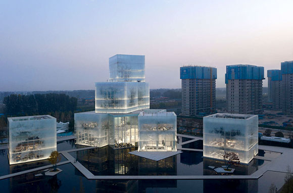
1: Appearing like nine stacked ice cubes, the Xinxiang Cultural Tourism Center aptly focuses on winter sports and recreation. With few cues to scale and size, the composition epitomizes contemporary architecture’s fascination with purity and abstract sculpture. Architects Zone of Utopia with Mathieu Forest Architecte created for the city of Pingyuan, China, enigmatic structures that beautifully transform throughout the day, throughout the seasons.

(photo by Iwan Baan)

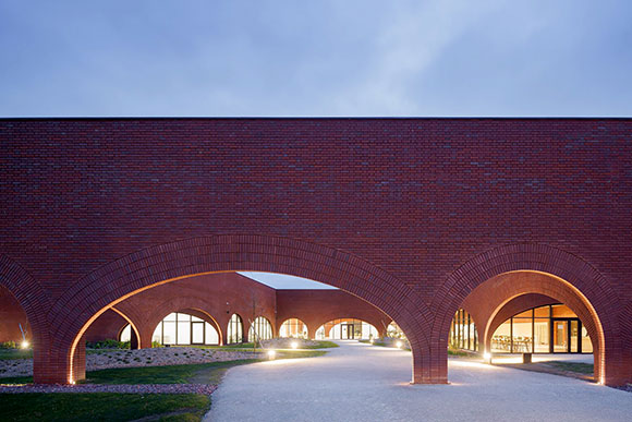
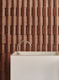
2: Half a million, locally-produced bricks comprise the 62,000-square-foot workshop, the Hermes Maroquinerie de Louviers, France. French-Lebanese architect, Lina Ghotmeh, employs one of history’s most iconic forms: the arch. Though modest conceptually, the cascade of various-size arches flexes its muscles delivering drama through repetition, as well as an abundance of natural light for the 260 leather artisans of this world-class luxury brand.

(photo from architizer.com)

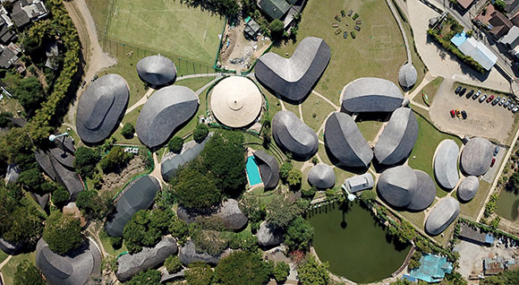
3: The Panyaden Secondary School in Chiang Mia, Thailand, composed mostly of bamboo and earth, is deceptively simple. This school employs technology unexpected within its vernacular walls, such as an advanced facial recognition system that checks body temperature and air-cleaning systems that scrub away pollutants. Like leaves scattered across the landscape, Chiangmai Life Architects has designed a peculiar but striking village of learning environments and social and recreational areas.

(photos by Sergio Pirrone)

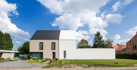
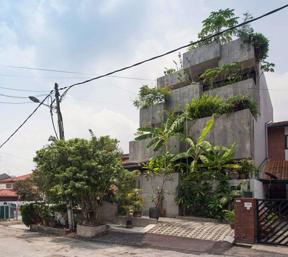
4: The expression of differing components of a house can be consistent and seamless or explicit and jarring. For House CR, architect dmvA created two halves, one that is sympathetic to the neighboring traditional houses and another that responds to its contemporary workspace and flexible exhibition area. Through a game of boundary pushing and interpretation, the odd 2,000-square-foot design stays in compliance with the restrictive housing planning laws of Zonhoven, Belgium.

(photo by Iwan Baan)

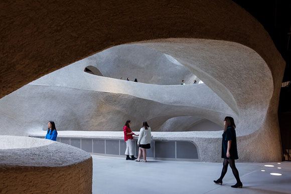
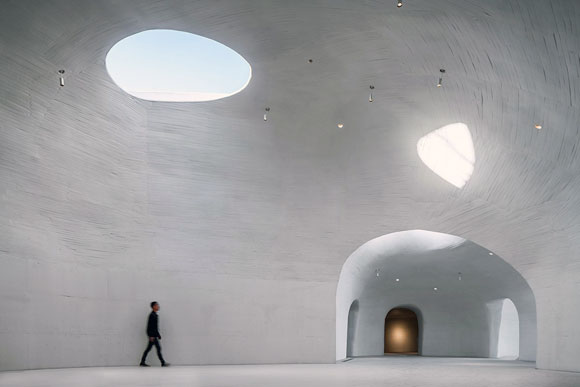
5: To great fanfare in Manhattan, Studio Gang opened the Richard Gilder Center. Processes in nature and geology, such as the movement of water and wind, shape the wow-factor, five-story atrium. Shotcrete, a spray-on concrete used in swimming pools, roadways, and overpasses, form the digitally-designed, curving walls and ceilings of this sculpturally cavernous museum poised to join the Bilbao-effect.

(photo by Kaori Ichikawa)

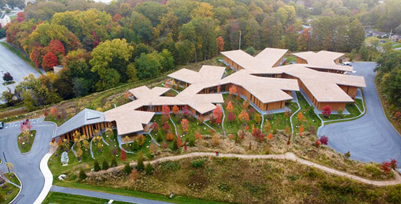
6: An international collaboration—Osaka-based company, Ryuichi Ashizawa Architects, with New Jersey-based Acari + Lovino Architects—designed the JST Harrisburg Production Engineering. Located in Harrisburg, Pennsylvania, the 79,000-square-foot semiconductor production facility challenges the traditional notion of orthogonally-planned corporate complexes, instead exploring the metaphor of a tree root system, appropriate for a company’s health, growth, and outreach.

(photo by Iwan Baan)

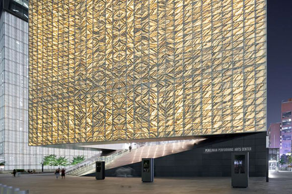
7: REX joins the ensemble of architectural wonders at New York’s World Trade Center (Arad’s 9/11 Memorial, Snohetta’s Museum Pavilion, Calatrava’s Oculus and St. Nicholas Church, and SOM’s Freedom Tower) with the 90,000-square-foot Perelman Performing Arts Center. Within this 138-foot tall, translucent Portuguese marble cube, REX and theater consultant, Charcoalblue, have designed a dynamic kinetic interior of three theaters that can be mechanically manipulated into a dozen different performance venues.

(photo by Eiichi Kano)

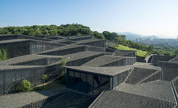
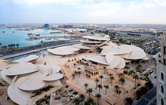
8: Conscious of the intricate hillside on which this museum sits, the building’s floors shift up and down in harmony. For the town of Hangzhou, architect Kengo Kuma designed the 50,000-square-foot China Academy of Art’s Folk Art Museum using parallelograms and geometric division to arrive at a cohesive whole of roof forms. Applying reclaimed roof tiles from nearby structures, the museum’s village-like character, though distinctly modern, responds to the context of the surrounding traditional homes.

(photo by Scott Norsworthy)

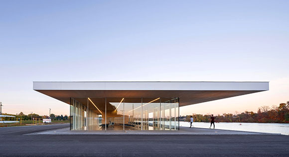
9: The architectural team of MJMA and Raimondo delivers a muscularly minimal, 5,700-square-foot, glass box, the Neil Campbell Rowing Centre. “Less is more” has rarely looked so elegant and profound. For the city of St. Catharines, Canada, this net-zero and zero-carbon fitness center employs mass timber construction with glulams and CLT systems.

(photo by Ossip van Duivenbode)

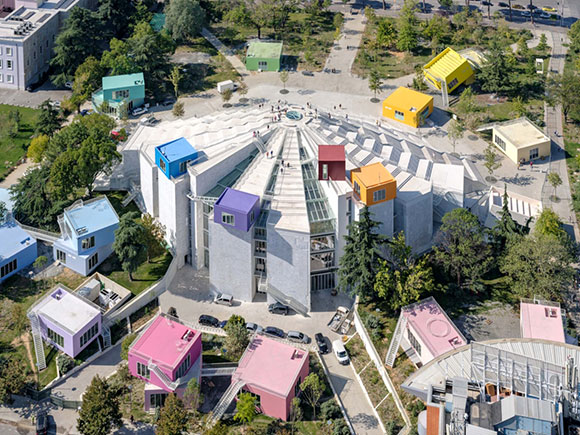
10: Originally a controversial museum for Enver Hoxha, the communist dictator of Albania, the Pyramid of Tirana has been re-envisioned as a cultural center and park. The addition of colorful boxes throughout—a welcome and whimsical intervention—contain restaurants, workshops, offices, classrooms, and other social uses. The 120,000-square-foot structure has had a questionable past, as a conference center, radio station, nightclub, and NATO base, and architect MVRDV has transformed it into it current successful chapter.

For past years’ “top ten” lists, visit 2019, 2020, 2021, and 2022.

#111: THE MOST SEDUCTIVE BUILDINGS OF 2019

December 31, 2019

UCCA Dune Art Museum, Qinhuangdao, China (photo by Qingshan Wu)

I am avoiding “The Best of” list, because I don’t know how to define “the best.” Instead, I have chosen the adjective “seductive.” Seduction is an act that might lead to enticement or worse, being led astray into questionable moral ground. Seducing someone suggests lurid temptation and even sexual desire.

So why not? Why not list ten projects of 2019 that have led the creative mind astray, enticed and tempted us to desire such an experience?

(photo by Iwan Baan)

1: The 500,000-square-foot National Museum of Qatar is both a structural feat of glass-fiber reinforced concrete over steel frames, as well as a metaphor of the local mineral formations called the Desert Rose. Upon seeing this work of Atelier Jean Nouvel, I initially questioned if such a striking work of originality was real or a make-believe digital image. Yes, it is real.

(photo by Ameen Deen)

2: Architect Formzero designed this “Planter Box House” for a retired couple in tropical Kuala Lumpur, Malaysia. With edible plants abound and sustainable split bamboo as the concrete formwork, the design is a combination of a green house, garden courtyards, and vertical farm, as well as a statement of Abstract art and Minimalist sculpture.

(photo from cityfodreamsmacau.com)

3: For me, the 770-room Morpheus Hotel in Macau doesn’t represent the curvaceous surfaces of China’s traditional jade carving—as PR statements promote. Regardless, Zaha Hadid’s free styling steel and aluminum exoskeleton presents a stunning visual character unlike anything seen before in city skylines.

(photo by Edmund Sumner)

4: In Kopargaon, India, the undulating roof of a building is transformed into a walkable surface, a social area for this children’s library. Sameep Padora’s singular exploration of local tile vaults in structural compression defines the Maya Somaiya Library.

V&A Dundee

5: Is it a museum or a massive sculpture? A giant symbolic ship honoring the historic waterfront? Or maybe the bizarre building surface recalls the cliffs of Scotland? Over 2,500 textured precast concrete panels create this enigmatic and beautiful United Kingdom project called V&A Dundee.

(photo by Maurizio Montagna)

6: In my early years living in New York City, I was fascinated by the works of Peter Eisenman and his propaganda of Formalism, Deconstructivism, the Avant-Garde, Post Humanism, Jacques Derrida, Giuseppe Terragni, blah, blah, etc. I have no idea what the “emancipation and autonomization of the discipline” is about. Critics and users alike considered Eisenman’s buildings to be hostile environments or simply confusing. But at the Residenze Carlo Erba in Milan, the result is not an overly complicated pompous statement of critical theory and mathematical analogs, but rather, the design is an elegant and beguiling composition of program, structure and geometry.

(photo by Iwan Baan)

7: Toshiko Mori’s Fass Elementary School is much more than yet another one-classroom schoolhouse. It is a poetic statement of global and local proportions. The modest output of village labor and techniques, such as the bamboo structure, mud brick walls and a grass-thatched roof, delivers a profound, elemental and humane building for the remote area of Sengal, West Africa.

(photo by Aesop)

8: To his students, Louis Kahn famously suggested, “You say to a brick, what do you want, brick?” In Brooklyn’s Park Slope, how far can Frida Escobedo go with a brick for Aesop, the beauty products boutique? The theme-and-variations on brick patterns, details, tones, and textures are far-reaching, as Escobedo finds inspiration in the historic fabric of New York’s brick and brownstone buildings.

(photo by Edmund Sumner)

9: Simply called the “House in a Garden,” Gianni Botsford’s 2,500-square-foot jewel-of-a-building occupies a tight urban London site. Recalling the Pantheon in miniature, a heavenly oculus tops off the double-curved, copper and timber roof.

(photo by Qingshan Wu)

10: (See first image and above.) Yes, this is the third museum on my list. Buildings that house art are usually also seductive statements of art themselves. In Qinhuangdao, China, the UCCA Dune Art Museum goes bizarrely further. Dug into sandy dunes like children with beach toys, this museum is sometimes there and sometimes not. With cave-like galleries partially hidden from the sea, OPEN Architecture’s design for Qinhuangdao is primitive, raw and unforgettable.

(For the list of my all-time 15 favorite buildings, visit here. )

THE JOKE’S ON YOU: HUMOR AND WIT IN DESIGN

September 1, 2017

Yes, the façade is intended to look like it is crumbling. The “Indeterminate Façade” of the BEST store, Houston, Texas (photo from siteenvirodesign.com)

Architecture possesses this important and noble side, such as the design of the historic cathedrals in Europe, New York’s September 11 Memorial, or inspiring public schools . But what about humor? Can a building be funny?

Yes! Architecture can be a witty query or a laugh-out-loud punch line.

This International Style by Le Corbusier is certainly tasteful, but it is NOT FUNNY. Weissenhof, Stuttgart (photo by Andreas Praefcke

The 70’s and 80’s spawned Post Modern architecture, here and here. In response to the preceding Modern movement from the Bauhaus, the famous German design school, Post Modernism employed clever metaphors and satire—and even campy spoof. Bauhaus’ austerity in design and self-righteous seriousness had a philosophical challenger in Post Modernism, and the protest was loud.

The entire façade has lifted up to welcome you. The “Tilt Building” of the BEST store, Towson, Maryland (photo from siteenvirodesign.com)
An entry has been created by dislocating a corner of the building. The “Notch Building” of the BEST store, Miami, Florida (photo from siteenvirodesign.com)

Take for example the BEST Products stores completed between 1972 and 1984, designed by the New York design company named SITE. Throughout nine cities, this architecture firm designed large stores which were conceived not just as works of ironic art, but also tongue-in-cheek commentary on the big box stores. Though many critics argued that SITE’s one-liner jokes are vapid, the cleverness in the architecture raised design conversations to fresh new levels.

Piazza d’Italia, New Orleans, Louisiana (photo by Notes From Architecture)

The Piazza d’Italia stands as an iconic example of humor and irony. An endless lists of essays, blogs, books, exhibits, and lectures have both bestowed intellectual admiration, as well as unleashed hostile mockery on this project. This skillful and insane jam session of architecture apparently had inspiration from the Italian immigrant stories of New Orleans. For historicists, purists and contrarians alike, the architecture of this public plaza possesses every idea that floated into the imagination of the architect, Charles Moore.

upper left: A bust of Moore spewing water into the fountain (photo from devriesdesigndiary.blogspot.com); upper right: Angular Ionic column capital reimagined in facets of chrome stainless steel (photo source unknown); lower left: Fragments of history with layers of colors (photo by Polly Neill); lower right: Illuminated with neon (photo by Helena from flixster). Piazza d-Italia, New Orleans, Louisiana (photo by Helena)

Bizarre interpretations of everything from the Roman orders of classicism, to shapes that defy the Vitruvian rules of beauty, function and structural rationality, flaunt their bravado. Moore did not believe that “Less is more.” He supported the quote from fellow Post Modernist, Robert Venturi, “Less is a bore.”

At Piazza d’Italia, the visitor engages confusing references to historic temples, as well as modern materials like neon lighting and chrome. Arcs of water define column capitals in space and time, incomplete colonnades and arches suggest a work in progress, and De Chirico-esque clocks and long shadows critique the passages of life. This masterful work of Post Modernism is accompanied by a courage akin to a standup comedian.

Kitakyushu International Conference Centre, Japan (photo from rebloggy.com)

In these two examples from the earlies nineties, the observer might react with “WTF?” and “Has the architects lost their minds?” On the other hand, one could compliment architect Arata Isozaki’s facile use of geometries and colors to create sublime imagery.

For Kengo Kuma, what might appear to be nothing more than an aesthetic disaster, on further examination, the juxtaposition of everything but the kitchen sink (or maybe including the kitchen sink) has delivered something strikingly surreal and incomparable.

Mazda M2 Building, Tokyo, Japan (photo from ryanpanos.tumblr.com)

In-your-face jokes can be hilarious, but not always so with architecture, as is this unfortunate example of the “Big Basket Building” for the Longaberger Company, makers of wooden baskets. Designed by architects NBBJ, the seven-story headquarters is a basket, literally. At 160 times bigger than a typical picnic basket, the novelty is adroit and the engineering of massive steel planks and plates is fascinating.

Picnic basket (photo from polkcitylibrary.com)

Due to tax debt, the Longaberger had to vacate the property. After 24 months on the market at increasing discounts to the sales price, the architectural novelty had no legs in the real estate market. Unless you sell baskets for a living, no one wants to work in a giant basket.

Whether in architecture or literature, in painting or dance, creative forces can be profound, poetic and beautiful. And such forces can also be light-hearted, tongue-in-cheek and glib. Perhaps all of the above can occur at the same time. And that’s no joke.

Longaberger Company, Newark, Ohio
© Poon Design Inc.