Tag Archives: MARIO BOTTA

MY FIFTEEN FAVE BUILDINGS

February 3, 2017

Dominus Winery, Yountville, Napa Valley, California (photo by Anthony Poon)

“Hey Anthony, what is your favorite building in the world?” I am often asked.

I might reply obnoxiously but with reason, “What is your favorite painting, favorite book or favorite ice cream?”

Just as there is no one favorite piece of music, there is no one favorite work of architecture. There are hundreds. But here I try. In this list of some of my favorites (in no particular order), I selected different building types and sizes—from a house to a parliament building, from a public plaza to a winery. I have also included a few of The Usual Suspects.

(photo from brownbook.tv)

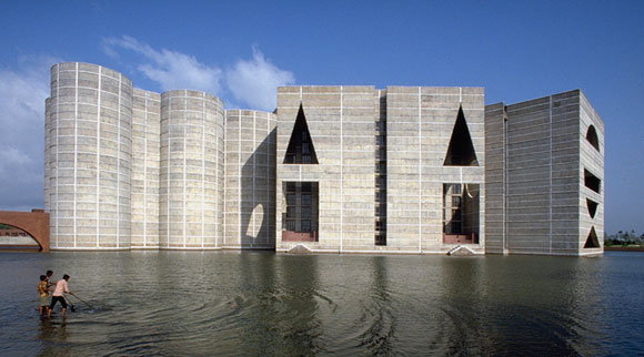
1: Can a design be both exquisitely silent and majestically heroic? Such is Louis Kahn’s 1982 National Parliament House in Dhaka.

(photo from urbansplatter.com)

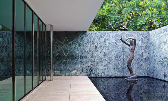
2: In 1929, Mies van der Rohe contributed to the pioneering concept known as the Free Plan. Through a few carefully placed walls and columns, the Barcelona Pavilion gently and epically implies space and journey.

(photo from mimoa.eu)

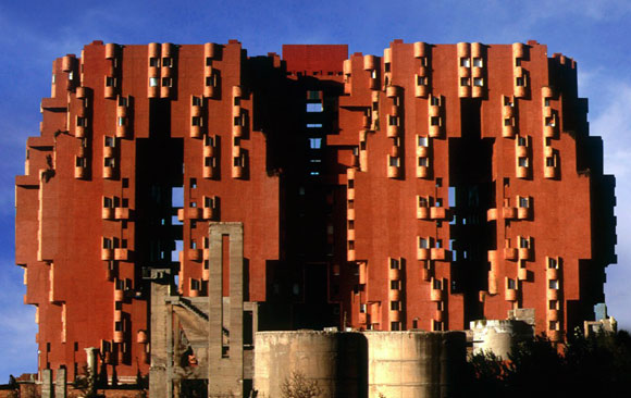
3: Before Ricard Bofill became fascinated with Postmodernism, he delved deep into his mind for fantastical dreamscapes. This 1975 apartment building known as Walden 7, in Sant Just Desvern, Spain, demonstrates what it means to be imaginative.

(photo from arquiscopio.com)

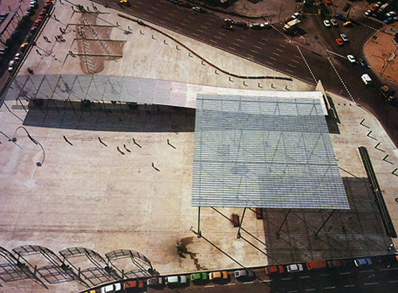
4. Situated over a station rail yard, Pinon and Vilaplana created a public square, transforming a blank space into one of Barcelona’s most powerful works of urban sculpture and place making, the Plaza de los Paises Catalanes.

(photo by Andrea de Poda)

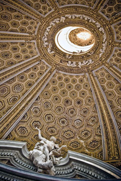
5: Even in 1670, there were revolutionaries within a revolution. Baroque architect Gian Lorenzo Bernini twisted the classical world of pure geometry, and designed a chapel in the shape of an ellipse. Upon arriving inside Sant’Andrea al Quirinale in Rome, you are confronted by a twisted perspective.

(photo by Marketing Groningen)

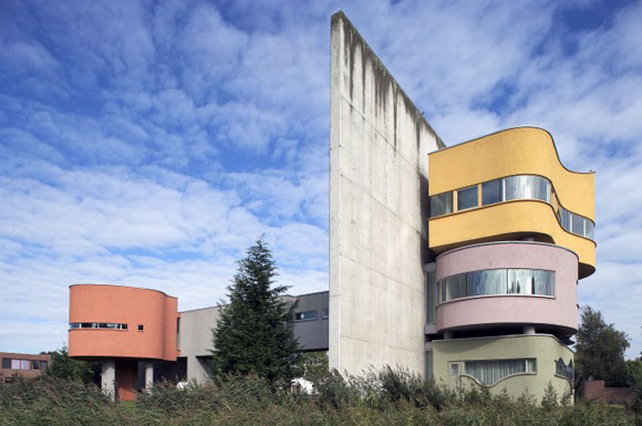
6: The 2001 Wall House in The Netherlands was constructed three decades after the completed design, and a year after the death of architect John Hejduk. He juxtaposed Corbusian ideas with Cubism and Surrealism, offering one of the most formidable visions of a home.

(photo from archdaily.com)

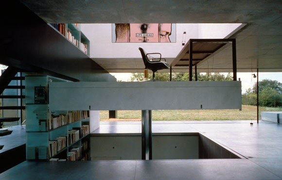
7: During the design process for Maison Bordeaux in France, the client had a car accident that left him wheelchair bound. OMA quickly changed the 1998 design, transmuting the home office into a room size elevator, open on all four sides—where the three-story shaft is his library, art collection and office supplies.

(photo from nest-hostles.com)

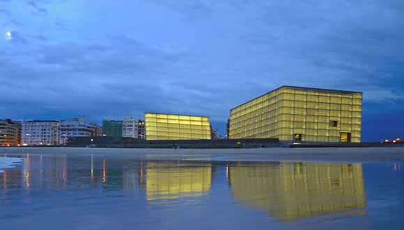
8: In 1999, Rafael Moneo made two massive structures into leaning ethereal cubes of otherworldliness. For Spain’s Kursaal Congress Centre and Auditorium, Moneo explored prismatic volumes, glowing translucency, and double walls of rippled glass.

(photo by Sander Lukers)

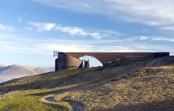
9: Some works, such as the Chapel Santa Maria degli Angeli, are pure poetry. Like the hand of God, architect Mario Botta placed this 1996 building gently in the Swiss mountains of Monte Tamaro.

(photo from azahner.com)

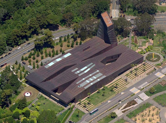
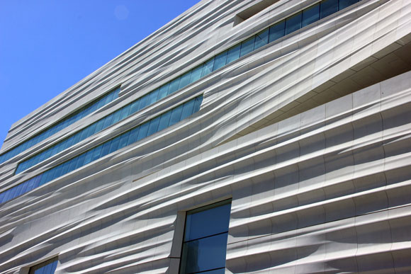
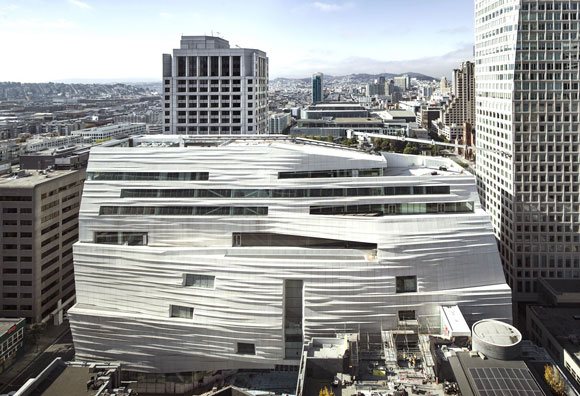
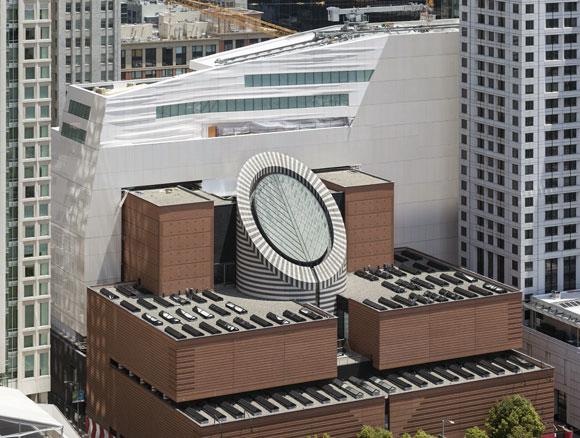
10. It is not only astounding that Herzog & de Meuron wrapped an entire museum with dimpled, perforated, aging copper panels in 2005, but that these architects were able to convince the city of San Francisco that such a curious design idea would be the perfect addition to the beloved Golden Gate Park.

(photo by Bernard Gagnon)

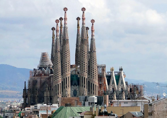
11: There is no limit to the extraordinary creativity of Catalan architect, Antonio Gaudi. Alongside studying the engineering of this ambitious cathedral by building an upside catenary model of stings and chains, Gaudi combined the Grotesque, Gothic and Art Nouveau, amongst many other influences. Since the start of construction of the Sagrada Familia church in 1882, the unfinished project is still underway in Barcelona.

(photo by IlGiozzi)
(photo by IlGiozzi)

12. Sometimes I think it is just fetishized retail design, but not at Rem Koolhaas’s 2001 Prada store in Manhattan. The street level floor wraps up then sweeps down to the lower level, bringing natural light to an otherwise dark space and creating the grand theater that is fashion.

(photo by Joao Morgado)

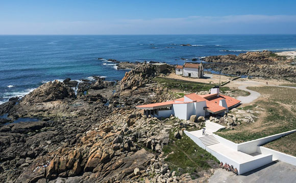
13: At the early age of 26, Alvaro Siza created one of the most graceful compositions. More than a mere restaurant in Portugal, the Boa Nova Tea House of 1963 sits elegantly in its setting, as instinctively as the surrounding rock outcroppings.

(photo by Kevin Cole)

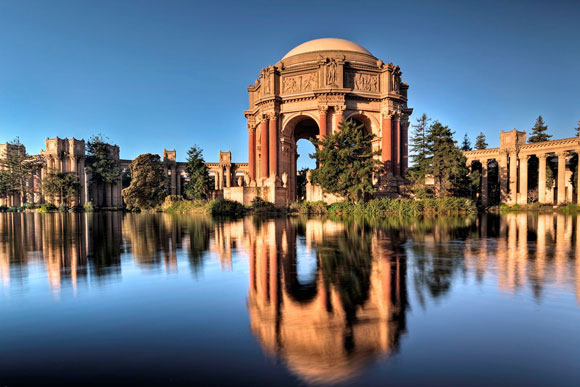
14: Bernard Maybeck’s “temporary” monumental jewel of the 1915 World’s Fair still stands a century later, a romantic icon of San Francisco. With this Palace of Fine Arts, the “fictional ruin” expresses both an enduring melancholy of lost worlds and the ambition for new worlds to come.

(photo from architectural-review.com)

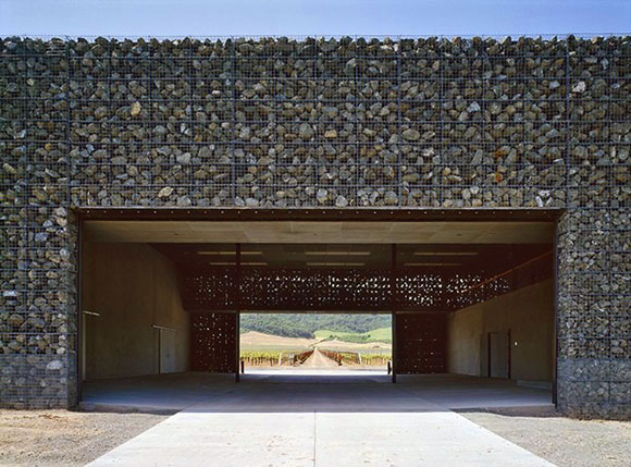
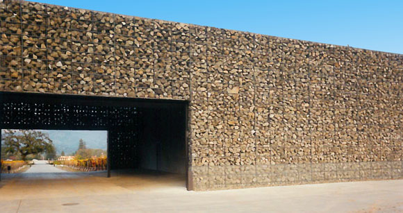
15: Exploiting the elemental scenery in Napa Valley, California, Herzog & de Meuron formed the 1998 Dominus Winery with just some rocks placed in steel baskets. And that was the entire idea, the whole building.

SQUEEZING IN THE NEW SFMOMA

August 19, 2016

SFMOMA, San Francisco, California (photo by Quinten Dol)

As a kid running around Chinatown, the alleys of San Francisco fascinated me. This childhood curiosity preceded my academic studies two decades later into urban density and the small streets that patiently waited to be discovered.

In 2009, the San Francisco Museum of Modern Art (“SFMOMA”) announced a massive $300 million, 235,000 square foot addition to the iconic 1995 museum by Swiss architect Mario Botta. In the dense South of Market area expecting this museum’s expansion, there is barely any land left. Only slivers of in-between spaces. How would this big project squeeze into the city?

View of SFMOMA from the northeast alley (photo from snohetta.com)

Recently completed, Norwegian architect Snohetta with local architect EHDD, unveiled the new SFMOMA—a skinny, ten-story building addition, woven and tucked neatly into the urban fabric.

By allowing visitors to enter SFMOMA from various directions, Snohetta re-envisioned how the public graciously arrives, with the first and second floors engaging the street. This architectural porosity, as I call it, is notable as museum goers conveniently and casually approach the world of art. Such an accessible lobby experience provides a democratic outreach, as compared to the controlling arrival at The Getty Center in Los Angeles.

Here, one cannot walk easily to this museum. As it is in most of Los Angeles, one has to drive. Approaching the Getty, one first plunges deep into the earth, parking six or seven levels below the surface—a time-consuming downward spiraling journey. After fighting the slow and crowded elevators back up to fresh air, one finally arrives at the welcome mat to the museum.

The Getty Center, Los Angeles, California (photo by Gary Friedman / Los Angeles Times)

But you are not at the Getty yet. Rather, you are only on a platform waiting 40 minutes for a small tram that takes you to the museum that sits atop a hill, like a private Acropolis. Appearing unsure of its direction, the tram jostles absurdly and moves slowly as if a movie prop, and not the cutting edge transportation bragged about for this billion dollar museum.

(photo by Snohetta, courtesy of SFMOMA)

Back to SFMOMA. What is the purpose of wrapping the building in 700 unique panels of white fiberglass-reinforced polymer? The building’s skin ripples and stretches provocatively, while silicon crystals in the surface create subtle changing light effects. Though sculpturally fascinating, do the fetishized facades really remind us, as the architect claims, of the waters of the San Francisco Bay? Unfortunately, the evocative building skin appears to have no impact on the interior experience.

Architectural study models from Snohetta (upper left: photo from wfmoma.org; upper right: photo by Katherina Du Tile; lower left: photo from twitter.com/fmearchdesign; lower right: photo by Henrik Kam)

One exhibit that displays several dozen tiny architectural models by Snohetta highlight the manically-obsessive design process. With each study model, this architect appears to randomly go from one exterior idea of form, color and texture to another—from glass to stone, from plastic to wood, to wavy surfaces, to stretched fabrics, and so on.

I know that the design process is not linear, but it shouldn’t be arbitrary either.

SFMOMA lobby (photo by Henrik Kam)
Intensely red restroom (photo by Lee Rosenbaum)

The distribution of natural light through a museum is both a science and an art form. Museum designers explore all kinds of architectural moves: skylights, patterned glass, operable louvers, diffused washes of sunlight, contrast-y dramatic accents, etc. At SFMOMA, not much new ground was broken in terms of light technology. But the galleries are made pleasant through what the architect calls “Vertical Gardens,” outdoor landscaped plazas inhabited by wonderful installations from sculptors such as Calder and Newman.

The interiors are mostly white with light woods. But the restrooms are intensely colored throughout, wall-to-wall, floor-to-ceiling. And different colors per floor. The vivid red used on the second floor left me viscerally disoriented.

As far as the relationship between the original Botta museum and the new Snohetta addition two decades later, let’s just say the juxtaposition of old and new has the feel of a forced marriage.

Original brick SFMOMA in foreground, white taller addition in background (photo by Snohetta, courtesy of SFMOMA)
© Poon Design Inc.