Tag Archives: PETER GREENAWAY

SYMMETRY AND THE LIKE

August 31, 2018

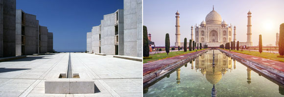
left: Salk Institute for Biological Studies, La Jolla, California (photo from The Architectural Archives, University of Pennsylvania/John Nicolais); right: Taj Mahal, Agra, India (photo by Getty Images

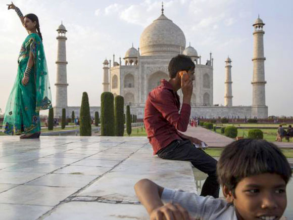
These images are what we commonly think of as symmetry. What you see on one side is mirrored on the other side. Classical architecture relied on symmetry for powerfully balanced compositions. But for a setting as peacefully symmetrical as the Taj Mahal, I find the architecture more interesting when accompanied by the asymmetry of life.

The symmetry of Taj Mahal is made more interesting with visitors and the asymmetry of life of Agra, India (photo by Getty Images)

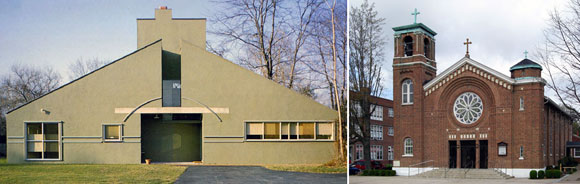
The 1929 Barcelona Pavilion, by Mies Van Der Rohe  is hailed as one of the most significant contributions to the Modern architecture movement, with the pavilion’s Minimal walls and lines, blurring inside and outside. This structure is rarely mentioned in the conversations about symmetry. But that is only because we think that symmetry is when the right side is the same as the left side.

From what I learned in graduate school, I argue that symmetry can be such that the top half is the same as the bottom half. Top-and-bottom, not right-and-left.

left: Unexpected symmetry at the Barcelona Pavilion, Spain (photo from behance.net); middle: Axonometric drawing of the Barcelona Pavilion, Spain (drawing from handesi.wordpress.com); right: Unexpected symmetry at the Barcelona Pavilion, Spain (photo by Lindsay Koffler)

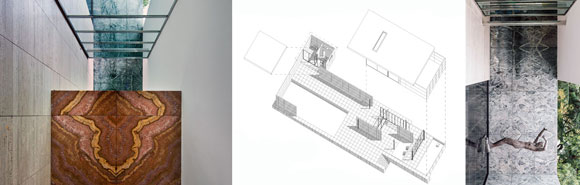
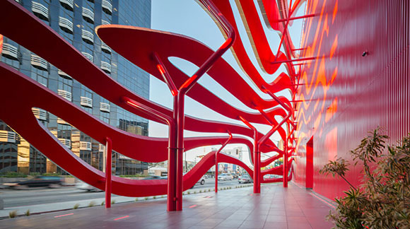
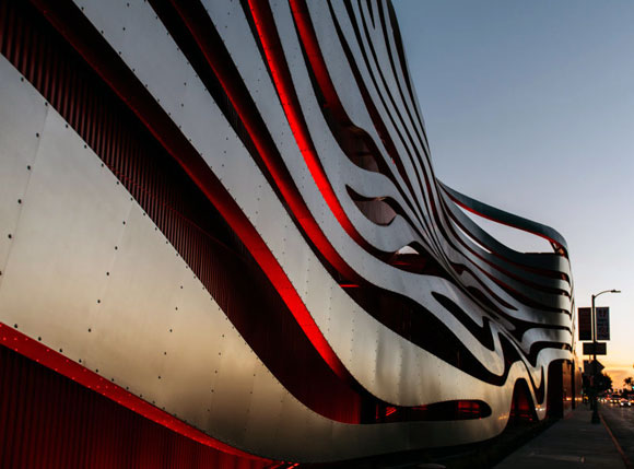
In challenging traditional symmetry, implied symmetry offers complexity. Here, the balance of symmetry is only suggested, not at all exact. As the eye moves from the vertical axis of symmetry to the right and to the left, the design is forgiving, no longer relentlessly mirrored halves. An architectural feature on one side is not replicated on the other.

left: Vanna Venturi House, Philadelphia, United States (photo by Maria Buszek); right: St. John the Baptist Catholic Church, West Frankfort, Illinois (photo from stjohnchurch-wf.org)

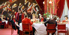
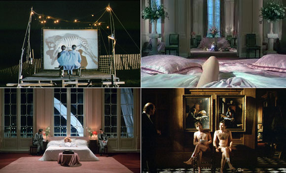
Beyond architecture, film director Peter Greenaway enjoyed applying symmetry as a cinematic device. As a young student of classical paintings, Greenaway employed symmetry not just in the set design, but with how the actors moved into the scene and located themselves. Akin to architecture, the result creates classical balance. But in movies, the experience is progressing over time and not as a static building. Greenaway delivers an experience that is harmonious but also disturbingly artificial. Could such compositions of people and objects exist in real life?

Symmetry in Peter Greenaway films. Upper left, lower right and lower left: A Zed & Two Noughts (1985); upper right: The Cook, The Thief, His Wife & Her Lover (1989)

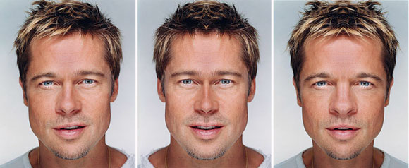
Symmetry in a person’s face is considered to be an underlying trait of beauty and attractiveness. A balanced composition of facial features supposedly delivers a fetching handsome appeal. But exact symmetry in one’s face is impossible. Consider one of Hollywood’s leading actors, often complimented as being good looking. Digitally creating a face using the left side and mirroring it, then as another composition, using the right side and mirroring it, you will see how even the handsome Brad Pitt is not symmetrical. As above, his face only implies symmetry.

Brad Pitt montage (photo from memoliion.com)
Property Brothers from HGTV

These popular TV twins from HGTV exploit their identical look. But the outcome is like a Greenway scene— a contrived and awkward symmetry. Quite creepy actually, if you binge watch the show.

Lastly, this piano is symmetrical in exterior appearance. But inside, it is not. As with life, even things that strive for symmetry, harmony and balance, such things are often asymmetrical and lop-sided—and enjoyably so.

Schimmel Konzert K132 piano (photo from schimmelpianos.com)

PETERSEN AUTOMOTIVE MUSEUM: ARCHITECTURE OF THE GROTESQUE

December 18, 2015

Street façade of the Petersen Automotive Museum, Los Angeles, California (photo by A. Zahner Co.)

I don’t mean ugly or gross. The Grotesque, an art movement, originated in 16th century Italy, and by the 18th century, the philosophy traveled to France, Germany and England. The Grotesque exists today in many forms of painting, sculpture, music, literature, architecture, and other arts.

Originally, the decorative style combined and distorted human, animal, and plant parts. Whether in its basic historical form or in contemporary explorations, adjectives for the Grotesque include the following: bizarre, uncomfortable, disgusting, weird, comical, twisted, and deformed.

Thelonious Monk at the piano, from www.thewinehousemag.com
Thelonious Monk at the piano (photo from thewinehousemag.com)

Take the 1963 recording of Thelonious Monk’s Tea for Two. This territorializing rendition is often thought of as melodically disturbed, unharmonious, and rhythmic off balance. Some have even called Monk’s music perverse and violent. But the irony is this: the so called ugliness of his music is often considered pleasurable. In fact, Monk’s music is considered one of the most important and most enjoyed jazz of our time, by experts and mainstream

Three Studies of George Dyer, 1967, by Francis Bacon
Three Studies of George Dyer, by Francis Bacon, 1967

In Francis Bacon’s paintings, note how often viewers comment on the artwork’s beauty, even when Bacon represents tortured and deformed faces.

Dining scene from The Cook, the Thief, His Wife & Her Lover, 1989

Consider Peter Greenaway’s 1989 The Cook, the Thief, His Wife & Her Lover. The vivid and lush interiors with the decadent and abundant dishes of food open the film beautifully and hypnotically. Eventually the interiors and food transform into something else.

Towards the end of the movie, the excesses of the cinematic beauty become repulsive. It is not simply that beauty is overtaken by the perverse, but all the same properties that made the films’ beauty actually beautiful, reaches the limit to represent the expected qualities of beauty. The overwhelming proportion of beauty becomes horrific but still attractive: the Grotesque.

Whether with Monk, Bacon or Greenaway, the evolution from beauty to something undesirable to something pleasurable, supports Immanuel Kant’s belief that beauty is restful and that the sublime is movement. Kant argues that, “this movement may be compared to a vibration, i.e. to a quickly alternating attraction toward, and repulsion from, the same object.”

Street arcade of the Petersen Automotive Museum, Los Angeles, California, photo by A. Zahner Co.
Street arcade of the Petersen Automotive Museum, Los Angeles, California (photo by A. Zahner Co.)

And so it is with the Petersen Automotive Museum, recently opened to the public in Los Angeles. Previously, I critiqued the Broad vs. the Petersen, two local museums under construction at that time. As I started to write an article about the now complete museums, I chose to not compare and contrast. Instead, I sought an academic framework to discuss the Petersen.

I have no idea if the architects of the Petersen, KPF from New York, were testing the philosophy of the Grotesque. Somehow, I doubt it. But I think contemplating the enormous racing red and chrome building in an intellectual context gives the design prowess and gravitas. If not for such an academic narrative, then all I can hear from every passerby is, “This Petersen is ugly.”

Upon arriving at the museum, do not avert your gaze. Do not simply call it unattractive. Perhaps you will be taken by Kant’s movement, where this new sculptural building will repulse you and eventually attract you. Hopefully.

Detail of steel ribbons, photo by Blake Z. Rong
Detail of steel ribbons (photo by Blake Z. Rong)
© Poon Design Inc.