THE JOKE’S ON YOU: HUMOR AND WIT IN DESIGN
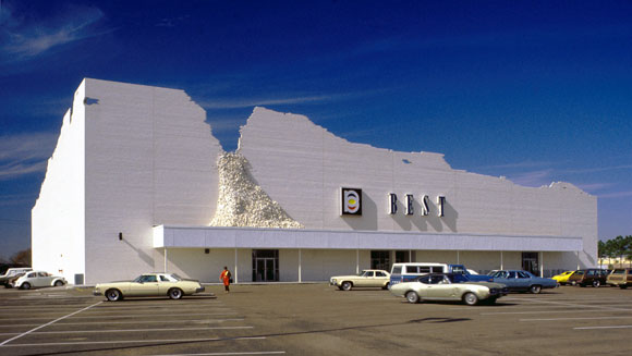
Yes, the façade is intended to look like it is crumbling. The “Indeterminate Façade” of the BEST store, Houston, Texas (photo from siteenvirodesign.com)
Architecture possesses this important and noble side, such as the design of the historic cathedrals in Europe, New York’s September 11 Memorial, or inspiring public schools . But what about humor? Can a building be funny?
Yes! Architecture can be a witty query or a laugh-out-loud punch line.
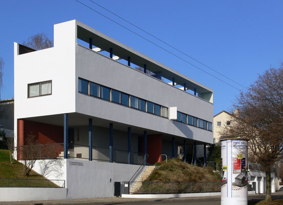
The 70’s and 80’s spawned Post Modern architecture, here and here. In response to the preceding Modern movement from the Bauhaus, the famous German design school, Post Modernism employed clever metaphors and satire—and even campy spoof. Bauhaus’ austerity in design and self-righteous seriousness had a philosophical challenger in Post Modernism, and the protest was loud.
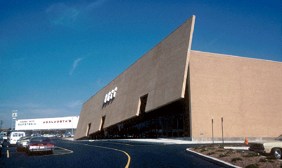
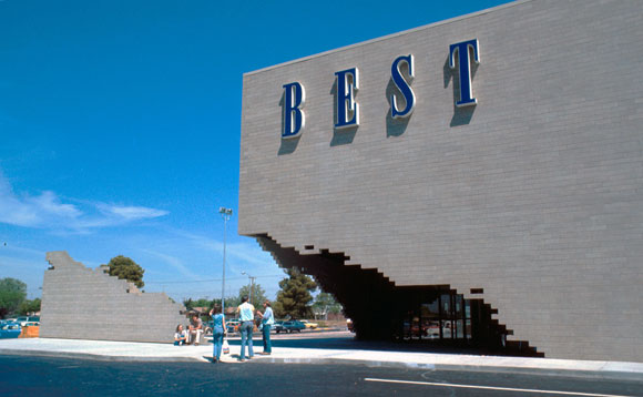
Take for example the BEST Products stores completed between 1972 and 1984, designed by the New York design company named SITE. Throughout nine cities, this architecture firm designed large stores which were conceived not just as works of ironic art, but also tongue-in-cheek commentary on the big box stores. Though many critics argued that SITE’s one-liner jokes are vapid, the cleverness in the architecture raised design conversations to fresh new levels.
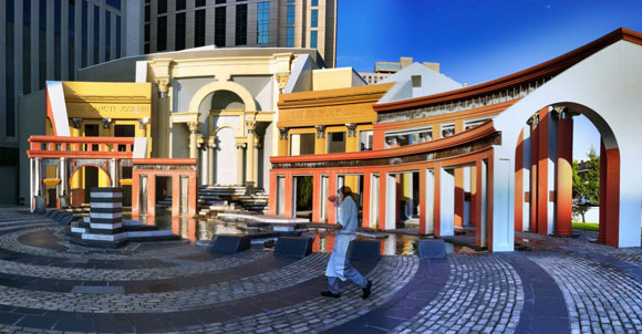
The Piazza d’Italia stands as an iconic example of humor and irony. An endless lists of essays, blogs, books, exhibits, and lectures have both bestowed intellectual admiration, as well as unleashed hostile mockery on this project. This skillful and insane jam session of architecture apparently had inspiration from the Italian immigrant stories of New Orleans. For historicists, purists and contrarians alike, the architecture of this public plaza possesses every idea that floated into the imagination of the architect, Charles Moore.
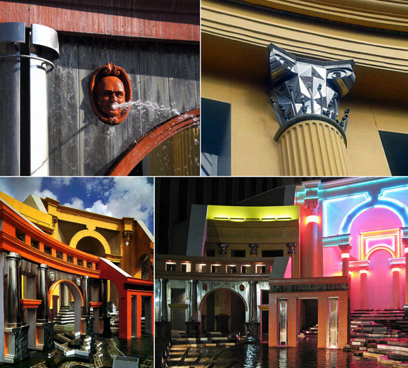
Bizarre interpretations of everything from the Roman orders of classicism, to shapes that defy the Vitruvian rules of beauty, function and structural rationality, flaunt their bravado. Moore did not believe that “Less is more.” He supported the quote from fellow Post Modernist, Robert Venturi, “Less is a bore.”
At Piazza d’Italia, the visitor engages confusing references to historic temples, as well as modern materials like neon lighting and chrome. Arcs of water define column capitals in space and time, incomplete colonnades and arches suggest a work in progress, and De Chirico-esque clocks and long shadows critique the passages of life. This masterful work of Post Modernism is accompanied by a courage akin to a standup comedian.
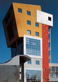
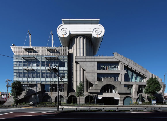
In these two examples from the earlies nineties, the observer might react with “WTF?” and “Has the architects lost their minds?” On the other hand, one could compliment architect Arata Isozaki’s facile use of geometries and colors to create sublime imagery.
For Kengo Kuma, what might appear to be nothing more than an aesthetic disaster, on further examination, the juxtaposition of everything but the kitchen sink (or maybe including the kitchen sink) has delivered something strikingly surreal and incomparable.
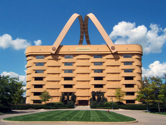
In-your-face jokes can be hilarious, but not always so with architecture, as is this unfortunate example of the “Big Basket Building” for the Longaberger Company, makers of wooden baskets. Designed by architects NBBJ, the seven-story headquarters is a basket, literally. At 160 times bigger than a typical picnic basket, the novelty is adroit and the engineering of massive steel planks and plates is fascinating.

Due to tax debt, the Longaberger had to vacate the property. After 24 months on the market at increasing discounts to the sales price, the architectural novelty had no legs in the real estate market. Unless you sell baskets for a living, no one wants to work in a giant basket.
Whether in architecture or literature, in painting or dance, creative forces can be profound, poetic and beautiful. And such forces can also be light-hearted, tongue-in-cheek and glib. Perhaps all of the above can occur at the same time. And that’s no joke.
