#43: SQUEEZING IN THE NEW SFMOMA

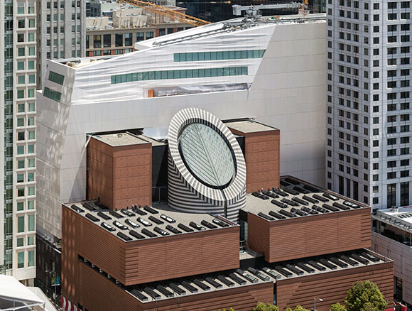
SFMOMA, San Francisco, California (photo by Quinten Dol)
As a kid running around Chinatown, the alleys of San Francisco fascinated me. This childhood curiosity preceded my academic studies two decades later into urban density and the small streets that patiently waited to be discovered.
In 2009, the San Francisco Museum of Modern Art (“SFMOMA”) announced a massive $300 million, 235,000 square foot addition to the iconic 1995 museum by Swiss architect Mario Botta. In the dense South of Market area expecting this museum’s expansion, there is barely any land left. Only slivers of in-between spaces. How would this big project squeeze into the city?

Recently completed, Norwegian architect Snohetta with local architect EHDD, unveiled the new SFMOMA—a skinny, ten-story building addition, woven and tucked neatly into the urban fabric.
By allowing visitors to enter SFMOMA from various directions, Snohetta re-envisioned how the public graciously arrives, with the first and second floors engaging the street. This architectural porosity, as I call it, is notable as museum goers conveniently and casually approach the world of art. Such an accessible lobby experience provides a democratic outreach, as compared to the controlling arrival at The Getty Center in Los Angeles.
Here, one cannot walk easily to this museum. As it is in most of Los Angeles, one has to drive. Approaching the Getty, one first plunges deep into the earth, parking six or seven levels below the surface—a time-consuming downward spiraling journey. After fighting the slow and crowded elevators back up to fresh air, one finally arrives at the welcome mat to the museum.

But you are not at the Getty yet. Rather, you are only on a platform waiting 40 minutes for a small tram that takes you to the museum that sits atop a hill, like a private Acropolis. Appearing unsure of its direction, the tram jostles absurdly and moves slowly as if a movie prop, and not the cutting edge transportation bragged about for this billion dollar museum.
Back to SFMOMA. What is the purpose of wrapping the building in 700 unique panels of white fiberglass-reinforced polymer? The building’s skin ripples and stretches provocatively, while silicon crystals in the surface create subtle changing light effects. Though sculpturally fascinating, do the fetishized facades really remind us, as the architect claims, of the waters of the San Francisco Bay? Unfortunately, the evocative building skin appears to have no impact on the interior experience.

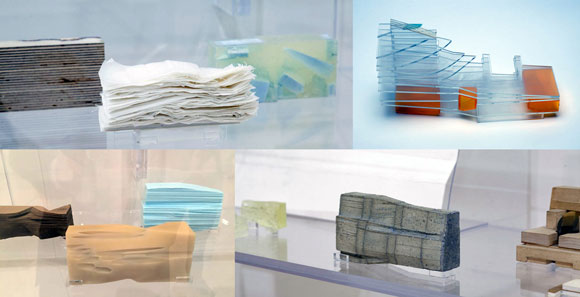
One exhibit that displays several dozen tiny architectural models by Snohetta highlight the manically-obsessive design process. With each study model, this architect appears to randomly go from one exterior idea of form, color and texture to another—from glass to stone, from plastic to wood, to wavy surfaces, to stretched fabrics, and so on.
I know that the design process is not linear, but it shouldn’t be arbitrary either.
The distribution of natural light through a museum is both a science and an art form. Museum designers explore all kinds of architectural moves: skylights, patterned glass, operable louvers, diffused washes of sunlight, contrast-y dramatic accents, etc. At SFMOMA, not much new ground was broken in terms of light technology. But the galleries are made pleasant through what the architect calls “Vertical Gardens,” outdoor landscaped plazas inhabited by wonderful installations from sculptors such as Calder and Newman.
The interiors are mostly white with light woods. But the restrooms are intensely colored throughout, wall-to-wall, floor-to-ceiling. And different colors per floor. The vivid red used on the second floor left me viscerally disoriented.
As far as the relationship between the original Botta museum and the new Snohetta addition two decades later, let’s just say the juxtaposition of old and new has the feel of a forced marriage.

