#156: ACADEMY MUSEUM OF MOTION PICTURES: PLOT AND CLIMAX
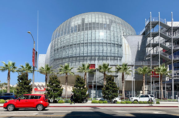
(photo by Anthony Poon)
My first thought is simply this: weird. But is weird a bad thing? After years of delay, the $484-million Academy Musuem of Motion Pictures finally opened late last year. Designed by Pritzker-prized Renzo Piano with local Gensler as executive architect, the results are indeed weird.

When Renzo Piano first arrived at the doorstep of the Los Angeles County Museum of Art, or LACMA, in 2003, the city was thrilled. Art patrons were giddy and light-headed. The Italian architect had already designed notable museums around the world, e.g., Whitney in New York, Menil in Houston, Kimbell in Fort Worth, and of course, his career-launching, iconic Pompidou in Paris. (He was only in his early 30s!)
After having created a master plan for LACMA, two Piano-designed buildings were completed. The $56 mil, 60,000-square-foot BCAM opened in 2008, and two years later, the $54 mil, 45,000-square foot Resnick was completed. Unfortunately, the architecture world was mildly impressed. The critics were not kind: serviceable, predictable, Team B, elegant but not inspired, etc.—such notions come to my mind.
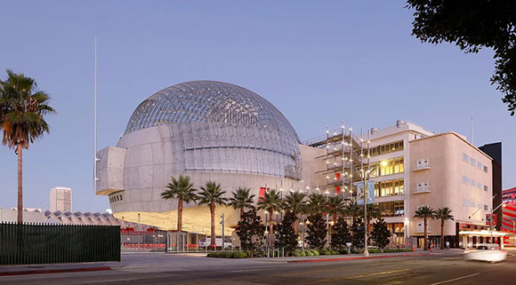
Yet Starchitect Piano was asked to return for this fourth round. (Why?) With the new Academy Museum of Motion Pictures, he was determined to defy his critics and not let this city down again. Perhaps his ego needed to make an artistic statement, a final cry for attention. Indeed, the bar had been raised by Zumthor’s “Blob” and the Peterson’s swoops and stripes.
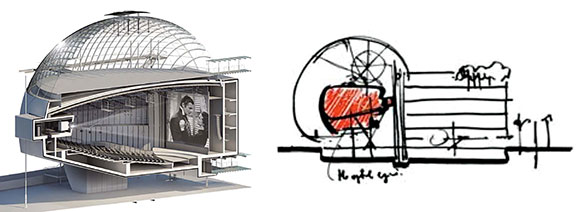
Piano’s concept is that of juxtaposition: a new 45,000-square-foot theater in the form of a 150-foot diameter sphere vs. the renovation of the 250,000-square-foot May Company Building. It is a story of new meets old—a futuristic concrete, steel, and glass globe confronting the historic 1931 Streamline Moderne, former department store. The meeting of the two sentinels finds it success in contrast and the ability to make each other look good. The parasitic relationship of visitor to host is both uneasily beautiful and compositionally stunning. But after this, the plot loses its voice.
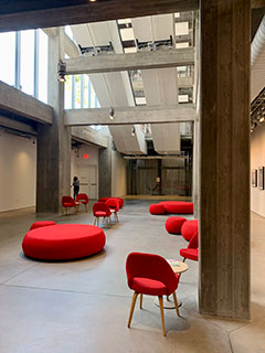
The renovation of the existing building, now called the Saban Building, explores “less is more.” Offering the museum curators a canvas of bare concrete floors and columns with a splash of red, inspired by the Red Carpet, the reduction and simplicity results in sincerity. Yet with the new spherical building, the design might have been better served by investing in the strength of the effortless sphere, understanding its elemental power, and exploiting this sense of reduction. As Louis Kahn showed us, there is power in abstraction, purity, and geometry.
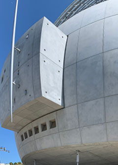
Instead, creative decisions are no more than clumsy attachments and visual distractions. A projection booth that protrudes on the outside piercing the beautiful curvature of concrete? What about the odd slices and chamfers that appear to be from the hand of a clumsy chef attempting to decorate his cake, the uncomfortable plaza crushed by the hulking mass above, pointy sticks and javelins, stairs like scaffolding, giant earthquake-resistant base isolators of toy-like black rubber and red trim, and so on?
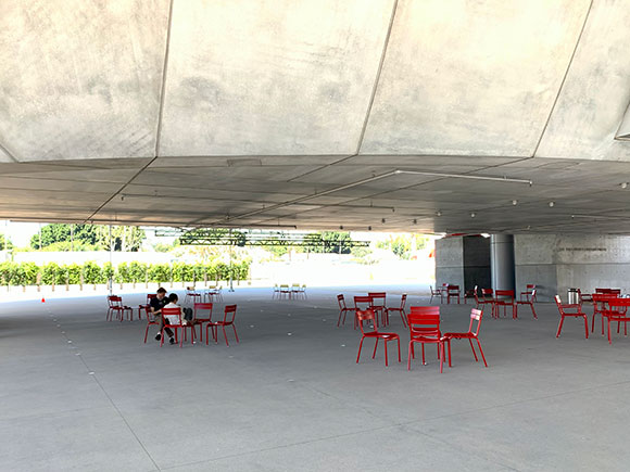
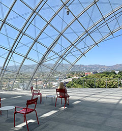
I found the most effective story twist on the roof terrace, an incredible engineering climax of glass and steel. Viewing 180 degrees north towards the Hollywood Hills and sheltered by a massive yet graceful transparent dome, the sublime experience is accompanied by a sense of wonder, a feeling of enlightenment.
I have always enjoyed movies for their ability to transport me to other worlds, whether Wakanda, Elm Street, Oz, or WWII. For a museum dedicated to the art of film, maybe the architect sought to deliver us a fantasy, a design of weirdness. Angelenos have been quick to label the building the “Death Star.” Of course, Piano dislikes this title that references the evil Galactic Empire. He prefers Tom Hanks’ “magic lantern.” Hoping for Hollywood magic, Renzo Piano states, “Call it a dirigible, a zeppelin,” “flying vessel,” or “a soap bubble in the middle of a concrete city.”

