#92: NOT JUST FOR KIDS: THE ART OF COMIC BOOKS
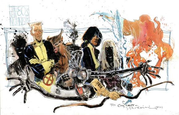
The New Mutants, by Bill Sienkiewicz
(On November 12, 2018, we lost a super hero. In memory of Stan Lee, 1922 – 2018.)
No longer targeting an adolescent male audience, comic books have become more complex and far reaching. Some comics, known as “graphic novels,” highlight the quality of the writing—even honored with the Pulitzer Prize. Alongside the award-winning stories, the artwork of comic books have evolved from the crude cartoons of early comic strips found in the back pages of the newspaper. Comic book illustration has advanced to the level of art. As in fine art, as in Michelangelo and Da Vinci.
And why?
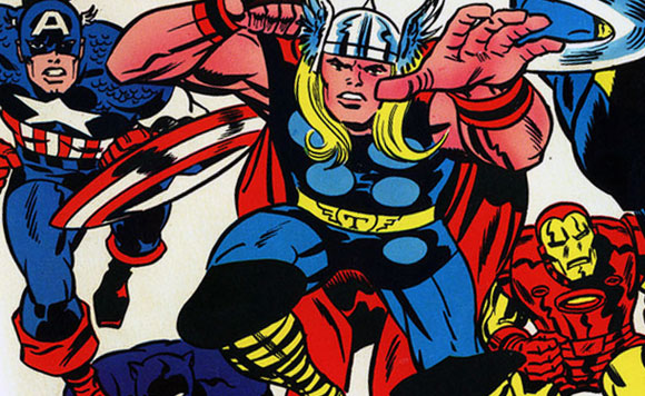
The classic art form of comics arguably started with the giants of the 50’s and 60’s, Jack Kirby and Steve Ditko. Their line work was crisp and clear. Though graphically modest, the art was expressive. The colors were flat, but boldly captured movement and energy in two dimensions. In part due to the limits of rudimental printing, early comic book artists were forced to be thoughtful and efficient. The results brightly portrayed the optimism of the generation.
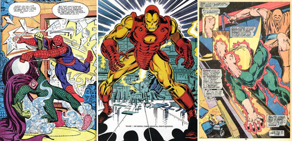
From the late 60’s to the 80’s, John Romita added tonality and detail. Influenced by the world of Pop Art, abstract graphics enhanced the drama of a scene. Later, ground breaking artist, John Byrnes, continued the study of graphic design and narrative structure, literally breaking out of the typical paneled grid of comic book pages. Note the revolutionary full page art of Iron Fist, and how the smaller insets exhibit the fist of our hero transforming to iron, alongside the oddly shaped boxes of commentary. As with the Pop Art movement, irony and criticism entered the pictorial lexicon, representing a growing interest for originality and a fresh look at old things.
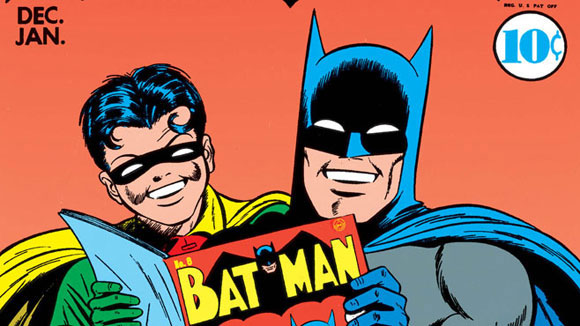
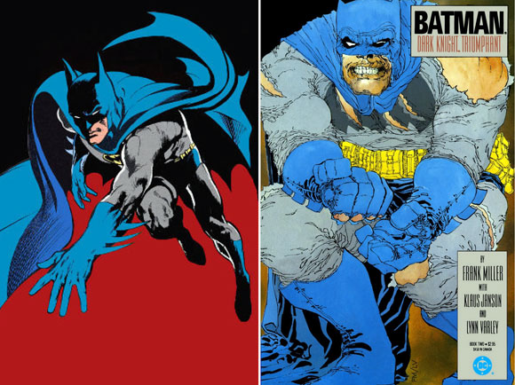
In studying the development of Batman over the generations, the simplicity and naivety of pioneer Dick Sprang’s Batman from the 40’s evolved to the heavy use of black ink from Neal Adams three decades later. In Frank Miller’s seminal 1986 release of The Dark Knight Returns, we confront the twisted representation of our gritty anti-hero, whose shadowy presence is barely contained within the limits of the physical page. From innocence to dark forces, graphic tools displayed our weariness in celebrating so-called virtuous heroes.
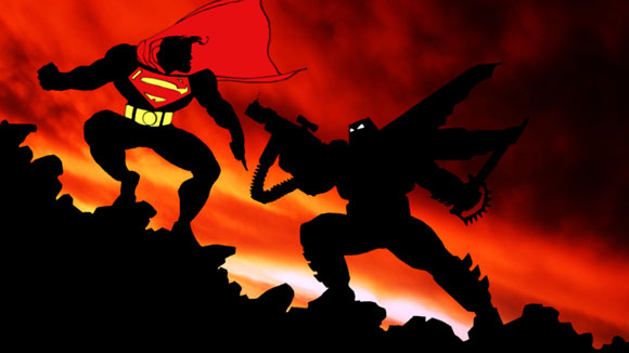
Testing further visual limits, Miller takes an abstract pictorial approach, reducing Superman and Batman to merely cinematic silhouettes. Yet through this graphic austerity, the carefully composed and detailed postures imply the entire story. Perhaps our brains are so filled these days with data, emotions and retorts, that a mere gesture can cause our bodies to generate complex reactions.
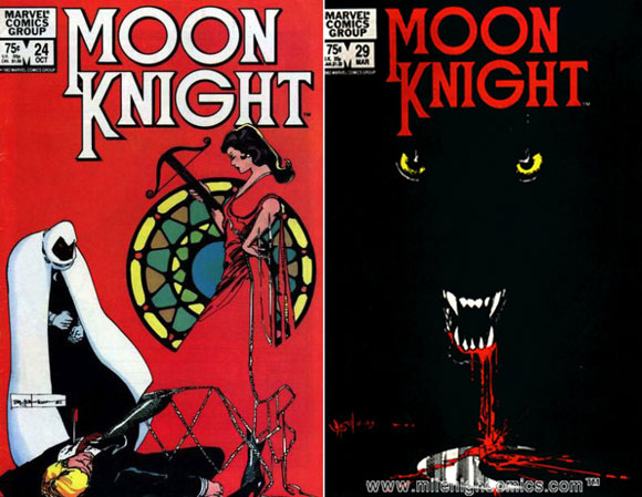
My all-time favorite, Bill Sienkiewicz, transforms the visuals of comics to the highest level—as a classical painter would, as a mixed-media artist would. For the past three decades, Sienkiewicz captured emotional and psychological content in the most imaginative of techniques. In this Moon Knight cover, note how the villainess in red, intentionally omitting her body’s outline, becomes the entire background of evil, or the cover drawing that is 98% minimalist black.
Going further, The New Mutants cover illustrates Sienkiewicz’s interest in mixed-media collage, expressing even the tape that attaches the scraps of paper. Doing away with the slickness of illustration now offered by digital means, he reverses his approach to show an honest and revealing snapshot of process and composition.
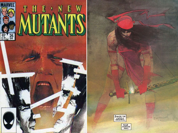
Finally, Sienkiewicz’s beloved assassin, Elektra, is treated with the skill, vision and artistry on par with any generation’s most prominent creative geniuses. With some illustrators, we have reached the bleakest and most dense part of our souls. Sienkiewicz and other innovative artists reached deep into murky places and offered beauty, instead of despair.
Is it so simple to say there is a linear path from the innocence and optimism of early generations to the difficulties and sarcasm of later generations, from oppressing nightfall to triumphant invention? If comic book art and the methods of artistic process and reproduction represent the development of the human condition, than I utter the legendary phrase by the father of comic books, Stan Lee, “Nuff Said!”