#205: THE RHYTHM OF ARCHITECTURE, PART 3 OF 3 | “BITCHES BREW”

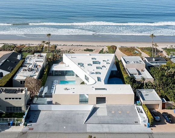
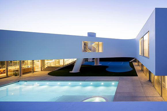
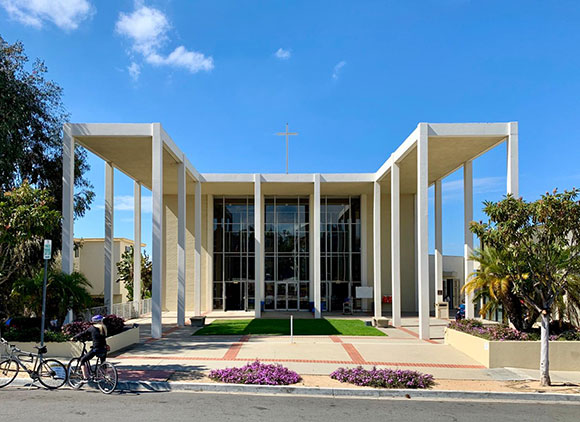
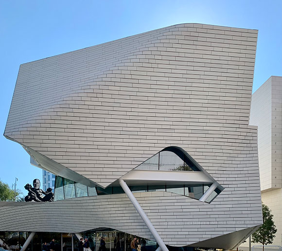
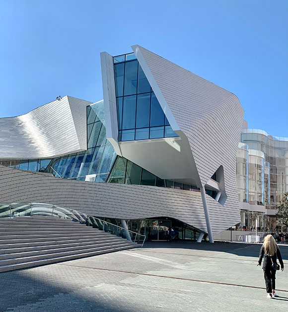
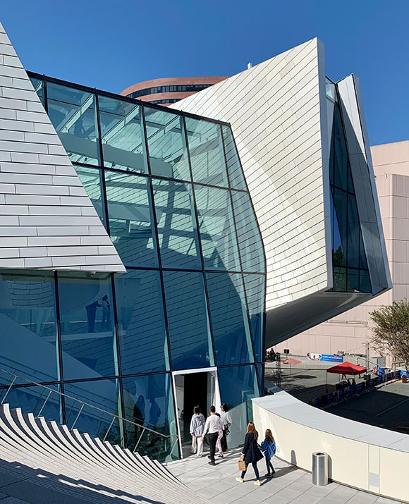
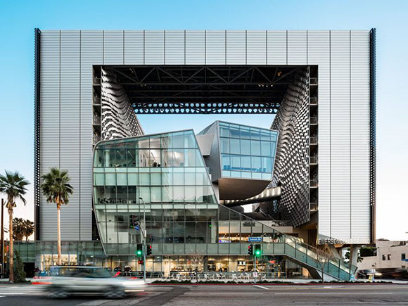
Social Justice Headquarters, Los Angeles, California, by Poon Design
Please enjoy part 3, excerpts that conclude my podcast with host Josh Cooperman, “The Rhythm of Architecture.” For the podcast series, Doctoring Up Design, we recorded this episode S4/E36 alongisde Parts 1 and 2.
Josh Cooperman: We’re kind of at this intersection between what is and what is possible. What’s so great about architecture is you can look at something that has been created 75, 100, 500 years ago and find something that is relevant for today. Good ideas transcend time.

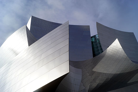
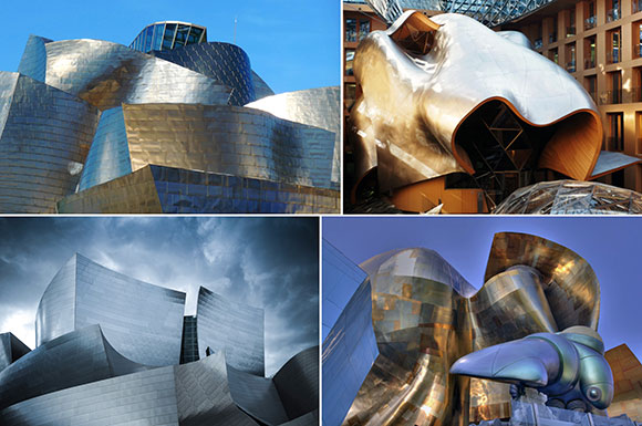
Anthony Poon: Correct, if they are elemental ideas, like proportion, light, scale, space, etc. These are label-less in terms of their style. And we have to be careful with what we take from the past. Right now, there is an obsession with Mid-Century Modernism. But for me, It is a just another historic style of architecture, no different than Elizabethan Stick Style or Victorian Revival.

Victorian House, San Francisco, California, (photo by David Vives on Unsplash)
There’s a line about jazz in the movie, La La Land. At one point jazz was progressive, but now, “It’s dying on the vine.” Jazz is an old style of music, that is not too different from classical music or Gregorian chants. Meaning, we have to look past these style movements and look at what the essence of things are. I look at jazz for the ideas around improvisation, not for the specific music that is produced.
Josh: Okay, so now I got to back up because I am reminded of one of our previous conversations. I think this is actually how and where it started. Bitches Brew is one of my least favorite albums. I mean, I have a visceral and violent reaction to it.

Anthony: And it’s groundbreaking music.
Josh: It’s progressive, and I hate it. I hated it the first time I heard it. But I recognize and respect its value. And that’s the thing, and that’s why I come back to architecture. When you talked about Brutalism and how people will kind of not respect it for what it is, you don’t have to like it, but you have to respect it, how it moved the movement forward and how it moved the art form forward. Bitches Brew changed music for a lot of people…

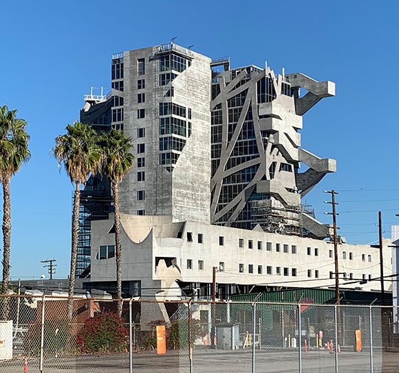
Anthony: … and is still changing music. It’s from a different definition of music. Mozart said that music is intended to be beautiful. But that’s not necessarily what every musician is trying to do. Musicians like Thelonious Monk was trying to be intentionally off kilter, off rhythm, and not necessarily harmonic. Thom Mayne of Morphosis designs projects of which I think he once said something like: Because these are tough times, we need tough architecture. He’s not looking for his work to be beloved or considered beautiful. I think his work is beautiful within a completely different criteria. This is the same way that Bitches Brew is kind of nuts and crazy, but beautiful in the way that the art movement of the Grotesque is.

Josh: 5, 7, 10 years ago—clean water, air, noise, pollution were all things of such high importance. And it was the designers, the architects, who affected this, who addressed it for the first time to make it better. And now we get to a point where security and safety in a residential construct, as well as religious institutions, schools, hospitals, businesses, is more important than it ever was before. You go back to what the Romans designed. It was created for safety and security, where you would wall yourself off and live in an interior structure. I don’t think we’re necessarily there yet, but the idea of safety and security in regards to architecture is now something that is more and more important, because we haven’t focused on it.

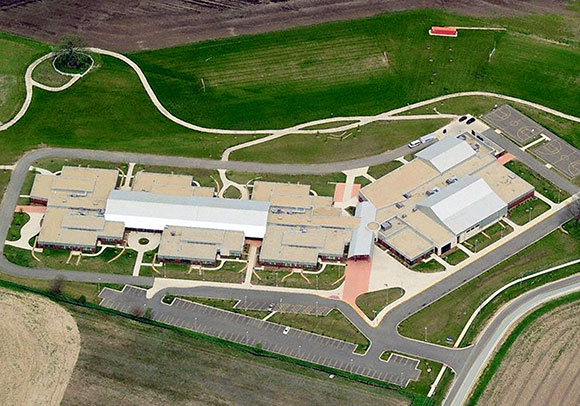
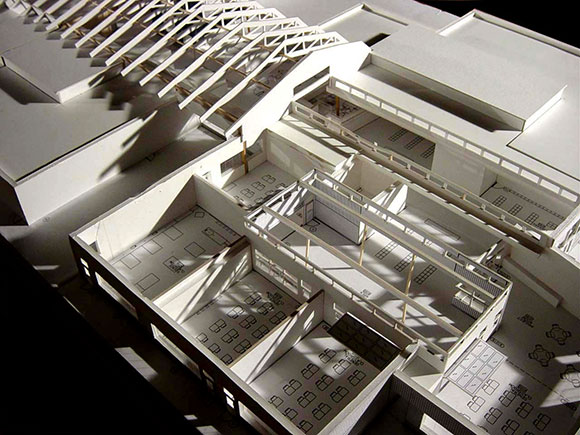
Anthony: That goes back to when I mentioned resilience. At Poon Design, we design a lot of schools. To discuss school shootings during design is a very unfortunate topic. As a driver of design, school shootings weren’t even talked about years ago. Back then, we had the luxury of talking about how students would learn, what a fun place school would be, and made sure there’s a lot of natural light, because light has been proven to increase academic excellence.
Now we focus on what happens if there is a school shooter. And security, as you mentioned, is primary. But it also has to be thought of architecturally, because if we’re only designing for security, we would have a concrete box with one door and no windows—and safe rooms within. It would be a military prison, and that is not school architecture. There are no easy answers. You’re not just going to build a concrete classroom without window, because there are school shooters. Design has to be a lot more thoughtful, resourceful and strategic.
Josh: And nuanced.
Anthony: Yes, nuanced. Exactly.