Tag Archives: Los Angeles

JOURNAL ENTRIES FROM THE LIFE OF DESIGN

December 4, 2015

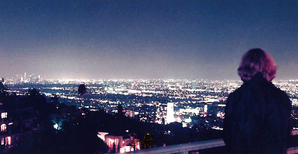
View of Los Angeles from my Hollywood Hills house

In designing a house for myself, the process became a diary of sorts. This design journey documented the chapters of my life.

In being my own client and in never actually implementing any construction, each proposed design captured my evolution over the years—from single, young couple, adulthood, married life, baby, to two children. All six design studies below (there are dozens more) addressed domesticity, views of the city, designing for a steep hill, adaptability, and new aesthetic ground.

Over fifteen years ago, I purchased a 1957 tear down in the Hollywood Hills, in an enclave of exclusive homes known as the Bird Streets. The following designs track my existence and evolution.

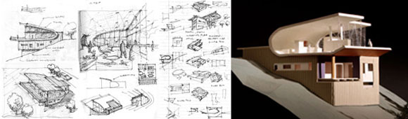
1998. Called the “Wrapping House,” this first scheme explored my joy of entertaining. The iconic loft combined the living room, dining room, kitchen, and other public functions into one space. A continuous walnut plank floor/wall/ceiling wrapped this great room.

The Wrapping House
The Wrapping House

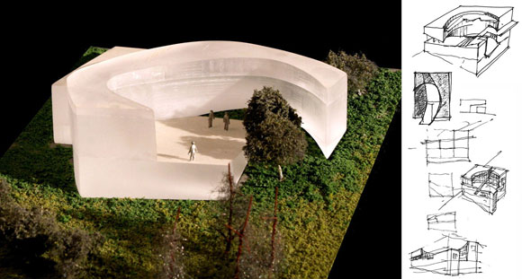
2000. Then arrived a design entitled the “Glass Courtyard House.” My interest in hosting extended to the outdoors. A sizable courtyard was the canvas for socializing under the stars. A perimeter of glowing rooms embraced three sides of the exterior space. The open side faced the sparkling city lights below.

The Glass Courtyard House

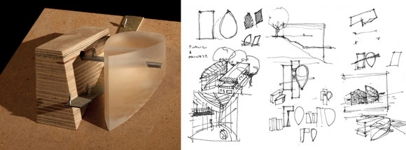
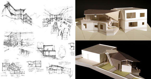
2002. I sought some privacy as I aged, wanting a distinct separation between the general living areas vs. the bedrooms. As I matured, I also chose not to brazenly demolish my Mid-Century house. With a parasitic idea called the “Floating Addition,” I created a polycarbonate and steel structure of bedrooms that hovered over the existing building.

The Floating Addition

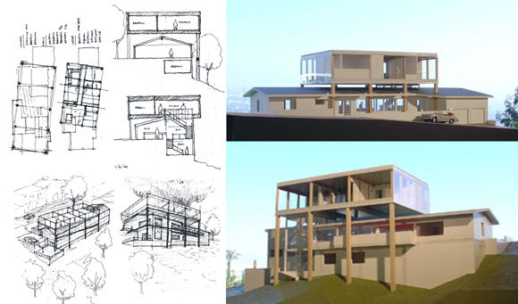
2004. Furthering this notion that I desired both a public social life and a private personal life, the “Public/Private House” explored a home comprised of two abstract shapes. The glass and aluminum public building contained the kitchen, dining room, family room, and living room. The wood clad private building had the bedrooms, bathrooms and art studio. The simplicity of forms signified an agenda to simplify my increasingly busy life.

The Public/Private House

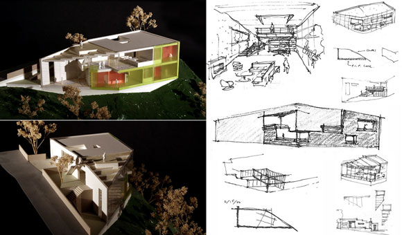
2005. Then came a baby. Two juxtaposed halves composed this “Adult/Child House”: sophisticated and serious for adults vs. whimsical and animated for the child. Luxurious with marble, stainless steel, and dark exotic woods, the adult half was intentionally strict. Playful with exposed ducts, the child half employed novel materials like colored rubber, bright acrylics, and translucent resins.

The Adult/Child House

2012. With children, my growing family needed a bigger home, both inside and outside. Simply called “The Point,” I created a geometric house, with a double height rumpus room pointing towards downtown. With my daughters needing an exterior area to play, the rooftop amphitheater provided a zone for the young to imagine, with the surrounding tree tops as audience.

The Point
The Point

As in life, the creative process is not a closed loop—never a sentence with a period. Design and life are works in progress. They are open-ended acts. Ralph Waldo Emerson acknowledged, “Because the soul is progressive, it never quite repeats itself, but in every act attempts the production of a new and fairer whole.”

2015. None of the above designs were implemented. I sold my property to a developer who has his own plans for a dream estate. In turn, I purchased yet another old house on yet another hillside property. Also with nice views. My design journey starts again.

ARCHITECTURE FOR LEARNING

August 28, 2015

Multipurpose building, Feather River Academy, Yuba City, California, by Anthony Poon (w/ A4E, photo by Gregory Blore)

Certainly, Poon Design has designed luxury estates for A-listers, Michelin-rated restaurants, and hospitality projects for cities like Beverly Hills.

Moreover, Poon Design thrives for a greater good. We embrace our opportunities for a higher social purpose, where vital agendas advance the lives of individuals and their communities. Of all our project types, we find ourselves grounded when designing educational buildings and campuses.

The school is one of the most influential works of architecture. Whether for a child, teenager, young adult or lifelong learner, architecture for knowledge substantiates one’s existence. Poon Design’s solutions promote curiosity, embrace social interaction, and inspire leadership, whether it is for an elementary school, student union or university library.

I have been fortunate, having designed over 50 educational projects. Focusing on young students, the four schools below tell my story of designing for Pre-K to 12th grade. (Future posts will discuss my work for higher education.)

Central courtyard, Bel Air Presbyterian Preschool, Los Angeles, California, by Poon Design (rendering by Mike Amaya)
Central courtyard, Bel Air Presbyterian Preschool, Los Angeles, California, by Poon Design (rendering by Amaya)

BEL AIR PRESBYTERIAN PRESCHOOL, Los Angeles, California

As the first structured environment a child experiences, a preschool serves as both an introduction to the world and one’s first civic duty. At 23,000 square feet perched high in the Santa Monica Mountains, our “Village of Discovery” is ambitious: 120 students, 11 classrooms, 5 play yards, 3 pavilions for library/music/art, multipurpose hall, and administration building.

Poon Design’s vision delivers a community of small scaled, cedar buildings with large sheltering overhangs. Features include bamboo classroom flooring, butterfly and hummingbird gardens, and an amphitheater.

Central courtyard, Bel Air Presbyterian Preschool, Los Angeles, California, by Poon Design (rendering by Mike Amaya)
Central courtyard, Bel Air Presbyterian Preschool, Los Angeles, California, by Poon Design (rendering by Amaya)

GREENMAN ELEMENTARY SCHOOL, West Aurora, Illinois

This 63,000-square foot school finds innovative ways for the performing arts to flourish. The extra-wide staircase doubles as audience seating for impromptu performances. Second story balconies overlook double height spaces. Window compositions express rhythm and harmony. The 700 students are arranged in seven Small Learning Communities, alongside facilities for students of Aurora University—for hands-on, in-classroom training of future teachers.

top: Lobby and amphitheater staircase; bottom: Street façade, Greenman Elementary School, Aurora, Illinois, by Anthony Poon (w/ A4E and Cordogan, Clark & Associates, photos by Mark Ballogg)

HERGET MIDDLE SCHOOL, West Aurora, Illinois

With the metaphor of the American heartland, our 113,000-square foot school for 850 students sits as a heroic farmhouse on the 38-acre rural property.

Why do most schools have a monotonous narrow hallway, flanked by metal lockers? For our design, the light filled hallway is no hallway. It is 60 feet wide (not the standard 12 feet) and 30 feet tall (not the standard 9 feet). Rather than merely circulation, our groundbreaking energy-filled hall IS the library, technology center, life skills lab, and wood shop. Field stone, standing seam metal, brick walls, and wood plank details capture the vernacular design metaphor. Roof lines recall the old barns that once stood on the site.

top: Technology center and “Grand Hall”; bottom: Overall view, Herget Middle School, Aurora, Illinois, by Anthony Poon (w/ A4E and Cordogan, Clark & Associates, photos by Mark Ballogg)

FEATHER RIVER ACADEMY, Yuba City, California

Rather than design a single building with parking in front and playfields in back, we explore the school’s mission statement of “Learning in Action,” by interweaving the program across the entire property. The 25,000 square foot, 180-student school serves students referred by the probation department, expelled by their local schools, or even homeless.

Our undulating roofs create an ever-changing journey—symbolic of the path of learning. The campus itself is an open textbook, where aspects of the architecture teaches. As one example, the paving has the solar system inscribed in the concrete, where the paths of the planets arc throughout the property. An illustration of Pluto marks the school’s entry, Earth is described in the central courtyard, and the sun is represented by an eight-foot tall sundial.

top: Special education building and classroom buildings; bottom: Multipurpose and administration buildings, Feather River Academy, Yuba City, California, by Anthony Poon (w/ A4E, photos by Gregory Blore)

We are honored to have received dozens of local and national design awards from KnowledgeWorks, DesignShare, Edutopia, Illinois Association of School Boards, and the American School & University Magazine, just to name a few.

Most significantly, our work has been honored twice with the National Grand Prize, given jointly from Learning By Design, The American Institute of Architects, and National School Boards Associations—for the best designed school in the country.

“School District 129 is fortunate to have Anthony Poon learn about us, and capture our spirit and beliefs about education in the buildings we will build for our children. I believe that Anthony’s thinking and his work is extraordinary, and will find its way to many honors. He will create the future dreams of this nation.” – Dr. Sherry Eagle, former Superintendent in West Aurora, Illinois, and Executive Director for the Institute for Collaboration at Aurora University.

MUSEUM VS. MUSEUM

June 5, 2015

The Petersen Automotive Museum (rendering by KPF)

Late 2015, Los Angeles will welcome two new museums: the Petersen Automotive Museum and the art museum simply called, The Broad. Before discussing these civic structures, let’s step back to the architecture of museums in general.

Traditionally, museums are empty vessels that come to life when artwork is inserted. This museum architecture is a neutral backdrop.

In opposition to this premise, architect Frank Gehry’s 1997 Guggenheim Museum is a work of art itself, and symbiotically co-exists with the art and sculptural installations. Considered one of the most influential living architects, Gehry created for Bilbao in Spain a design that counters the classical muted environment for art. By doing so, this museum has been hailed as one of the greatest buildings in current history.

The Guggenheim in Bilbao, Spain, by Frank Gehry (photo by Miro Hotel), The Guggenheim in New York, New York, by Frank Lloyd Wright (photo by jdglek)

In yet another approach, when Frank Lloyd Wright completed his Guggenheim Museum in New York City in 1959, visitors were stunned. No defined galleries existed, but rather, a continuous sloping floor of exhibits spiraled up six stories.

Complaints from curators were immediate. If they were to hang art parallel to the ground as one typically does, then it would be crooked to the sloping floor of the museum. But if the curators were to hang art parallel to the sloping floor, then the art would be at an angle—a warped viewing for visitors.

When Wright was questioned, he responded with indifference: the curators’ concerns were insignificant. The architect proclaimed that visitors have come to see art. And here, the art is his architecture, the building itself. Not the negligible objects within.

The Broad (rendering by DS+R)

Back to the present. The soon-to-arrive Petersen museum, at a price tag of $125 million for 300,000 square feet, is designed by New York-based, corporate giant Kohn Pedersen Fox Associates. The new Broad museum, $140 million for 120,000 square feet, is designed by New York-based creative studio Diller Scofidio + Renfro.

(I will not deliberate on the obvious question and necessary outcry: why are these two Los Angeles museums created by New York architects?)

For both the Petersen and the Broad, the large buildings present an aggressive exterior. Both facades are radical and alluring.

With a muscular honeycomb skin of precast concrete, the Broad is an enigmatic and commanding building. Called the “veil” by the architects, this elusive skin looks to the future, with an unintentional throwback to the 60’s office buildings that also employed modular concrete exteriors.

The Broad exterior detail (photo by Luis Sinco, Los Angeles Times)

At the Petersen, a bizarre facade of seductive stainless steel ribbons wraps a bright red building. According to the architects, this design “evokes the imagery of speed and the organic curves of a coach-built automobile.” Though appropriate as a design theme for a museum of cars, I frankly don’t see it. It appears to be like an uncomfortable extra-terrestrial armor, instead of the sophisticated lines of a Citroen or Alfa Romeo.

Here’s one big thing that separates the two exteriors. The sculptural outside of the Broad is a beautifully patterned concrete fabric that is integral to the structure of the building. Also, this “veil” cleverly diffuses sunlight into the museum, providing bright and stimulating gathering spaces.

The endless ribbons of the Petersen are merely tacked on, superficially applied like mascara. Not even a part of the building’s structure, the zippy ribbons have no impact on the actual journey through the museum, other than the initial impact of a billboard that you see, read, and pass by.

The Petersen exterior detail (photo by urbanize.LA)
The Petersen exterior detail (photo from  urbanize.LA)

When the two museums are unveiled to the public, the quality of the interiors, the scale and character of the galleries, and the voyage from one exhibit to the next will all be judged.

Today’s vote of confidence is for The Broad. I see the pioneering vision that architects DS+R have created in their other outstanding works of civic architecture, such as the impressive High Line, a one-and-a-half-mile long, outdoor recreational space and social connector, hovering over the streets of Manhattan.

KPF’s Petersen museum tries hard with their automobile metaphor, and perhaps too hard. This design is a dangerous one-move dance number. At first glance, I am impressed with the self-assurance of form and color. Later, I am already fatigued by the architecture’s brashness, wishing there was some subtlety and depth.

For both projects, I enjoy the qualities of strength. Both architecture companies possess courage. Though some critics are tired of “statement” architecture—the headline grabbing designs—a museum needs to be exactly this. Museums are one of those rare city structures that speaks to the broadest community. Standing for generations, these buildings house the great minds of our artistic present and past.

© Poon Design Inc.