My fave pair of jeans, by AG (photo by Anthony Poon)
What is it about our favorite pair of jeans—weathered and perfectly broken in? How about the ol’ leather jacket—worn and faded? The lustrous surface, cracking a little—almost poetically.
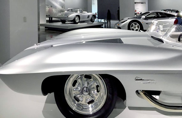
The Silver Room, Petersen Automotive Museum, Los Angeles, California (photo by Anthony Poon)
But a car. No one wants a car that has been distressed, with a shattered windshield and scratches on the sides. No, we want our cars immaculate. Like new.
The Acropolis, Athens, Greece (photo by Mohammed Zar on Pexels)
Many think of architecture like a polished car. Buildings should look new. Buildings are constantly being renovated, and historic buildings restored to their original sheen.
Renovation by Martin / Poon Architects of the legendary 1924 Gordon Kaufman-designed estate, Los Angeles, California (photo by Martin / Poon Architects)
But why not we embrace a building as worn, like our denim jeans or favorite leather shoes?
Consider the dreamy paintings of Antiquity, with the gleaming majesty of white temples. Think of how they look today: tired, old, covered in both soot and scaffolding. Most buildings can’t look the same as they did on the first day.
And I argue that they shouldn’t.
Amazon summarizes the book by my thesis advisor, Mohsen Mostafavi, On Weathering: The Life of Buildings in Time. “On Weathering illustrates the complex nature of the architectural project by taking into account its temporality . . . weathering makes the “final” state of the construction necessarily indefinite, challenges the conventional notion of a building’s completeness.”
For $1,200 at Barneys New York, you can get a brand new pair of shoes that are already distressed and patina’d (photo by Anthony Poon)
I suggest that we embrace building materials that patina with inherent beauty. I think of the tag that comes with my jeans, “Variations and changes in color and surface are not defects of the material, but considered to be part of the fabric’s natural beauty.”
(photo by Anja from Pixabay)
Copper, for example, expresses evolution and maturity, as it starts shiny and bright, deepening to a rich “dirty penny” brown, eventually becoming a vivid and brilliant green. Bricks begin life as a crisply cast block of masonry. Over time, the edges soften and the surfaces crack a little. The standard red color becomes twenty different shades of the hue of origin. Consider the 200-year old brick sidewalks of Boston.
(photo by Pete Willis on Unsplash)
Materials aside, allowing architecture to breathe, express its age and soul, and change even mutate—all this displays character and life, like the worn grooves in a wood service stair. Progress: A caterpillar does not exist only as a worm.
Rome, Italy (photo by Fineas Anton from Pexels)
#24: PETERSEN AUTOMOTIVE MUSEUM: ARCHITECTURE OF THE GROTESQUE
December 18, 2015
Petersen Automotive Museum, Los Angeles, California (photo by BP Miller on Unsplash)
I don’t mean ugly or gross. The Grotesque, an art movement, originated in 16th century Italy, and by the 18th century, the philosophy traveled to France, Germany and England. The Grotesque exists today in many forms of painting, sculpture, music, literature, architecture, and other arts.
Originally, the decorative style combined and distorted human, animal, and plant parts. Whether in its basic historical form or in contemporary explorations, adjectives for the Grotesque include the following: bizarre, uncomfortable, disgusting, weird, comical, twisted, and deformed.
(photo by Cottonbro Studio from Pexels)
Take the 1963 recording of Thelonious Monk’s Tea for Two. This territorializing rendition is often thought of as melodically disturbed, unharmonious, and rhythmic off balance. Some have even called Monk’s music perverse and violent. But the irony is this: the so called ugliness of his music is often considered pleasurable. In fact, Monk’s music is considered one of the most important and most enjoyed jazz of our time, by experts and mainstream
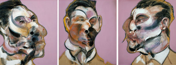
Three Studies of George Dyer, by Francis Bacon, 1967
In Francis Bacon’s paintings, note how often viewers comment on the artwork’s beauty, even when Bacon represents tortured and deformed faces.
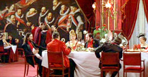
Dining scene from The Cook, the Thief, His Wife & Her Lover, 1989
Consider Peter Greenaway’s 1989 The Cook, the Thief, His Wife & Her Lover. The vivid and lush interiors with the decadent and abundant dishes of food open the film beautifully and hypnotically. Eventually the interiors and food transform into something else.
Towards the end of the movie, the excesses of the cinematic beauty become repulsive. It is not simply that beauty is overtaken by the perverse, but all the same properties that made the films’ beauty actually beautiful, reaches the limit to represent the expected qualities of beauty. The overwhelming proportion of beauty becomes horrific but still attractive: the Grotesque.
Whether with Monk, Bacon or Greenaway, the evolution from beauty to something undesirable to something pleasurable, supports Immanuel Kant’s belief that beauty is restful and that the sublime is movement. Kant argues that, “this movement may be compared to a vibration, i.e. to a quickly alternating attraction toward, and repulsion from, the same object.”
And so it is with the Petersen Automotive Museum, recently opened to the public in Los Angeles. Previously, I critiqued the Broad vs. the Petersen, two local museums under construction at that time. As I started to write an article about the now complete museums, I chose to not compare and contrast. Instead, I sought an academic framework to discuss the Petersen.
I have no idea if the architects of the Petersen, KPF from New York, were testing the philosophy of the Grotesque. Somehow, I doubt it. But I think contemplating the enormous racing red and chrome building in an intellectual context gives the design prowess and gravitas. If not for such an academic narrative, then all I can hear from every passerby is, “This Petersen is ugly.”
Upon arriving at the museum, do not avert your gaze. Do not simply call it unattractive. Perhaps you will be taken by Kant’s movement, where this new sculptural building will repulse you and eventually attract you. Hopefully.
Facade detail, Petersen Automotive Museum, Los Angeles, California (photo by Denys Nevozhai on Unsplash)
#10: MUSEUM VS. MUSEUM
June 5, 2015
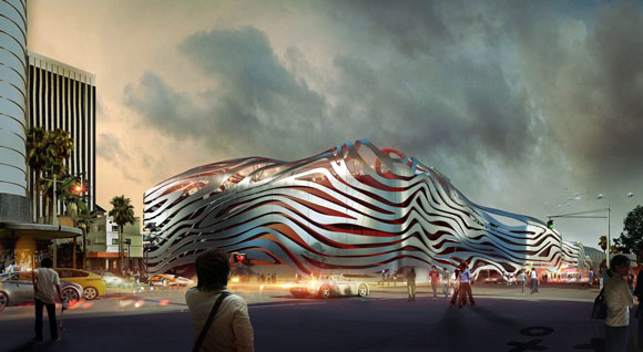
The Petersen Automotive Museum (rendering by KPF)
Late 2015, Los Angeles will welcome two new museums: the Petersen Automotive Museum and the art museum simply called, The Broad. Before discussing these civic structures, let’s step back to the architecture of museums in general.
Traditionally, museums are empty vessels that come to life when artwork is inserted. This museum architecture is a neutral backdrop.
In opposition to this premise, architect Frank Gehry’s 1997 Guggenheim Museum is a work of art itself, and symbiotically co-exists with the art and sculptural installations. Considered one of the most influential living architects, Gehry created for Bilbao in Spain a design that counters the classical muted environment for art. By doing so, this museum has been hailed as one of the greatest buildings in current history.
top: Guggenheim, Bilbao, Spain, by Frank Gehry (photo by David Vives from Pexelsl); Guggenheim, New York, New York, by Frank Lloyd Wright (photo by David Vives from Pexels)
In yet another approach, when Frank Lloyd Wright completed his Guggenheim Museum in New York City in 1959, visitors were stunned. No defined galleries existed, but rather, a continuous sloping floor of exhibits spiraled up six stories.
Complaints from curators were immediate. If they were to hang art parallel to the ground as one typically does, then it would be crooked to the sloping floor of the museum. But if the curators were to hang art parallel to the sloping floor, then the art would be at an angle—a warped viewing for visitors.
When Wright was questioned, he responded with indifference: the curators’ concerns were insignificant. The architect proclaimed that visitors have come to see art. And here, the art is his architecture, the building itself. Not the negligible objects within.
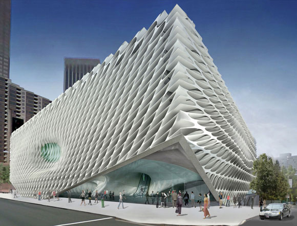
The Broad (rendering by DS+R)
Back to the present. The soon-to-arrive Petersen museum, at a price tag of $125 million for 300,000 square feet, is designed by New York-based, corporate giant Kohn Pedersen Fox Associates. The new Broad museum, $140 million for 120,000 square feet, is designed by New York-based creative studio Diller Scofidio + Renfro.
(I will not deliberate on the obvious question and necessary outcry: why are these two Los Angeles museums created by New York architects?)
For both the Petersen and the Broad, the large buildings present an aggressive exterior. Both facades are radical and alluring.
The Broad exterior detail (photo by Christian Acosta on Unsplash)
With a muscular honeycomb skin of precast concrete, the Broad is an enigmatic and commanding building. Called the “veil” by the architects, this elusive skin looks to the future, with an unintentional throwback to the 60’s office buildings that also employed modular concrete exteriors.
At the Petersen, a bizarre facade of seductive stainless steel ribbons wraps a bright red building. According to the architects, this design “evokes the imagery of speed and the organic curves of a coach-built automobile.” Though appropriate as a design theme for a museum of cars, I frankly don’t see it. It appears to be like an uncomfortable extra-terrestrial armor, instead of the sophisticated lines of a Citroen or Alfa Romeo.
Here’s one big thing that separates the two exteriors. The sculptural outside of the Broad is a beautifully patterned concrete fabric that is integral to the structure of the building. Also, this “veil” cleverly diffuses sunlight into the museum, providing bright and stimulating gathering spaces.
The endless ribbons of the Petersen are merely tacked on, superficially applied like mascara. Not even a part of the building’s structure, the zippy ribbons have no impact on the actual journey through the museum, other than the initial impact of a billboard that you see, read, and pass by.
The Petersen exterior detail (photo by Nikhil Mistry on Unsplash)
When the two museums are unveiled to the public, the quality of the interiors, the scale and character of the galleries, and the voyage from one exhibit to the next will all be judged.
Today’s vote of confidence is for The Broad. I see the pioneering vision that architects DS+R have created in their other outstanding works of civic architecture, such as the impressive High Line, a one-and-a-half-mile long, outdoor recreational space and social connector, hovering over the streets of Manhattan.
KPF’s Petersen museum tries hard with their automobile metaphor, and perhaps too hard. This design is a dangerous one-move dance number. At first glance, I am impressed with the self-assurance of form and color. Later, I am already fatigued by the architecture’s brashness, wishing there was some subtlety and depth.
For both projects, I enjoy the qualities of strength. Both architecture companies possess courage. Though some critics are tired of “statement” architecture—the headline grabbing designs—a museum needs to be exactly this. Museums are one of those rare city structures that speaks to the broadest community. Standing for generations, these buildings house the great minds of our artistic present and past.