#217: TRIBUTE | FRANK GEHRY (1929-2025) AND A VISIT TO BILBAO
December 16, 2025
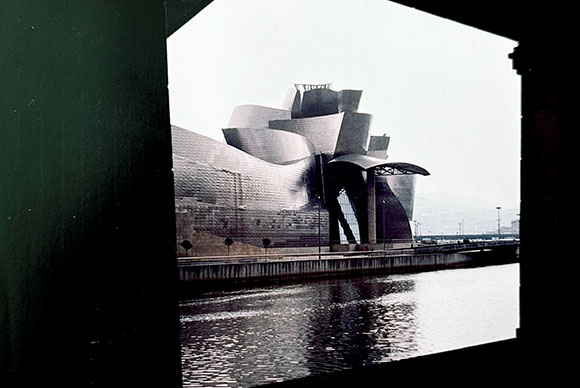
From across the river passing under a bridge (photo by Anthony Poon)
In 1998, I was traveling through Spain, and this new building just opened: the Guggenheim Museum. In the obscure industrial port city of Bilbao, the Basque Country of northern Spain, this museum was the talk of the industry. So I wrapped up my tour of Barcelona, then hopped on a short flight to check out the buzzy Guggenheim structure. No doubt, it was a work of genius.
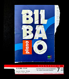
Program booklet and visitor wristband
My travel partner asked, “Why do we need go out of our way to some unknown town just to see a single building.”
I responded, “Well, based on all the press, reviews, rumors, etc., missing this opportunity would be like being in Egypt and not seeing the pyramids.”
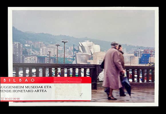
As seen from the bus soon to arrive at the museum (photo by Anthony Poon)
There is little I can add in this tribute to Frank Gehry (1929-2025) that hasn’t already been said in thousands of articles from the past weeks. After all, he is the most celebrated and visionary architect of our generation.
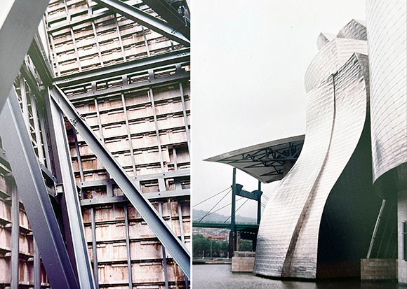
A pairing of glass and metal panels (photo by Anthony Poon)left : the structure behind the exterior titanium skin; right: the museum meeting its river setting (photos by Anthony Poon)
Instead, I will simply share images from that random rainy visit in the 90s to Bilbao. The iPhone was certainly not yet invented. My following grainy photos are shot on a Nikon FE2 on ISO 200 film. Despite the greyness of that day, the importance of this single work of architecture was as illuminating as a bright afternoon.
Plane ticket, Barcelona to BilbaoFish scale-like titanium panels (photo by Anthony Poon)
#141: SEATTLE HEROES AND ICONS
September 24, 2021
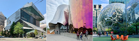
left to right: Seattle Century Library; Museum of Pop Culture; The Spheres, Amazon (photos by Anthony Poon)
Upon a visit to Seattle, I confronted three different buildings—all leaving a seductive imprint on the city and my memory.
– Seattle Central Library by Pritzker-laureate Rem Koolhaas,
– Musuem of Pop Culture by Pritzker-laureate Frank Gehry, and
– The Spheres at Amazon by corporate NBBJ.
The first two projects are by two of the most famous living architects on the planet. The third is by an anonymous company, one without the trappings of a sole Wright-ian genius which gives way to collaboration instead—for better or worse.
(Three disclaimers: Rem Koolhaas was my professor in grad school; I was employed by NBBJ in the 90s; and I did not have an opportunity to visit the interiors of The Spheres.)
THE SEATTLE CENTRAL LIBRARY
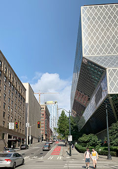
Seattle Central Library (photo by Anthony Poon)Library and its neighbor (photo by Anthony Poon)
The Seattle Central Library, designed by the Rem Koolhaas and shepherded by local Architect-of-Record, LMN, opened to the public in 2004—the winner of a lengthy design competition. The reviews of this 11-level, 363,000-square-foot building varied.
The international architectural scene claimed the design a heroic success. Others saw a design with a target on its back—and its front too. The Seattle Post-Intelligencer spewed adjectives: “decidedly unpleasant,” “relentlessly monotonous,” and “profoundly dreary.”
I side with the glorious praise hailed from the enlightened world. The library design comprises community spaces that engage the public on many levels, (literally) as well as a civic icon unlike anything seen before.
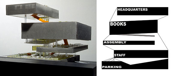
Conceptual model and section diagram (from archdaily.com)
As Professor Koolhaas taught us in school: Do not design simply in floor plan, meaning, not just one-dimensionally laying out an auditorium next to offices next to restrooms. Instead, design in section, meaning, three dimensionally as one places a library over a five-story high living room, then tucking parking under the auditorium.
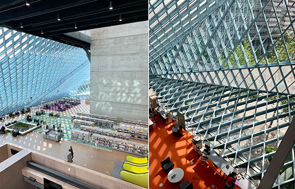
Library interiors (photos by Anthony Poon)
The library’s innovative and challenging (yes!) urban form, the diamond-patterned skin of glass and steel, a four-level spiral of books, a complex layering of space and experience, and so on—all this together convinces me that I have walked into one of the most exciting works of contemporary architecture.
THE MUSEUM OF POP CULTURE
Musuem of Pop Culture and the Seattle Center Monorail (photo by Hester Qiang on Unsplash)
The Museum of Pop Culture, coined “MoPOP,” opened in 2000 under the former name, the Experience Music Project—coincidentally also included the participation of the same Architect-of-Record, LMN. Frank Gehry’s design, though predictable and yet another variation-on-a-theme (nearly a career-long theme) offers passerby’s a composition of great risk and resulting beauty.
Museum of Pop Culture, various metal exterior skins (photo by Lucas Myers on Unsplash)
According to the client, “When Frank O. Gehry began designing the museum, he was inspired to create a structure that evoked the rock ‘n’ roll experience. He purchased several electric guitars, sliced them into pieces, and used them as building blocks for an early model design.”
Such tales subscribe to the mad artist genius syndrome. True or not, it makes Gehry sound like less of a thoughtful architect creating wonderful spaces for the public, and more like an awkward child who believes that the broken pieces of a guitar can represent a work of architecture.
Museum of Pop Culture, exterior stainless steel shingles (photo by Leif Christoph Gottwald on Unsplash)
Five giant building masses sit at the base of the Space Needle, each mass clad in enigmatic surfaces, like fire-engine-red stainless steel or fuchsia-fluorocarbon-coated aluminum—comprising a total of 21,000 individually cut metal shingles. As an object, as architectural sculpture, the composition is stunning. Does not disappoint. Having the monorail pass through the building is yet another daring move that delivers a thrilling creation.
But the 140,000 square feet of interior space underwhelms, fails to translate the exterior exhilaration to the indoors. Whereas the Seattle Central library sings with its visionary interior design, MoPOP falls out of tune. Aside from a few flourishes, like a dynamic staircase or a contorted lobby space, most of the museum’s inside is not much more than generic exhibit space. One might argue that a museum’s interiors should be flexible and so inherently boring, but I would then direct your attention to the Guggenheim Museum in Bilbao, also by Gehry.
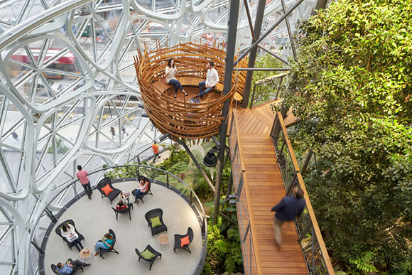
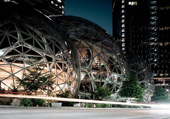
THE SPHERES, AMAZON
The Spheres, Amazon (photo by Alexandra Tran on Unsplash)
You don’t need the singular vision of great artistic minds like Koolhaas and Gehry to deliver good architecture. Unlike the first two projects, NBBJ played the role of Design Architect and local Architect-of-Record, meaning both the creative lead as well as the development and production team.
Aptly named The Spheres, Amazon’s new workplace and quasi-visitor center is made of three giant glass and steel spheres, colliding like a kid’s exhaled soapy water bubbles. Recently completed in 2018, Amazon claims, “The Spheres are a place where employees can think and work differently surrounded by plants.”
Interiors (photo by Fran on Unsplash)
Is it just another glamorized office? Just more “creative office space” glorified by real estate agents? But the phrase “surrounded by plants” fascinates me.
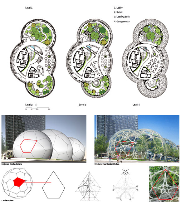
The spherical structures, conservatories actually, house 40,000 plants from over 30 countries. Within a meticulously engineered structure of 2,600 pentagonal hexecontahedron panes of glass alongside 620 tons of steel, I see one of the finest examples of biophilia. For reference, a past article, “Biophilic Design refers to our instinctive association to nature and the resulting architecture that enhances our well-being.”
Floor plans and diagrams (from archdaily.com)
Aside from the obvious design reference to Buckminster Fuller’s utopian geodesic domes of the 60s, the Amazon Spheres offer a new narrative for office space, retail, café, and meeting places. NBBJ has shed the dogmatic aim of developers to maximize floor area. Similar to Koolhaas, NBBJ celebrates the magnificence of volume, as in cubic footage (or in this case, spherical footage) and the capture of air, light, and a more productive work culture.
Exterior at night (photo by Patrick Schneider on Unsplash)
The total result is impressive, likely to be a local fan favorite and on every city tour guide. The design is good, even great, but is it inspired? Will it change the world? Probably not.
But the Seattle Central Library has already influenced the way architecture students think, the way teachers teach, the way professional architects design. Most of Rem Koolhaas’ projects deliver new ideas beyond form-making, embracing social engagement and re-inventing the meaning of living, shopping, or learning.
Frank Gehry, on the other hand, seems to be playing the same note over and over again. But is that wrong, especially if this one note is sheer genius played with virtuosity?
#128: BLURRING THE BOUNDARY BETWEEN ART, SCULPTURE, AND ARCHITECTURE
December 25, 2020
(photo by Hunter Kerhart)
Architecture can—and most definitely should—be artistic. Masterpieces such as both Guggenheim museums, in New York City and Bilbao, Spain, are called “works of art” by pretty much everyone. Interesting that a legendary work of art such as the Monet’s Water Lilies would never be referred to as an exquisite “work of architecture.” Some sculptures on the other hand, such as those by Richard Serra, are indeed called architectural.
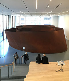
Sequence, by Richard Serra, 2006, SFMOMA, San Francisco, California (photo by Anthony Poon)
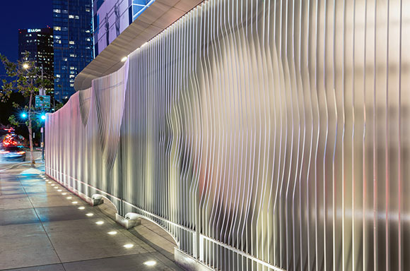
Poon Design was honored to be commissioned by two global hospitality brands, the Ritz-Carlton and JW Marriott at the 27-acre L.A. Live in downtown Los Angeles. The Ritz stands proud as one of the highest standards of quality, earning the colloquial adjective that defines sophistication and elegance, “Ritzy.”
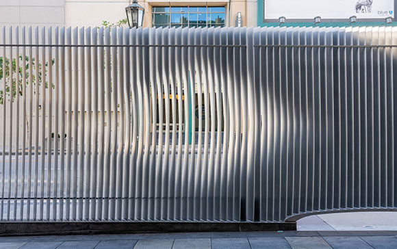
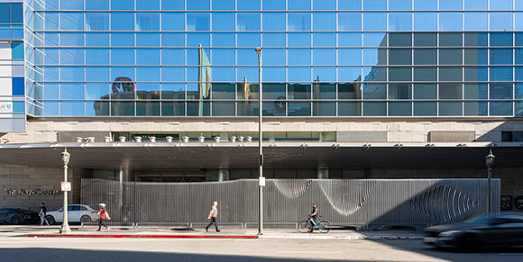
At the existing porte cochere and main entrance to the 54-level luxury hotel and residential high-rise, our client challenged us to replace the hundred foot long fence with something innovative. Not only was the existing fence not at all Ritzy, it was more akin to a low end motel—the fence barely better than a commercial chain link screen. Failing dramatically, the 9-foot tall fence was supposed to accomplished several things, most importantly: provide security and privacy to the residents and visitors who comprise high net worth individuals, Hollywood stars, celebrated athletes, and the like.
(photo by Hunter Kerhart)
Alongside creating a unique privacy scrim, the Ritz-Carlton gave Poon Design additional design objectives:
– Present a notable front door for a world-renowned brand,
– Provide security to the residents and their luxury cars arriving at the porte cochere,
– While providing privacy, allow natural light to enter the porte cochere, meaning, not a solid fortress-like wall,
– Screen out the movie complex across the street which brought glaring lights, noisy customers, and trash, and finally,
– Establish a friendly face, but one that can protect the hotel from bystanders, loiterers, and paparazzi—again, but not a fortress-like wall.
(photo by Hunter Kerhart)
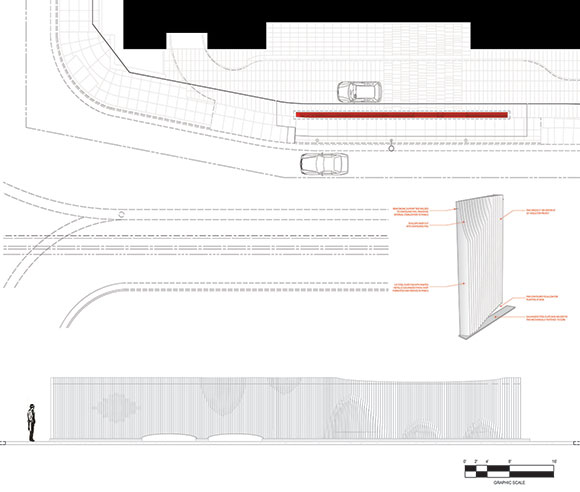
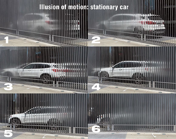
The assignment was a triple-threat challenge of architecture, sculpture, and art. In response, we designed an 87-foot-long statement of contour and texture. Our 260 shaped steel fins at 10’-6” tall guard the Ritz-Carlton, while projecting a distinguished curbside appeal and allowing in dappled sunlight.
Plan, elevation, and detail
As a visitor moves alongside this wall of ever-changing angled slats, her views, perception and exposure to light constantly and mysteriously change. Even a stationary car on the other side of our wall appears to be in motion.
(photos by Poon Design)
In addition to the uplights in the ground, the steel’s powder-coated silver surface captures the constantly changing colors of the theater’s flashing signs and lights from across the street, and reflects it back as an everchanging light show.
Is it architecture because it is a mere freestanding wall—an element of a building? Is it sculpture that happens to serve many programmatic functions from security to trade dress? Or is it art because it’s sublime presence surpasses the base purpose of being just a piece of architecture?
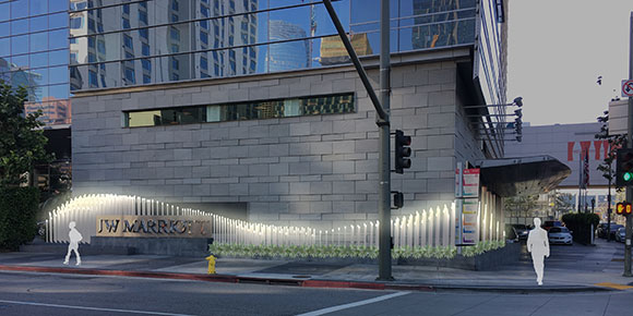
A future design to come to enhance the streetscape at the Ritz-Carlton, by Poon Design
#21: THE ROAD TO FRANK GEHRY: WHAT HAPPENED AT LACMA?
November 5, 2015
Gehry’s vulcanized fiber wall, LACMA, Los Angeles, California (photo by Lily Poon)
When The Simpsons make fun of your work, you have arrived, right?
Many think of architecture as a final product, such as a building, a park or a piece of furniture. Many forget about the creative journey that arrives at the final product.
Process and product—in life as in design, getting there is as gratifying as being there.
I ask this of the Los Angeles County Museum of Art: why is the process that architect Frank Gehry is famously known for absent from your current exhibit?
left: Model of Gehry’s design for the Louis Vuitton Foundation, LACMA, Los Angeles, California (photo by Olive Poon); right: Louis Vuitton Foundation by Gehry, Paris, France (photo by Jo Kassis from Pexels)
Simply entitled “Frank Gehry,” LACMA delivers their latest blockbuster show. Now in his late 80’s, Gehry’s career has been showered with every accolade, i.e. AIA Gold Medal, Pritzker Prize, and the National Medal of Arts awarded by the U.S. President. So why did the museum capture five decades of Gehry’s work by displaying only two aspects: early sketches (the beginning) followed by a large physical model (the conclusion)?
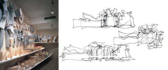
Sure, there are other aspects in the show, like photographs and video clips. But where is the most fascinating aspect, Gehry’s artistic explorations? Well known for his ingenious studies—the process of drawing and drawing, building models of all sizes, variations and permutations, material and construction research, and innovative technological applications—these (samples below) are missing at LACMA.
left: Study models for the Guggenheim Museum, Bilbao, Spain (photo by Hisao Suzuki); right: Sketches by Gehry for the Guggenheim Museum
Here’s what I think. Over the years, Gehry’s imaginative process has been unfortunately labeled by the mainstream as “crumpled paper.” When this architect designs, his studies do look like crumpled pieces of paper. Dozens of them. Hundreds of them.
Doomed, Gehry’s thoughtful research has been labeled not just formulaic, but cliché. Even my 10-year old daughter’s class studied his work, calling it crumpled wads of paper. As such, all the children giggle.
Clip from The Simpsons 2005 episode “The Seven-Beer Snitch”
To reach the height of pop-culture zeitgeist, for better or for worse, a 2012 episode of The Simpsons parodied Gehry’s designs. Fictionally, Marge’s crumpled letters inspired one of Gehry’s most prominent buildings, the Walt Disney Concert Hall.
Though Gehry cooperated with the TV show, he later stated how he is “haunted” by the Simpsons’ gag. Disappointed, Gehry confesses, “Clients come to me and say, crumple a piece of paper. We’ll give you $100, and then we’ll build it.”
I believe LACMA, or even Gehry himself, chose to counter the ill-fated wrinkled paper theme. But by doing so, perhaps too much has been edited out. The previous exhibit at Bergamot Station in Santa Monica curated a much more revealing and exciting show, presenting Gehry’s inner workings and the in-betweens.
Walt Disney Concert Hall by Gehry, Los Angeles, California (photo by Falkenpost from Pixabay)
Years back in Maui, I drove the legendary “Road to Hana.” When I arrived in Hana, I was dissatisfied by this small nondescript community. I then realized the point was not Hana itself, but rather, the road to Hana. I looked back at my delightful day—at how the 65-mile drive toured me through rain forests, waterfalls, beaches, bridges and the sunset.
In architecture and in life: think process and product. Enjoy the trek and smell the roses.
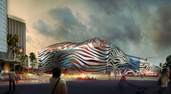
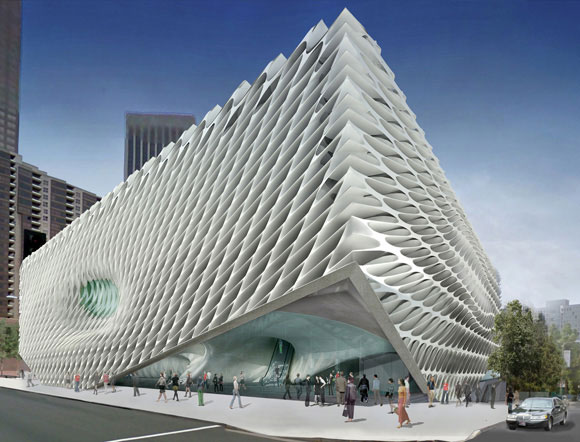
Late 2015, Los Angeles will welcome two new museums: the Petersen Automotive Museum and the art museum simply called, The Broad. Before discussing these civic structures, let’s step back to the architecture of museums in general.
Traditionally, museums are empty vessels that come to life when artwork is inserted. This museum architecture is a neutral backdrop.
In opposition to this premise, architect Frank Gehry’s 1997 Guggenheim Museum is a work of art itself, and symbiotically co-exists with the art and sculptural installations. Considered one of the most influential living architects, Gehry created for Bilbao in Spain a design that counters the classical muted environment for art. By doing so, this museum has been hailed as one of the greatest buildings in current history.
top: Guggenheim, Bilbao, Spain, by Frank Gehry (photo by David Vives from Pexelsl); Guggenheim, New York, New York, by Frank Lloyd Wright (photo by David Vives from Pexels)
In yet another approach, when Frank Lloyd Wright completed his Guggenheim Museum in New York City in 1959, visitors were stunned. No defined galleries existed, but rather, a continuous sloping floor of exhibits spiraled up six stories.
Complaints from curators were immediate. If they were to hang art parallel to the ground as one typically does, then it would be crooked to the sloping floor of the museum. But if the curators were to hang art parallel to the sloping floor, then the art would be at an angle—a warped viewing for visitors.
When Wright was questioned, he responded with indifference: the curators’ concerns were insignificant. The architect proclaimed that visitors have come to see art. And here, the art is his architecture, the building itself. Not the negligible objects within.
The Broad (rendering by DS+R)
Back to the present. The soon-to-arrive Petersen museum, at a price tag of $125 million for 300,000 square feet, is designed by New York-based, corporate giant Kohn Pedersen Fox Associates. The new Broad museum, $140 million for 120,000 square feet, is designed by New York-based creative studio Diller Scofidio + Renfro.
(I will not deliberate on the obvious question and necessary outcry: why are these two Los Angeles museums created by New York architects?)
For both the Petersen and the Broad, the large buildings present an aggressive exterior. Both facades are radical and alluring.
The Broad exterior detail (photo by Christian Acosta on Unsplash)
With a muscular honeycomb skin of precast concrete, the Broad is an enigmatic and commanding building. Called the “veil” by the architects, this elusive skin looks to the future, with an unintentional throwback to the 60’s office buildings that also employed modular concrete exteriors.
At the Petersen, a bizarre facade of seductive stainless steel ribbons wraps a bright red building. According to the architects, this design “evokes the imagery of speed and the organic curves of a coach-built automobile.” Though appropriate as a design theme for a museum of cars, I frankly don’t see it. It appears to be like an uncomfortable extra-terrestrial armor, instead of the sophisticated lines of a Citroen or Alfa Romeo.
Here’s one big thing that separates the two exteriors. The sculptural outside of the Broad is a beautifully patterned concrete fabric that is integral to the structure of the building. Also, this “veil” cleverly diffuses sunlight into the museum, providing bright and stimulating gathering spaces.
The endless ribbons of the Petersen are merely tacked on, superficially applied like mascara. Not even a part of the building’s structure, the zippy ribbons have no impact on the actual journey through the museum, other than the initial impact of a billboard that you see, read, and pass by.
The Petersen exterior detail (photo by Nikhil Mistry on Unsplash)
When the two museums are unveiled to the public, the quality of the interiors, the scale and character of the galleries, and the voyage from one exhibit to the next will all be judged.
Today’s vote of confidence is for The Broad. I see the pioneering vision that architects DS+R have created in their other outstanding works of civic architecture, such as the impressive High Line, a one-and-a-half-mile long, outdoor recreational space and social connector, hovering over the streets of Manhattan.
KPF’s Petersen museum tries hard with their automobile metaphor, and perhaps too hard. This design is a dangerous one-move dance number. At first glance, I am impressed with the self-assurance of form and color. Later, I am already fatigued by the architecture’s brashness, wishing there was some subtlety and depth.
For both projects, I enjoy the qualities of strength. Both architecture companies possess courage. Though some critics are tired of “statement” architecture—the headline grabbing designs—a museum needs to be exactly this. Museums are one of those rare city structures that speaks to the broadest community. Standing for generations, these buildings house the great minds of our artistic present and past.