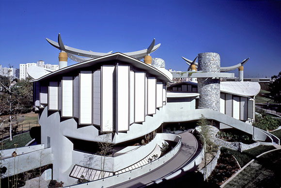
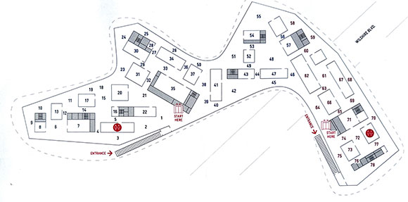
#224: LOVE HIM, HATE HIM, BUT DON’T IGNORE ZUMTHOR
(photo by Anthony Poon)
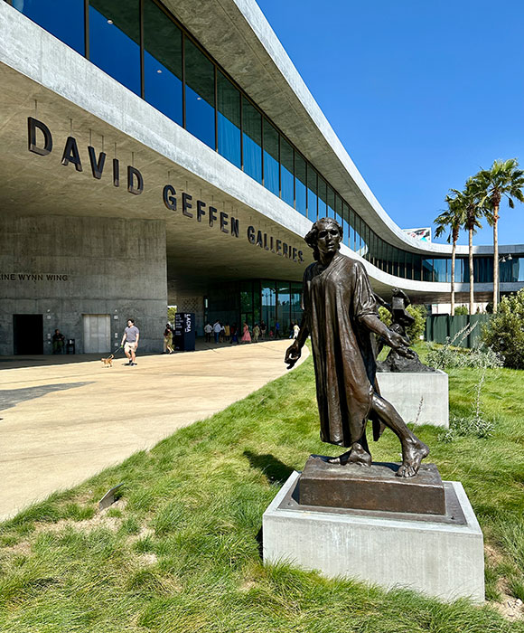
25 years in the making, the new Los Angeles County Museum of Art (“LACMA”) recently opened to the public. The adjectives are in: ravishing, dismal, lyrical, divisive, pugnacious, palpable, disorienting, iconic, polarizing, dazzling, inelegant, revolutionary, one-liner, monotonous, and so on. The range of commentary is vast, being that much of criticism is subjective.

Then there are the facts:
– $724 million construction cost: $74 million over budget.
– 110,000 square feet of new gallery space: 10,000 square feet less than the museum it replaces.
– Anticipated April 2026 completion: Several years behind schedule.
– Two million cubic feet of concrete used: Staggering carbon emissions.
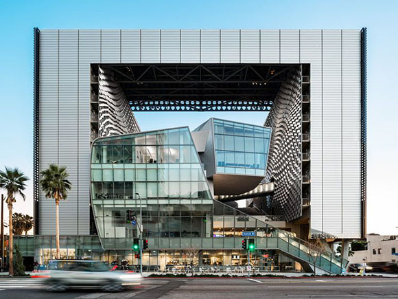
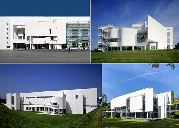
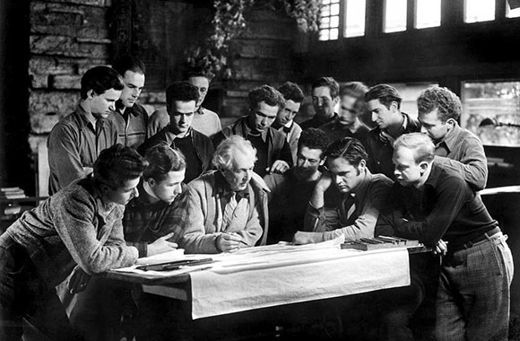
All this said, I continue my review which began at a 2017 lecture where the selected Swiss architect, Peter Zumthor, presented his preliminary concepts. I followed up with a 2025 review of the project under construction. Today, I make the claim that the new LACMA, known as the David Geffen Galleries—despite controversies and shortcomings—is a masterwork, nothing short of the expected creative prowess from this Pritzker-prized architect.
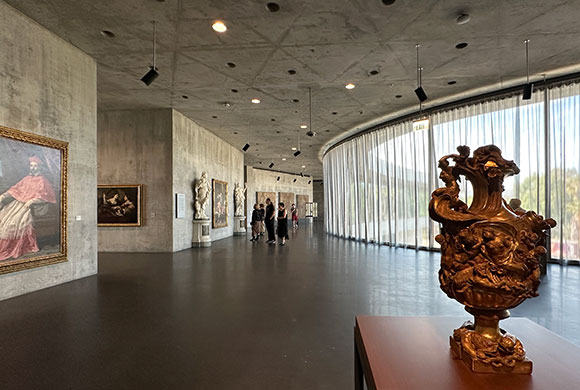
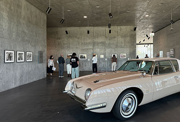
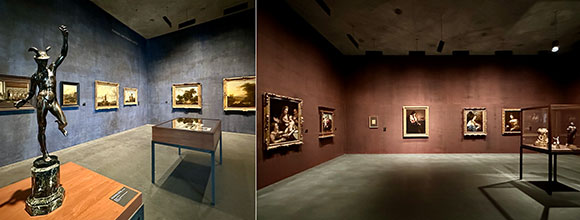
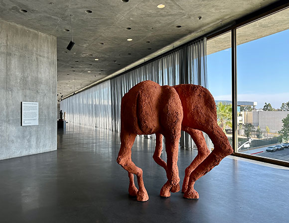
Much has already been written about museum director Michael Govan’s meandering curation: a non-traditional, non-linear, mostly formless arrangement of 2,000 works of art currently on exhibit (organized by oceans?). It’s a free fall of chronology, historical themes, and art viewing. Consider a Greek sculpture from antiquity confronting a Francis Bacon triptych. Or 18th-century Mexican pottery coupling with 2026 food photography by Brooklyn-based Stephanie Shih. Or 14th-century Spanish-colonial paintings bonding with a 1963 Studebaker Avanti car.
(This is not so dissimilar to Philadelphia Museum of Art currently relocating the bronze statue of Rocky Balboa from the exterior steps into the museum next to Haring, Basquiat, and Warhol. Pop movie culture meets high art.)
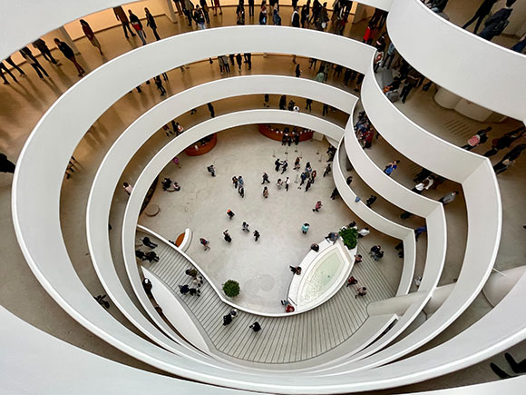
Radical gallery layout aside, the existential question remains, as I have wondered in past discussions of museum designs: Should a museum be a silent vessel to present art or an apparent work of art in and of itself? A past anecdote of Frank Lloyd Wright reveals ironies around his famed Guggenheim Museum. When Wright was asked how art was supposed to be viewed within this peculiar ramping spiral of galleries, he proclaimed that his building was the work of art and takes precedence over the art within.
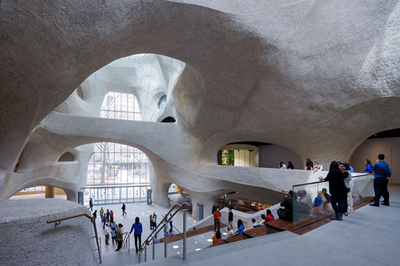
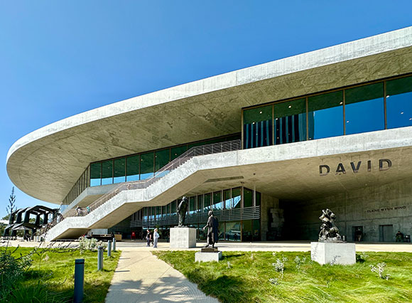
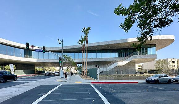
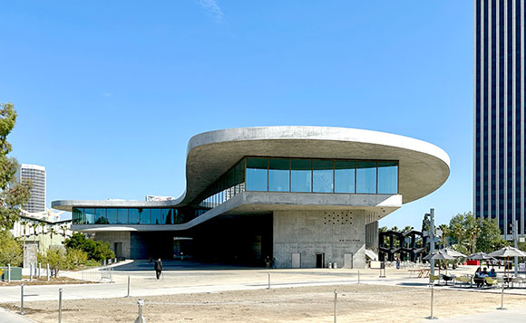
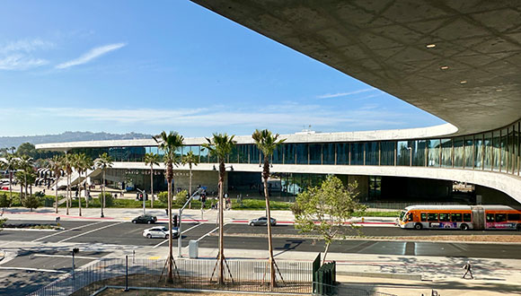
Developed with SOM as collaborating architect/engineer, LACMA is certainly no mute actor, akin to Wright’s sentiment. The museum is a bold, visceral, visionary statement, sometimes in union with the art, sometimes in dispute.
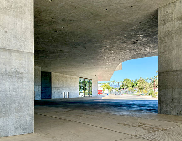
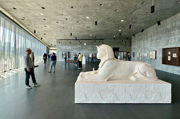
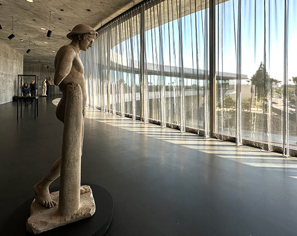
With the spaces defined singularly by concrete—all walls, floors, and ceilings—the rawness can be a wonderful contrasting backdrop to the elegance of much of the historical works, for example, teapots and tapestries. But when the Brutalist nature overwhelms, as in the interior galleries, the art is subsumed by primitiveness, not unlike art in a warehouse.
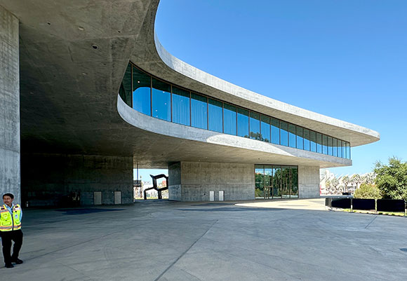
The exterior continuous glass walls, 28-foot-tall wrapping a building the size of three football fields, deliver the horizontal raking light that Zumthor sought for presenting sculpture, while also offering views to the museum’s diverse context: Mid-Wilshire, La Brea Tar Pits, Hollywood Hills, and surrounding neighborhoods. But when this Los Angeles sun creates glare, especially on the glass-enclosed works, visitors place their faces close upon the art hoping to find a functional viewing angle. The metallic perimeter curtains by Japanese textile designer, Reiko Sudo, protect light-sensitive artwork, a significant concern of curators, and do soften the sun but often not enough for digesting the art.
So yes, Zumthor’s design does conflict in some areas, but I favor this tension, this vibration between what is traditionally expected from the pearl-clutching art crowd and the evolving future of art consumption. Progress is built upon new ideas, challenges to the norm, even constructed upon outrage.
Despite Zumthor’s explicit frustrations with working in the US and the compromises from the original concept—such as the black concrete, continuous fluidity of the exterior, articulated roof, typical Zumthor details—the museum is a success. I favor the Wrightian approach that such a building should not be a voiceless container for art. Architects are indeed artists, and architecture is indeed art. And we should celebrate LACMA for showing how potent this understanding can be.
Think of the city of Los Angeles, or any city for that matter, as an urban-scale canvas. Every building placed on this backdrop—every home and skyscraper, park and freeway, mall and museum—is like an artist’s dab of paint on canvas. Such a canvas is neither blank nor neutral as each city brings its history, topography, natural features, climates and micro-climates. Upon our canvas, Peter Zumthor has served us a declaration. Some will hate it, but I suspect most will love it, especially in the long run. And no one can ignore it.