Tag Archives: LUDWIG MIES VAN DER ROHE

#188: THE IMPERFECT FARNSWORTH HOUSE

June 7, 2024

Sitting lightly on the earth. (photo by Anthony Poon)

Considered one of the most iconic houses of Modernism, a masterpiece of the International Style, the Farnsworth House is near perfect. And the imperfections make it more thought-provoking. Finished in 1951, the design from Ludwig Mies van der Rohe has been revered for all its ambition: minimalism and glass walls, connection to nature, groundbreaking engineering, painstaking attention to detail and craft, and of course, “less is more.”

Thousands of books, articles, and university classes have studied this 1,500-square-foot, one-bedroom, weekend retreat. As a freshman at UC Berkeley, my very first assignment was to study this house, then design a hypothetical guest house in the style of. Four decades later, my study continues here.

Entry sequence to the front door. (photo by Anthony Poon)

Client: Dr. Edith Farnsworth (1903-1977)—graduate of literature and zoology, fluent in English, French, German, and Italian, and a concert violinist—attended nearby Northwestern University, only one of four women in her class at medical school. Afterwards, Farnsworth became a successful and wealthy Chicago physician, seeking an architect of greatness for her weekend cottage.

Entry porch: View shows the house sitting above the land on steel posts. (photo by Anthony Poon)

Budget: Back in the 50s, the average construction cost of a home was merely $5,000.00. Though Farnsworth allowed Mies an outrageous budget of $40,000.00, the house costed $74,000.00! Why and how? Many factors contributed to a cost 15 times the average: perfectionist details, costly steel structure (compared to conventional wood framing), expansive glass panels, Roman Travertine, remote location, and so on—not to mention the architect’s requirement for Primavera wood for the cabinetry. At the time, this Central American species was the most expensive wood in the world.

Lawsuit: No surprise. Farnsworth sued Mies for going over budget and malpractice. In turn, Mies sued Farnsworth for unpaid invoices. In the end of a bitter public battle, Mies sort of won and was paid, not a victory worth celebrating.

“Less is more” with structural symmetry. (photo by Anthony Poon)

Flooding: The region is notorious for flooding with water levels reaching over 10 feet. Famous for sitting lightly on the earth, the house floats on its signature steel posts. Raising the structure is a smart countermeasure, but why only 5’-3”—clearly a dimension that is useless during a big flood? Not long ago, catastrophic waters filled up the house like a literal aquarium. The water’s weight and pressure shattered out one of the large panes of glass.

Living room: No, the left side are not cabinets. The house has barely any storage space. (photo by Anthony Poon)

Lighting: I wonder if less is truly more. Within the living areas, there is only one light fixture in the house: the undercabinet strip light over the kitchen counter. Mies designed this first-of-its-kind fixture, now a standard in nearly all kitchens. But the living room has no recessed ceiling lights, dining room has no chandelier, bedroom has no wall sconces, no cove lighting, no floor uplights, no nothing. The architect’s solution to the homeowner: Purchase a floor lamp, and carry that around from room to room, plugging and unplugging into the few floor outlets.

Dining room with its blurred line between the interiors and exteriors. (photo by Anthony Poon)

Heat: Though one might think a glass house would not fare well in a cold climate, Mies created an innovative system. Rather than standard floor registers, the ceiling has a barely visible, continuous slot near the top of the glass walls. Running the interior perimeter of the entire house, warm air washes down the windows, countering any outside cold transfer.

A linear kitchen with the longest stainless steel counter ever made and the rare Primavera wood cabinets. (photo by Anthony Poon)

Counter: Impressively, Mies designed the longest stainless steel counter at the time. At 17 feet in length, the counter isn’t just a single continuous span; it has a built-in backsplash and integral sink, and has been customized for the cooktop.

left: Master bathroom with no storage: The left side contains no cabinets, just two slab of stone.; right: Guest bathroom: Behind the secret door in the shower sits all the guts of the house. (photos by Anthony Poon)

Storage: Again, is less more? Is less storage actually better? Though designed as a weekend retreat, the lack of storage could be challenging, even for a patron client of Minimalism. Take the master bathroom for example: no medicine cabinet and below the stone counter, no drawers or cabinets. Where does one put their toothpaste and extra toilet paper?

Infrastructure: Within this most elegant of interiors, where are all the guts of the building: roof drain, electrical panel, water heater, mechanical system, etc.? Within the guest bathroom, the back wall of the shower contains a secret door, and behind it sits the infrastructure. From there, pipes and conduits are gathered into a cylinder, called the “umbilical cord,” that punctures the floor in a single spot, then drops into the earth for connection to county-provided services

Entry minimalism within nature. (photo by Anthony Poon)

Setting: The residence once sat peacefully on 60 acres of lush green nature with a nearby picturesque river. The county made an unfortunate decision to transform a nearby side path into a major road that not only passes uncomfortably close to the house, but is elevated on a slope so that cars view intrusively down upon the structure. Due to this disastrous compromise to the once-idyllic environment, Farnsworth sold the house in 1971 to Lord Peter Palumbo, a British developer and collector of art and architecture.

Today: In 1996, the house opened to the public as a museum, included on the National Register of Historic Places in 2004, listed as a National Historic Landmark in 2006, and currently owned and operated by the National Trust for Historic Preservation. If ever in Chicago, drive to Plano (110 miles round trip) and visit an imperfect stroke of genius.

#55: MY FIFTEEN FAVE BUILDINGS

February 3, 2017

(photo by Will Truettner on Unsplash)

“Hey Anthony, what is your favorite building in the world?” I am often asked.

I might reply obnoxiously but with reason, “What is your favorite painting, favorite book or favorite ice cream?”

Just as there is no one favorite piece of music, there is no one favorite work of architecture. There are hundreds. But here I try. In this list of some of my favorites (in no particular order), I selected different building types and sizes—from a house to a parliament building, from a public plaza to a winery. I have also included a few of The Usual Suspects.

(photo from brownbook.tv)

1: Can a design be both exquisitely silent and majestically heroic? Such is Louis Kahn’s 1982 National Parliament House in Dhaka.

photo by Merna Rakha on Pexels)

2: In 1929, Mies van der Rohe contributed to the pioneering concept known as the Free Plan. Through a few carefully placed walls and columns, the Barcelona Pavilion gently and epically implies space and journey.

(photo from mimoa.eu)

3: Before Ricard Bofill became fascinated with Postmodernism, he delved deep into his mind for fantastical dreamscapes. This 1975 apartment building known as Walden 7, in Sant Just Desvern, Spain, demonstrates what it means to be imaginative.

(photo from arquiscopio.com)

4. Situated over a station rail yard, Pinon and Vilaplana created a public square, transforming a blank space into one of Barcelona’s most powerful works of urban sculpture and place making, the Plaza de los Paises Catalanes.

(photo by Andrea de Poda)

5: Even in 1670, there were revolutionaries within a revolution. Baroque architect Gian Lorenzo Bernini twisted the classical world of pure geometry, and designed a chapel in the shape of an ellipse. Upon arriving inside Sant’Andrea al Quirinale in Rome, you are confronted by a twisted perspective.

(photo by Marketing Groningen)

6: The 2001 Wall House in The Netherlands was constructed three decades after the completed design, and a year after the death of architect John Hejduk. He juxtaposed Corbusian ideas with Cubism and Surrealism, offering one of the most formidable visions of a home.

(photo from archdaily.com)

7: During the design process for Maison Bordeaux in France, the client had a car accident that left him wheelchair bound. OMA quickly changed the 1998 design, transmuting the home office into a room size elevator, open on all four sides—where the three-story shaft is his library, art collection and office supplies.

(photo from nest-hostles.com)

8: In 1999, Rafael Moneo made two massive structures into leaning ethereal cubes of otherworldliness. For Spain’s Kursaal Congress Centre and Auditorium, Moneo explored prismatic volumes, glowing translucency, and double walls of rippled glass.

(photo by Sander Lukers)

9: Some works, such as the Chapel Santa Maria degli Angeli, are pure poetry. Like the hand of God, architect Mario Botta placed this 1996 building gently in the Swiss mountains of Monte Tamaro.

(photo from azahner.com)

10. It is not only astounding that Herzog & de Meuron wrapped an entire museum with dimpled, perforated, aging copper panels in 2005, but that these architects were able to convince the city of San Francisco that such a curious design idea would be the perfect addition to the beloved Golden Gate Park.

(photo by Heike Georg from Pixabay)

11: There is no limit to the extraordinary creativity of Catalan architect, Antonio Gaudi. Alongside studying the engineering of this ambitious cathedral by building an upside catenary model of stings and chains, Gaudi combined the Grotesque, Gothic and Art Nouveau, amongst many other influences. Since the start of construction of the Sagrada Familia church in 1882, the unfinished project is still underway in Barcelona.

(photo by IlGiozzi)

12. Sometimes I think it is just fetishized retail design, but not at Rem Koolhaas’s 2001 Prada store in Manhattan. The street level floor wraps up then sweeps down to the lower level, bringing natural light to an otherwise dark space and creating the grand theater that is fashion.

(photo by Joao Morgado)

13: At the early age of 26, Alvaro Siza created one of the most graceful compositions. More than a mere restaurant in Portugal, the Boa Nova Tea House of 1963 sits elegantly in its setting, as instinctively as the surrounding rock outcroppings.

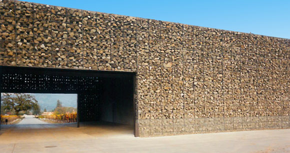
14: Dominus Winery, Yountville, Napa Valley, California (photo by Anthony Poon)14: Exploiting the elemental scenery in Napa Valley, California, Herzog & de Meuron formed the 1998 Dominus Winery with just some rocks placed in steel baskets. And that was the entire idea, the whole building.

(photo by Emmanuel Appiah on Unsplash)

15: Bernard Maybeck’s “temporary” monumental jewel of the 1915 World’s Fair still stands a century later, a romantic icon of San Francisco. With this Palace of Fine Arts, the “fictional ruin” expresses both an enduring melancholy of lost worlds and the ambition for new worlds to come.

© Poon Design Inc.