#179: MY TOP TEN FAVE ARCHITECTS
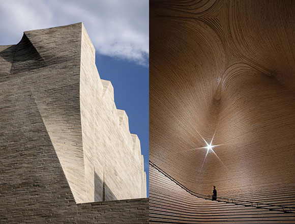
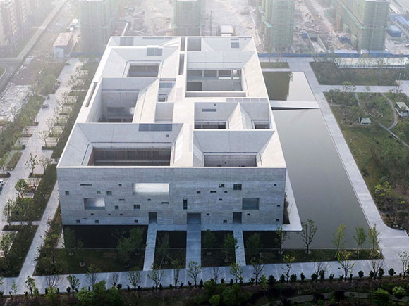
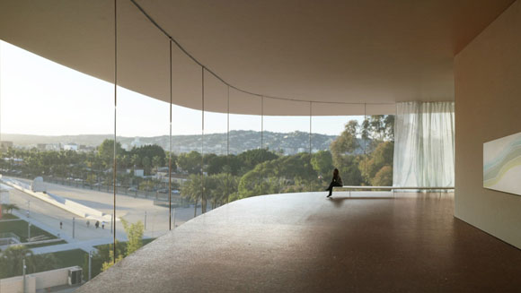
The Nancy and Rick Kinder Building at the Museum of Fine Arts, Houston, Texas, by Steven Holl. The architect’s inspiration came from the changing shapes of clouds and the trapezoidal shape of the property. (photo by Richard Barnes)
“Hey Anthony, who is your favorite architect?,” I am often asked.
I might reply, “Can there only be one fave? What is your favorite book or your favorite song?”

For nearly all, there is no one favorite piece of music. For me, there is no one favorite architect. There are several dozen. But here I try, gathering a mere list of ten, in no particular order. Just a note: My list comprises living architects, so excludes favorites like Antoni Gaudi, Louis Kahn, Le Corbusier, and Ricardo Bofill.
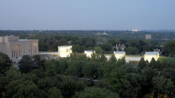
1: Steven Holl
Holl possesses an individualistic vision of architecture, where his signature watercolors establishes the conceptual agenda for each project. This New York–based architect blends complex building programs—both new structures as well as additions—with seemingly random sculptural shapes, while applying his mastery of shaping natural light. Time magazine called him “America’s Best Architect” for “buildings that satisfy the spirit as well as the eye.”
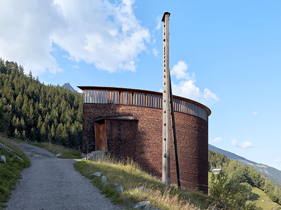
2: Peter Zumthor
Often called the “architect’s architect,” there is no one else practicing today so often referred to as a “master” of his craft. Each project from the Swiss architect, the son of a cabinet maker—whether a home, chapel, or museum—is precisely uncompromising, often austere, and elemental, embracing the basics of architecture, e.g., shelter, light, materials. Zumthor suggests, “Architecture is not a vehicle or a symbol for things that do not belong to its essence.”

3: Rem Koolhaas
Dutch architect, provocative theorist, prolific author, professor at Harvard, and one-time filmmaker—Koolhaas brings gravitas and intellectualism to his practice. His work is known for its clarity in conceptual thinking, where a simple idea or diagram drives the development of an entire project, whether a house, library, or entire town. Time magazine put him in their top 100 of “The World’s Most Influential People.”

4: Alvaro Siza
Some buildings from this Portugues architect are quiet and minimal, like his Leca Swimming Pools—so integrated into the waterfront that one doesn’t even know where the buildings end and the land begins. Other projects combine invention, and poetry. “Every design,” Siza states, “is a rigorous attempt to capture a concrete moment of a transitory image in all its nuances . . . the more precise they are, the more vulnerable.”

5: Tadao Ando
Self-taught Japanese architect started out as a truck driver and professional boxer. Contrasting the delirium of such a past, Ando’s portfolio is the epitome of minimalism, exploring a profound nothingness. Nearly all his projects are composed of primarily two materials. 1) poured-in-place concrete—concrete walls, concrete floors, concrete roofs, and 2) natural light (yes, I view light as a construction material). Though many of his buildings appear to be the similar, celebrities flock to own an Ando design: Beyonce and Jay-Z, Kanye West, Tom Ford, Kim Kardashian, amongst others.

6: Richard Meier
New York architect Meier (now retired with controversy) claims, “White conventionally has always been seen as a symbol of perfection, of purity and clarity.” He established his design language, for better or for worse, as the one of the most recognizable styles in history—a singular vision and personal brand of Modernism, stark white surfaces, and strict geometries. The formality and strictness in Meier’s work, though rigid and severe for some, provide an oasis of calm for others.

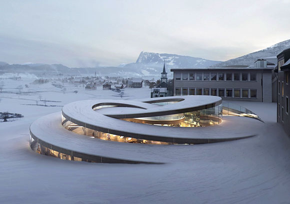
7: Herzog & de Meuron
Based in Basel, Switzerland, the partnership of Jacques Herzog and Pierre de Meuron approaches architecture as a deep dive into design philosophy, experimental methods, and technology. They believe their work “can meet the needs of our rapidly and radically changing world.” Each project is a reinvention of their creative process, with a fetishization of form making, textures, patterns, and materials—both traditional and radical.
8: Bjarke Ingels
Many of Ingels’ projects—bold, exaggerated, and cartoonish—appear to have leapt off the pages of a comic book. In fact, he published a 2009 graphic novel entitled, Yes Is More: An Archicomic on Architectural Evolution. His firm of 700 architects, simply known as BIG, is one of the fastest rising companies in the global marketplace. The Wall Street Journal called this Copenhagen-based architect, “Innovator of the Year” for architecture and “one of the design world’s rising stars.”
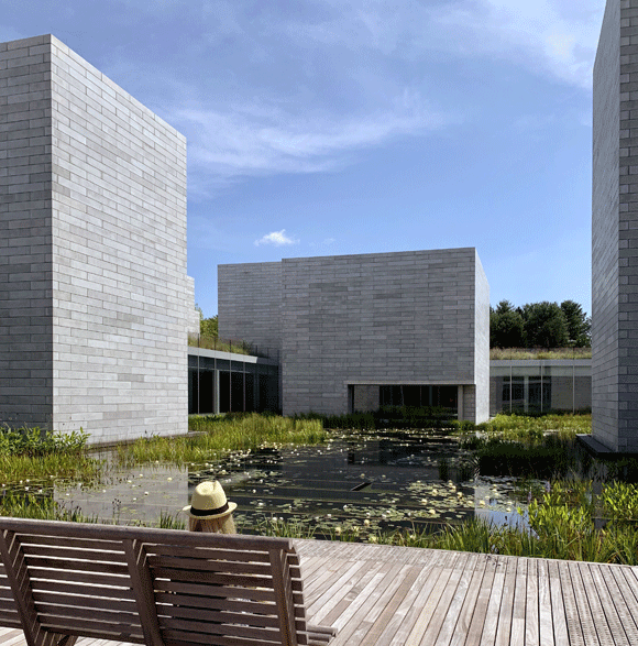
9: Thomas Phifer
One of the lesser known names on my list, and not yet a Pritzker Laureate like more than half of my list, Phifer established his Manhattan studio after working for Richard Meier. Whether Phifer’s work comprises the self-proclaimed “light buildings that landed lightly on the land” or Thomas De Monchaux’s description of “a river stone, embedded in the flow of its place,” I would suggest that Mies’ “less is more” is the rule. If ever in the D.C. area, do not miss a visit to the Glenstone Museum.

10: Frank Gehry
The stunning collisions of steel, glass, and stone from this Canadian-born American has made him the most famous living architect on the planet. Though often accused of aesthetic sameness—a kind of architectural one-liner—the mastery of his design vocabulary never ceases to impress. With the 1997 completion of the Guggenheim Museum in Bilbao, Spain, Gehry’s single building attracted so many visitors to the area that the entire economy of the Basque region improved dramatically.
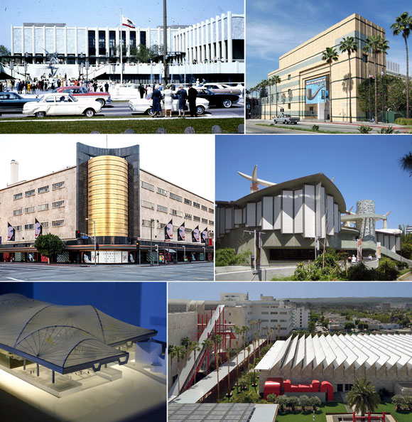
Along the lines of favorites, here are my favorite buildings in Los Angeles, favorite buildings of all time, and most breathtaking buildings of last year.