Tag Archives: HERZOG & DE MEURON

THE NOISE OF ARCHITECTURE

September 22, 2017

(photo from jimjenningsarchitecture.com)

I am not referring to the acoustic engineering of a concert hall or the aural quality of a restaurant. Rather, all works of architecture have a certain artistic volume level, from blank mute to in-your-face loud. The visual and experiential clamor of a building can reverberate with a subtle hum, or brash feedback and distortion.

Here I list fifteen projects that represent the dynamic range of architecture’s capacity to blare, starting with silence and increasing to an uproar.

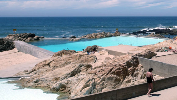
1. If you are wondering where the architecture is, that is exactly the point. The Tidal Pools de Leca da Palmeira intentionally blur the lines between nature and manmade. In so doing, Alvaro Siza (here and here) created a quiet structure for Porto, Portugal.

(photo from mimoa.eu)
(photo from uncubemagazine.com)

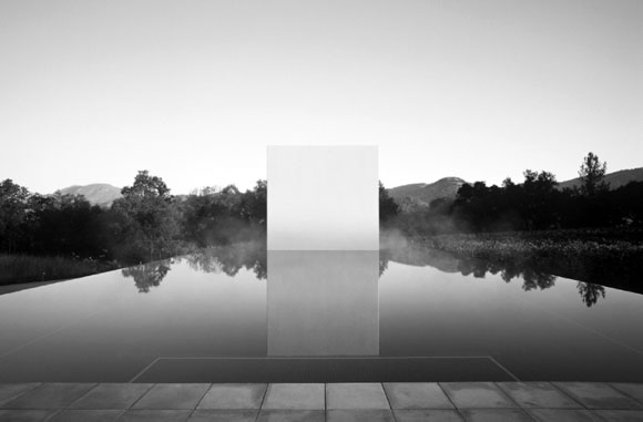
2. Present though voiceless, Jim Jennings’ Art Pool + Pavilion in Calistoga, California, provides the visitor nothing to relate to. The project is powerfully hush and abstract. (Black and white image above.)

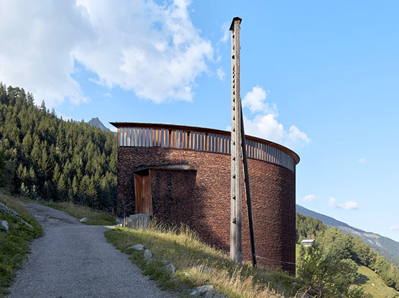
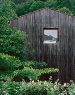
3. Looking like not much more than a barn, rock star architect, Peter Zumthor, delivers a house/office, offering only a single window for scale. Here in Hadlerstein, Switzerland, Zumthor barely speaks and shows off his capacity for restraint.

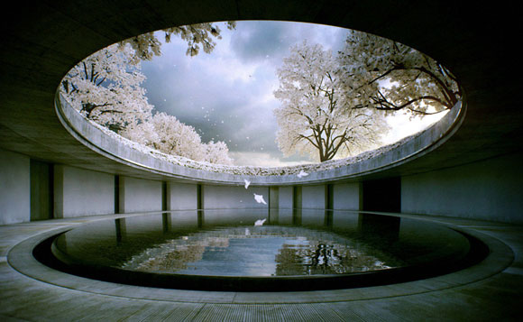
4. The Benesse House in the Kagawa District of Japan does not need to yell to get your attention. Practicing a meditative Zen-like harmony, Tadao Ando’s (here and here) building is at noiseless peace.

(photo by Tadao Ando)

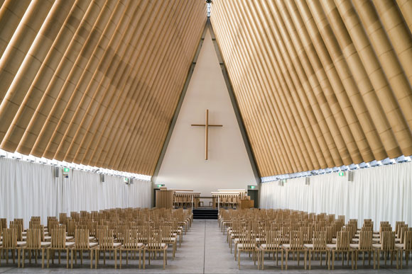
5. What appears to be a typical sacred building starts at first through its name, the “Cardboard Cathedral.” Then it hits you: Shigeru Ban literally used cardboard tubes for this New Zealand project.

(photo by Stephen Goodenough)

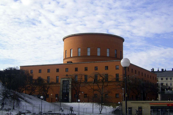
6. Like a child’s toy, a cylinder on top of a box comprises the Stockholm Public Library in Sweden. But for Gunnar Asplund, this is no simple toy. The sheer scale and volume makes the building’s presence loud and clear.

(photo from architectsjournal.co.uk)

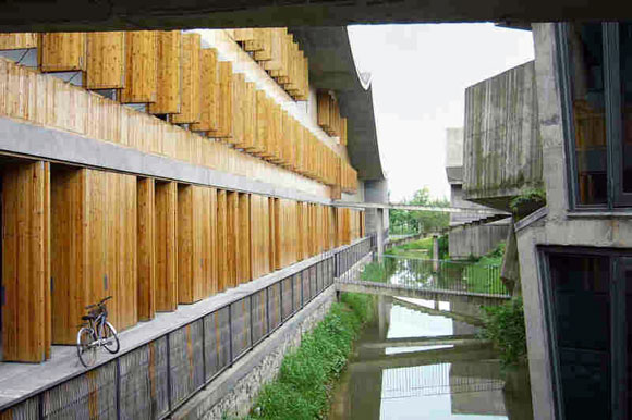
7. Wang Shu’s China Academy of Art seems to be contextual with the vernacular of Hangzhou, China. But it is the architect’s details and use of materials in innovative ways that provide this project a slight degree of commotion.
(photo from npr.org)

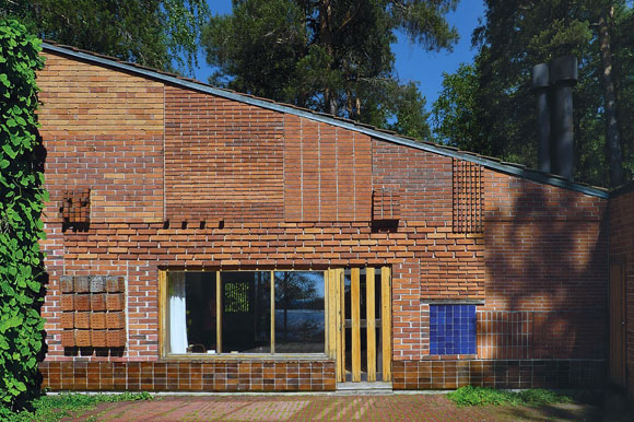
8. For his Experimental House in Muuratsalo, Finland, Alvar Aalto generated an outcry with his brick patterns.

(photo from Architizer.com)

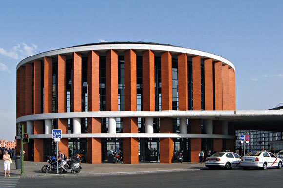
9. Rafael Moneo (here and here) used a cylinder, as did Asplund above. But for Moneo’s Atocha Train Station in Madrid, the crisp brick pillars form a cylinder in an untraditional way. And they resound with a majestic boom.

(photo from europaenfotos.com)

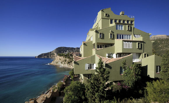
10. For a housing project cutely entitled “Xanadu,” Taller de Arquitectura (here and here) created something that demands more attention that your generic hillside apartment. In La Manzanera Alicante, Spain, Xanadu may have some items that appear to be normal, like clay tile, gable roofs, painted stucco and residential scale windows—but upon a second look, the overall composition is a hullabaloo.

(photo by Ricardo Bofill)

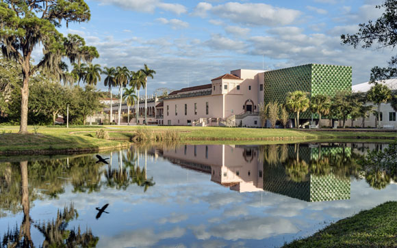
11. The green, glazed terra cotta, exterior tiles on this addition possesses a visual bark, especially in counterpoint to the traditional original building. In Sarasota, Florida, Macado Silvetti clearly wanted the Center for Asian Art to create a racket when having the new holler to the old.

(photo from machado-silvetti.com)

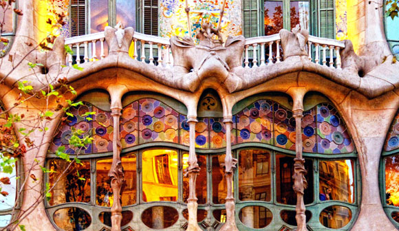
12. I typical attribute the work of Antonio Gaudi to jazz. His fantastical improvised vision of the world, seen here at Casa Batlo in Barcelona, breaks the rules of composition and color, resulting in an intuitive, lyrical work.

(photo from apetcher.wordpress.com)

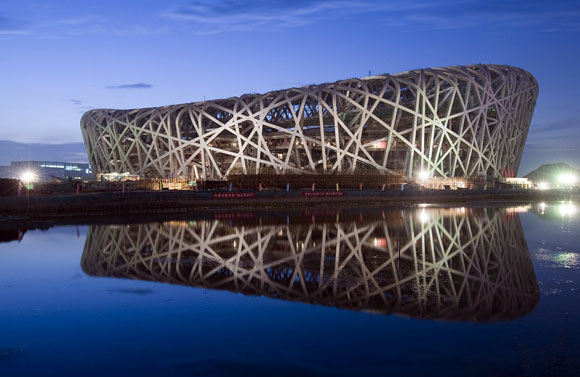
13. The historic collaboration between Chinese artist, Ai Weiwei, and Swiss architects, Herzog & de Meuron (here and here) offered up the 2008 Olympics’ Chinese National Stadium, also known as the famous “Bird’s Nest”. This artistic structure in Beijing blasted onto the world stage with its surreal knitting of massive steel members, alongside the building’s enormous presence.

(photo from hoesthetics.net)

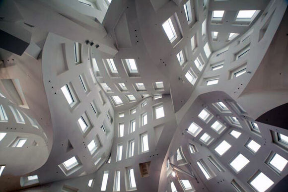
14. This image of the Lou Ruvo Center for Brain Health in Las Vegas has not been distorted. Frank Gehry (here, here, herehere and here) designed an interior that has quite an uproar—one that questions if such noise is good for the purpose of this facility, the healthiness of one’s brain.

(photo from newsroom.clevelandclinic.org)

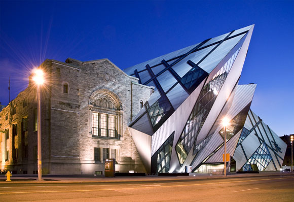
15. Similar to the Center for Asian Art, above, this Royal Ontario Museum in Toronto represents a dialogue between old and new. But here, Studio Libeskind’s (LINK best friends) new addition screams and cries for attention. The juxtaposition fascinates, but does architecture need to bellow like this?

MY FIFTEEN FAVE BUILDINGS

February 3, 2017

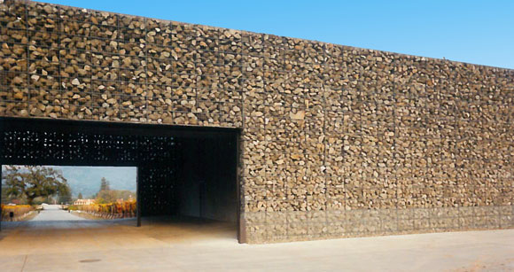
Dominus Winery, Yountville, Napa Valley, California (photo by Anthony Poon)

“Hey Anthony, what is your favorite building in the world?” I am often asked.

I might reply obnoxiously but with reason, “What is your favorite painting, favorite book or favorite ice cream?”

Just as there is no one favorite piece of music, there is no one favorite work of architecture. There are hundreds. But here I try. In this list of some of my favorites (in no particular order), I selected different building types and sizes—from a house to a parliament building, from a public plaza to a winery. I have also included a few of The Usual Suspects.

(photo from brownbook.tv)

1: Can a design be both exquisitely silent and majestically heroic? Such is Louis Kahn’s 1982 National Parliament House in Dhaka.

(photo from urbansplatter.com)

2: In 1929, Mies van der Rohe contributed to the pioneering concept known as the Free Plan. Through a few carefully placed walls and columns, the Barcelona Pavilion gently and epically implies space and journey.

(photo from mimoa.eu)

3: Before Ricard Bofill became fascinated with Postmodernism, he delved deep into his mind for fantastical dreamscapes. This 1975 apartment building known as Walden 7, in Sant Just Desvern, Spain, demonstrates what it means to be imaginative.

(photo from arquiscopio.com)

4. Situated over a station rail yard, Pinon and Vilaplana created a public square, transforming a blank space into one of Barcelona’s most powerful works of urban sculpture and place making, the Plaza de los Paises Catalanes.

(photo by Andrea de Poda)

5: Even in 1670, there were revolutionaries within a revolution. Baroque architect Gian Lorenzo Bernini twisted the classical world of pure geometry, and designed a chapel in the shape of an ellipse. Upon arriving inside Sant’Andrea al Quirinale in Rome, you are confronted by a twisted perspective.

(photo by Marketing Groningen)

6: The 2001 Wall House in The Netherlands was constructed three decades after the completed design, and a year after the death of architect John Hejduk. He juxtaposed Corbusian ideas with Cubism and Surrealism, offering one of the most formidable visions of a home.

(photo from archdaily.com)

7: During the design process for Maison Bordeaux in France, the client had a car accident that left him wheelchair bound. OMA quickly changed the 1998 design, transmuting the home office into a room size elevator, open on all four sides—where the three-story shaft is his library, art collection and office supplies.

(photo from nest-hostles.com)

8: In 1999, Rafael Moneo made two massive structures into leaning ethereal cubes of otherworldliness. For Spain’s Kursaal Congress Centre and Auditorium, Moneo explored prismatic volumes, glowing translucency, and double walls of rippled glass.

(photo by Sander Lukers)

9: Some works, such as the Chapel Santa Maria degli Angeli, are pure poetry. Like the hand of God, architect Mario Botta placed this 1996 building gently in the Swiss mountains of Monte Tamaro.

(photo from azahner.com)

10. It is not only astounding that Herzog & de Meuron wrapped an entire museum with dimpled, perforated, aging copper panels in 2005, but that these architects were able to convince the city of San Francisco that such a curious design idea would be the perfect addition to the beloved Golden Gate Park.

(photo by Bernard Gagnon)

11: There is no limit to the extraordinary creativity of Catalan architect, Antonio Gaudi. Alongside studying the engineering of this ambitious cathedral by building an upside catenary model of stings and chains, Gaudi combined the Grotesque, Gothic and Art Nouveau, amongst many other influences. Since the start of construction of the Sagrada Familia church in 1882, the unfinished project is still underway in Barcelona.

(photo by IlGiozzi)
(photo by IlGiozzi)

12. Sometimes I think it is just fetishized retail design, but not at Rem Koolhaas’s 2001 Prada store in Manhattan. The street level floor wraps up then sweeps down to the lower level, bringing natural light to an otherwise dark space and creating the grand theater that is fashion.

(photo by Joao Morgado)

13: At the early age of 26, Alvaro Siza created one of the most graceful compositions. More than a mere restaurant in Portugal, the Boa Nova Tea House of 1963 sits elegantly in its setting, as instinctively as the surrounding rock outcroppings.

(photo by Kevin Cole)

14: Bernard Maybeck’s “temporary” monumental jewel of the 1915 World’s Fair still stands a century later, a romantic icon of San Francisco. With this Palace of Fine Arts, the “fictional ruin” expresses both an enduring melancholy of lost worlds and the ambition for new worlds to come.

(photo from architectural-review.com)

15: Exploiting the elemental scenery in Napa Valley, California, Herzog & de Meuron formed the 1998 Dominus Winery with just some rocks placed in steel baskets. And that was the entire idea, the whole building.

THE CURIOUS THING ABOUT STYLE, PART 1 OF 2

December 31, 2015

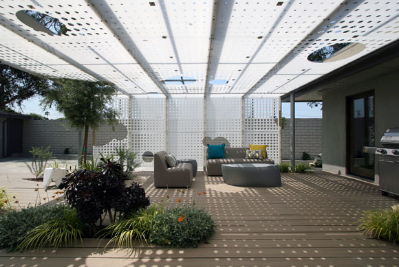
For this food blogger’s residence in Pasadena, we juxtaposed the technology of parametric algorithms on to polyethylene, the material used to make household cutting boards.

Recently, I was asked by an interviewer, “What is your style?”

This question is often asked, and not just of architects, but creatives of all sorts: fashion, graphics, advertising, cuisine, etc. The media typically aims to capture one’s design philosophy in a sound bite digestible by mainstream readers.

Many interior decorators have a packaged response. I hear words like “eclectic,” “warm and welcoming,” “contemporary yet timeless.” I am not sure what kind of design results from this mash up of clichés.

Architects have a hard time speaking of their style. Hugh Hardy, one of my past employers, argued that once you answer the dreaded question, your critics will constantly be assessing your work to see if you have lived up to your declarations.

What is style after all?

With extensive education, a higher degree and a 250-page graduate school thesis, many architects simply can’t and won’t summarize their creative philosophy in 20 words or less. For some, “style” is a bad word, and it shouldn’t be an elevator pitch.

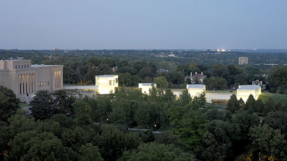
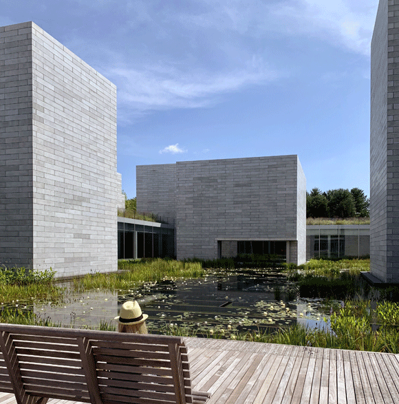
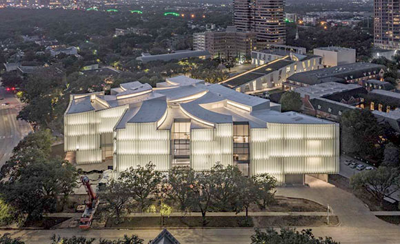
upper left: Federal National Council’s Parliament Building, Abu Dhabi, United Arab Emiretes by Ehrlich Architects; upper right: McNamara Alumni Center, University of Minnesota, Minneapolis, by Antoine Predock Architect Studio (photo by Bobak Ha’Eri); lower left: Dominus Estate, Yountville, California, by Herzog & de Meuron (photo by dominusestate.com); lower right: Nelson-Atkins Museum of Art, Kansas City, Missouri, by Steven Holl Architects (photo by Andy Ryan)

Some colleagues who talk about their architectural style do so with clever labels. Steven Ehrlich, based in Los Angeles, calls his work “Regional Modernism.” New Mexico architect Antoine Predock is a self-described “Cosmic Modernist.” Herzog & de Meuron of Switzerland has been coined, “Elemental Reductivists.” From New York, Steven Holl’s work involves “typology, phenomenology and existentialism.”

For architects such as Frank Gehry, Tadao Ando or Richard Meier, their style has been accused of being formulaic. Many would argue that all their buildings look the same. Is this so bad? Don’t all the Beatles’ songs and Beethoven Sonatas sound similar? (This topic of formula will be discussed in an upcoming blog.)

Oscar Peterson Trio (photo by Paul Hoeffler)

So now it is my turn to answer the universal question of style. My response should not be trite, but rather complex—but not pretentious.

I answered in two parts: Process and Product. My Process is inspired by jazz—the spontaneity and the improvisational spirit. (More another day.)

My Product, meaning the final structure, say a house or school, is driven by juxtaposition. I enjoy combining things together, either comfortably or awkwardly, to see what might arise: the modern and the traditional, the hand crafted and the machine made, the broad strokes and the finicky details, just to name a few.

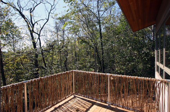
Meditation Retreat House, Blue Ridge Mountains, Virginia, by Poon Design

For a Buddhist meditation retreat in Virginia, Poon Design created a guardrail that juxtaposed a galvanized off-the-shelf steel frame with natural twine made from hemp. Yes, you can smoke it.

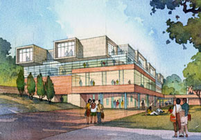
Student Center, University of California, Riverside, by Anthony Poon while w/ HHPA (rendering by Gilbert Gorski)
Student Center, University of California, Riverside, by Anthony Poon (w/ HHPA, watercolor by Gilbert Gorski)

For the University of California, our student center combined traditional campus brick and limestone, with sleek glass curtain wall and over-scaled weathering zinc shingles.

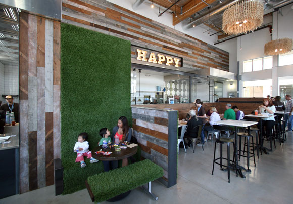
At Mendocino Farms, we blended a funky old school vibe, such as chalk board walls, vaudeville signage, clothespins, and industrial piping, with high-end luxury, such as Carrara marble, walnut planks, stainless steel trim, and custom furniture.

Mendocino Farms, Los Angeles, California, by Poon Design

Juxtaposition is not just my artistic approach, but the interests in my life as well. I like Brahms and I also like American Idol. I like Rembrandt and Pop Art. I like omakase sushi with a Coke, as well as McDonald’s with sake. I wear Gucci with the Gap. Love Nan Goldin and commercial photography. I read biographies, but also comic books. I like watching ping pong and the Superbowl. Reality shows that follow CNN.

I like the diversity and the messiness. I like unexpected results.

© Poon Design Inc.