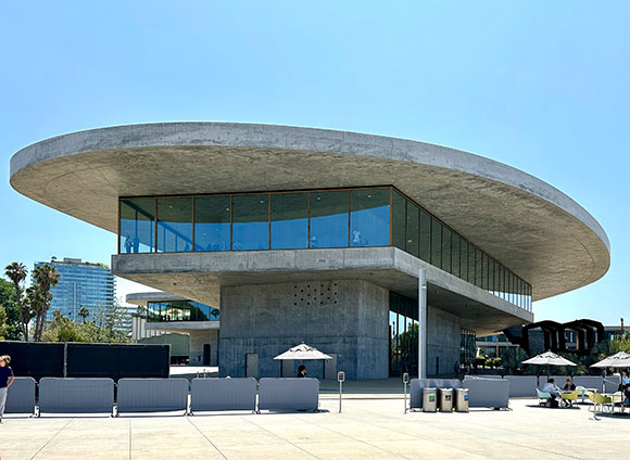
In June, LACMA (Los Angeles County Museum of Art) invited select visitors to marvel at their nearly finished $750 million museum. Of this project by Pritzker-honored, Swiss architect, Peter Zumthor, celebration and applause accompanied uneasiness and doubt.
(photo courtesy of Iwan Baan)
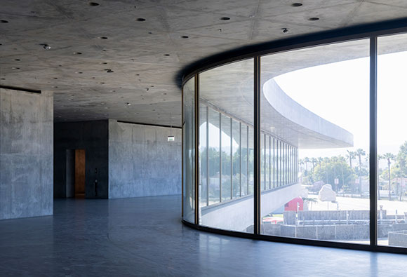
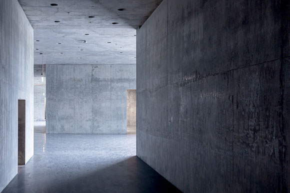
Named the David Geffen Galleries, Zumthor’s new museum exploits minimalism to various extremes. Only two materials—concrete and glass—define the entirety of this 347,500-square-foot structure, of which 110,000 square feet comprise the exhibition area. Contrasting the perimeter of floor-to-ceiling windows set in brass frames, every other surface is concrete—as in concrete walls, concrete floors, concrete roof, concrete ceiling, concrete stairs, and so on.
(photo courtesy of Iwan Baan)
Critics pondered: How do you hang art on concrete walls or from concrete ceilings?
LACMA’s CEO, Michael Govan, defended, “You can just drill right into the walls.” He claimed that with each new exhibit, curators can patch up the holes and drill more where needed. “It’s supposed to be like a good pair of old blue jeans that gets better with time.” Sentiments of patina referenced wabi-sabi. I predict that the future of these concrete surfaces will have some kind of hanging display system, hopefully in matching brass.
(photo courtesy of Iwan Baan)
Critics continued: With so much glass, isn’t sunlight bad for viewing art and the preservation of it? In earlier presentations, Zumthor stated his fascination with horizontal light striking sculptures. Also, light-controlled galleries placed away from the windows will address UV light and radiant heat
(photo courtesy of Iwan Baan)
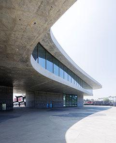
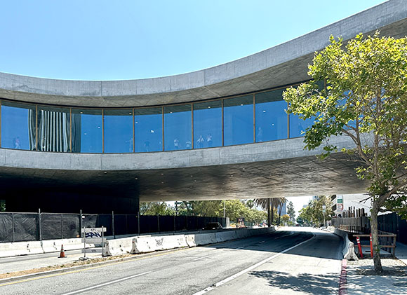
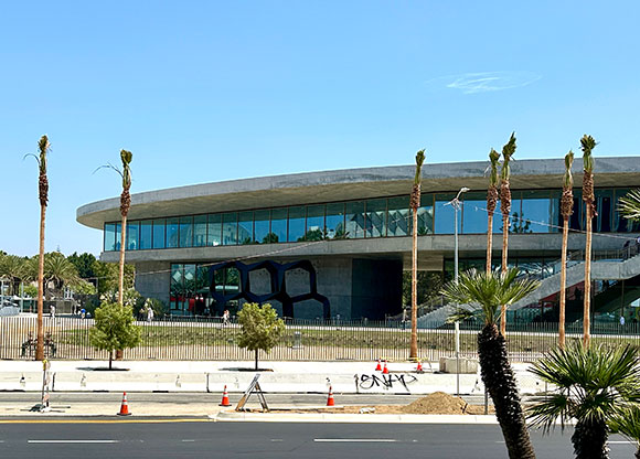
Curiosity revolved around this museum conceived as a massive one-floor, curving form, as compared to a traditional boxy building of multiple floors, hierarchical departments, and chronological galleries.
LACMA responded, “The horizontal, single-level layout eliminates traditional cultural hierarchies, placing all works on the same plane…” Of the “non-hierarchical” architecture, Govan exclaimed democratically, “I don’t want anyone in the front.”
The project’s progress is a milestone in a journey over two decades. It started with an international design competition in 2001, won by Rem Koolhaas with a glass roof design—not convincingly buildable. Zumthor entered the scene in 2009, impressing architects, as he usually does, with ideas of incredible genius. The original design comprised an all-black building supposedly inspired by the amoebic shapes at the nearby La Brea Tar Pits. To accommodate Zumthor’s vision, called by many as “The Blob,” he required the demolition of four major buildings on the museum campus.
(photo by Anthony Poon)
At LACMA, one can see the strengths apparent in Zumthor’s portfolio. His work exudes an authority through elemental minimalism. His architecture edits and curates moves of simplicity and singularity. His uncompromising details may be attributed to his cabinet maker father. Investigating basic materials like concrete, stone, and wood, Zumthor’s structures are sensuously tactile—a palpable spirituality.
But expectations can be so high, maybe too high. There are disappointments here. In 2014, the design was forced, due to budget, to be smaller and in conventional gray concrete, no longer an enigmatic black. The building maintains the heroic minimalism, but loses the elegance and exquisite beauty seen in the architect’s other works. The poetry coming from simplicity still persists, but many of the compromises are severe, particularly for an architect considered to be uncompromising. One of the most unfortunate changes from the original scheme is the straightening of curving floors and windows, seen most impotent under a roof where the bold sweeping edge remains.
(photo by Anthony Poon)
With such concessions, the architect has distanced himself, “saying he had repeatedly been forced to ‘reduce’ his design, and that the experience had convinced him to never again work in the US,” reported The Guardian. Adding insult to injury, several advocacy groups had banned to stop the project. Even alternative designs were proposed pro-bono from many architects.
(photo by Anthony Poon)
LACMA’s new David Geffen Galleries and its 142,000 works of art are targeted to open in spring 2026—and the final judgment is TBD. Stay tuned.
#116: THE ARCH PODCAST, FORM MAGAZINE, 3 OF 3: JAZZ, MISTAKES AND BEAUTY
April 10, 2020
120 years in the making: St. Peter’s Basilica, Vatican City (photo by Konstantinos Porikis on Pexels)
(Note on COVID-19: As I compile thoughts for a timely essay on the pandemic, not much of my writing was adding to the sentiments already out there, i.e., what can architects do, what is the future of cities, how to design public spaces, what will healthcare architecture be, etc.? Rather than be repetitive with many current writers, I am publishing this interview which was previously prepared but not yet released. Stay safe everyone.)
I invite you to listen to The Arch, a podcast of Form magazine. Previous excerpts are here and here.
Carol Bishop: Can you name any of the projects from the past or any projects that are around that you just said, “Wow, I think this is a great one and I think I’ll try something to meet that same criteria”?
Anthony Poon: There are a number of architects that inspire us, but for me, my architecture is not inspired by necessarily other buildings or architects’ work. I find my inspiration in my other interests, music for example or writing.
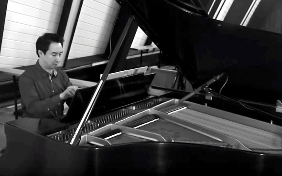
Playing Bach and Schumann at St. Paul’s, Rancho Palos Verdes, California (photo by Grant Bozigian)
A building design can be inspired by a poem. It can be inspired by beautiful footage from a movie. I’m fascinated by, for example, the music of Thelonious Monk, a jazz pianist whose work is extremely individual and unique. He plays chords and harmonies that are, in the classical sense, considered discordant and off-beat. Some would even say it is kind of grotesque. But at the same time, the music is considered beautiful. What is it that he does that seems to be incorrect but somehow still so beautiful? It’s that kind of thinking that inspires what we do in architecture.
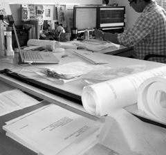
I think of jazz specifically because, architecture has to involve a budget and schedule. It has to involve gravity, keeping the weather out, waterproofing, gutter details, and city codes. It’s a slow process. It can take years to get a project done. It can take a decade to get a large project done.
The tedious and rigorous process of architecture (photo by Anthony Poon)
In that sense, architecture is for those who are patient and possess perseverance. But to bring it back to jazz, my fascination is this. Jazz ,as you know, is something that is spontaneous. It’s fast. It’s improvised. It’s played impromptu. Three or four jazz musicians can gather in a studio and sit at their instruments, and just start playing. They can choose a key, they can choose a theme, just something they can think about collaboratively. They wink and they just hit a beat. And all of a sudden, there’s music. That kind of spontaneous artistic process inspires me. And it makes me think: What can we do in architecture, in that creative process, to make it a little more organic, a little more fluid and loose?
Carol: Have you ever had a situation where even you went in and said, “Oh my goodness, it should have been green”? Or, “Oh no, it should have been cement”?
Anthony: Yes, of course, that can happen. I think one of the curses of being an architect— and most of my architect colleagues would probably agree and maybe artists, writers and musicians as well—is that the work is never done. The work is always in progress. We always think that we can do better. When a building is designed and finally constructed, we may have rave reviews, many thanks, and letters of recommendation and handshakes, but we might be walking into that finished space thinking: Oh, I wish we had raised that ceiling six more inches; it would have done so much more for the volume of the space and the indoor/outdoor connection.
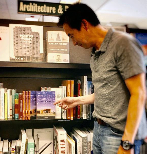
My book, Sticks and Stones, Steel and Glass: One Architect’s Journey, at Barnes & Noble, Los Angeles (photo by Olive Stays)
I know of colleagues who have published books and they’ve done well. They’ve won awards, they’ve won critical acclaim, and they’re thinking: Oh, that just wasn’t right. I really should have written a more elaborate ending. I should have added that extra character.
Maybe it’s a curse. Maybe it’s just the burden of the creative spirit—that even though a building is done, even though a book gets published, or a piece of music is performed—that the creative process is a continuing journey. In our minds, just because that building has finally cut the red ribbon for opening day, that design is not done.
Carol: You brought up the concept of beauty and, of course, there are so many definitions of what beauty is, so many ideas of what beauty can be. You can say to somebody, “Oh, this is beautiful”, and they’re just looking at eye candy, or you could say, “Well, the Greeks used mathematical intervals.” What is your idea of beauty?
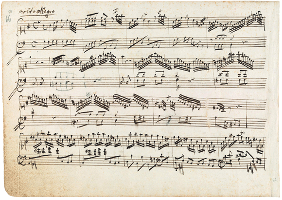
Molto Allegro from the Concerto in G, by Wolfgang Amadeus Mozart, 1764 (image from Philharmonia Baroque)
Anthony: There are several definitions of beauty. There are, as you mentioned, the kind of mathematical ideas of beauty that play out both in music and in architecture. There are scientific relationships between notes of music that have been determined to sound harmonious. There are scientific studies on the rhythm of music, meters, the key of music, and the colors that have been proven to be beautiful. There are some musicians who say beauty isn’t necessarily a goal in music. Mozart had always claimed that music should be beautiful, but there are other composers, say Beethoven, that say: Yes, it could be beautiful, but it doesn’t have to be. It can also be aggressive. It can also be heroic or bombastic or ceremonial. It doesn’t always have to be of all the ideas one thinks of being pretty and lyrical.
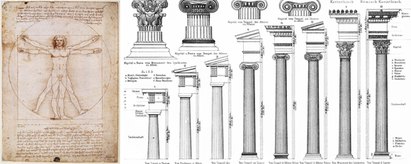
The Vitruvian Man, by Leonardo da Vinci, and the Classical Orders (image from Smarthistory)
Take architecture. There are also scientific ideas of what feels right using studies of proportions. The Greeks and Romans studied those and decided there are certain dimensions and proportioning systems that feel right. There are arguments of buildings or even aspects of the building, like a column, that if it represents man or the human figure, that it will relate more to a person and therefore feel more beautiful. Take a column. A classical column has three parts: the base, the shaft, and the capital. That is supposed to relate to the human figure, the feet, the body, and the head. In that way, there’s the belief that that will give you beauty in the end.
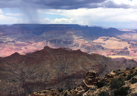
Setting aside the scientific approach, I do believe there are things that are inherently beautiful. I think people would agree that a sunset is beautiful. Or, I’ve never heard anyone go to the Grand Canyon and say: Yeah, this is not beautiful. This is ugly.
Grand Canyon National Park, Arizona (photo by Anthony Poon)
I think there are true aspects of beauty. I think the challenge is, how do we make beauty? How do we craft beauty? In our work, we believe that beauty comes from seeing the craft of the hand. There are many ways to put a building together, that can be machine made, can be digitally fabricated. But where we can add components that display the hand, where you can see the craft of the maker—I think that inherently makes it more beautiful.
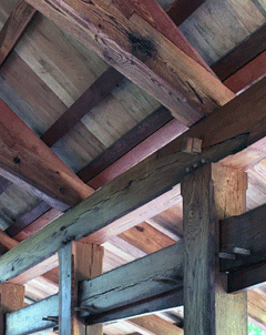
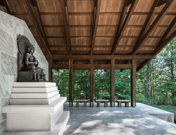
The heavy timbers aging gracefully at our Buddhist Temple, Natural Bridge, Virginia (photo by Anthony Poon)
Another aspect that’s important to our work is patina, the idea of weathering and aging. We believe that that patina also adds beauty. For example, everyone has their favorite pair of jeans or maybe leather jacket, and those items have been worn over time. As they look more distressed, they look more beautiful. But this idea of patina doesn’t apply to a car. No one wants to drive around in a beat-up car.
With architecture I think there is an in between. We’ve designed a project, a Buddhist temple in Natural Bridge, Virginia, in which it was designed to age, in which the wood timbers are meant to weather over time and show the wear. The copper roof, as most people know, will be a metal that ages, that starts bright copper, orange color, goes to a dark penny patina, and eventually goes a beautiful green. This idea of patina expresses the weathering of a building, that a building ages gracefully, as we do, and thereby becomes more beautiful.
We don’t want someone to say: Oh, these timbers of this Buddhist temple are now unattractive. Let’s sand them again, let’s stain them again. Let’s paint them. We don’t want someone to say: How come that copper roof isn’t shiny orange anymore? We want to design it in such a way that people will look at our work each day, see it change over time, compare that to their own life as they evolve, and say: This is what we see as beauty.