Tag Archives: MID-CENTURY MODERNISM

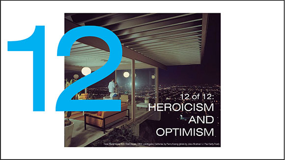
#167: MID-CENTURY MODERNISM: POINT OF DEPARTURE

March 24, 2023

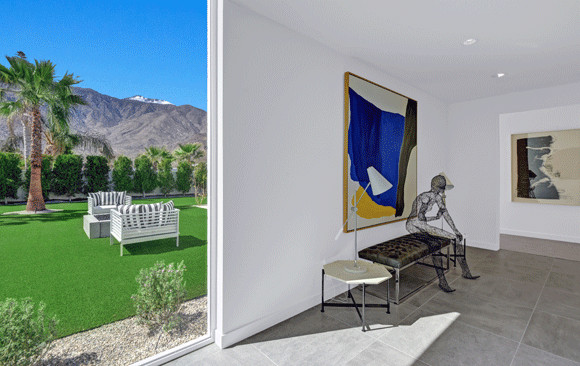
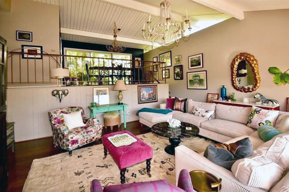
Linea Residence G, Palm Springs, California (w/ Andrew Adler, photo by Hunter Kerhart)

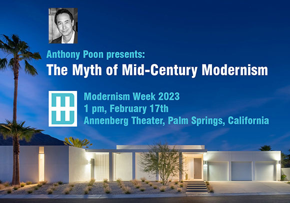
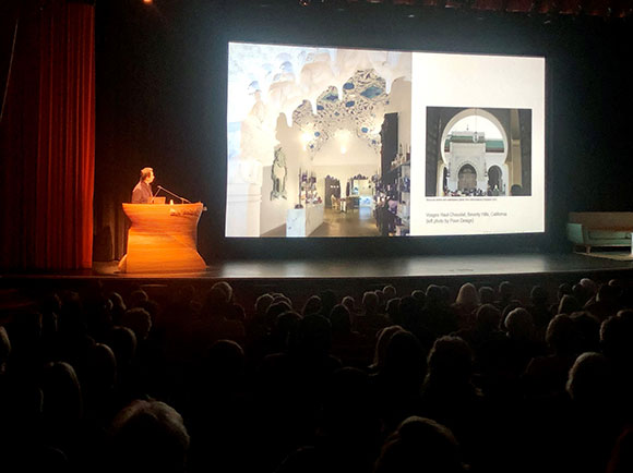
100,000 attendees descended on Palm Springs last month for Modernism Week 2023, the 10-day design festival celebrating Mid-Century Modernism (“MCM”). As a feature lecturer, I presented The Myth of Mid-Century Modernism—positing that we honor the design style of the 1950s and 1960s, but should not embalm it. For the thousands of MCM fans and fanatics, my position was blasphemous of sorts.

Speaking at the Annenberg Theater, Palm Springs (photo by Olive Stays)

There are a dozen ideas from MCM that serve well as design themes—to be adapted not regurgitated. Acknowledge past legacies, but look forward not backward.

Case Study House #9 / Entenza House, 1950, Pacific Palisades, California, by Eames and Saarinen (photo by Julius Shulman)
Herget Middle School, Aurora, Illinois (w/ A4E and Cordogan Clark, photo by Mark Ballogg)

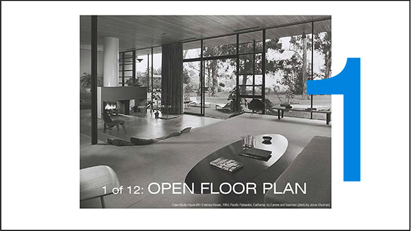
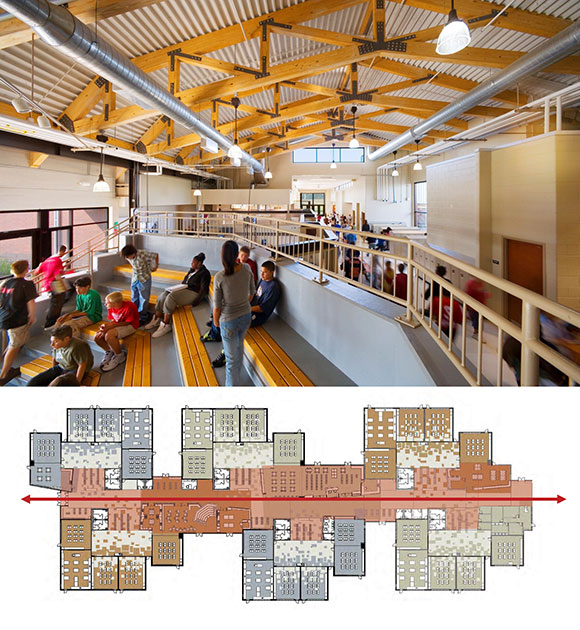
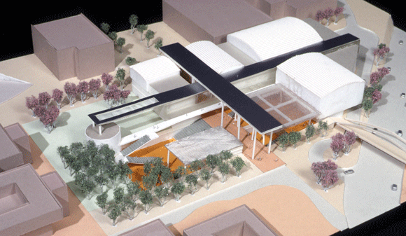
The MCM concept of the open floor plan countered the traditional compartmentalization of homes. At Poon Design, we applied the open floor plan to the design of a middle school. Rather than the conventional 12-foot wide by 10-foot tall, congested hallway lined with lockers, we created a 60-foot wide by 30-foot tall corridor—more a central atrium. Within sits the community functions open and accessible—library, math amphitheater, woodshop, and social areas.

Mirman Residence, 1959, Arcadia, California, by Buff, Straub and Hensman (photo by Julius Shulman)
Linea Residence L, Palm Springs, California (w/ Andrew Adler, photos by James Butchart)

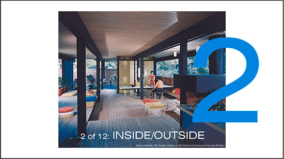
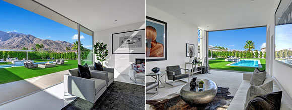
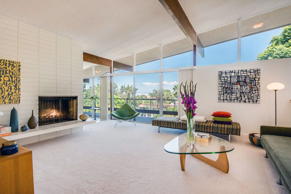
In California, we are blessed with moderate climate—not too hot, not too cold—that allows us to bring the outside in, blurring the division between interior and exterior. With today’s advanced engineering, the span of openings are wider. Technology even allows for sliding doors to disappear into walls.

Case Study House #22 / Stahl House, 1960, Los Angeles, California, by Pierre Koenig (photo by Julius Shulman / J. Paul Getty Trust
14th Shamarpa Reliquary Building, Natural Bridge, Virginia (photos by Mark Ballogg)

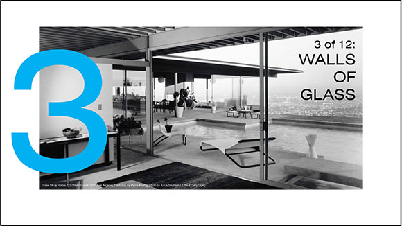
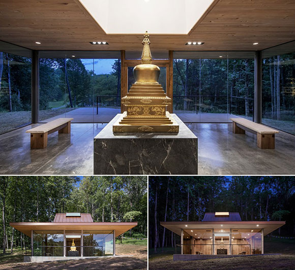
Expansive walls of glass are prevalent in MCM homes. Here, we apply the ideas of lightness and transparency to a Buddhist temple. In the day, the walls of glass mirror the surrounding landscape, and at night, the glass disappears.

top: Alexander Home, Twin Palms, 1955, by William Krisel; bottom: Park Imperial South, 1960, by Barry A. Berkus, Palm Springs, California (photos from palmspringslife.com)
Feather River Academy, Yuba City, California (w/ A4E, photo by Gregory Blore)

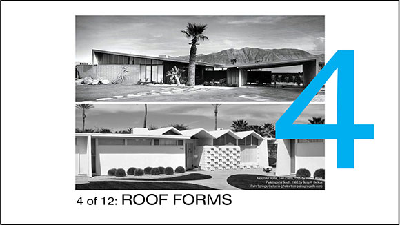
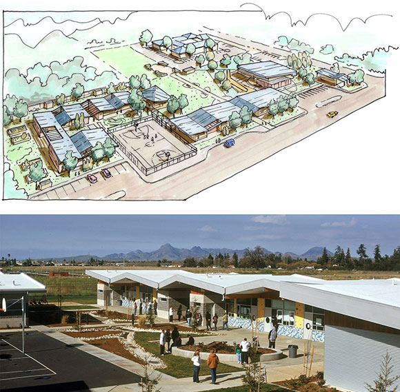
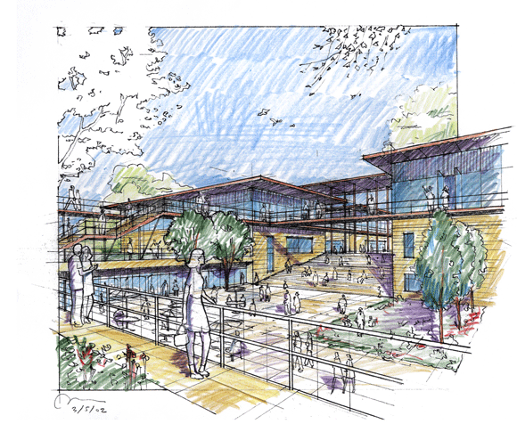
Often called the “butterfly” and “accordion” roof, we used such shapes not as an MCM gesture on a house, but as a unifying theme throughout a high school campus. Our roof lines recall the local mountains and serves as a metaphor for the institution’s mission statement, “Learning in Action.”

Frey House II, 1964, Palm Springs, California, by Albert Frey (photo from psmuseum.org)
top and bottom left: Mendocino Farms 3rd and Fairfax; bottom right: Mendocino Farms Fig at 7th, Los Angeles, California (photos by Poon Design)

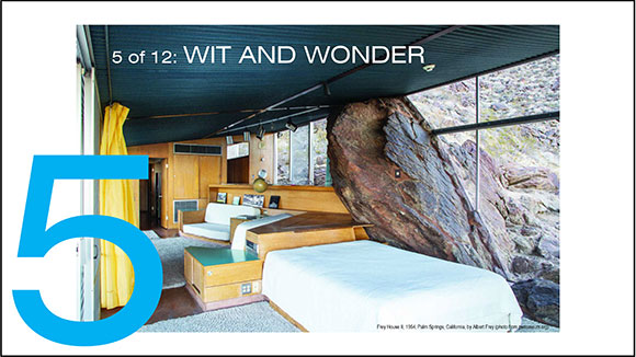
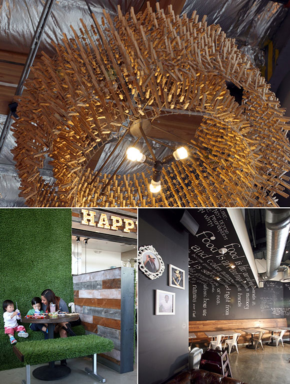
A restaurant can capture the imagination through wit and charm by applying 400 wood clothespins on chicken wire making a chandelier, faux grass expressing a new concept of the American picnic, and a mural-like chalkboard continuous from wall to ceiling.

top: Century Modern Pattern 01 (from happywall.com); bottom: color palette (from kathykuohome.com)
top left: Vosges Haut-Chocolat Factory and Headquarters, Chicago, Illinois (photo by Anthony Poon); top middle: Joss Cuisine, Beverly Hills, California (photo by Poon Design); top right and second row left: S/B Residence, Encino, California (photo by Poon Design); second row middle: Greenman Elementary School, West Aurora, Illinois (w/ A4E and Cordogan Clark, photo by Mark Ballogg); bottom left: Coral Mountain Residence C, La Quinta, California (w/ Andrew Adler, photo by Lance Gerber); Villa Sunset, Beverly Hills, California (photo by Martin/Poon)

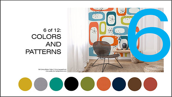
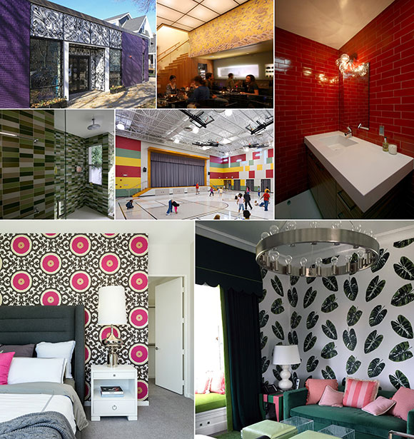
We enjoy the application of color and patterns, but not just as decoration—rather, to add personality to a space, to capture the spirit and character of the owner—whether a purple chocolate factory, red powder room, of multi-colored gymnasium.

left: Eichler Home, 1950s, California, by Joseph Eichler (photo from sunset.com); right: Sputnik chandelier, 1939, by Hans Harald Rath of J&L Lobmeyr (photo from etsy.com)
top: Aura Cycle, West Hollywood, California (photo by Aura Cycle); bottom left: Doheny Plaza, West Hollywood, California (photo by Hunter Kerhart); bottom right: S/B House, Encino, California (photo by Poon Design)

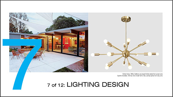
Light can be more than simply a source of illumination. Consider light to be similar to stone, wood, or metal. Meaning, light can also be a building material. Light can be an element to be shaped, harnessed, and applied like a painter applies oils to a canvas.

Round House, 1968, Wilton, Connecticut, by Richard Foster (photo by Iwan Baan)
bottom: Heritage Fine Wines, Beverly Hills, California (photo by Poon Design)

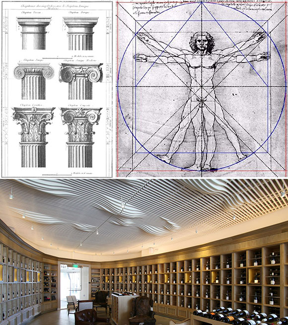
Having dominated architectural outcomes for centuries, the classical principles of architecture were open to MCM reinterpretation. At this wine store, the cabinetry possesses a traditional look with its cornice, trim and paneling. Yet, we applied such a traditional look to an elliptically-shaped showroom. Upon entering, the bottles of Bordeaux embrace the visitor.

Eichler Homes, Burlingame, California, by Joseph Eichler (photos by Anthony Poon)
top: Alta Verde Escena, Palm Springs, California (photo from earth.google.com); bottom: Residence I-3, Palm Springs, California (w/ Andrew Adler, photo by Chris Miller)

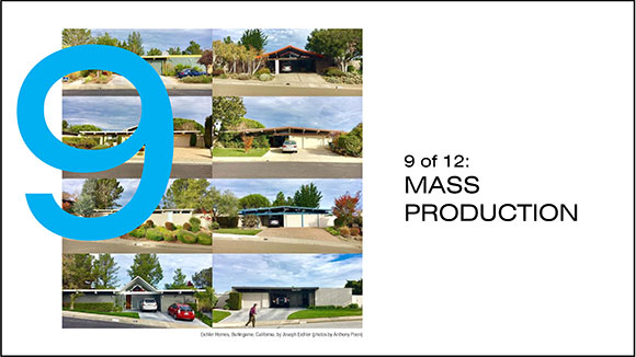
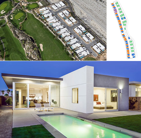
As the Case Study Housing program attempted, Poon Design also sought to provide attainable, budget-driven, mass produced homes. Building and selling 230 contemporary homes in four new Palm Springs communities has earned us the highest national honor from the American Institute of Architects, the 2018 Best in Housing, alongside dozens of other regional and national awards.

left: MCM Hilltop Community, 1950, Seattle, Washington, by Paul Kirk; right: Roberts House, 1955, West Covina, California, by Richard Neutra (photo by Cameron Carothers)
Din Tai Fung, Costa Mesa, California (photos by Poon Design)??? Glendale, California (photos by Poon Design and Gregg Segal)

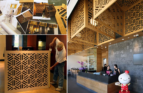
New tools and technology allowed us to exploit MCM’s drive for a high sense of craft. Giant lampshades at the famed Din Tai Fung restaurant reinterpret historic Chinese screens. Through computer scripted patterns alongside milling techniques of oak plywood, we created lampshades and skylights that are works of sculpture, expressing a devotion to detail and innovation.

Case Study House #8 / Eames House, 1949, Pacific Palisades, California, by Charles and Ray Eames (photo by Julius Shulman, J. Paul Getty Trust)
top: Chaya Downtown, Los Angeles, California (photo by Gregg Segal); graphic design for Chaya (by Poon Design)

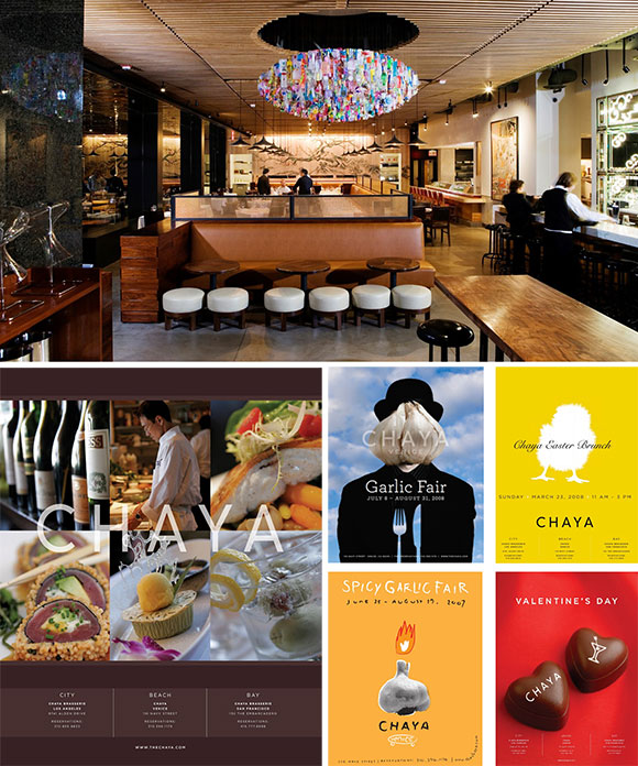
MCM architects sought to provide design services combining three prominent strains: architecture, interiors and landscape. For our Chaya Downtown restaurant, we went further to deliver a cohesively designed environment. We created the branding, website, and graphics. We also designed furniture and lighting, as well as curated the art. We continued our pursuits to include the employee uniforms and even the selection of music. Music too is an element of architecture. What is heard during the morning hours of coffee is different than the business lunches—different than festive happy hour, different than an elegant dinner, and different than late night cocktails.

Case Study House #22 / Stahl House, 1960, Los Angeles, California, by Pierre Koenig (photo by Julius Shulman / J. Paul Getty Trust)
The Point Lifestyle Center, Irvine, California

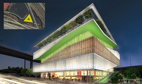
We continue the optimism of MCM at larger scales and more ambitious programs than housing. For this lifestyle center serving the Asian community, the first floor comprises an Asian fish market, the second is a Korean spa, the third a Japanese karaoke bar, and the fourth a Chinese rooftop garden restaurant.

Kaufmann House, 1946, Palm Springs, California, by Richard Neutra (photo by Slim Aarons)

The design concepts of Mid-Century Modernism endure, because they are timeless and universal. The challenge is to look to MCM concepts as a platform to launch into the future—as inspiration not as nostalgia, for interpretation not replication.

#131: GOOD OR BAD: THE SUBJECTIVITY OF DESIGN

February 26, 2021

Notre-Dame de Paris, France: Universally considered as good architecture: (Photo by Leif Linding from Pixabay) San Francisco Marriott Marquis, California: “. . . always was and remains at the top of the ugly heap,” from gabriellafracchia.com (photo by Beyond My Ken)

It must be asked: What is good architecture? What is bad architecture?

A 3rd century B.C. Greek adage has become the seminal motto, “Beauty is in the eye of the beholder.” But who are these “beholders”? And is architecture subjective—to be determined on a case-by-case basis by whoever is beholden, whoever is the random casual visitor?

House VI (photo from eisenmanarchitects.com)

At a Princeton University panel, I once heard New York architect Peter Eisenman argue that there is, indeed, such a thing as good architecture and bad architecture. He cited one example, and I paraphrase, “If a stair is designed to go up, and the architect makes it to go down, then that is bad architecture.”

Mid-Century Modern home, Portland, Oregon: Timeless design or old fashion? (photo by Kate Reggev)

When a design is labeled timeless, that generally suggests something good—as in the architecture has stood the test of time. But timelessness is elusive. Someone might think of Mid-Century Modernism as timeless. Other would call it a fad. Another might argue for a classical Colonial style. And in turn, some would call it old fashion.

Louvre Pyramid, Paris, France (photo by Edi Nugraha from Pixabay)
Vanna Venturi House, Philadelphia, Pennsylvania (photo by Venturi, Scott Brown & Associates, Steven Goldblatt, Rollin LaFrance)

The American Institute of Architects bestows one project a year with their Twenty-Five Year Award. The AIA states, “The award is conferred on a building that has stood the test of time for 25-35 years and continues to set standards of excellence for its architectural design and significance.” And the winners of this annual award—from I.M. Pei’s pyramid in Paris (awarded in 2017) to Robert Venturi’s Post-Modern house for his mom in Philadelphia (awarded in 1989)—never look the same, meaning there is no explicit link between good and timelessness.

Vitruvius presenting architecture to Augustus (by Sebastian Le Clerc)

Over 2,000 years ago, the Roman architect Vitruvius gave us three rules defining good architecture:

  • Firmatis, meaning durability: should stand up and remain in good condition,
  • Utilitas, meaning utility: should function well, and
  • Venustatis, meaning beauty: should delight people and enliven the human spirit.
Boston City Hall, Massachusetts: Considered both good and bad, depending on who you ask. (photo by Anton Grassl)

But when I teach, how do I apply Virtruvius’ teachings when grading the work of my students? What is a B plus design vs. an A minus? If the students are designing a hypothetical city hall, I can recognize if the design complies with the required functions, i.e., enough offices, nice big lobby, required restrooms, and so on. But what about the intangibles? Does the work exude civic spirit? Does it stand proud acknowledging the history of the town, as well as look to its future?

Like with classical music, the performance is not good because the player has gotten all the notes right. The goodness comes from what is added after the notes, even in between the notes—such as the interpretation, the communication of something beyond the music.

Good architecture goes beyond its sticks and stones, steel and glass, beyond the number of classrooms in a school or seats in a theater. What is beyond is not up to the beholder or the architect, but things known as culture, progress, evolution, invention, wonder, humor, and amazement. Grasping all this or even some of this, if humanly possible for the architect, comprises good architecture.

Universally considered a good design: Taj Mahal, Agra, Uttar Pradesh, India (photo by Simon from Pixabay)

#105: PODCAST: DESIGN INFLUENCER GROUP AND THE NEW RULES OF DESIGN & ARCHITECTURE

August 23, 2019

Linea Residence L, Palm Springs, California, by Poon Design (photo by James Butchart)

I was honored to be an inaugural member of Josh Cooperman’s Design Influencer Group, or better yet, “DIG.” As part of the Convo By Design’s platform, DIG was launched to examine, “industry trends and information not just about design, but about the business of design . . . design creatives are being asked to do more, for less.” Cooperman introduces, “The Design Influencer Group is a forum for a select group of design trade professionals to discuss these industry issues and design ideas that are shaping our design community here in Southern California.”

Josh Cooperman: What are the new trends of design and architecture?

Anthony Poon: We’re here today having a round table discussion with landscape designers, architects, interior designers, people of all sorts. The trend is that there are no boundaries, that people who are architects are also furniture designers. They’re also landscape architects. Interior designers are designing textiles and plumbing fixtures. It’s all one big blur of a movement of creativity.

Josh: What are the new rules?

Anthony: I think the exciting thing is that there are no rules. In the old school days, architects were well-defined, and so too were landscape designers, urban planners and furniture makers. The fact that there are no rules is what makes us all want to do what we do. It’s a form of creative entrepreneurship—everyone coming up with ideas and making it work. Learning as you go.

Thematic painting by Shag

Josh: With change comes casualties?

Anthony: I’m going to propose a trend that is the opposite of what some think is trendy. I call it, “The Death of Mid-Century Modern.” Sure, Mid-Century Modernism is popular. We all know it’s exciting; it’s everywhere. And I just came back from speaking at Modernism Week in Palm Springs.

My trouble with Mid-Century Modernism is that it’s become not just a fad, but a predictable formula. People are collecting Mid-Century Modern design as if they’re painting by numbers. These fans purchase that perfect pottery, the Eames chair, the avocado green paint, etc. We all know the elements that make up the beautiful Mid-Century composition, but if you’re just putting the pieces together like a mindless formula, like painting by numbers, then all you’ve got is a generic composition of random pieces that don’t speak to your personality.

Design should be individual, should be unique. It should tell a story about who you are. Mid-Century Modern is no different than saying you want an Elizabethan home, or that you want a Grecian temple, or any of these past historical theme parks. It’s not design. It’s not creativity, and I am getting tired of seeing these predictable clichés. No one should want to live in a museum of Mid-Century cliches.

Concept sketch for the Aztec Center Student Union, San Diego State University, California, by Anthony Poon (w/ HHPA)

Josh: What’s next in design?

Anthony: I think what’s next should not be driven by styles, clichés and formulas. It should be driven by the elemental qualities of architecture. Elemental items—we’re talking about things like indoor/outdoor connection. We’re talking about proportions, air, light, scale, composition. These are the things that are “what’s next.” “Next” should not be a discussion of a trendy shade of green paint, but rather the crafting of a spatial experience, a creative journey.

My footage on YouTube here. My podcast segment on iTunes starts at 43:52.

Study model for the Aztec Center Student Union, San Diego State University, California, by Anthony Poon (w/ HHPA)

MID-CENTURY MODERNISM: STOP THE INSANITY!

March 2, 2018

The Refill, by Shag

I am exhausted watching Mid-Century Modern (“MCM”) seep into every crevice of design. As popular as this design movement is, I find MCM outdated and old fashion, like the styles of 19th century Victorian or 17th century Baroque.

Why are people obsessed with living in this particular MCM past? Are these fanatics doing away with their computers, going to drive-in movie theaters, wearing saddle shoes, and twisting to Doris Day? No, these MCM zealots are only interested in the superficial look of a vintage era, roughly the 50’s and 60’s.

An ’embalmed’ MCM interior in Palm Springs, California (photo from soosxer.com)

Returning recently from my lecture at Modernism Week, where 100,000 attendees descended on Palm Springs to celebrate the MCM movement, the crowds were more interested in embalming the style vs. understanding it. Some of the attendees arrived in full 50’s theme attire, similar to how Trekkies and Fanboys proudly share their geekdom, dressing as Kirk, Spock and Klingons at Comic-Con.

The current MCM mania is an unfortunate approach that is merely design paint-by-numbers. For example, the enthusiasts create homes for themselves that are nothing more than architectural historical replicas. Call it curating or antique-ing, but all I see are devotees trying so hard to obtain that mint condition, original issue, Saarinen table within a Neutra house, where the Zeisel pottery sits perfectly in the room of avocado green paint.

Nice MCM yes, but only as a piece of history, Palm Springs, California. (photo from birdcourage.com)

Stylish, yes—but has anyone ever sat in an Eames rocking chair? The majority of MCM pieces have been panned as not just uncomfortable, but not all that functional.

So predictable and so uncomfortable; every piece is a cliché, Palos Verdes, California. (photo by Nate Cole)

My view: MCM should stand for Mid-Century Mausoleum. The owners of these fetishized environments have not created a pleasant home, but rather, forced their families and visitors to live in an ironic display from a history museum. Nostalgia is fine, but not when it is only a kit-of-parts, or worse, a collection of stale clichés.

To my 1957 MCM Bird Streets house, I added Brazilian Cherry and Maple flooring, along with a hand-troweled, sculptural fireplace, by Poon Design. The predictable Eames chair is not in the usual black but in putty leather, and the chair’s wood is not the usual Walnut, but Cherry. In Hollywood Hills, California (photo by Elon Schoenholz)

There is nothing wrong with collecting, like when a child buys, sells and trades baseball cards. But ask any kid the stats of a particular player, and you will get a wealth of data. Ask a MCM collector about the design movement’s origins, and it is unlikely that you will receive a grasp of post-war housing crisis, the drive for affordability and production, middle class views of wilderness, high rag content paper, and offset lithography. No, you will probably just hear some MCM buff bragging about his Satellite 23 clock.

I have learned from MCM ideas, i.e., the open plan, indoor/outdoor connections, and walls of glass. But I choose to view MCM as inspiration, not an ancient source for replication. As a point of departure, I view MCM as a place to stand and look to the future.

Do something different with MCM, like bright white, laser-cut, Italian cabinets, blue Brazilian marble, and a pair of Parallam ridge beams, by Poon Design. Renovation of my 1964 house, Bel Air, California. (photo by Anthony Poon)
A distinctive addition adds new life to a 1957 MCM house, in New Canaan, Connecticut. (photo by Peter Aaron / Esto)

To my clients who are fans of MCM architecture, I suggest this: Your homes can have MCM ideas, but let’s add your own ideas. Let’s add your personality, and it doesn’t have to come from one catalog. You are not living in a period film, but rather, you are breathing a modern existence, full of current ideas about lifestyle, technology, media, sustainability, and invention.

Here is a good example of adding personality to a 1962 MCM house, Palos Verdes, California. (photo from redfin.com)
© Poon Design Inc.