#211: TEN YEARS OF WRITING THIS STUFF

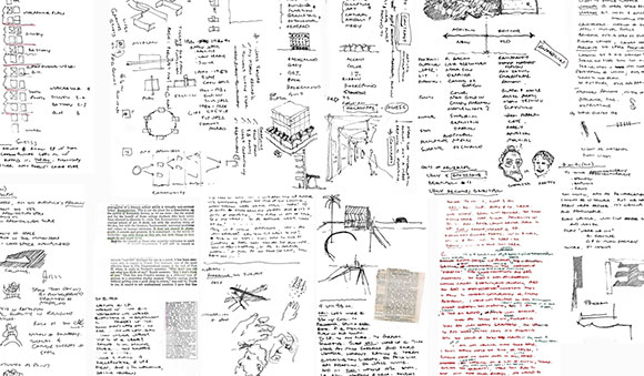
Live Learn Eat: Architecture by Anthony Poon, edited by Michael Webb, published 2020 by ORO Editions (photo by Anthony Poon)
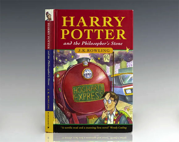
In 2015, I launched this weblog. It has been a decade of writing, now over 200 articles, totaling about 150,000 words. For reference, the first Harry Potter book contains 76,944 words.
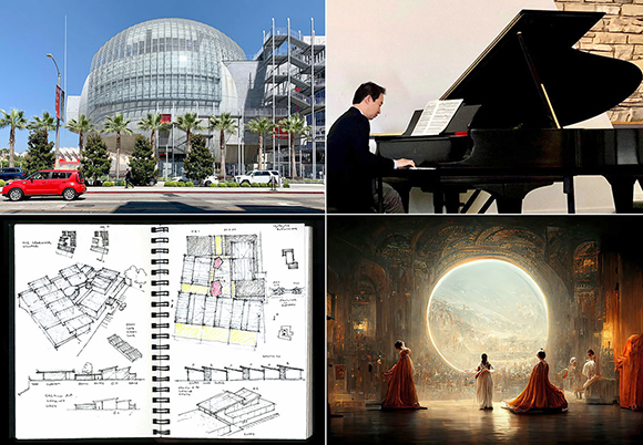
For my years of writing here, I have steered away from glib tweets, one-paragraph blurbs, and clever lists. Instead, I have written critical essays, researched commentary, informative rants-n-raves, biographical examinations, and reviews of buildings, exhibits, films, and books—all illustrated with photos, drawings, and sources cited. My work has spanned:
- from a review of a new museum to music and jazz,
- from architectural sketching to AI,
- from social responsibility to social media, and
- from examining success to the search for perfection.
Writing is about recording what I see, think, and feel. It’s personal and public. Writing is not just about finding that “voice,” but finding an audience, whether a single reader or thousands. Writing is typically a solo act, one of both introspection and exaltation, but to close the creative loop, there needs to be the reader.
In George Orwell’s 1946 essay, Why I Write, he identifies four motives that drive all writers. I study each motive as an architect writing about architecture.
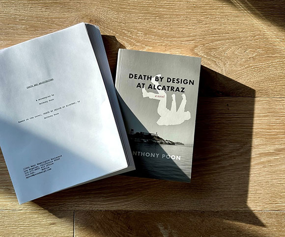
The first driver is “sheer egoism.” Orwell suggests that writers have a “desire to seem clever, to be talked about, to be remembered after death…” I have written much about the ego of architects. In fact, I have published a 2022 novel, Death and Design at Alcatraz, about ego, with a sequel in the works. This theme also drives my screenplay, Death by Architecture (recently honored by Scriptapalooza 2025 as one of the top 30 screenplays out of 4,500 international projects!) In architecture, it takes a certain amount of confidence and courage, yes ego even, to design a building—house, church, or skyscraper—and have it stand in the eyes of a judgmental society for decades, even a century or more.
Second, we have “aesthetic enthusiasm.” You have heard the accusation used to describe a narcissist: “He likes the sound of his own voice.” Orwell believes one aspect of writing is self-flattery, having “pleasure in the impact of one sound on another, in the firmness of good prose or the rhythm of a good story.” There is a narrative and compositional aspect in architecture—the play of proportions, use of light and air, combination of Calacatta marble and Padouk wood. It was the 1st century Roman architect, Vitruvius, who described good design as having “firmitas” or firmness.

“Historical impulse” is third on Orwell’s list. He argues that writers have a “desire to see things as they are, to find out true facts and store them up for the use of posterity.” All architects base their work on history, context, and precedence—whether in sincere acknowledgment or argumentative denial. The Neo-Classicists and Post-Modernists referenced history literally, whereas the Deconstructivists and Bauhaus designers reacted against history as a point of departure.

Lastly comes “political purpose,” in which Orwell claims that writers possess a “desire to push the world in a certain direction.” All architecture is political—from DEI team building to Queer Space, from gendered design to literal political structures like a courthouse or civic center. For many architects, the point of our industry is to challenge the socio-political world to move in a progressive path forward.
I look forward to my next decade of writing, and the many decades after.