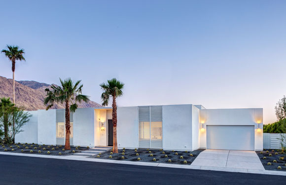
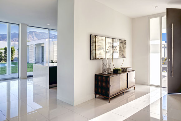
Linea Residence G, Palm Springs, California (w/ Andrew Adler, photo by Hunter Kerhart)
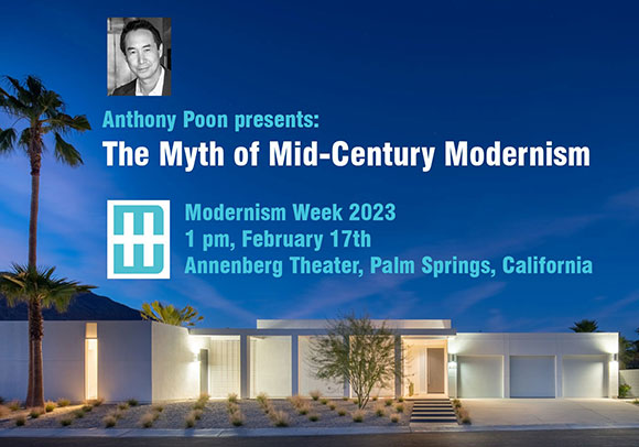
100,000 attendees descended on Palm Springs last month for Modernism Week 2023, the 10-day design festival celebrating Mid-Century Modernism (“MCM”). As a feature lecturer, I presented The Myth of Mid-Century Modernism—positing that we honor the design style of the 1950s and 1960s, but should not embalm it. For the thousands of MCM fans and fanatics, my position was blasphemous of sorts.
Speaking at the Annenberg Theater, Palm Springs (photo by Olive Stays)
There are a dozen ideas from MCM that serve well as design themes—to be adapted not regurgitated. Acknowledge past legacies, but look forward not backward.
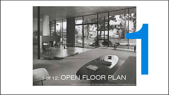
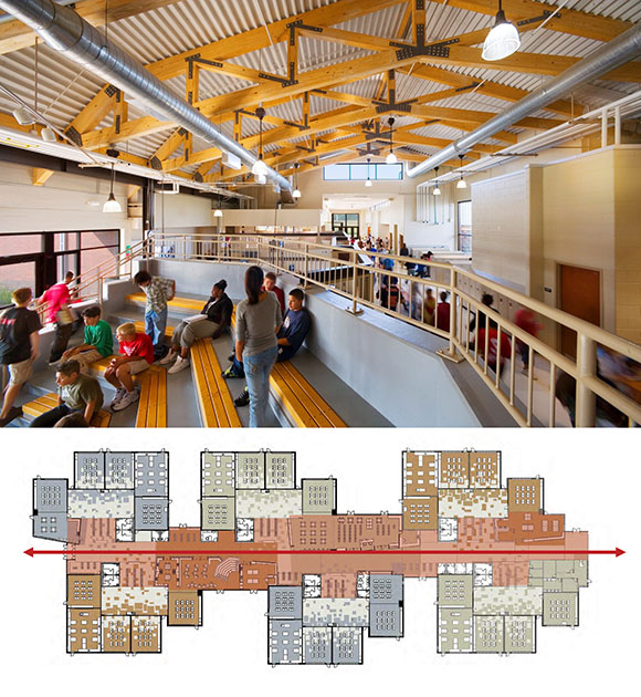
Case Study House #9 / Entenza House, 1950, Pacific Palisades, California, by Eames and Saarinen (photo by Julius Shulman)Herget Middle School, Aurora, Illinois (w/ A4E and Cordogan Clark, photo by Mark Ballogg)
The MCM concept of the open floor plan countered the traditional compartmentalization of homes. At Poon Design, we applied the open floor plan to the design of a middle school. Rather than the conventional 12-foot wide by 10-foot tall, congested hallway lined with lockers, we created a 60-foot wide by 30-foot tall corridor—more a central atrium. Within sits the community functions open and accessible—library, math amphitheater, woodshop, and social areas.
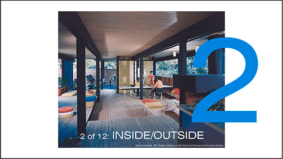
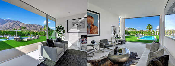
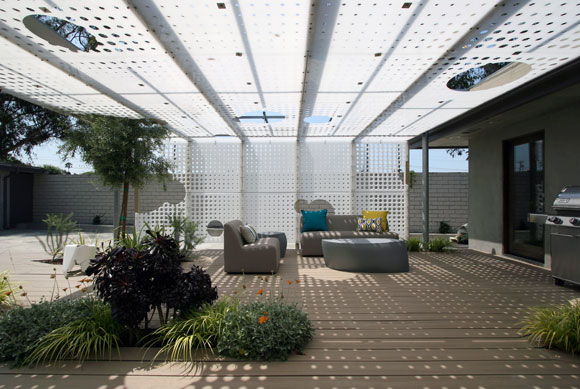
Mirman Residence, 1959, Arcadia, California, by Buff, Straub and Hensman (photo by Julius Shulman)Linea Residence L, Palm Springs, California (w/ Andrew Adler, photos by James Butchart)
In California, we are blessed with moderate climate—not too hot, not too cold—that allows us to bring the outside in, blurring the division between interior and exterior. With today’s advanced engineering, the span of openings are wider. Technology even allows for sliding doors to disappear into walls.
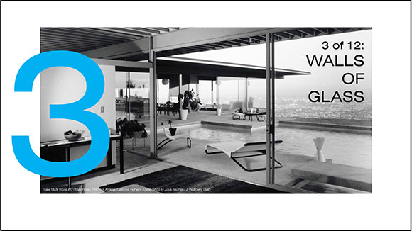
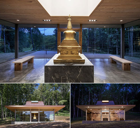
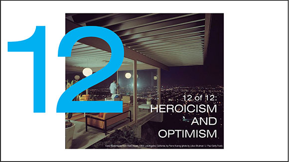
Case Study House #22 / Stahl House, 1960, Los Angeles, California, by Pierre Koenig (photo by Julius Shulman / J. Paul Getty Trust)14th Shamarpa Reliquary Building, Natural Bridge, Virginia (photos by Mark Ballogg)
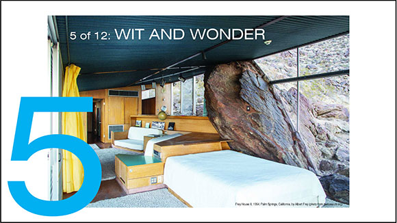
Expansive walls of glass are prevalent in MCM homes. Here, we apply the ideas of lightness and transparency to a Buddhist temple. In the day, the walls of glass mirror the surrounding landscape, and at night, the glass disappears.
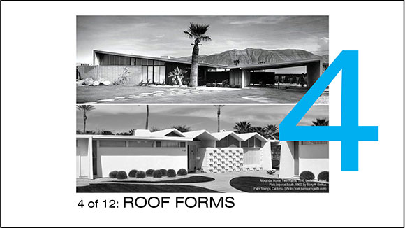
top: Alexander Home, Twin Palms, 1955, by William Krisel; bottom: Park Imperial South, 1960, by Barry A. Berkus, Palm Springs, California (photos from palmspringslife.com)Feather River Academy, Yuba City, California (w/ A4E, photo by Gregory Blore)
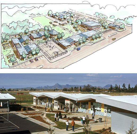
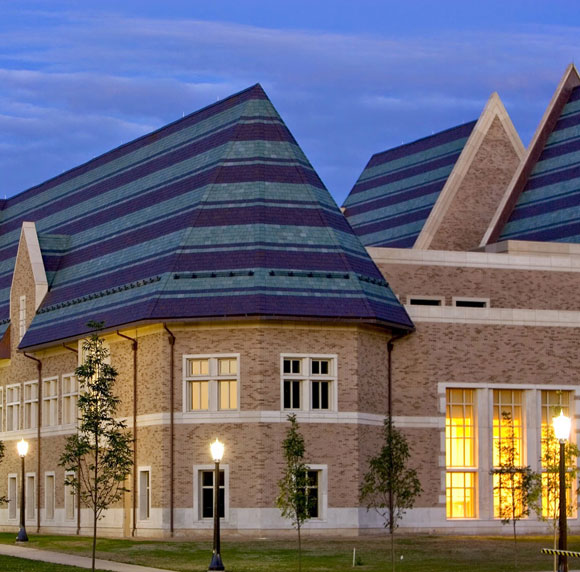
Often called the “butterfly” and “accordion” roof, we used such shapes not as an MCM gesture on a house, but as a unifying theme throughout a high school campus. Our roof lines recall the local mountains and serves as a metaphor for the institution’s mission statement, “Learning in Action.”
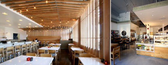
Frey House II, 1964, Palm Springs, California, by Albert Frey (photo from psmuseum.org)top and bottom left: Mendocino Farms 3rd and Fairfax; bottom right: Mendocino Farms Fig at 7th, Los Angeles, California (photos by Poon Design)
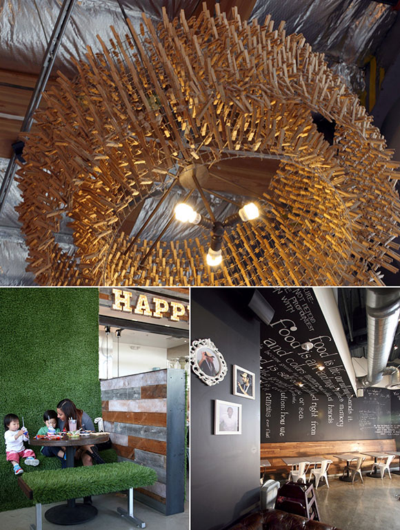
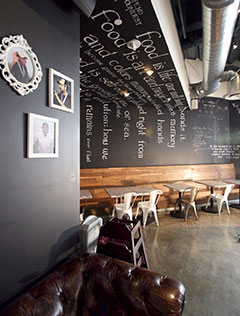
A restaurant can capture the imagination through wit and charm by applying 400 wood clothespins on chicken wire making a chandelier, faux grass expressing a new concept of the American picnic, and a mural-like chalkboard continuous from wall to ceiling.
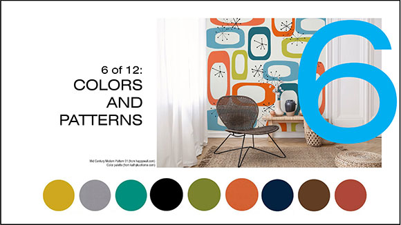
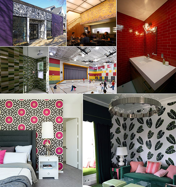
top: Century Modern Pattern 01 (from happywall.com); bottom: color palette (from kathykuohome.com)top left: Vosges Haut-Chocolat Factory and Headquarters, Chicago, Illinois (photo by Anthony Poon); top middle: Joss Cuisine, Beverly Hills, California (photo by Poon Design); top right and second row left: S/B Residence, Encino, California (photo by Poon Design); second row middle: Greenman Elementary School, West Aurora, Illinois (w/ A4E and Cordogan Clark, photo by Mark Ballogg); bottom left: Coral Mountain Residence C, La Quinta, California (w/ Andrew Adler, photo by Lance Gerber); Villa Sunset, Beverly Hills, California (photo by Martin/Poon)
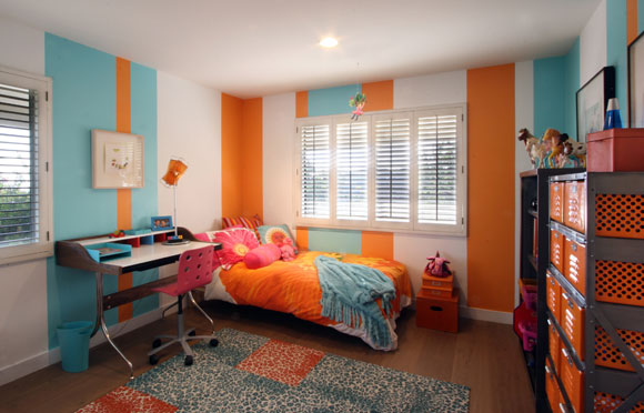
We enjoy the application of color and patterns, but not just as decoration—rather, to add personality to a space, to capture the spirit and character of the owner—whether a purple chocolate factory, red powder room, of multi-colored gymnasium.
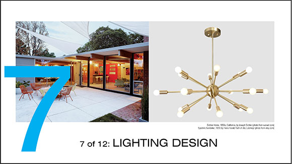
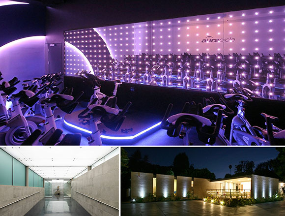
left: Eichler Home, 1950s, California, by Joseph Eichler (photo from sunset.com); right: Sputnik chandelier, 1939, by Hans Harald Rath of J&L Lobmeyr (photo from etsy.com)top: Aura Cycle, West Hollywood, California (photo by Aura Cycle); bottom left: Doheny Plaza, West Hollywood, California (photo by Hunter Kerhart); bottom right: S/B House, Encino, California (photo by Poon Design)
Light can be more than simply a source of illumination. Consider light to be similar to stone, wood, or metal. Meaning, light can also be a building material. Light can be an element to be shaped, harnessed, and applied like a painter applies oils to a canvas.
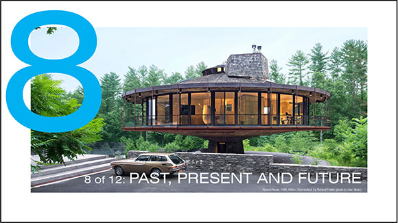
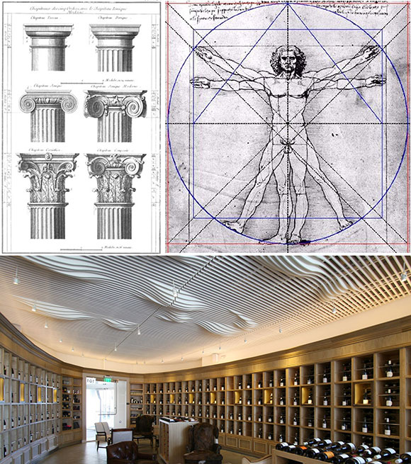
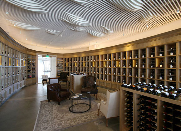
Round House, 1968, Wilton, Connecticut, by Richard Foster (photo by Iwan Baan)bottom: Heritage Fine Wines, Beverly Hills, California (photo by Poon Design)
Having dominated architectural outcomes for centuries, the classical principles of architecture were open to MCM reinterpretation. At this wine store, the cabinetry possesses a traditional look with its cornice, trim and paneling. Yet, we applied such a traditional look to an elliptically-shaped showroom. Upon entering, the bottles of Bordeaux embrace the visitor.
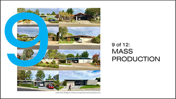
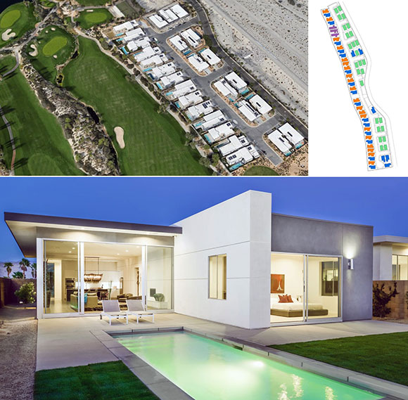
Eichler Homes, Burlingame, California, by Joseph Eichler (photos by Anthony Poon)top: Alta Verde Escena, Palm Springs, California (photo from earth.google.com); bottom: Residence I-3, Palm Springs, California (w/ Andrew Adler, photo by Chris Miller)
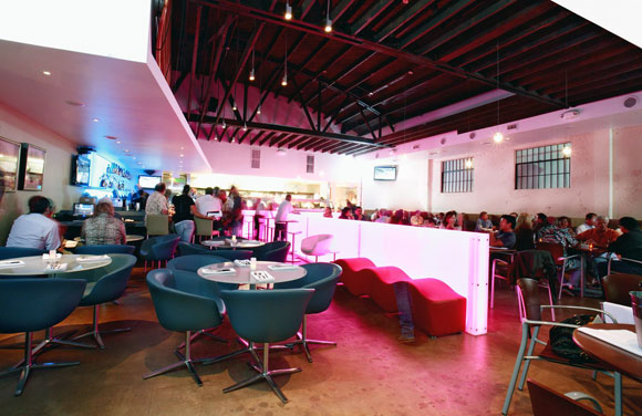
As the Case Study Housing program attempted, Poon Design also sought to provide attainable, budget-driven, mass produced homes. Building and selling 230 contemporary homes in four new Palm Springs communities has earned us the highest national honor from the American Institute of Architects, the 2018 Best in Housing, alongside dozens of other regional and national awards.
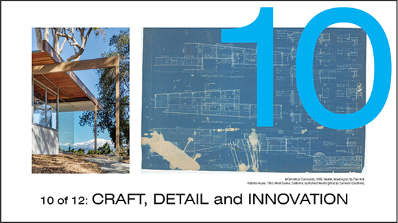
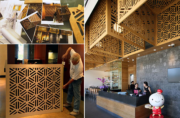
left: MCM Hilltop Community, 1950, Seattle, Washington, by Paul Kirk; right: Roberts House, 1955, West Covina, California, by Richard Neutra (photo by Cameron Carothers)Din Tai Fung, Costa Mesa, California (photos by Poon Design)??? Glendale, California (photos by Poon Design and Gregg Segal)
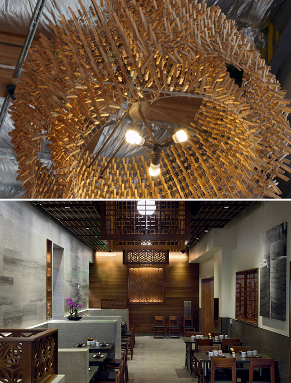
New tools and technology allowed us to exploit MCM’s drive for a high sense of craft. Giant lampshades at the famed Din Tai Fung restaurant reinterpret historic Chinese screens. Through computer scripted patterns alongside milling techniques of oak plywood, we created lampshades and skylights that are works of sculpture, expressing a devotion to detail and innovation.
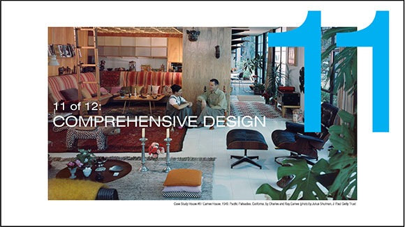
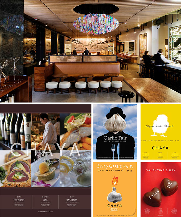
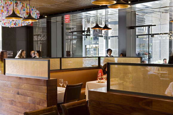
Case Study House #8 / Eames House, 1949, Pacific Palisades, California, by Charles and Ray Eames (photo by Julius Shulman, J. Paul Getty Trust)top: Chaya Downtown, Los Angeles, California (photo by Gregg Segal); graphic design for Chaya (by Poon Design)
MCM architects sought to provide design services combining three prominent strains: architecture, interiors and landscape. For our Chaya Downtown restaurant, we went further to deliver a cohesively designed environment. We created the branding, website, and graphics. We also designed furniture and lighting, as well as curated the art. We continued our pursuits to include the employee uniforms and even the selection of music. Music too is an element of architecture. What is heard during the morning hours of coffee is different than the business lunches—different than festive happy hour, different than an elegant dinner, and different than late night cocktails.
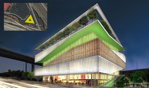
Case Study House #22 / Stahl House, 1960, Los Angeles, California, by Pierre Koenig (photo by Julius Shulman / J. Paul Getty Trust)The Point Lifestyle Center, Irvine, California
We continue the optimism of MCM at larger scales and more ambitious programs than housing. For this lifestyle center serving the Asian community, the first floor comprises an Asian fish market, the second is a Korean spa, the third a Japanese karaoke bar, and the fourth a Chinese rooftop garden restaurant.
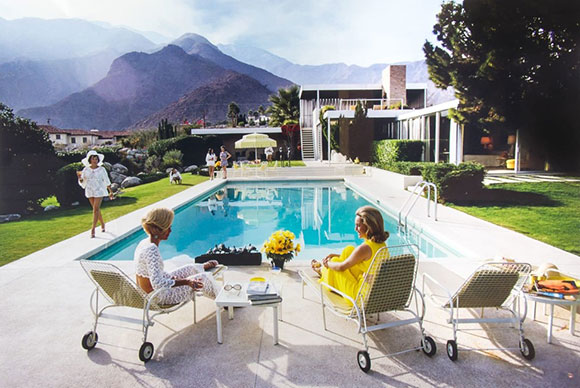
Kaufmann House, 1946, Palm Springs, California, by Richard Neutra (photo by Slim Aarons)
The design concepts of Mid-Century Modernism endure, because they are timeless and universal. The challenge is to look to MCM concepts as a platform to launch into the future—as inspiration not as nostalgia, for interpretation not replication.
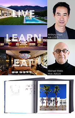
#134: LIVE LEARN EAT – INTERVIEW | PART 2 OF 2: RESTAURANTS BY POON DESIGN INC.
April 30, 2021
A wall of honed sandstone at Din Tai Fung, South Coast Plaza, Costa Mesa (photo by Gregg Segal)
(The complete Zoom interview is here, and part 1 on school design is here. The book, Live Learn Eat, is available at Amazon and your local retailers. Excerpts below.)
Michael Webb: Let’s finally get to restaurants. You’ve designed more than 50 varied examples, working on both generous and frugal budgets. Like schools, restaurants have to accommodate all their uses in the kitchen and dining area, and in between. How do you choreograph those movements?
Anthony Poon: That’s a good word, Michael, choreography.
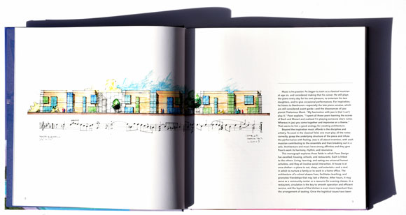
Architect Anthony Poon and author Michael Webb on Zoom; lower image: pages of Live Learn Eat, displaying Linea Residence G, Palm Springs, California (photo by Mark Ballogg)
All of us who go to restaurants spend time in the dining room, at the bar, or the outdoor patio. Behind the walls is a tremendous amount of activity. Roughly 50% of a floor plan goes to the back of house. It’s like a theater where one sees the play—sees what’s presented to them at the front of the stage—but they are not explicitly aware of all the activity going on behind stage, all the people running around. In the case of restaurants, there’s dozens of people in the kitchen with 30 cooktops, waiters dashing around, dishwashers, circulation moving everywhere—all while trying to present the most elegant dining experience for the user.
We choreograph all this—like a football coach with his green board, drawing X’s and O’s in chalkboard lines—to understand how a waiter needs to move from spot A to spot B, and not conflict with diners coming in for their nice anniversary dinner. There’s quite a lot of planning before we even get to choosing, for example, light fixtures and materials.
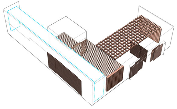
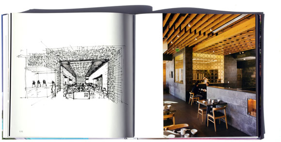
Concept diagram for Din Tai Fung, Americana at Brand, Glendale, California
Michael: A lot of this is both physical, but also intangible. Restaurants define themselves by their cuisine, their service, and the atmosphere, the feel of the place, the acoustics, the way that everybody dresses. There are places that are super casual, others that are more formal. How do you bring all those things together in a seamless whole?
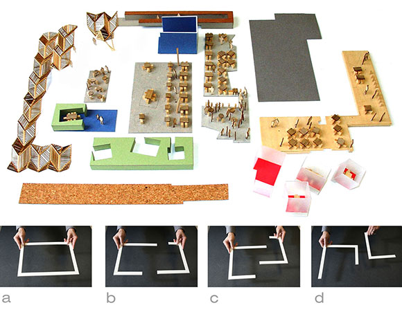
Kit-o-parts model for Chaya Downtown, Los Angeles, California (photo by Poon Design)
Anthony: We offer to our restaurants what we call comprehensive design. It starts with looking at the type of cuisine and the service model. It might be the handcrafted sandwiches of our client, Mendocino Farms. It could be the world famous dumplings of the Chinese restaurant, Din Tai Fung. We look to how their ideas can be represented in the architecture, but space-making goes far beyond architecture. For a lot of our restaurant clients, we have designed the architecture and the interior design, of course, but also bring in landscape ideas and lighting design. Also, we custom design furniture, and handle graphic design, the branding, website, and for some clients, even evaluate their uniform design.
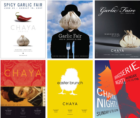
Graphic design for the Chaya restaurants, by Sue and Danny Yee with Poon Design
And then comes the music. Architecture is more than the experience you feel as you walk into a restaurant. As a musician, I believe that music is part of that architecture. I don’t know how many times I’ve been in a restaurant and the general manager has plopped in his iPod, and it’s just playing his playlist, a selection of music irrelevant to the style and flavor of the dining room.
At Poon Design, we feel that music should support the ideas of the chef. It’s the same way that some might say, “Let’s look at the way sunlight moves through the day, through the windows, through the restaurant.” We ask the same thing. What kind of music should be playing at lunchtime when the professionals arrive? At happy hour when everyone’s celebrating the end of an exhausting workday? What’s the appropriate music for fine dining? As a crowd winds down for late night drinks or dessert, what’s the kind of music for that? We think of music the same way we think of lighting design, the same way we pick the fabric for a banquette, or the wood stain for the tabletops. It’s all a comprehensive, integrated experience.
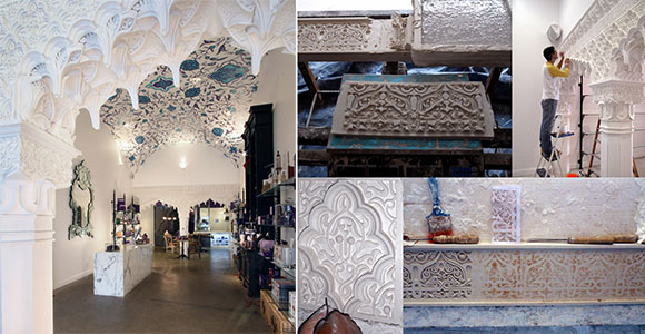
Artisanal plaster arches made by hand in Marrakesh, Morocco, and installed at Vosges Haut-Chocolat, Beverly Hills, California (photos by Poon Design and Marrakesh Designs Ltd.)
Just one last aspect, Michael, you’ve mentioned the acoustics. That plays into the quality of experience as well. I’m sure many of you have been to restaurants where you sit three feet from your friends, and you can barely hear their voices, because there’s such a loud ringing in the restaurant. Finally, you leave the restaurant after 90 minutes realizing your throat is sore from having yelled so much, and your ears are ringing from all the reverberation.
Sushi Noguchi, Yorba Linda, California (photo by Poon Design)
Part of the quality of the restaurant architecture is not just what it looks like but what it feels like—to all the senses. For music, that’s the ears. But we have to also bring our technical experience with acoustic engineering to control the sound, give a wonderful environment that is not just visual, but that is physical, that is aural.
Michael: I’d been told that restaurants actually welcome noise, because people drink more and eat faster, and therefore, the turnover and the profit is greater—that there is actually a kind of country movement against quiet acoustics of the kind that existed when there were carpets, upholstery, curtains, and all the old-fashioned things that we remember from long ago in restaurants. Now it’s all hard reverberant surfaces.
Anthony: All of our restaurants clients want their spaces to have a certain buzz—a kind of energy sounding through the room. No one wants to walk in and feel like it’s the university library where it’s too quiet. People go to restaurants for social contact, to be amongst a community of people, similarly to the difference between watching a movie at home on Netflix vs. going to a theater with a large group. There are people you might not even know, but that’s a certain valuable social experience.
Elliptical wine room with shaped slatted ceiling at Heritage Fine Wines, Beverly Hills, California (photo by Anthony Poon)
Most restaurants will want music playing with a certain hum of sound, but it’s about controlling that, like playing the restaurant as if it’s an instrument. Like a musician, you tune it to the right feel. Some restaurants want a certain hyper energy during happy hour, where there’s loud music and a pulse. Other restaurants want that elegant, fine dining experience.
We start by looking to the restaurateur and asking them, what is your experience? Then we tune it to what they want as an identity, an acoustic identity. Just as a quick lesson, we explain to our clients what we call the ABC of acoustic design. A meaning absorb, B meaning block, and C meaning cover.
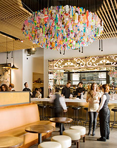
Chandelier of 1,500 recycled plastic toys and collectibles by a collaboration of Stuart Haygarth and Poon Design, Venetian-influenced mirror décor, and custom furniture, at Chaya Downtown, Los Angeles, California (photo by Gregg Segal)
We choose materials to absorbwhat we want to absorb. You mentioned carpet. That’s a great material, but of course, very hard to maintain. There are so many other materials that could be used to absorb sound.
Block is about blocking out the sound no one wants to hear. No one wants to hear noises from the kitchen and washing dishes. So we want to block that as well as other back of house sounds—the restrooms, or the cars outside.
Coveris thinking about what sounds you want to cover and what you want to let in. If you’re on an outside patio on a busy street, you may want to cover the sound of cars honking, but you might want to pick up some of the energy of the city. You can cover unwanted noise with music. You can cover that with a fountain.
Michael: One of your star clients in Southern California was Din Tai Fung, who you mentioned earlier. The global chain that moved from its original place in Taiwan. Why do people line up for hours to get in? And what do they expect when they get in?
Entry with a restoration of a mid-century structure at Din Tai Fung, South Coast Plaza, Costa Mesa (photo by Gregg Segal)
Anthony: People have waited several hours, even as much as five hours in the San Francisco location to get in. Visitors are expecting a lot, not just from the quality of the food, but also the experience, the service, and of course, the interior design and architecture. We’re proud to be the architect for the restaurant institution that the New York Times have named “one of the top 10 restaurants in the world.”
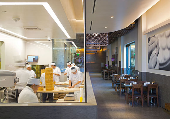
Design-wise, there were two main themes. The first: Din Tai Fung is famous for their dumplings, of which every day, they hand-make roughly between 50,000 to 100,000 dumplings per location. Folded carefully by hand, each fold represents a different artistic style and what the content is within the dumpling, releasing flavors and aromas as it goes into your mouth. We featured the dumpling-making as a theatrical element. As you enter, there is a large glass exhibition kitchen that presents all the dumpling makers as they’re making dumpling one by one, by hand. And the entire restaurant centers around this one activity, this one architectural feature. People come, even people not dining, just to sit there and watch this artistry in real time.
Dumpling exhibition kitchen at Din Tai Fung, South Coast Plaza, Costa Mesa (photo by Gregg Segal)
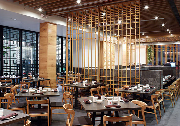
The second design aspect was this: Din Tai Fung is a traditional Chinese restaurant with cuisine and ideas from quite a legacy of family recipes. But this restaurant did not, in our minds, want to be a Chinese theme park, not a Chinese Disneyland. The clients were not interested in golden dragons, red silk cloths, phoenixes, and Chinese calligraphy. So we reinterpreted the legacy, both in aesthetics and in technique.
For example, we studied the traditional Asian, wood, privacy screens. Then we re-envisioned the traditional patterns, modernized them, and gave it a contemporary graphic feel. We took sheets of walnut plywood and water-jet cut our patterns, a new technique, or laser cut metal plates, then powder coated a finish. It’s a way of blending new construction techniques with traditional ideas, respecting Asian heritage and history, but also looking to the future.
Din Tai Fung, Americana at Brand, Glendale, California (photo by Gregg Segal)
Michael: Din Tai Fung can afford to do it in a very sophisticated way, but a lot of restaurateurs are working on a shoestring, and don’t want to burden themselves with a huge overhead before they proved themselves. Even some of the most important restaurants in L.A. has started in a very modest way. And when your clients have a tight budget, how do you make the best use of that?
Internally LED-lit walls of 3-form acrylic panels at Memphis, Manhattan Beach, California (photo by Sean Rosenthal)
Anthony: Most of our restaurant clients aren’t the big famous Michelin-rated ones. A a number of our clients have been small businesses—even a first restaurant cobbling together through family and friends, their first budget to launch a restaurant. We have to respect that, to know there are limits, and pick our design battles. We decide where best to spend money, being thoughtful and efficient in using dollars.
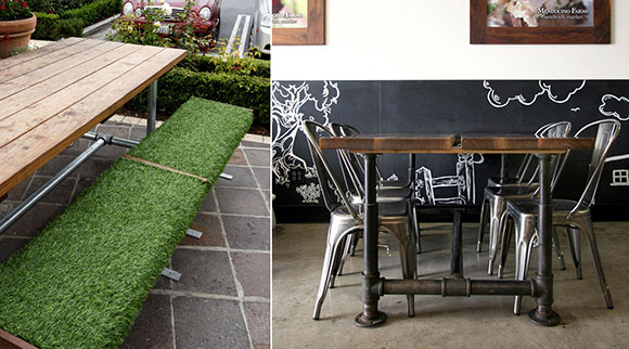
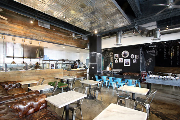
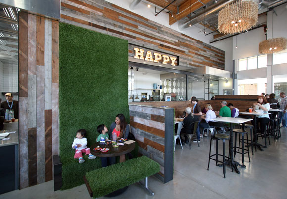
Custom furniture: outdoor benches wrapped in artificial grass and dining tables with adjustable legs made from plumbing parts, at Mendocino Farms, Marina del Rey, California (photos by Poon Design)Chalk art at Mendocino Farms, FIGat7th, Los Angeles, California (photos by Poon Design)
It also has to do with the conceptual approach. Mendocino Farms was one of our clients of which we’ve done one then several of their restaurants. We achieved a wonderful aesthetic through their interests in hand-crafted sandwiches within a kind of gastropub feel.
That gave us the opportunity to explore materials in a new way, to use industrial components, or maybe building materials right off the shelf. For example, plumbing parts were used to make the legs of a tabletop that looks cool and also adjustable in height. Or chalkboard paint on the walls with large chalk murals.
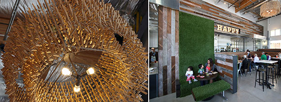
For the location near the Grove, each chandelier was made of chicken wire with 400 wooden clothes pins attached. It created a beautiful lighting effect, affordable too, and captures the aesthetic of that restaurant.
Chandelier at Mendocino Farms, 3rd and Fairfax, Los Angeles, California (photos by Poon Design)Gold Rush, 18″ x 24″, November 2018
Michael: We’ve discussed the three themes of the monograph—homes, schools, and restaurants—but you have many other talents. You’re a classically trained pianist, an accomplished artist, published author, and your eight-person firm has tackled many other commissions from sacred spaces, to graphics, furniture and lighting design. How have you been able to achieve so much with such modest resources?
Anthony: I like to think of the metaphor of the jazz ensemble or maybe the small orchestra. We’re all highly trained and intelligent designers. We bring different unique talents, whether it’s interior design, lighting design, or construction expertise, maybe a graphics person. Everyone at Poon Design has multiple interests outside of the architecture field too, from photography to writing to studying history. We even had a literal rocket scientist on our staff for five years, who studied architecture at UCLA.
Cover and pages of Life Learn Eat, displaying WV Mixed-Use Project, Manhattan Beach, California (photo by Gregg Segal) Book published by ORO Editions.
We assemble together all these talents and work organically. Our studio is a collaboration of everyone putting ideas together, bouncing off each other—similar to some of the ideas that jazz music represents, such as improvisation and spontaneity. I think it’s that kind of freedom and thinking that allows a smaller team to set forth some pretty big ideas.
Michael: What are your ambitions for the next decade, once we’re through the pandemic?
Anthony: We’re hoping to continue our design ambitions on a larger scale. We already work on projects from schools to restaurants, sacred structures, churches, mixed-use, and cultural projects. And it’s all for a sense of community, neighborhood, equality, and equity. We will continue what we do, but for a broader civic audience, and touch as many people as we can, as many participants of the public that want to engage good architecture and design.
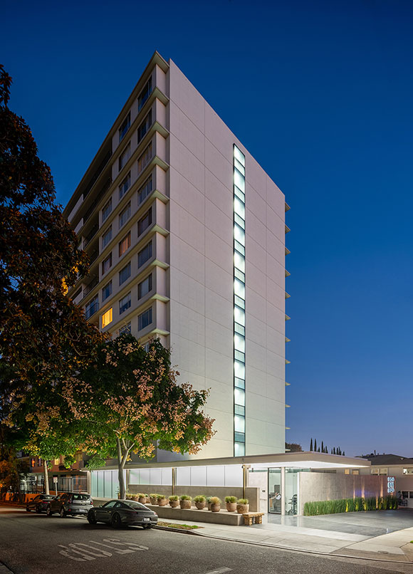
Doheny Plaza, West Hollywood, California, by Poon Design (photo by Hunter Kerhart)
#121: LIVE LEARN EAT: A NEW BOOK ON THE WORK OF POON DESIGN INC.
July 24, 2020
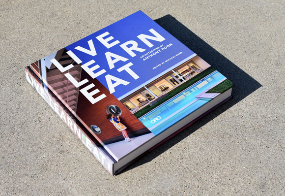
Edited by Michael Webb and internationally published by ORO Editions
So many books with so many beautiful photos of architecture; so many coffee-table books of extraordinary designs, heroic forms, and exquisite details. When approached about creating a book on our work, I hesitated. I did not want to propose yet another catalog of glossy pictures. If I were to offer a monograph (as this type of book is often called) to a broad audience of design enthusiasts, I wanted this book to tell a story, to display our creative journey and hopefully prove a thesis or two.
WV Mixed-Use Project, Manhattan Beach (photo by Gregg Segal)Linea Modern, Palm Springs, California (photo by James Butchart)
Spearheaded and edited by acclaimed architectural critic, Michael Webb, and entitled Live Learn Eat: Architecture by Anthony Poon, the “triple-threat” publication features our work in three areas: homes, schools, and restaurants. With all three, we not only strive to make our architecture handsome and striking, but we also communicate ideas, expressing everything from our culture and the community we live in, to the specific needs of each client. We call this content; each and every client of ours has ambitions for their existence, memories of past successes, and lessons learned. This is the basis for our design process.
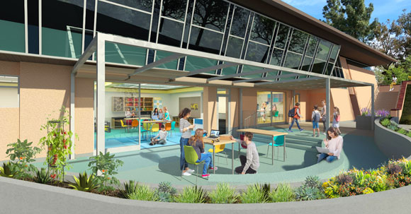
Greenman Elementary School, School District 129, Aurora, Illinois (drawing by Anthony Poon w/ A4E)STEM lab, under construction, Berkeley Hall School, Los Angeles, California
I enjoy looking at how ideas are conceived. How did the architect get here? What are the hundred steps, missteps, and side steps—from the very first sketch on the back of a napkin to the finished project? A monograph should dedicate some of the graphic real estate of the pages to the journey, showing the roses that are noticed along the path, as well as the thorns.
Din Tai Fung, The Americana at Brand, Glendale, California (sketch by Anthony Poon, photo by Gregg Segal)Mendocino Farms, Fig at 7th, Los Angeles, California (photo by Poon Design)
For a recent podcast, the interviewer asked me, “Of your various activities, what creative pursuit do you like best?” Akin to the challenges of identifying one’s favorite rock band or flavor of ice cream, there is no reasonable answer. Do I like playing a Brahms Intermezzo more than writing a position article on the design industry? Do I enjoy working on a large mixed-media art piece more than designing a Buddhist temple? I don’t see any such exercises as separate, or, in any way, independent from each other. Artistic endeavors are not discrete. All my investigations, experiments, tests, and failures fall under the shelter of a single umbrella, a simultaneous effort—that of a creative voyage with no starting point, and, excitingly, no end in sight.
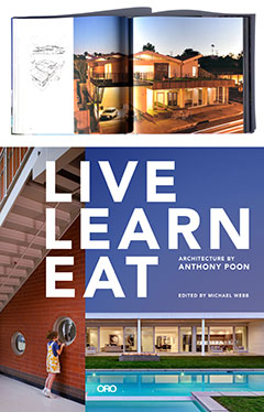
226 pages, 9 1/2″ by 9 1/2″, hard cover, fully illustrated
Internationally published by ORO Editions. Receive a 20% discount when ordering directly from the publisher through August. This book is also available now on Amazon and your local retailers.
Stay tuned for our next two books. One is the second volume, Work Shop Pray. This monograph will feature our designs for offices and work places, retail projects, and sacred structures. For the other book, I have authored an architectural novel. Taking place in present day San Francisco, architects are being murdered as they compete for a new museum at the infamous Alcatraz Island. The 350-page tale of murder and intrigue examines ego and arrogance within the creative process
#81: TEN THOUGHTS, TEN MINUTES
April 13, 2018
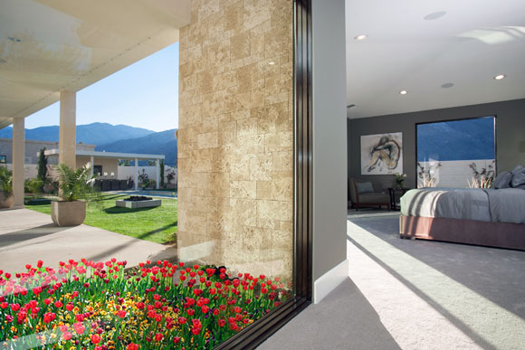
Beams of desert sun breaking between the mountains, entering the master bedroom suite. Modern Villa, Monte Sereno, Palm Springs, California, by Poon Design (photo by Lance Gerber)
Take ten minutes and get ten thoughts for your design project.
Besides architecture, these ten thoughts can apply to many other pursuits, from graphic design to gardening, from composing music to creating life itself. (All designs by Anthony Poon and/or Poon Design Inc.)
1. LIGHT
An entry hall welcomes the morning light. Residence G, Linea, Palm Springs, California, by Poon Design (photo by The Agency)
Luminosity, natural or artificial, places a static environment into motion.
2. PATTERN
Color bands of brick and concrete on the walls, with color bands of slate on the roof. DeBartolo Performing Arts Center, University of Notre Dame, Indiana, by Anthony Poon (w/ HHPA, photo by HHPA)
Give your surroundings pace and tempo. Rhythm isn’t just for music.
3. COLOR
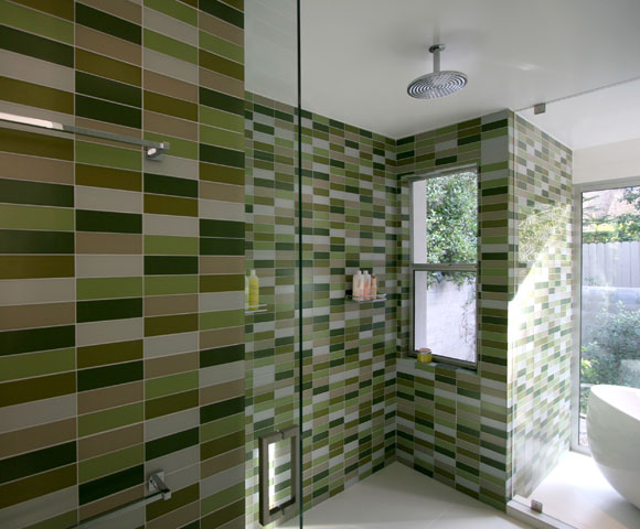
Shower tile: four shades of green glass tiles by Ann Sacks. S/B House, Encino, California, by Poon Design (photo by Poon Design)
Colors make surfaces recede or stand out. At turns, colors soothe and enliven.
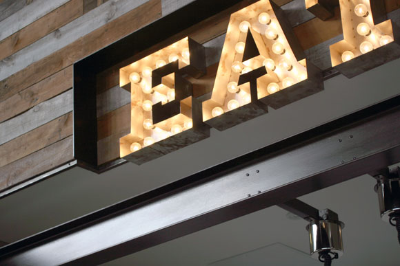
4. CRAFT
Vaudeville signage and reclaimed wood planks, with blackened custom steel details. Mendocino Farms, Los Angeles, California, by Poon Design (photo by Poon Design)
A thoughtful, well-constructed project will last a lifetime, and even change in meaning over time.
5. TEXTURE
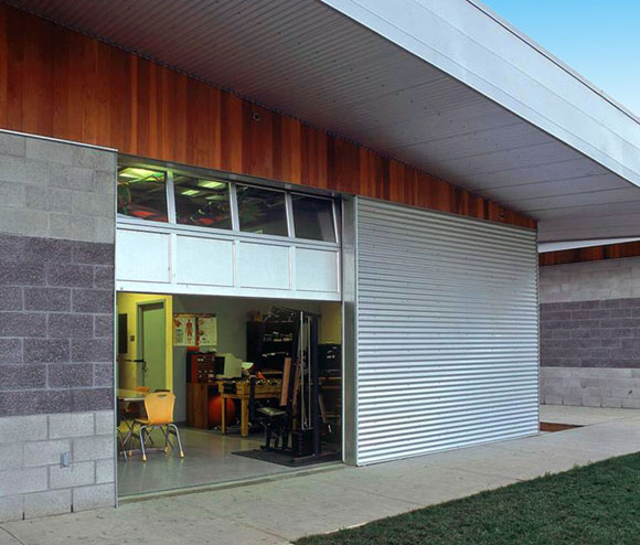
Textures of ground face and split face concrete block, vertical redwood siding and corrugated galvanized metal siding. Special Education classroom, Feather River Academy, Yuba City, California, by Anthony Poon (w/ A4E, photo by Gregory Blore)
Texture gives the body something to touch and the eye something to eat.
6. SURPRISE
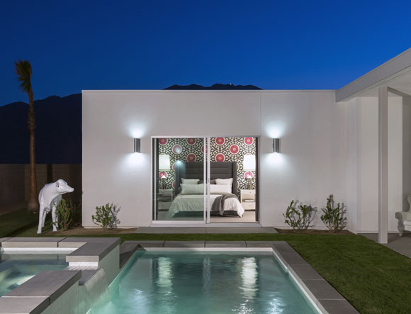
A cow makes a surprising appearance, as well as vibrant wallcovering within. Arcadia Residence, Escena, Palm Springs, California, by Poon Design (photo by Lance Gerber)
Unexpected moments deliver flair and amazement. Predictable architecture is boring.
7. SCALE
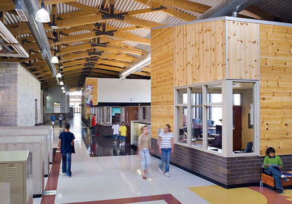
A mix of scales: small classrooms within a big atrium. Herget Middle School, West Aurora, Illinois, by Anthony Poon (w/ A4E, photo by Mark Ballogg)
Grand scale is heroic. Small scale is intimate. Choose the appropriate scale for the activity in mind.
8. HUMOR
Two unlikely bright colors make up a stimulating composition. Roberto Lane, Bel Air, California, by Poon Design (photo by Anthony Poon)
Why can’t architecture have wit, irony and charm? It should.
9. COURAGE
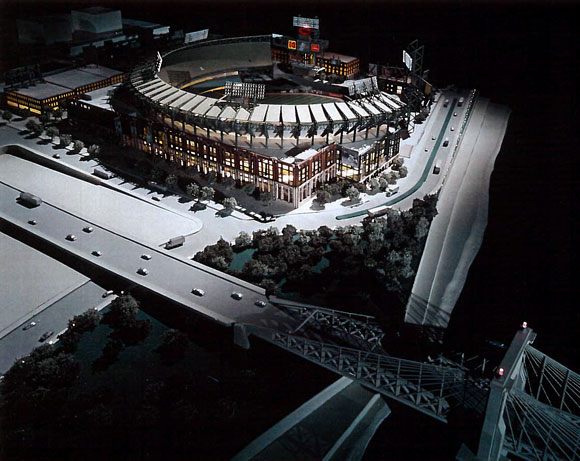
Gateway to the city. Proposed new Reds Baseball Stadium, Cincinnati, Ohio, by Anthony Poon (w/ NBBJ, photo by John Lodge)
Chase your dreams. Don’t be timid. And it might take some guts and perseverance to get results.
10. PLEASURE
Private dining areas as glowing lanterns. Chaya Downtown, Los Angeles, California, by Poon Design (rendering by Biolinia)
Good design should challenge you and please you. Architecture might test you, but know that delight and satisfaction are close.
#29: MY EARS ARE RINGING
February 19, 2016
Blue Cow Kitchen & Bar, Los Angeles, California, by Mass, renovated by Poon Design (photo by Alen Lin)
Okay, I won’t name names, but the guilty comprise many restaurants in Los Angeles and other cities. At these establishments, yes, I enjoy the food, the service and the architecture. But why can’t I hear my friends who sit across from me? Why is the noise level actually painful—my ears ringing from the haranguing clamor, and my throat sore from yelling mere table conversation?
I came across the post, How to Choose A Restaurant When You have Heraing Loss, from leading hearing health advocate Shari Eberts, on her blog, Living With Hearing Loss. In her post, she describes the challenges that those with hearing loss can have when dining out and provides suggestions for how to best navigate a restaurant environment.
While I complain about poorly designed acoustic environments, I can only imagine the overwhelming negative impact on restaurant customers with any degree of hearing loss.
Acoustical panels made from compressed recycled wood fibers painted red by Tectum, with cork wall panels, Saffron, Beverly Hills, California, by Poon Design
The irresponsibility is embarrassing. Most restaurateurs, architects and interior designers/decorators seem to be okay focusing only on the visual and ignoring the aural. Meaning, focusing only on what you see and ignoring how you hear. Listen, it is as if a lazy chef separated your taste buds from yours eyes, suggesting that your entrée doesn’t have to taste good, as long as it is looks good.
Recent interests in tuning up the restaurant experience to address the adverse effects of sound, vibration and reverberation are admirable. Though it is questionable to view the topic as a “new design trend.” Would we call safety a new design trend in automotive design?
To create a comprehensive design, don’t just select stylish furniture, nice art and an agreeable palette of paint colors. The notes below are only a start, but should guide everyone from chefs to managers to designers in achieving quality aural architecture.
ONE
Parallel surfaces can bounce the clatter of noise everywhere, even increasing it at times. A few degrees of shift or angle to any surface dissipate the echo. This can be done ambitiously with walls or easily with the placement of a wine display case or host stand.
Angled porcelain tile dividers at 8 Fish, Los Angeles, California, by Poon Design
TWO
Adding soft surfaces like upholstered furniture and wall coverings are givens. Think about attaching sound absorbing fabric to the underside of dining tables. As sound bounces from the floor up towards customers’ ears, the fabric reduces the impact. Absorbing material and industry acoustic panels can be hidden in dozens of places. You don’t have to install an acoustic tile ceiling, which makes your restaurant look like a corporate office.
Acoustic insulation laid out of sight, on top of the lid over the bar (left side) at Memphis Café, Manhattan Beach, California, by Poon Design (photo by Within A Dream)
THREE
I like “transparent ceilings.” Besides delivering the impression of a taller space, this approach produces one of the best acoustic solutions. As noise travels up, it is trapped by acoustic insulation. Another ceiling idea: varying heights prevent lingering echo, which also offers a diversity of scale.
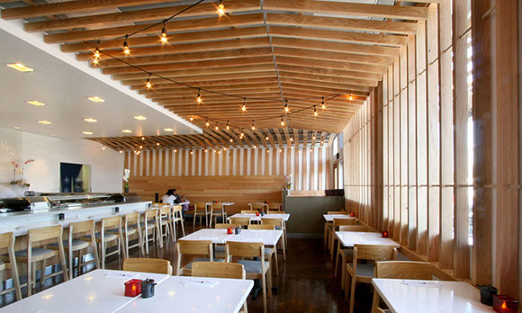
left: Hickory slat ceiling at Sushi Noguchi, Yorba Linda, California; right: A lowered ceiling at Deluca’s Italian Deli, The Americana at Brand, Glendale, both by Poon Design
FOUR
Ms. Eberts is correct about “Sound Absorbing Décor.” Almost anything can be engineered to diffuse sound travel, such as large painted canvases, ceiling sculpture, metal screens, wood lattices, or even light fixtures. Or, surprise a visitor with artificial grass used on a vertical surface, or a tree on the inside.
top left: Water jet cut, weathered steel screens in an interpretive Chinese pattern at Joss Cuisine, Beverly Hills, California; top right: Moveable white oak screens at Din Tai Fung, The Americana at Brand, Glendale (photo by Gregg Segal); bottom left: Mendocino Farms, Marina del Rey (winner of 2011 International Design Award for Best Restaurant from The American Institute of Architects) and West Hollywood, California, all by Poon Design
FIVE
Restaurants are embracing modern design, but that doesn’t have to mean hard cold surfaces. Balance a concrete floor with walnut planks and brass mesh. Sleek surfaces are easy to keep clean, but juxtapose that polished stone countertop with a leather elbow rest.
Dividers at Chaya Downtown, Los Angeles, CA, by Poon Design, winner of 2009 International Design Award for Best Restaurant from The American Institute of Architects (photo by Gregg Segal)
Keep the high ceilings, but bring the intimate scale and noise level down with funky chandeliers.
Top: Each chandelier is made of wire fencing and 1,500 wood clothespins at Mendocino Farms, Los Angeles, California; bottom: Laser cut Walnut plywood lamp shades, Din Tai Fung, South Coast Plaza, Costa Mesa, California (photo by Gregg Segal) both projects by Poon Design
CONCLUSION
Include acoustic ideas as part of every design discussion, not as an afterthought or something trivial. Think of your restaurant as an instrument. It needs to be tuned.
#25: THE CURIOUS THING ABOUT STYLE, PART 1 OF 2
December 31, 2015
For this food blogger’s residence in Pasadena, we juxtaposed the technology of parametric algorithms on to polyethylene, the material used to make household cutting boards.
Recently, I was asked by an interviewer, “What is your style?”
This question is often asked, and not just of architects, but creatives of all sorts: fashion, graphics, advertising, cuisine, etc. The media typically aims to capture one’s design philosophy in a sound bite digestible by mainstream readers.
Many interior decorators have a packaged response. I hear words like “eclectic,” “warm and welcoming,” “contemporary yet timeless.” I am not sure what kind of design results from this mash up of clichés.
Architects have a hard time speaking of their style. Hugh Hardy, one of my past employers, argued that once you answer the dreaded question, your critics will constantly be assessing your work to see if you have lived up to your declarations.
What is style after all?
With extensive education, a higher degree and a 250-page graduate school thesis, many architects simply can’t and won’t summarize their creative philosophy in 20 words or less. For some, “style” is a bad word, and it shouldn’t be an elevator pitch.
upper left: Federal National Council’s Parliament Building, Abu Dhabi, United Arab Emiretes by Ehrlich Architects; upper right: McNamara Alumni Center, University of Minnesota, Minneapolis, by Antoine Predock Architect Studio (photo by Bobak Ha’Eri); lower left: Dominus Estate, Yountville, California, by Herzog & de Meuron (photo by Anthony Poon); lower right: The Kennedy Center for the Performing Arts, Washington D.C., by Steven Holl Architects (photo by Lewis J Goetz on Unsplash)
Some colleagues who talk about their architectural style do so with clever labels. Steven Ehrlich, based in Los Angeles, calls his work “Regional Modernism.” New Mexico architect Antoine Predock is a self-described “Cosmic Modernist.” Herzog & de Meuron of Switzerland has been coined, “Elemental Reductivists.” From New York, Steven Holl’s work involves “typology, phenomenology and existentialism.”
For architects such as Frank Gehry, Tadao Ando or Richard Meier, their style has been accused of being formulaic. Many would argue that all their buildings look the same. Is this so bad? Don’t all the Beatles’ songs and Beethoven Sonatas sound similar? (This topic of formula will be discussed in an upcoming blog.)
So now it is my turn to answer the universal question of style. My response should not be trite, but rather complex—but not pretentious.
Louis Armstrong (by WikiImages from Pixabay)
I answered in two parts: Process and Product. My Process is inspired by jazz—the spontaneity and the improvisational spirit. (More another day.)
My Product, meaning the final structure, say a house or school, is driven by juxtaposition. I enjoy combining things together, either comfortably or awkwardly, to see what might arise: the modern and the traditional, the hand crafted and the machine made, the broad strokes and the finicky details, just to name a few.
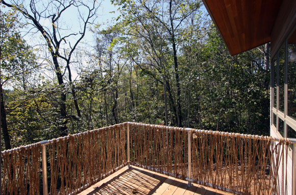
Meditation Retreat House, Blue Ridge Mountains, Virginia, by Poon Design
For a Buddhist meditation retreat in Virginia, Poon Design created a guardrail that juxtaposed a galvanized off-the-shelf steel frame with natural twine made from hemp. Yes, you can smoke it.
Student Center, University of California, Riverside, by Anthony Poon (w/ HHPA, watercolor by Gilbert Gorski)
For the University of California, our student center combined traditional campus brick and limestone, with sleek glass curtain wall and over-scaled weathering zinc shingles.
At Mendocino Farms, we blended a funky old school vibe, such as chalk board walls, vaudeville signage, clothespins, and industrial piping, with high-end luxury, such as Carrara marble, walnut planks, stainless steel trim, and custom furniture.
Mendocino Farms, Los Angeles, California, by Poon Design
Juxtaposition is not just my artistic approach, but the interests in my life as well. I like Brahms and I also like American Idol. I like Rembrandt and Pop Art. I like omakase sushi with a Coke, as well as McDonald’s with sake. I wear Gucci with the Gap. Love Nan Goldin and commercial photography. I read biographies, but also comic books. I like watching ping pong and the Superbowl. Reality shows that follow CNN.
I like the diversity and the messiness. I like unexpected results.