Tag Archives: Minimalism

#208: ZUMTHOR IN PROGRESS AT LACMA

July 4, 2025

(photo by Anthony Poon)

In June, LACMA (Los Angeles County Museum of Art) invited select visitors to marvel at their nearly finished $750 million museum. Of this project by Pritzker-honored, Swiss architect, Peter Zumthor, celebration and applause accompanied uneasiness and doubt.

(photo courtesy of Iwan Baan)

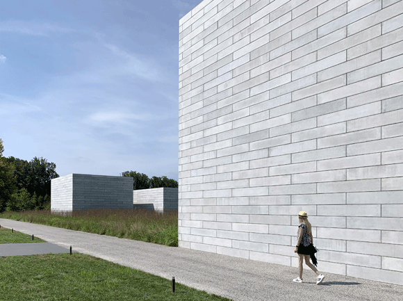
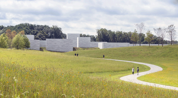
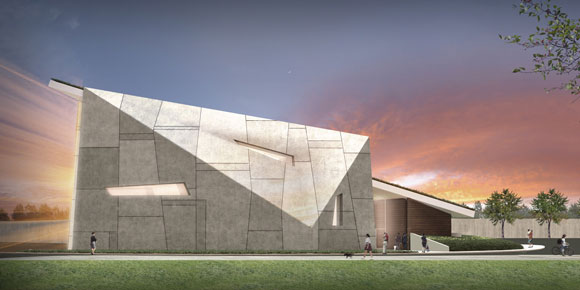
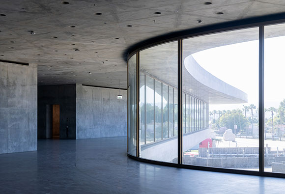
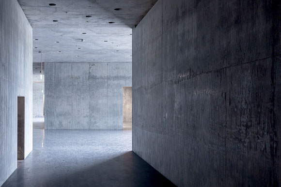
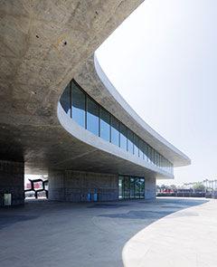
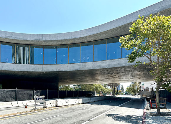
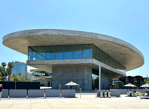
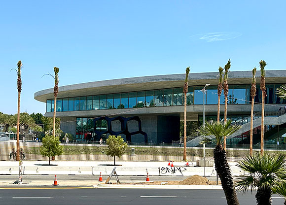
Named the David Geffen Galleries, Zumthor’s new museum exploits minimalism to various extremes. Only two materials—concrete and glass—define the entirety of this 347,500-square-foot structure, of which 110,000 square feet comprise the exhibition area. Contrasting the perimeter of floor-to-ceiling windows set in brass frames, every other surface is concrete—as in concrete walls, concrete floors, concrete roof, concrete ceiling, concrete stairs, and so on.

(photo courtesy of Iwan Baan)

Critics pondered: How do you hang art on concrete walls or from concrete ceilings?

LACMA’s CEO, Michael Govan, defended, “You can just drill right into the walls.” He claimed that with each new exhibit, curators can patch up the holes and drill more where needed. “It’s supposed to be like a good pair of old blue jeans that gets better with time.” Sentiments of patina referenced wabi-sabi. I predict that the future of these concrete surfaces will have some kind of hanging display system, hopefully in matching brass.

(photo courtesy of Iwan Baan)

Critics continued: With so much glass, isn’t sunlight bad for viewing art and the preservation of it? In earlier presentations, Zumthor stated his fascination with horizontal light striking sculptures. Also, light-controlled galleries placed away from the windows will address UV light and radiant heat

(photo courtesy of Iwan Baan)

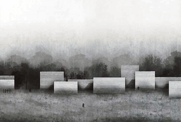
Curiosity revolved around this museum conceived as a massive one-floor, curving form, as compared to a traditional boxy building of multiple floors, hierarchical departments, and chronological galleries.

LACMA responded, “The horizontal, single-level layout eliminates traditional cultural hierarchies, placing all works on the same plane…” Of the “non-hierarchical” architecture, Govan exclaimed democratically, “I don’t want anyone in the front.”

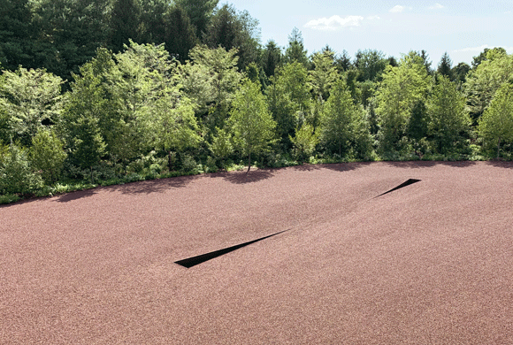
The project’s progress is a milestone in a journey over two decades. It started with an international design competition in 2001, won by Rem Koolhaas with a glass roof design—not convincingly buildable. Zumthor entered the scene in 2009, impressing architects, as he usually does, with ideas of incredible genius. The original design comprised an all-black building supposedly inspired by the amoebic shapes at the nearby La Brea Tar Pits. To accommodate Zumthor’s vision, called by many as “The Blob,” he required the demolition of four major buildings on the museum campus.

(photo by Anthony Poon)

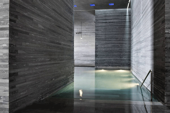
At LACMA, one can see the strengths apparent in Zumthor’s portfolio. His work exudes an authority through elemental minimalism. His architecture edits and curates moves of simplicity and singularity. His uncompromising details may be attributed to his cabinet maker father. Investigating basic materials like concrete, stone, and wood, Zumthor’s structures are sensuously tactile—a palpable spirituality.

But expectations can be so high, maybe too high. There are disappointments here. In 2014, the design was forced, due to budget, to be smaller and in conventional gray concrete, no longer an enigmatic black. The building maintains the heroic minimalism, but loses the elegance and exquisite beauty seen in the architect’s other works. The poetry coming from simplicity still persists, but many of the compromises are severe, particularly for an architect considered to be uncompromising. One of the most unfortunate changes from the original scheme is the straightening of curving floors and windows, seen most impotent under a roof where the bold sweeping edge remains.

(photo by Anthony Poon)

With such concessions, the architect has distanced himself, “saying he had repeatedly been forced to ‘reduce’ his design, and that the experience had convinced him to never again work in the US,” reported The Guardian. Adding insult to injury, several advocacy groups had banned to stop the project. Even alternative designs were proposed pro-bono from many architects.

(photo by Anthony Poon)

LACMA’s new David Geffen Galleries and its 142,000 works of art are targeted to open in spring 2026—and the final judgment is TBD. Stay tuned.

#106: GLENSTONE: A CONVERSATION BETWEEN ART, LANDSCAPE AND ARCHITECTURE

September 13, 2019

The “Pavilions” forming the “Water Court” (photo by Anthony Poon)

To call Glenstone a mere museum is to misrepresent the power of how a visitor can experience art. The museum’s website posits, “Glenstone is a place that seamlessly integrates art, architecture, and landscape into a serene and contemplative environment.” And boy, it’s successful.

Glenstone blurs the lines between the three mediums. Know this: “Art” is not just a simple framed painting hanging on a gallery wall. At Glenstone, art is a relationship between several forces experienced as an enchanted journey through time and space.

For my soon to be published second book, I scribed, “Do I like playing a Beethoven piano sonata more than writing a position article on the design industry? Do I enjoy working on a large mixed-media art piece more than designing a Buddhist temple? I don’t see any such exercises as separate, or in any way, independent from each other. Artistic endeavors are not discrete. All my investigations, experiments, tests and failures fall under the shelter of a single umbrella, a simultaneous effort—that of a creative voyage with no starting point and excitingly, no end in sight . . . Music, painting, writing, architecture, and so on. For me, it is all one artistic gesture—interconnected, intertwined, inseparable.”

Compression Line, by Michael Heizer,1968/2016 (photo by Anthony Poon)

Over the years, Glenstone’s founders, Emily and Mitchell Rales, billionaire business leader and philanthropist, amassed an incredible private art collection of approximately 1,300 works from the 20th and 21st century: Twombly, Kelly, Heizer, Basquiat, Rothko, Koons, Serra, just to name a few—the Usual (but incredible) Suspects. In Potomac, Maryland, Glenstone opened in 2006 with safe and somewhat predictable Modern buildings by New York architect, Gwathmey Siegel & Associates. The museum’s name is a mash-up of the nearby Glen Road and the indigenous Carderock stone.

Design drawing by Thomas Phifer and Partners

In late 2018, the museum entered the transcendental world stage with architect Thomas Phifer and Partners’ powerful composition of the “Pavilions” and “Water Court,” with landscape collaboratively designed by Peter Walker of Berkeley, California. Glenstone’s 230 acres transformed into a state of mind that balances art, sculpture, installations, design, nature, water, light and all good things. Glenstone challenges one of my favorite places on Earth, the 500-acre Storm King Art Center in Mountainville, New York.

The Therme Vals, Braubunden, Switzerland, by Peter Zumthor (photo from vals.ch)

Akin to the Minimalism of architect Peter Zumthor’s  Therme Vals Spa in Switzerland, Glenstone is dramatic and theatrical, despite its mute Pavilions. A dozen of them, each a single art experience, center around a sunken water garden. Who knew that saying nothing and being silent can say so much?  Here, an engaging and direct conversation occurs when a massive vertical wall of Cardderock stone meets the peaceful horizontal surface of reflecting water, while above is the infinity of a blue sky. Nothing more, nothing less, and yet, so much more.

Massive and poetic vertical surfaces of Carderrock stone-clad “Pavilions” (photo by Anthony Poon)

Even the museum staff are Minimalistic. Accompanying their drab grey cotton garb with pants cropped at the ankles, they each have a small name tag of slim horizontal chrome stainless steel. But the name tags remain blank!

The approach through broad landscape, the “Pavilions” in the distance like an enigmatic modern day Stonehenge (photo from glenstone.org)
Buried in nature, one comes upon the mystery Clay Houses (Boulder-Room-Holes), by Andy Goldsworthy 2007 (photo by Anthony Poon)

The overall result of Glenstone is a must-see, near-religious experience of Modern art, elemental architecture and the pastoral outdoors. Make a reservation; the museum only lets in a limited number of people per day.  And sorry, no photography allowed within the galleries.

#95: BUILDINGS: INTROVERTS VS. EXTROVERTS

January 25, 2019

An introverted mute facade offers quiet contentment. Linea Residence G, Palm Springs, California, by Poon Design. 2018 National Award Winner from The American Institute of Architects.

In 2012, author Susan Cain published Quiet: The Power of Introverts in a World That Can’t Stop Talking. Cain suggested that the world devalues and misreads introverted people. So too for architecture that might be considered introverted.

Thiis elemental house expresses only the bare minimum. Casa Delle Bottere, Veneto, Italy, by John Pawson (photo by Marco Zanta)

Cain states, “Introversion—along with its cousins sensitivity, seriousness, and shyness—is now a second-class personality trait, somewhere between a disappointment and a pathology . . . Extroversion is an enormously appealing personality style, but we’ve turned it into an oppressive standard to which most of us feel we must conform.”

In architecture, an introverted design idea might be confused with making a meek statement. In agreement with Cain, I argue that introversion is a strength. With design driven by introversion and not the “enormously appealing” extroversion, the introverted design result can be powerfully introspective, confidently content and simply genuine. Introversion is not a weakness.

Even in dramatic black, an introverted warehouse sits comfortably in its own skin. Buenos Aires, Argentina, by Moargs (photography by Alvano Garcia)

From the art movement of the 60s and 70s known as Minimalism, the creative output was not ever empty or marginal, as the literal meaning of minimal might suggest. Through the Minimalists’ interests in being spare, expressing only the essentials, the final work was dramatic through its reductive and introverted self.

Architect Mies van der Rohe proclaimed one of history’s most profound sentiments, “Less is more.”  Through simplicity, such a philosophy can deliver the most commanding presence, surpassing the noise of extroverted architecture.

A simple and private residence walls itself from the world, not due to shyness, but for self-examination and contemplation, in Maia, Portugal, by Eduardo Souto de Moura, (photo by Lius Ferreira Alves)

Author Cain on introverts: “They listen more than they talk, think before they speak . . .” In contrast, Cain speaks of extroverts as “risk-taking, assertive, dominant, prefer talking to listening . . .” Brace yourself and see below.

The extroverted rooftop addition does not want to be ignored. Backadrin’s Headquarters, Asten, Austria, by Coop Himmelb(l)au (photo from pathologyandhistology.com)

This extroverted form of architecture is commonly known. Our heroic buildings defy gravity, beautifully express forms reaching to the sky, and grab the attention of magazine covers and blog features. These extroverted structures stand proud and righteous, egotistically even, and are often delivered through the self-assured hands of one of our Starchitects, our celebrity hero personalities.

For marketing and PR, it is easier for an architecture business to pitch extroverted projects than introverted ones—just as a big symphonic performance tends to outsell a concert hall, as compared to an intimate solo cello recital. Extroverted design makes a bold statement, and architects often aim for this, so as to put their name on the map—to plant a flag on the ever competitive landscape of design awards and recognition.

A colorful extroverted palace screams for attention. Palais des Congres, Montreal, Canada, by Hal Ingberg with Tetreault, Dubuc, Saia et Associes (photo from congresmtl.com)

Lastly, what is the appropriate architecture for an introverted individual vs. an extroverted individual? Obvious themes: introverts prefer private offices over the trendy open office space. Meaning, introverts chose areas for focus and reflection vs. the cliché of groupthink and the overrated committee collaboration. In the home, introverts seek out solitude like a reading niche, not the open kitchen and the adjacent high ceiling great room. At the park, the bench under a tree, not the big lawn. One simple conclusion is that introversion is related to the scale of the architecture, not necessarily its size. Meaning,  when appropriate,  a big room can be designed to feel intimate.

A sleek glass and steel office tower stands out boldly from its old brick neighbors. Broadgate Tower, London, England, by Skidmore, Owings and Merrill (photo by Viktor Forgacs on Unsplash)

Director of a non-profit, Christine Fang provides education on mindfulness and meditation, and she observes, “In fact, architecture that supports the inward endeavor is addressing real human needs, helping us all breathe a little easier in this sometimes obsessively outwardly facing world.”

As Susan Cain suggests, the world is made up of 1/3 to 1/2 introverts, and introversion is not inferior to extroversion. Quite the opposite, as she lists ground-breaking introverts, from Steve Wozniak to Dr. Seuss, from Rosa Parks to Chopin—and the many more that have shaped this extroverted world.

#4: …IS IN THE DETAILS

March 30, 2015

2015 Jaguar XF car and toy model (photo by Anthony Poon)

Jaguar, the stylish automotive company, has a new campaign: The Devil is In The Details.

This catch phrase that we often throw around is actually a derivative from an original quote, “God is in the details.” Most people don’t know about the architectural roots of this popular saying. The New York Times credits it to master architect Ludwig Mies van der Rohe (1886-1969), a German-born titan of Modernism who pioneered Minimalism and is ensconced in the profession’s pantheon along with Frank Lloyd Wright and Le Corbusier.

And as if Mies needed any more help securing a place in our lexicon, he is also famously known for another popular quote among architects and the public in general: “Less is More.”

While it may seem that Mies was contradicting himself, he was actually saying the same thing but in different ways. He was urging us to always think of the details, no matter how few, and to be precise and thorough with those details we have and use.

Buddhist Temple in the Blue Ridge Mountains, Virginia, by Poon Design
Buddhist Temple in the Blue Ridge Mountains, Virginia, by Poon Design (photo by Poon Design)

In architecture, work is all about attention to detail. Whether that means finding the perfect shade of white paint or the right kind of metal, design requires that we pay close attention to the small things, because they all add up. How do we balance the quality of light? Should we use polished, honed, rough sawn, or brushed stone? Do the mechanical ducts interfere with the steel beams supporting the roof? Is the emergency exit corridor out of a hotel lobby the right width?

True, in architecture school and in every project we tackle at Poon Design Inc., we must be concerned with the Big Picture, the Concept. For instance, when we designed a chapel for Air Force village in Texas, we explored larger themes, such as reaching for the sky, heroism and the meaning of grandeur. Or, when an architect designs an airport, the standard metaphor is flight, hence wing-like roofs, soaring forms, and structures appear to defy gravity.

Air Force Village Chapel in San Antonio, Texas, by Poon Design, rendering by Mike Amaya
Air Force Village Chapel in San Antonio, Texas, by Poon Design (rendering by Amaya)

Big Picture, yes.

But at the same time, if you are attempting to defy gravity or give the impression that you are, you better have the detailed engineering behind it. This risky feat of structural gymnastics must not fail because of a lack of detailed thinking or else, like the mythical Icarus who overlooked the details of his altitude, you will suffer a catastrophic collapse.

So I believe that both God and the Devil are in the details. Even the few details when less is more.

© Poon Design Inc.