Tag Archives: Mies van der Rohe

#163: THE MOST BREATHTAKING BUILDINGS OF 2022

December 30, 2022

(photo from Adam Mork)

In 2017, I listed my all-time favorites. In 2019, I presented ten projects I called the most seductive. In 2020, the adjective used was most intriguing. In 2021, my essay displayed buildings that were the most striking. For the end of 2022, I highlight what takes my breath away. Defining breath-taking typically involves words such as awe-inspiring, astonishing, wondrous, and even out-of-this-world.

(photo from Adam Mork)

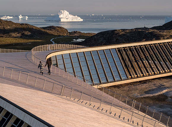
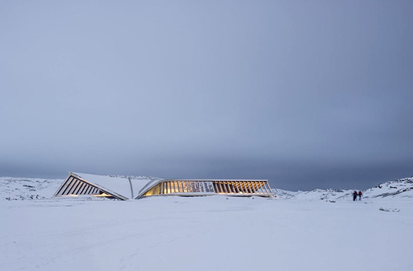
1: The western coast of Greenland offers the Ilulissat Icefjord Centre, both a research center and eloquent sculpture. Focusing on the study of massive glaciers and climate change, Dorte Mandrup’s design expresses the human condition within the science of ice, such as archeological artifacts contained in prisms of glass.

(photo by MVRDV)

2: MVRDV’s “art depot” at the Museumpark, Rotterdam, comprises multiple exhibit halls, a rooftop garden, and restaurant. This Depot Boijmans Van Beuningen takes a behind-the-scenes approach by presenting all current works along with ones usually hidden in storage, both in full display. The architect sees the mirrored exterior as an innovative response to complementing the surroundings.

(photo by Iwan Baan)

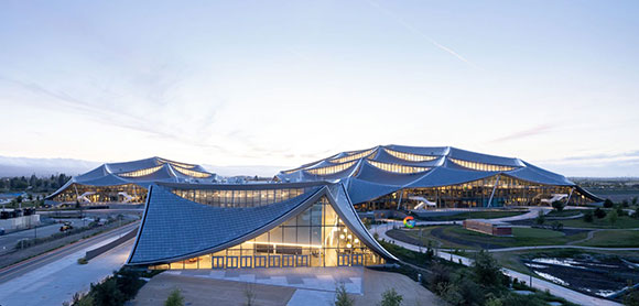
3: Google Bay View aims to operate the 42-acre campus on carbon-free energy by 2030. For Silicon Valley in Mountain View, California, a collaboration between Denmark’s  BIG and England’s Heatherwick Studio created 1.1 million square feet of building, which includes an event center for 1,000, short-term accommodation for 240 employees, 20 acres of open space, and three main buildings covered in lightweight translucent canopy structures.

(photo by Office of Architecture in Barcelona)

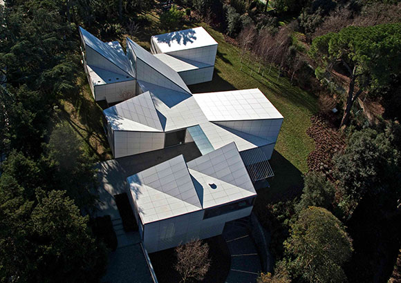
4: The project’s title, Origami House, is apt as this Barcelona house folds, creases, and rises out of the land adjacent to a forest and golf course. Designed by Office of Architecture in Barcelona, the paper white crispness and hidden service facilities (where are the stairs?) delivery a surreal composition, part home, part arts and crafts, and part dreamscape.

(photo by CreatAR Images)

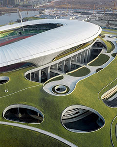
5: MAD Architects conceived the Quzhou Stadium in China as “a piece of land art.” Though with allusions to Bradbury’s science fantasy, this 30,000-seat stadium is no fiction. As an Earthwork, it links the worlds of art installation, landscape design, and architecture, while also straddling the visions of a mad man and artistic genius.

(photo by Leonardo Finotti)

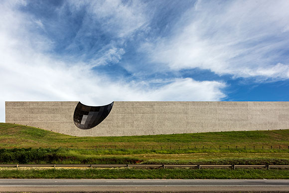
6: Since the 18th century, coffee has been a mainstay of Brazil’s economy. For the city of Carmo de Minas, Gustavo Penna Arquiteto & Associados deliver an iconic headquarters for CarmoCoffees. Introverted and introspective, save for the concave skylight, this warehouse for processing, tasting, and selling coffee explores the colors found in coffee beans.

(photo by Iwan Baan)

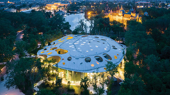
7: Sou Fujimoto reinterprets nature at the Hungarian House of Music in Budapest’s City Park. Inspired by sound waves, the roof structure with its 100 Swiss cheese-like holes is both inspired by nature and “neo-nature.” The connection from inside to outside is exploited though a continuous translucent glass façade, like a candy wrapper.

(photo by W Workspace)

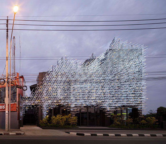
8: Tens of thousands of aluminum pieces make up the high-relief exterior of the Museum of Modern Aluminum. Bangkok possesses a deep history of aluminum production, and he city of Nonthaburi became home to this 4,300-square-foot, prickly composition by HAS Design and Research. Serving as both a public space and urban getaway, the museum is viewed as an extension of the natural landscape offering contemplation on this busy street.

(photo by Atelier FCJZ)

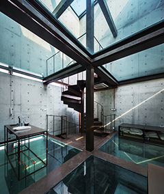
9: Different than the Rohe’s Farnsworth House and Johnson’s Glass house, both using glass in the vertical direction, Yung Ho Chang explores glass in the horizontal direction. Unlike the two renowned precedents which allow views out to the landscape, the Vertical Glass House focuses on viewing up to the sky and down to the earth. Located in Shanghai, China, the residence is poetic and ambitious, though with glass floors, perhaps impractical.

(photo by OMA, Chris Stowers)

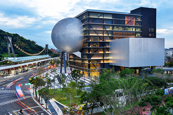
10: OMA often explores new types and forms of architecture. With the Taipei Performing Arts Center in Taiwan, the exploration reveals powerful results if not clumsily beautiful. OMA reversed the typical floor plan where the audience and performance spaces are central within the overall structure. Instead, the technical support spaces are now in the middle, and the audience is dramatically cantilevered on the exterior, hovering over public spaces, greeting the city’s fabric.

(For my recent list of faves in Los Angeles, visit here.)

#149: NO BED OF ROSES, PART 4 OF 4: CHALLENGES OF THE HUMAN CONDITION

March 11, 2022

Luma Arles Tower, Arles, France, by Frank Gehry (photo by Baptiste Buisson on Unsplash)

“Host Jeff Haber shares conversations with interesting people from all walks of life, using a positive, uplifting and funny approach,” from the podcast series, No Bed of Roses, brought to you by Kenxus. Edited excerpts below are from the full podcast of episode #1030. Take a look at part 1, part 2, and part 3.

Jeff Haber: Who’s out there that is inspiring you with what they’re doing? Is there anybody that catches your eye?

Bruder Klaus Field Chapel, Mechernich, Germany, by Peter Zumthor (photo by Lisa Therese on Unsplash)

Anthony Poon: There are a lot of influential people. I mean, Frank Gehry—I don’t know who doesn’t admire his work as an architect, artist, sculptor. Peter Zumthor, who is the architect of the new LACMA, the county museum under construction–he’s a Swiss architect, and everything he does is so poetic, so simple and elemental. One of my professors from Harvard is Rem Koolhaas, a Dutch architect who does amazing things, so creative, how he rethinks what the client wants, whether it’s a corporate headquarters or a house. He delivers a unique solution every time.

But I also look for inspiration in people that aren’t architects, to inspire my architecture. As an example, I love the music of Thelonious Monk. His music is offbeat; it’s sometimes discordant, sometimes rhythmically off. But at the same time, it’s beautiful, improvisational. I listen and ask, “How can that inspire what I’m writing, what I’m painting, or what building I’m designing?”

Album cover for Monk’s Dream

Jeff: Is there a project that you have where you would walk us through and say, “See this section here, I was listening to this for Monk, or this was inspired by something.” Are there pieces of projects that you could directly relate to a piece of music?

Courtyard of Greenman Elementary School, Aurora, Illinois, by Anthony Poon (w/ A4E and Cordogan, Clark & Associates, photo by George Lambros)

Anthony: A lot of times the relationship to music is abstract. It’s more of a conceptual influence. But there is a school that we designed just outside of Chicago in the city of Aurora. It’s an elementary school with a focus on the performing arts. I took a piece of music by Johann Sebastian Bach, one of his piano Partitas, and studied the score and notations. That helped me lay out the window patterns, inspired me to create a play of window shapes and bays projecting off the brick. The building looks very musical as it rolls down the street. Someone who doesn’t see this metaphor, it’s okay. All they might see is a very interesting building. Or someone might say, “I like how the scale has been broken down—less institutional looking and suits the size of the one- and two-story homes across the street.” The result is there, and people can read into what they will. I know from my standpoint, it started with Bach.

Greenman Elementary School and music of J.S. Bach (drawing by Anthony Poon w/ A4E)

Jeff: Is there a space that you have experienced, that has evoked very strong emotion for you? I’ve been into spaces that have moved me to tears.

Barcelona Pavilion, Spain, by Mies van der Rohe (photo by Tomas Val on Unsplash)

Anthony: Yes, I would say, “yes!”—plenty of times through travels and backpacking through Europe, visiting some of the historic churches, museums, and sculpture gardens—just walking into the Pantheon, or some of the chapels in Rome. A specific example, which may not be an obvious one is in Barcelona. There’s a pavilion, often called the Barcelona Pavilion or the German Pavilion, designed by Mies van der Rohe. It’s just this elegant marble, steel and glass composition, not much bigger than a small house, but it’s so perfectly put together. It was groundbreaking in the way it defined space and didn’t define space, the way you didn’t know whether you’re inside or outside. It’s such a pure piece of architecture.

Jeff: This is part of the human condition. We can be reduced to very base human instincts, and design can make us soar. When I worked as an actor, I had a teacher tell me, “You’re a conduit for something much bigger than you.” I don’t know if you feel that there’s a force bigger greater than you that is just channeling through you or not, as the artist that you are. Man, we have that ability to channel that energy. Design can help elevate all of us. Do you feel like you’ve connected with something bigger? Is there something to it? I might just puffing this up, or…?

(photo by Robert Collins on Unsplash)

Anthony: We definitely acknowledge something bigger. Our thinking is that our skills and talents are used to challenge the human spirit. And if it’s a temple, we’re there to enliven the human spirit. If it’s a school, we’re there the counter the children and say, “Is this the best way to socialize and learn?” We’re constantly asking these bigger picture questions because I think whatever skills or talents that I have, they’re to be used, tested, to take risks, and see if they can be offered to challenge the status quo.

BUILDINGS: INTROVERTS VS. EXTROVERTS

January 25, 2019

An introverted mute facade offers quiet contentment. Linea Residence G, Palm Springs, California, by Poon Design. 2018 National Award Winner from The American Institute of Architects.

In 2012, author Susan Cain published Quiet: The Power of Introverts in a World That Can’t Stop Talking. Cain suggested that the world devalues and misreads introverted people. So too for architecture that might be considered introverted.

Even with its rich exterior color, this introverted museum focuses inward. Chinese Academy of Art, Hangzou, China, by Alvaro Siza (photography by Fernando Guerra)

Cain states, “Introversion—along with its cousins sensitivity, seriousness, and shyness—is now a second-class personality trait, somewhere between a disappointment and a pathology . . . Extroversion is an enormously appealing personality style, but we’ve turned it into an oppressive standard to which most of us feel we must conform.”

This elemental house expresses only the bare minimum. Casa Delle Bottere, Veneto, Italy, by John Pawson (photo by Marco Zanta)
Intimate and introspective. Capela Do Monte, Luz, Portugal, by Alvaro Siza (photography by Joao Morgado)

In architecture, an introverted design idea might be confused with making a meek statement. In agreement with Cain, I argue that introversion is a strength. With design driven by introversion and not the “enormously appealing” extroversion, the introverted design result can be powerfully introspective, confidently content and simply genuine. Introversion is not a weakness.

From the art movement of the 60s and 70s known as Minimalism, the creative output was not ever empty or marginal, as the literal meaning of minimal might suggest. Through the Minimalists’ interests in being spare, expressing only the essentials, the final work was dramatic through its reductive and introverted self.

With dramatic black, a discreet but confident warehouse sits comfortably in its own skin. Buenos Aires, Argentina, by Moargs (photography by Alvano Garcia)

Architect Mies van der Rohe proclaimed one of history’s most profound sentiments, “Less is more.”  Through simplicity, such a philosophy can deliver the most commanding presence, surpassing the noise of extroverted architecture.

A simple and private residence walls itself from the world, not due to shyness, but for self-examination and contemplation, in Maia, Portugal, by Eduardo Souto de Moura, (photo by Lius Ferreira Alves)

Author Cain on introverts: “They listen more than they talk, think before they speak . . .” In contrast, Cain speaks of extroverts as “risk-taking, assertive, dominant, prefer talking to listening . . .” Brace yourself and see below.

The extroverted rooftop addition does not want to be ignored. Backadrin’s Headquarters, Asten, Austria, by Coop Himmelb(l)au (photo from pathologyandhistology.com)

This extroverted form of architecture is commonly known. Our heroic buildings defy gravity, beautifully express forms reaching to the sky, and grab the attention of magazine covers and blog features. These extroverted structures stand proud and righteous, egotistically even, and are often delivered through the self-assured hands of one of our Starchitects, our celebrity hero personalities.

A colorful extroverted palace screams for attention. Palais des Congres, Montreal, Canada, by Hal Ingberg with Tetreault, Dubuc, Saia et Associes (photo from congresmtl.com)

For marketing and PR, it is easier for an architecture business to pitch extroverted projects than introverted ones—just as a big symphonic performance tends to outsell a concert hall, as compared to an intimate solo cello recital. Extroverted design makes a bold statement, and architects often aim for this, so as to put their name on the map—to plant a flag on the ever competitive landscape of design awards and recognition.

In stark contrast to its neighbors, the extrovert high rise wants to be noticed from all directions. W57, New York, New York, by BIG (photo from e-architect.co.uk)

Lastly, what is the appropriate architecture for an introverted individual vs. an extroverted individual? Obvious themes: introverts prefer private offices over the trendy open office space. Meaning, introverts chose areas for focus and reflection vs. the cliché of groupthink and the overrated committee collaboration. In the home, introverts seek out solitude like a reading niche, not the open kitchen and the adjacent high ceiling great room. At the park, the bench under a tree, not the big lawn. One simple conclusion is that introversion is related to the scale of the architecture, not necessarily its size. Meaning,  when appropriate,  a big room can be designed to feel intimate.

Director of a non-profit, Christine Fang provides education on mindfulness and meditation, and she observes, “In fact, architecture that supports the inward endeavor is addressing real human needs, helping us all breathe a little easier in this sometimes obsessively outwardly facing world.”

Perhaps this one introverted visitor has found a discreet desk away from the busy central space. Bibliotheque Alexis de Tocqueville, Caen, France, by OMA (photo by Iwan Baan)

As Susan Cain suggests, the world is made up of 1/3 to 1/2 introverts, and introversion is not inferior to extroversion. Quite the opposite, as she lists ground-breaking introverts, from Steve Wozniak to Dr. Seuss, from Rosa Parks to Chopin—and the many more that have shaped this extroverted world.

SYMMETRY AND THE LIKE

August 31, 2018

left: Salk Institute for Biological Studies, La Jolla, California (photo from The Architectural Archives, University of Pennsylvania/John Nicolais); right: Taj Mahal, Agra, India (photo by Getty Images

These images are what we commonly think of as symmetry. What you see on one side is mirrored on the other side. Classical architecture relied on symmetry for powerfully balanced compositions. But for a setting as peacefully symmetrical as the Taj Mahal, I find the architecture more interesting when accompanied by the asymmetry of life.

The symmetry of Taj Mahal is made more interesting with visitors and the asymmetry of life of Agra, India (photo by Getty Images)

The 1929 Barcelona Pavilion, by Mies Van Der Rohe  is hailed as one of the most significant contributions to the Modern architecture movement, with the pavilion’s Minimal walls and lines, blurring inside and outside. This structure is rarely mentioned in the conversations about symmetry. But that is only because we think that symmetry is when the right side is the same as the left side.

From what I learned in graduate school, I argue that symmetry can be such that the top half is the same as the bottom half. Top-and-bottom, not right-and-left.

left: Unexpected symmetry at the Barcelona Pavilion, Spain (photo from behance.net); middle: Axonometric drawing of the Barcelona Pavilion, Spain (drawing from handesi.wordpress.com); right: Unexpected symmetry at the Barcelona Pavilion, Spain (photo by Lindsay Koffler)

In challenging traditional symmetry, implied symmetry offers complexity. Here, the balance of symmetry is only suggested, not at all exact. As the eye moves from the vertical axis of symmetry to the right and to the left, the design is forgiving, no longer relentlessly mirrored halves. An architectural feature on one side is not replicated on the other.

left: Vanna Venturi House, Philadelphia, United States (photo by Maria Buszek); right: St. John the Baptist Catholic Church, West Frankfort, Illinois (photo from stjohnchurch-wf.org)

Beyond architecture, film director Peter Greenaway enjoyed applying symmetry as a cinematic device. As a young student of classical paintings, Greenaway employed symmetry not just in the set design, but with how the actors moved into the scene and located themselves. Akin to architecture, the result creates classical balance. But in movies, the experience is progressing over time and not as a static building. Greenaway delivers an experience that is harmonious but also disturbingly artificial. Could such compositions of people and objects exist in real life?

Symmetry in Peter Greenaway films. Upper left, lower right and lower left: A Zed & Two Noughts (1985); upper right: The Cook, The Thief, His Wife & Her Lover (1989)

Symmetry in a person’s face is considered to be an underlying trait of beauty and attractiveness. A balanced composition of facial features supposedly delivers a fetching handsome appeal. But exact symmetry in one’s face is impossible. Consider one of Hollywood’s leading actors, often complimented as being good looking. Digitally creating a face using the left side and mirroring it, then as another composition, using the right side and mirroring it, you will see how even the handsome Brad Pitt is not symmetrical. As above, his face only implies symmetry.

Brad Pitt montage (photo from memoliion.com)
Property Brothers from HGTV

These popular TV twins from HGTV exploit their identical look. But the outcome is like a Greenway scene— a contrived and awkward symmetry. Quite creepy actually, if you binge watch the show.

Lastly, this piano is symmetrical in exterior appearance. But inside, it is not. As with life, even things that strive for symmetry, harmony and balance, such things are often asymmetrical and lop-sided—and enjoyably so.

Schimmel Konzert K132 piano (photo from schimmelpianos.com)

THE COMPLEXITY OF SIMPLICITY

January 20, 2017

Garden Residence, Palm Springs, California, by Poon Design and Andrew Adler (photo by Anthony Poon)

Many have heard the instructional 1960’s acronym from the U.S. Navy: K-I-S-S.

It stands for Keep It Simple, Stupid. These days, this pithy recommendation is delivered from anyone in the role of doling out advice, from architecture professors to life coaches, from advertisers to attorneys, from editors to campaign managers.

Kirsten Dunst in Marie Antoinette, 2006

But life gets complicated, and keeping things simple is not so easy. So what do we do?

A traditional wedding gown possesses an abundance of trim, lace, shoulder pads, embroidery, tones and textures. Not just a statement of the period fashion, all this creative noise and fuss was required, because it is actually difficult to keep the dress simple. What I call the gown’s ‘wedding cake décor’ was sometimes intentionally applied to camouflage the limits of craft. A clever game of misdirection enshrouded careless seams, poor stitching, low quality fabric, and even laziness.

Consider the modern day minimal bridal gowns by Vera Wang and Jil Sander. Without all the fussiness to detract, the simple designs must make an explicit statement of quality. Each stitch of tread, cut and drape, profile movement, and shimmer of silk must astound. It is no easy task to keep the dresses minimal and fashionable, as well as express the exquisite notion of bespoke craft. It is easier to simply camouflage shortcomings with crap.

Bridal gown by Vera Wang, fall 2015

In architecture, the application of trim crosses over from the wedding gown. The use of architectural crown moldings, door casings, base boards, wainscot, window trims, and so on, offer visual interest, detail and scale—and even a phenomenological connection to the human body.

But such design trim and wedding cake decor were also used to hide the flaws of construction. Where a smooth white plaster wall could not perfectly meet a polished stone floor, perhaps due to lack of skill or the limitations of the tools back then, a base board was installed as a transition—to basically hide gaps.

Moldings (photo from architectualmouldings.wordpress.com)

We all want to keep things simple, but to achieve this higher level of mindfulness, one has to work hard at making it look easy. At Poon Design, we call upon the analogy of a duck, where though it glides so gracefully across the lake, it is beneath the water’s surface that little feet paddle furiously.

Don’t underestimate the rigors required to achieve simplicity, whether a wedding gown, a work of architecture or the appearance of a duck leisurely floating in a figure eight.

Farnsworth House, Plano, Illinois, by Mies van der Rohe (photo from wallpaper.com)

Minimalist architect, Mies Van Der Rohe, gave us one of the most impactful phrases in design and in life: “Less is more.” Alongside this three-word philosophy, he paved the way for what is commonly called “clean lines.” Whether in a modern house, a Tesla or an Ikea dining table, we often comment on how “clean” the lines are.

For my own work, Mies’s iconic Farnsworth House and other such projects of sculptural clarity inspired Poon Design’s and developer Andrew Adler’s 14 boldly austere yet luxurious estates in Palm Springs. Our compositions posit lucidity and precision. Autonomy and self-referentiality comprise the unapologetic purging of the conventional beliefs for adornment.

Residence G at Linea, Palm Springs, California, by Poon Design and Andrew Adler (photo by Anthony Poon)
Residence G at Linea, Palm Springs, California, by Poon Design, Andrew Adler and Prest-Vuksic (photo by Anthony Poon)

Steve Jobs’ exploration into a philosophy of ascetic beauty is legendary, to the degree of severity. As researched today at Apple, the minimalist one button on the iPhone is being studied to be deleted, so as to achieve an even higher level of simplicity and artistry. Stupid.

iPhone 7 home button (photo from wccftech.com)

. . . IS IN THE DETAILS

March 30, 2015

2015 Jaguar XF

Jaguar, the stylish automotive company, has a new campaign: The Devil is In The Details.

This catch phrase that we often throw around is actually a derivative from an original quote, “God is in the details.” Most people don’t know about the architectural roots of this popular saying. The New York Times credits it to master architect Ludwig Mies van der Rohe (1886-1969), a German-born titan of Modernism who pioneered Minimalism and is ensconced in the profession’s pantheon along with Frank Lloyd Wright and Le Corbusier.

And as if Mies needed any more help securing a place in our lexicon, he is also famously known for another popular quote among architects and the public in general: “Less is More.”

While it may seem that Mies was contradicting himself, he was actually saying the same thing but in different ways. He was urging us to always think of the details, no matter how few, and to be precise and thorough with those details we have and use.

Buddhist Temple in the Blue Ridge Mountains, Virginia, by Poon Design

In architecture, work is all about attention to detail. Whether that means finding the perfect shade of white paint or the right kind of metal, design requires that we pay close attention to the small things, because they all add up. How do we balance the quality of light? Should we use polished, honed, rough sawn, or brushed stone? Do the mechanical ducts interfere with the steel beams supporting the roof? Is the emergency exit corridor out of a hotel lobby the right width?

True, in architecture school and in every project we tackle at Poon Design Inc., we must be concerned with the Big Picture, the Concept. For instance, when we designed a chapel for Air Force village in Texas, we explored larger themes, such as reaching for the sky, heroism and the meaning of grandeur. Or, when an architect designs an airport, the standard metaphor is flight, hence wing-like roofs, soaring forms, and structures appear to defy gravity.

Air Force Village Chapel in San Antonio, Texas, by Poon Design, rendering by Mike Amaya
Air Force Village Chapel in San Antonio, Texas, by Poon Design (rendering by Amaya)

Big Picture, yes.

But at the same time, if you are attempting to defy gravity or give the impression that you are, you better have the detailed engineering behind it. This risky feat of structural gymnastics must not fail because of a lack of detailed thinking or else, like the mythical Icarus who overlooked the details of his altitude, you will suffer a catastrophic collapse.

So I believe that both God and the Devil are in the details. Even the few details when less is more.

© Poon Design Inc.