Tag Archives: Post-Modernism

WHAT IS YOUR BRAND?

June 24, 2022

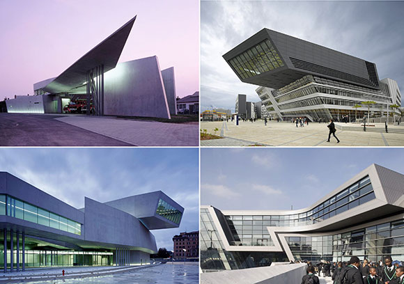
Architecture by Zaha Hadid – upper left: Vitra Fire Station, Weil am Rhein, Germany; upper right: Library and Learning Centre University of Economics, Vienna, Austria; lower right: MAXXI: Museum of XXI Century Arts, Rome, Italy; lower right: Evelyn Grace Academy, London, England (photos from www.re-thinkingthefuture.com)

Whether a company, institution, or even an individual, it is imperative to establish a brand—a distinct identity, a unique look and feel that distinguishes from others. But whereas branding can help to establish a foothold in the marketplace, does it limit evolution of self?

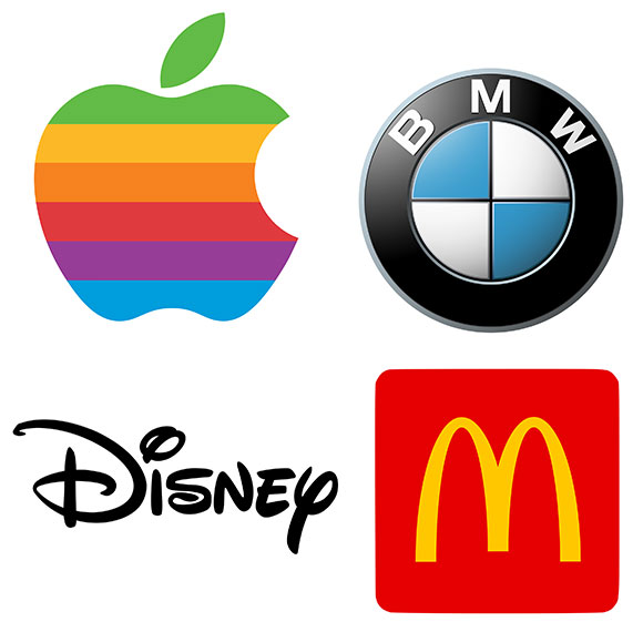
Our retail and hospitality clients call their brand, “trade dress.” A corporation might brand their company identity through the enactment of a mission statement. However one’s brand is created and implemented, it can offer a road map, and others can join this journey knowing where they are going. Speak the company names of Apple, BMW, Disney, or McDonald’s, and everyone has a sense of that company’s brand, what they pitch, what is sold, and who we as customers consume.

2014 Porsche Panamera S (photo from motorauthority.com)

On the other hand, an established brand can be like a straitjacket, restraining deviation and exploration that might lead to new opportunities. When Porsche, an automaker known for German efficiency and lean design, presented the Panamera, customers were baffled. This hulking sedan—more akin to an over-stuffed luxury vehicle than the agile Carrera—startled some, wondering what happen to the brand of Porsche. Was it risk-taking evolution or misguided brand confusion? The term “off-brand” reverberated in the halls of criticism.

Art by Patrick Nagel – left to right: Untitled (photo from artsandcollections.com); Untitled (photo from dreamboatsandhose.wordpress.com); Commemorative #10 (photo from 1stdibs.com); Jennifer Dumas (photo from fineart.ha.com)

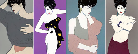
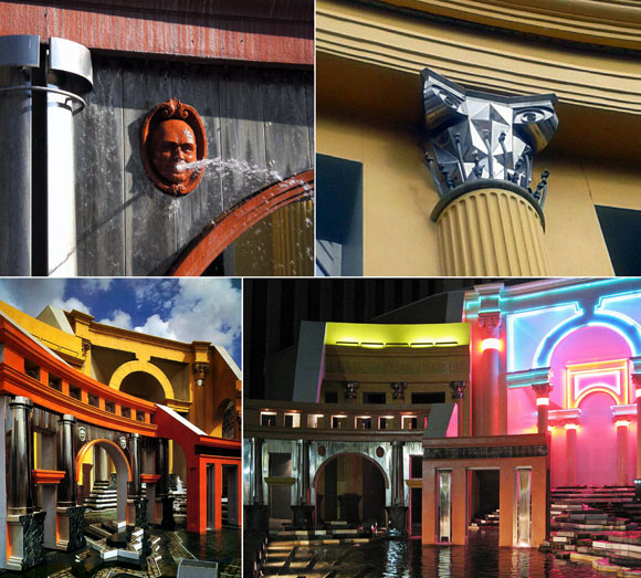
In art, consider the commercially successful works like Patrick Nagel’s soft-porn, male-fantasy caricatures (above) or Robert Longo’s thrashing individuals in business attire (below). Such art have reaped great exposure over the decades, from leading the pop culture zeitgeist to expanding in niche communities, to relishing a Renaissance of mainstream market presence. Some argue that the work, and that of many artists, look the same. But in the context of branding, repetition is not necessarily a bad thing, as it results in recognizability.

Art by Robert Longo – Blonde one: Barbara (photo from fineartmultiple.com)
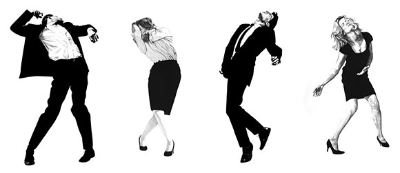
Man leaning back: Untitled (photo from pacegallery.com)
Women with hands over face: Cindy (photo from whitney.org)
Untitled (photo from redbubble.com)

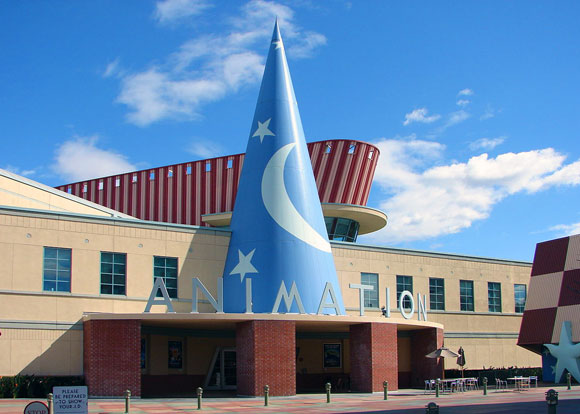
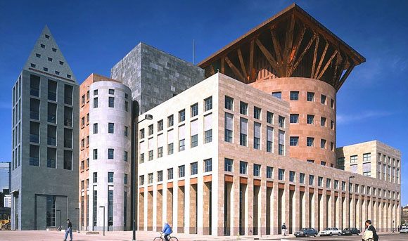
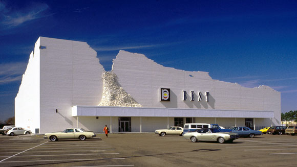
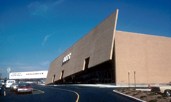
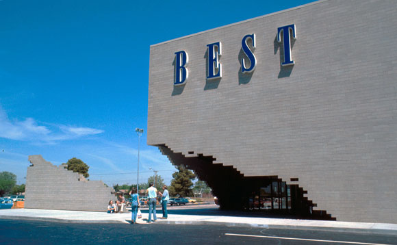
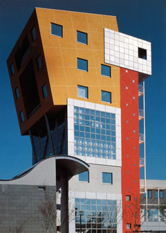
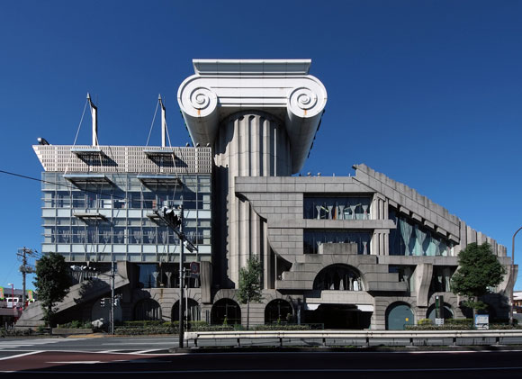
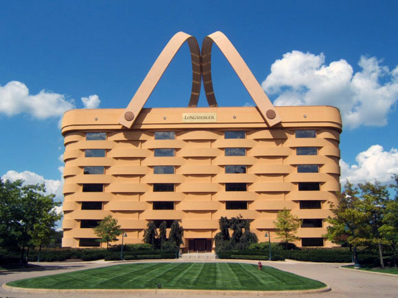
In architecture, companies big and small are branded as well. Some architects have developed a brand as a formulaic visual style. Others have branded their design process or a model of customer service. In the sphere of artistry, being predictable could be a death blow. But at times, cookie cutter processes can make for good business.

Architecture by Richard Meier – top left: Barcelona Musuem of Contemporary Art, Barcelona, Spain (photo by Alexie Bague, Plane-Site); top right: The Atheneum, New Harmony, Indiana (photo from archdaily.com); bottom left: Swissair North American Headquarters, Melville, New York (photo from rmparchives.xyz); bottom right: Museum Frieder Burda, Baden-Baden, Germany (photo from facebook.com/friederburda)

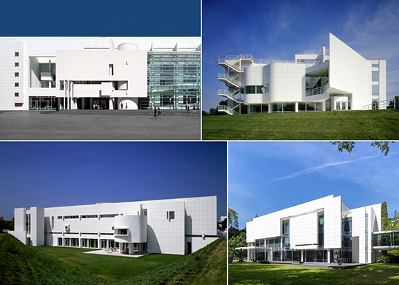
When an architect like Frank Gehry or Richard Meier (above), or actually any number of well-known designers, approach a project with the same road map resulting in what the building will look like, such formulas are profitable through their efficiency. For example, Meier doesn’t need to explore all the paint colors offered to him. He already knows that his building will be some shade of white. In business, this kind of brand saves times and makes the production swift. Clients don’t question the results much because they know the brand, and even expect it. The pitch is simple and evident from the start.

Architecture by Michael Graves – top left: Engineering Research Center, University of Cincinnati, Ohio (photo from reddit.com): top right: Disney Headquarters, Burbank, California (photo from friendsofarch.photoshelter.com); lower left: Denver Central Library, Colorado (photo from pinterest.com/jann5068/christopher-wren); lower right: Hyatt Regency La Jolla at Aventine, La Jolla, San Diego (photo from travel.usnews.com)

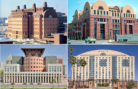
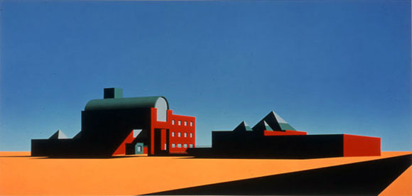
Same can be said with Michael Graves and his Post-Modern creations (above), Zaha Hadid’s extraordinary sweeping forms (at top), or Frank Lloyd Wright’s Prairie style (at bottom) .

Architecture by Frank Lloyd Wright – upper left: Darwin D. Martin House, Buffalo, New York (photo from susancohangardens.com); upper right: Frederick C. Robie House, Chicago, Illinois (photo from architectmagazine.com); lower left: Allen House in Wichita, Kansas (photo from visitwichita.com); lower right: Schwartz House, Two Rivers, Wisconsin (photo from wrightinwisconsin.org)

But what about risks and experimentation? Evolution, artistic progress, improvisation —such things fuel the design journey, challenges the industry’s status quo, as well as internal agendas. Finding the right balance within the spectrum is the challenge—to create a brand that provides recognition and stability, while paving paths to an unknown future.

THOSE WERE THE DAYS: POST MODERNISM AND ROBERT A.M. STERN ARCHITECTS

October 12, 2018

Arata Isozaki’s iconic rendering that inspired an entire movement of architectural representation. Created for MOCA, Los Angeles, California

At the simple age of 24, I was employed by the world-famous Post Modern architect Robert A.M. Stern in New York City. Post Modernism, the architectural movement of the 1960s to the 1980s, may not be the most beloved style of design today and even many despise it. But Post Modernism does at times stutter a comeback in different forms.

Roy E. Disney Animation Building, Burbank, California, by Robert A.M. Stern Architects (photo by Xurble)

In my undergraduate years of the 1980’s at UC Berkeley, we enthusiastically studied and exhaustively examined Post Modernism. It was the significant philosophy of art and architecture. This style, in the most elemental explanation, posits the notion that good architecture should provide human scale, harmony and beauty. Sounds obvious? Not always so.

Provincial Capitol Building, Toulouse, France, by Venturi, Scott Brown and Associates, Inc. (photo by Matt Wargo)

Post Modernism, often called “Po-Mo,” reacted strongly against the many buildings of Modernism that preceded Post Modernism. Cold white boxes lacking life and a sense of place–these minimal Modern buildings of steel and glass appeared inhumane to some architects and most day to day users.

Post Modern architects connected their designs to visitors by offering the sense of feeling grounded—offering a building that was simply warm and inviting. The iconography of classical architecture, such as a Greek column or a Renaissance arch, created this grounding. Such traditional features captured what people thought buildings should look like.

Denver Public Library, Michael Graves, (photo from michaelgraves.com)

Establishing the Po Mo movement as a 180-degree reversal from the evils of ice-y abstract Modernism, Post Modernists also added wit and charm. They did so through the use of vibrant colors, by making columns extra tall or extra fat, or by abstracting traditional forms into simple geometry, such as a triangle in lieu of a classical pediment. Though appearing to be merely a campy game of the visual arts, the movement added intellectual irony, rigorous research of historical precedence and proportions, and academic strategies of references.

A battle of history and precedence vs. looking forward to fresh ideas, currently occurring at the AT&T Corporate Headquarters, New York, New York, by Philip Johnson (photo by Kevin Lafontaine-durand); Inspired by a Chippendale highboy chest (photo from 1stdibs.com)
Perhaps taking the concepts of color, geometry and irony too far, the famous Memphis design room by Dennis Zanone (photo by Dennis Zanone)

In my early twenties, I was a smug, obnoxious young designer, which is a trait of plenty of new and naive architects. We believed even at our young age, that we had talents bestowed upon us that would certainly deliver world peace, or something idealistic and absurd like that.

Within Stern’s office of 100 of the best and brightest, I worked with defiance and sometimes too much confidence. Senior architects rolled their eyes in discomfort every time I made a statement of delusion and self-aggrandizing. I don’t know if it is our industry’s competitive style that causes this kind of behavior, or me just being an ill-advised juvenile architect. Maybe it was the Post Modern education that made me brash. After all, the Post Modernists boldly tossed aside the accomplishments of a previous generation, and replaced the old philosophies with new ideas that were forged through poking fun and having fun.

Collage illustrating some of the most well-known Post Modernist designs (photo from dezeen.com)
Robert A.M. Stern (photo by Witold Rybczynski)

On my last day at the office in 1988, Robert Stern gave me words of advice as I was leaving to Cambridge to start my graduate studies. Bob, as he liked to be called, wished me luck with a grin, “Harvard won’t teach you anything about architecture, but they will teach a Californian like you how to dress appropriately.”

(Other essays on Post Modernism: Humor, Tribute to Michael Graves and Lecture on Love. )

THE JOKE’S ON YOU: HUMOR AND WIT IN DESIGN

September 1, 2017

Yes, the façade is intended to look like it is crumbling. The “Indeterminate Façade” of the BEST store, Houston, Texas (photo from siteenvirodesign.com)

Architecture possesses this important and noble side, such as the design of the historic cathedrals in Europe, New York’s September 11 Memorial, or inspiring public schools . But what about humor? Can a building be funny?

Yes! Architecture can be a witty query or a laugh-out-loud punch line.

This International Style by Le Corbusier is certainly tasteful, but it is NOT FUNNY. Weissenhof, Stuttgart (photo by Andreas Praefcke

The 70’s and 80’s spawned Post Modern architecture, here and here. In response to the preceding Modern movement from the Bauhaus, the famous German design school, Post Modernism employed clever metaphors and satire—and even campy spoof. Bauhaus’ austerity in design and self-righteous seriousness had a philosophical challenger in Post Modernism, and the protest was loud.

The entire façade has lifted up to welcome you. The “Tilt Building” of the BEST store, Towson, Maryland (photo from siteenvirodesign.com)
An entry has been created by dislocating a corner of the building. The “Notch Building” of the BEST store, Miami, Florida (photo from siteenvirodesign.com)

Take for example the BEST Products stores completed between 1972 and 1984, designed by the New York design company named SITE. Throughout nine cities, this architecture firm designed large stores which were conceived not just as works of ironic art, but also tongue-in-cheek commentary on the big box stores. Though many critics argued that SITE’s one-liner jokes are vapid, the cleverness in the architecture raised design conversations to fresh new levels.

Piazza d’Italia, New Orleans, Louisiana (photo by Notes From Architecture)

The Piazza d’Italia stands as an iconic example of humor and irony. An endless lists of essays, blogs, books, exhibits, and lectures have both bestowed intellectual admiration, as well as unleashed hostile mockery on this project. This skillful and insane jam session of architecture apparently had inspiration from the Italian immigrant stories of New Orleans. For historicists, purists and contrarians alike, the architecture of this public plaza possesses every idea that floated into the imagination of the architect, Charles Moore.

upper left: A bust of Moore spewing water into the fountain (photo from devriesdesigndiary.blogspot.com); upper right: Angular Ionic column capital reimagined in facets of chrome stainless steel (photo source unknown); lower left: Fragments of history with layers of colors (photo by Polly Neill); lower right: Illuminated with neon (photo by Helena from flixster). Piazza d-Italia, New Orleans, Louisiana (photo by Helena)

Bizarre interpretations of everything from the Roman orders of classicism, to shapes that defy the Vitruvian rules of beauty, function and structural rationality, flaunt their bravado. Moore did not believe that “Less is more.” He supported the quote from fellow Post Modernist, Robert Venturi, “Less is a bore.”

At Piazza d’Italia, the visitor engages confusing references to historic temples, as well as modern materials like neon lighting and chrome. Arcs of water define column capitals in space and time, incomplete colonnades and arches suggest a work in progress, and De Chirico-esque clocks and long shadows critique the passages of life. This masterful work of Post Modernism is accompanied by a courage akin to a standup comedian.

Kitakyushu International Conference Centre, Japan (photo from rebloggy.com)

In these two examples from the earlies nineties, the observer might react with “WTF?” and “Has the architects lost their minds?” On the other hand, one could compliment architect Arata Isozaki’s facile use of geometries and colors to create sublime imagery.

For Kengo Kuma, what might appear to be nothing more than an aesthetic disaster, on further examination, the juxtaposition of everything but the kitchen sink (or maybe including the kitchen sink) has delivered something strikingly surreal and incomparable.

Mazda M2 Building, Tokyo, Japan (photo from ryanpanos.tumblr.com)

In-your-face jokes can be hilarious, but not always so with architecture, as is this unfortunate example of the “Big Basket Building” for the Longaberger Company, makers of wooden baskets. Designed by architects NBBJ, the seven-story headquarters is a basket, literally. At 160 times bigger than a typical picnic basket, the novelty is adroit and the engineering of massive steel planks and plates is fascinating.

Picnic basket (photo from polkcitylibrary.com)

Due to tax debt, the Longaberger had to vacate the property. After 24 months on the market at increasing discounts to the sales price, the architectural novelty had no legs in the real estate market. Unless you sell baskets for a living, no one wants to work in a giant basket.

Whether in architecture or literature, in painting or dance, creative forces can be profound, poetic and beautiful. And such forces can also be light-hearted, tongue-in-cheek and glib. Perhaps all of the above can occur at the same time. And that’s no joke.

Longaberger Company, Newark, Ohio

TO BE LOVED

July 22, 2016

Walt Disney World Swan and Dolphin Resort, Orlando, Florida, by Michael Graves Architecture & Design (photo by James Cornetet, Stringio)

In my last year as an undergrad, the brilliant (to some) Michael Graves gave an evening lecture. As one of the founders of Post Modernism, Graves sparked a movement of creative but tradition-bound architects.

The lecture hall on the UC Berkeley campus was packed; no, over packed. Architecture, art, and even philosophy and history majors plus faculty filled the large auditorium. Alongside filled seats, students littered the aisles and corridors—on the steps, on the floor, wall to wall. Even the entire stage, typically left empty for the dramatic effect of the lecturer at his podium, was covered with eager audience members. This forced Graves to reach the podium by crossing the stage as if it were a minefield.

Which in a way it was.

Portland Building, Oregon, by Michael Graves Architecture & Design (photo from archinect.com)

Delivering a fascinating presentation, Graves entertained with wonderful wit. At one point, he showed a slide of a city downtown, and said disapprovingly, “You can have office towers like these that are black, white or maybe grey.”

Then Graves displayed a slide of his misunderstood but enjoyable 1982 Portland Building in Oregon. He declared with enthusiasm that the freshness of his building lay in the happy shades of yellow, maroon and turquoise. “Or you can also have color!”

Whitney Museum of American Art, New York, New York, by Marcel Breuer (photo by Fred R. Conrad)

The esteemed architect concluded his two-and-a-half hour lecture by unveiling his ongoing design process for a big addition to the Whitney Museum of American Art in New York City. The original museum, a brutal mass of a building faced with dark grey granite, presented only one window facing Madison Avenue. For those who support the friendliness of Post Modernism, Marcel Breuer’s 1960’s Whitney was an uninviting and even mean building—the worst of Modernism. (I admit that this building is a personal fave.)

Addition to the Whitney Museum, by Michael Graves Architecture & Design, Whitney Museum on the left, Graves addition on the right and on top (photo by Michael Graves Architecture & Design)

That night, Graves displayed his multitude of designs being developed for the Whitney, each one already rejected by the museum committee. There were so many designs that it seemed to be an excessive, mindless path of creativity.

Addition to the Whitney Museum, by Michael Graves Architecture & Design (photo by Michael Graves Architecture & Design)

Was it the architect? Was it the client? Each design iteration was more bizarre than the last. Regardless of whether my young mind could comprehend the architect’s meandering artistic journey, a Post Modern addition to an existing Modern building exhibited the battle between the two artistic movements.

At the end of the epic presentation, the audience was split right down the middle. Some students cheered in support for this courageous architect’s vision. Other students booed his philosophy of architecture.

Graves tried to hold his ground at the podium, but even this senior diplomat could not handle the mix of admiration and disdain. Of love and hatred.

Graves raised his arms to quiet the audience. With tears running down his face, he felt defeat and embarrassment. Silence fell. Despite his stature in the industry, the very mortal designer expressed that night what many an artist must feel again and again, whether in private or in public. Here, he did so in public.

Michael Graves, 1934 to 2015 (photo from themsv.org)

Exhausted of all defense, Michael Graves simply said: “All anyone wants, is to love and be loved.”

TRIBUTE: MICHAEL GRAVES INSPIRES (1934-2015)

July 3, 2015

Team Disney Building, Burbank, California, by Michael Graves (photo by MGA&D)

Writing my business plan for Poon Design Inc. decades ago, a small paperback on entrepreneurship suggested that I think about an existing company that might be a model for my future company. The topics at hand were not about the business model, profits, size of staff, or geography—or even design style.

Rather, the topic was about design culture. What kind of design culture did I envision for Poon Design, and what architectural firm inspired me?

The answer was a New Jersey company: Michael Graves Architecture & Design.

St. Coletta of Greater Washington, Washington, DC, by Michael Graves (photo by MGA&D)

My interest did not have anything to do with Michael Grave’s colorful Post Modern buildings with their whimsical motifs and cartoonish proportions. My interest was in what Grave’s entitled “Humanistic Design.”

Graves designed for people. He did not design for headlines and critics, for academic debates, or for personal legacy. Designing for people—sounds obvious, right? It is no easy task to make good on this philosophy, as well as build a culturally impactful, artistically significant, and prolific career around designing in this basic manner. For people.

Toaster for J. C. Penney, by Michael Graves (photo by J.C. Penney)

Graves and his team applied this belief system to every aspect of design, from hotels to houses, from office buildings to toasters, from university research centers to the design of a wheelchair. Sure, many architects believe their repertory is this broad. During his time, Graves was a pioneer in designing without borders.

Late 1980’s, beginning my young adult life in Manhattan, I was a fan of the New York Five. For a national conference with a seminal follow up book, the Museum of Modern Art assembled five architectural voices. All five held a common interest in Modernism and the landmark architecture of Le Corbusier (1887-1965). The five architects became instantly celebrated: Peter Eisenman, Charles Gwathmey, John Hejduk, Richard Meier, and of course, Michael Graves.

Though I was fascinated with the (mostly unbuilt) work of Hejduk (1929-2000), Graves was the individual that I studied, even as he abruptly departed the New York Five. He rejected the Five’s philosophical Modernist common ground. In a heralded crusade on the intellectual battlefields, Graves led a Post Modern movement that was diametrically opposed to the repertory of the New York Five (now Four). Alongside him stood other leaders, such as Robert Venturi and my past employer, Robert Stern,

A new chapter for him, Graves used bright colors instead of stark whites. He used classical elements such as pediments and columns, instead of abstract forms and zero ornamentation. He used humor and wit, instead of severe Bauhaus rationalism.

Hotel Michael, Sentosa, Singapore, by Michael Graves (Photo by MGA&D)
Hotel Michael, Sentosa, Singapore, by Michael Graves (photo by MGA&D)

In the late eighties, I was fortunate to be invited to Graves’ 25th anniversary celebration at Princeton University, where he was the Professor of Architecture Emeritus for 39 years. As a young architect in my twenties, I joined the most influential voices of our industry to honor a man of artistic virtuosity and commitment.

Michael Graves passed away in March of this year. All of us who work in his shadow, are standing in an impressively long shadow.

HEATHERWICK DESIGNS EVERYTHING

May 18, 2015

Harvey Nichols store, Knightsbridge, London, by Heatherwick Studio (photo by Steve Speller)

Architecture companies that do more than architecture impress me.

I don’t mean the firms that provide additional services like interior design, landscape design, master planning, and/or graphic design. If you are a Design (with a capital “D”) driven company, than your field of Architecture (with a capital “A”) should inherently include such endeavors.

The recent passing of Michael Graves brings to mind how inspiring it is when an architect evolves and branches out, elevating his talent beyond the category of “building design,” which sometimes sounds like creating a mundane parking structure or coordinating an air conditioning system. Mr. Graves launched a Post-Modern movement of designing for all functions, for all people, at all scales. (Teapot, anyone?) This concept of what I like to call “comprehensive design services” are also offered from contemporaries like Rios Clementi Hale Studios or historical legends like Frank Lloyd Wright.

Teapot from Target, by Michael Graves, photo by Kean University
Teapot from Target, by Michael Graves (photo by Kean University)

At Poon Design, we provide design services of all types. In our past, we even offered the unique specialty of music programming for restaurant or retail projects. We posited a simple concept that music was as essential to the success of a branded space and its customer experience, as the right spatial forms, appropriately selected materials, and strategic lighting design. All of it, music as well, comprised Architecture.

Then there is Heatherwick Studio, www.heatherwick.com.

Heatherwick Studio has taken the idea of complete design services to a new level. Heatherwick has embraced broad design and research wholeheartedly, as evidenced by the studio’s current exhibition called “Provocations: The Architecture and Design of Heatherwick Studio” at the Hammer Museum in Los Angeles.

Spun Chairs by Heatherwick Studio, photo by Susan Smart
Spun Chairs by Heatherwick Studio (photo by Susan Smart)

Upon arrival to the museum, you encounter the famous Spun Chairs in the courtyard. Irresistible to all—children, teens, adults and seniors—you will see dozens of people gleefully spinning like giant-size tops on these chairs, design courtesy of Heatherwick.

With large public and private architectural projects, both executed or proposed—from the new Google Campus in Northern California, to a university building in Singapore, to a Capetown museum—Heatherwick also designs at other, more curious scales. From smallest to biggest, its portfolio boasts a Longchamp handbag, an extruded aluminum bench, the Olympic cauldron, newspaper kiosks, a London red bus, a portable bridge, and a grand park in the middle of an Abu Dhabi desert.

Heatherwick’s “Seed Cathedral,” the U.K pavilion at the 2010 Shanghai World Expo, drew worldwide attention. Measuring approximately 50’ x 50’ x 50’, the pavilion is make up of 60,000 protruding clear acrylic rods, the tips of which encapsulate 250,000 seeds. Magical and mesmerizing, the design stunned architects and non-architects alike.

“Seed Cathedral,” U.K. pavilion at the 2010 Shanghai World Expo, by Heatherwick Studio, photo by Iwan Baan
“Seed Cathedral,” U.K. pavilion at the 2010 Shanghai World Expo, by Heatherwick Studio (photo by Iwan Baan)

I am eager to see the breadth of Heatherwick’s design work, particularly the larger projects, executed in real life. Of their dozen featured grand architecture works, less than half are implemented. We have a lot to look forward to from Heatherwick in the coming decades.

Don’t miss the exhibit. Admission is free (as is playing on the ping pong tables in the courtyard). Exhibit closes May 24, 2015. Provocations at the Hammer Museum.

© Poon Design Inc.