Tag Archives: NBBJ

FLATTERY OR THEFT

March 3, 2023

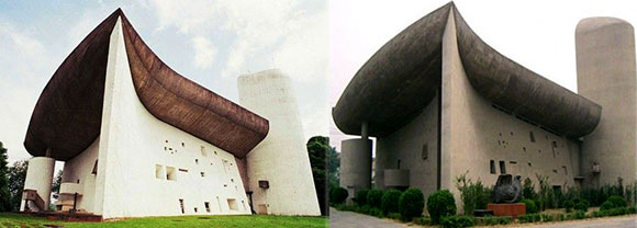
right: Colline Notre Dame du Haut, Ronchamp, France, by Le Corbusier; left: chapel in Zhengzhou, China (photo rom pinterest.ph, RMJM)

Often, two separate architectural projects by two separate architects appear similar. Sometimes too similar. Hmmm . . . it is simply a coincidence, did one design inspire the other, or has an idea been “appropriated”? In other words, stolen.

left: Lady Gaga (photo from soundcloud); right: Madonna (photo from news.madonnatribe.com)

In 2011, Lady Gaga released Born This Way, and comparisons to Madonna’s 1989 Express Yourself were swift, exacting, and accusatory. The two songs sounded more than just similar, and Lady Gaga was considered a plagiarist, a common thief. Gaga tried flattery stating that her song was not a copy, but rather, that she was inspired by Madonna—that the work was a tribute to the Queen of Pop.

In architecture, there are many creative overlaps between separate projects which can lead to the legal phrase, “likelihood of confusion.” But often the overlaps are innocent. The zeitgeist of ideas invades the media, websites, and magazine covers. Subconsciously, we design buildings that accidentally conform to pervasive aesthetic themes. But sometimes, there is thievery.

top: Saracen Casino Resort, Pine Bluff, Arkansas, by Marlon Blackwell; bottom: same project by HBG Design (photos by MBA)

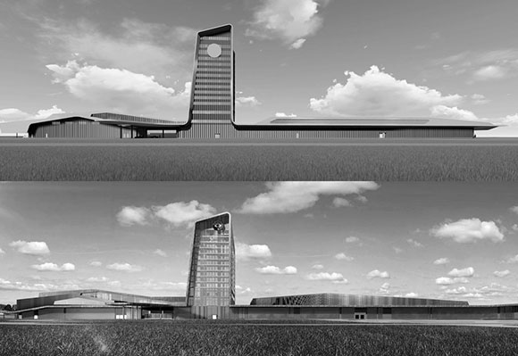
In 2017, Marlon Blackwell Architects (“MBA”), designed the Saracen Casino Resort in Pine Bluff, Arkansas (top image in the above collage). In 2018, HBG Design supposedly “collaborated” with MBA to develop the project. When the client dismissed MBA for unclear reasons, they filed the now infamous 2019 lawsuit. According to Architectural Record’s January 2020 reporting, the suit “claims that HBG has continued to use MBA’s intellectual property without credit or payment, and asks for a judgment of no less than $4.45 million . . . and a declaration indicating MBA’s original authorship of the design.”

MBA won, and HBG’s design (bottom image in the above collage) must now be credited as “an original design by Marlon Blackwell Architects.” Though the financial settlement remains confidential, this victory for the original creator contributes to the ongoing discussion of intellectual property and authorship.

New York–New York Hotel & Casino, Las Vegas, Nevada (photo by Frauke Feind, Pixabay)

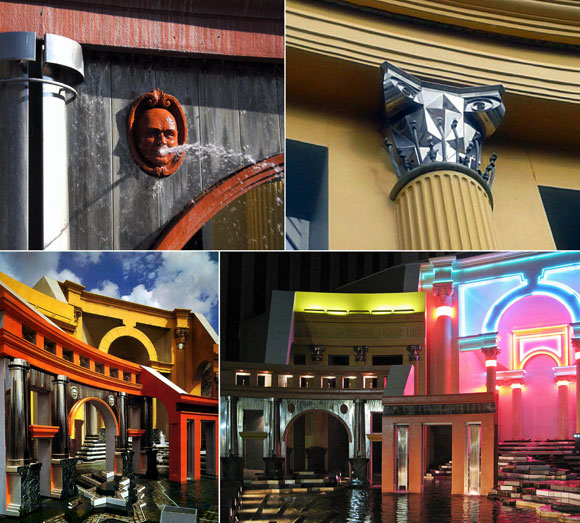
What about Las Vegas producing themed-casinos based on great cities, e.g., Paris, New York (here and here), Venice, and Egypt? What about when an architect in China brazenly reproduces one of the greatest works of the International Style? (See opening image at top.)

For my personal exploration below, admittedly tongue-in-cheek, I mined some of my past designs and found many similar projects by other architects, some explicitly similar. Are they copies or merely independent invention?

right: Harvard student project by Anthony Poon (photo by Anthony Poon); left: 8 Octavia, San Francisco, California (photo from saitowitz.com)

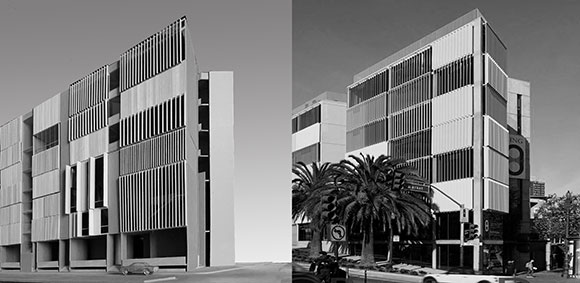
As a Harvard graduate student in 1990, I designed this seven-story, vertically-slatted building in downtown Boston (right). In 2015, Stanley Saitowitz (one of my undergraduate professors at UC Berkeley  designed this eight-story, vertically-slatted building in downtown San Francisco (left).

top: Olympic Stadium 2000, Sydney, Australia, by Anthony Poon and Greg Lombardi with NBBJ (rendering by NBBJ); bottom: SoFi Stadium, Inglewood, California (photo from hksinc.com)

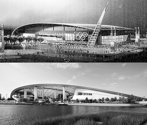
While employed at NBBJ, my design partner, Greg Lombardi, and I designed this sports building for the 2000 Sydney Olympics (top). Our design never got built, but SoFi Stadium opened in 2020 to much fanfare (bottom). Both projects feature an iconic roof curving up from the ground and soaring towards the other side.

right: Feather River Academy, Yuba City, California, by Anthony Poon with A4E (photo by Gregory Blore), left: Fontana School, Fontana, California (photo from architecture4e.com)

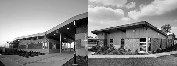
As Co-Founder and Design Principal of A4E, I led the team to create this school in Yuba City, California (left)—a design expressing structure, horizontal textures, and a folding roof. Years later after I left the company, A4E designed this Fontana school (right)—a design of similar sentiments.

right: Chaya Downtown, Los Angeles, California, by Poon Design (photo by Gregg Segal); left: Love Culture, Santa Monica, California (photo from shopa.off-77.tk)

My studio, Poon Design, designed this 2008 restaurant bar framed by an innovative, back-lit, decoratively-etched mirror composition (left). We won the 2009 International AIA Award, and our design was published extensively. Years later, this store installed a back-lit, decoratively-etched mirror composition (right).

right: Lifeguard Tower and Pier, Hermosa Beach, California, by Anthony Poon and Greg Lombardi (rendering by Al Forster); left: Oslo Opera House, Oslo, Norway (photo by Beata May, galleo.co)

In 1993, Lombardi and I designed this glassy building situated on a plaza that slopes upwards to the sea (left). We won the 1995 AIA Merit Award, and our design was published extensively. In 2008, Norwegian firm, Snohetta, designed this glassy building situated on a plaza that slopes upwards to the sea (right).

Yes, the above commentary possesses some glibness. I understand that we architects sometimes design what is exclusively in our heads and sometimes what is non-exclusively part of a larger dialogue. I accuse no one of plagiarism, but often the resemblances are too striking to ignore.

SEATTLE HEROES AND ICONS

September 24, 2021

left to right: Seattle Century Library; Museum of Pop Culture; The Spheres, Amazon (photos by Anthony Poon)

Upon a visit to Seattle, I confronted three different buildings—all leaving a seductive imprint on the city and my memory.

– Seattle Central Library by Pritzker-laureate Rem Koolhaas,
– Musuem of Pop Culture by Pritzker-laureate Frank Gehry, and
– The Spheres at Amazon by corporate NBBJ.

The first two projects are by two of the most famous living architects on the planet. The third is by an anonymous company, one without the trappings of a sole Wright-ian genius which gives way to collaboration instead—for better or worse.

(Three disclaimers: Rem Koolhaas was my professor in grad school; I was employed by NBBJ in the 90s; and I did not have an opportunity to visit the interiors of The Spheres.)

THE SEATTLE CENTRAL LIBRARY

Seattle Central Library exterior (photo from hoffmancorp.com)
Library and its neighbor (photo by Anthony Poon)

The Seattle Central Library, designed by the Rem Koolhaas and shepherded by local Architect-of-Record, LMN, opened to the public in 2004—the winner of a lengthy design competition. The reviews of this 11-level, 363,000-square-foot building varied.

The international architectural scene claimed the design a heroic success. Others saw a design with a target on its back—and its front too. The Seattle Post-Intelligencer spewed adjectives: “decidedly unpleasant,” “relentlessly monotonous,” and “profoundly dreary.”

I side with the glorious praise hailed from the enlightened world. The library design comprises community spaces that engage the public on many levels, (literally) as well as a civic icon unlike anything seen before.

Conceptual model and section diagram (from archdaily.com)

As Professor Koolhaas taught us in school: Do not design simply in floor plan, meaning, not just one-dimensionally laying out an auditorium next to offices next to restrooms. Instead, design in section, meaning, three dimensionally as one places a library over a five-story high living room, then tucking parking under the auditorium.

Library interiors (photos by Anthony Poon)

The library’s innovative and challenging (yes!) urban form, the diamond-patterned skin of glass and steel, a four-level spiral of books, a complex layering of space and experience, and so on—all this together convinces me that I have walked into one of the most exciting works of contemporary architecture.

THE MUSEUM OF POP CULTURE

Museum of Pop Culture aerial (photo from Wikimedia Commons)

The Museum of Pop Culture, coined “MoPOP,” opened in 2000 under the former name, the Experience Music Project—coincidentally also included the participation of the same Architect-of-Record, LMN. Frank Gehry’s design, though predictable and yet another variation-on-a-theme (nearly a career-long theme) offers passerby’s a composition of great risk and resulting beauty.

Musuem exterior with monorail at right (photo from blog.360modern.com)

According to the client, “When Frank O. Gehry began designing the museum, he was inspired to create a structure that evoked the rock ‘n’ roll experience. He purchased several electric guitars, sliced them into pieces, and used them as building blocks for an early model design.”

Such tales subscribe to the mad artist genius syndrome. True or not, it makes Gehry sound like less of a thoughtful architect creating wonderful spaces for the public, and more like an awkward child who believes that the broken pieces of a guitar can represent a work of architecture.

Close of exterior stainless steel shingles (photo by Pygmalion Karatzas)

Five giant building masses sit at the base of the Space Needle, each mass clad in enigmatic surfaces, like fire-engine-red stainless steel or fuchsia-fluorocarbon-coated aluminum—comprising a total of 21,000 individually cut metal shingles. As an object, as architectural sculpture, the composition is stunning. Does not disappoint. Having the monorail pass through the building is yet another daring move that delivers a thrilling creation.

Interior view (photo by Pygmalion Karatzas)

But the 140,000 square feet of interior space underwhelms, fails to translate the exterior exhilaration to the indoors. Whereas the Seattle Central library sings with its visionary interior design, MoPOP falls out of tune. Aside from a few flourishes, like a dynamic staircase or a contorted lobby space, most of the museum’s inside is not much more than generic exhibit space. One might argue that a museum’s interiors should be flexible and so inherently boring, but I would then direct your attention to the Guggenheim Museum in Bilbao, also by Gehry.


THE SPHERES, AMAZON

The Spheres, Amazon (photo by Sean Airhart)

You don’t need the singular vision of great artistic minds like Koolhaas and Gehry to deliver good architecture. Unlike the first two projects, NBBJ played the role of Design Architect and local Architect-of-Record, meaning both the creative lead as well as the development and production team.

Aptly named The Spheres, Amazon’s new workplace and quasi-visitor center is made of three giant glass and steel spheres, colliding like a kid’s exhaled soapy water bubbles. Recently completed in 2018, Amazon claims, “The Spheres are a place where employees can think and work differently surrounded by plants.”

Interiors (photo by Fran on Unsplash)

Is it just another glamorized office? Just more “creative office space” glorified by real estate agents? But the phrase “surrounded by plants” fascinates me.

The spherical structures, conservatories actually, house 40,000 plants from over 30 countries. Within a meticulously engineered structure of 2,600 pentagonal hexecontahedron panes of glass alongside 620 tons of steel, I see one of the finest examples of biophilia. For reference, a past article, “Biophilic Design refers to our instinctive association to nature and the resulting architecture that enhances our well-being.”

Floor plans and diagrams (from archdaily.com)

Aside from the obvious design reference to Buckminster Fuller’s utopian geodesic domes of the 60s, the Amazon Spheres offer a new narrative for office space, retail, café, and meeting places. NBBJ has shed the dogmatic aim of developers to maximize floor area. Similar to Koolhaas, NBBJ celebrates the magnificence of volume, as in cubic footage (or in this case, spherical footage) and the capture of air, light, and a more productive work culture.

Exterior at night (photo by Patrick Schneider on Unsplash)

The total result is impressive, likely to be a local fan favorite and on every city tour guide. The design is good, even great, but is it inspired? Will it change the world? Probably not.

But the Seattle Central Library has already influenced the way architecture students think, the way teachers teach, the way professional architects design. Most of Rem Koolhaas’ projects deliver new ideas beyond form-making, embracing social engagement and re-inventing the meaning of living, shopping, or learning.

Frank Gehry, on the other hand, seems to be playing the same note over and over again. But is that wrong, especially if this one note is sheer genius played with virtuosity?

THE JOKE’S ON YOU: HUMOR AND WIT IN DESIGN

September 1, 2017

Yes, the façade is intended to look like it is crumbling. The “Indeterminate Façade” of the BEST store, Houston, Texas (photo from siteenvirodesign.com)

Architecture possesses this important and noble side, such as the design of the historic cathedrals in Europe, New York’s September 11 Memorial, or inspiring public schools . But what about humor? Can a building be funny?

Yes! Architecture can be a witty query or a laugh-out-loud punch line.

This International Style by Le Corbusier is certainly tasteful, but it is NOT FUNNY. Weissenhof, Stuttgart (photo by Andreas Praefcke

The 70’s and 80’s spawned Post Modern architecture, here and here. In response to the preceding Modern movement from the Bauhaus, the famous German design school, Post Modernism employed clever metaphors and satire—and even campy spoof. Bauhaus’ austerity in design and self-righteous seriousness had a philosophical challenger in Post Modernism, and the protest was loud.

The entire façade has lifted up to welcome you. The “Tilt Building” of the BEST store, Towson, Maryland (photo from siteenvirodesign.com)
An entry has been created by dislocating a corner of the building. The “Notch Building” of the BEST store, Miami, Florida (photo from siteenvirodesign.com)

Take for example the BEST Products stores completed between 1972 and 1984, designed by the New York design company named SITE. Throughout nine cities, this architecture firm designed large stores which were conceived not just as works of ironic art, but also tongue-in-cheek commentary on the big box stores. Though many critics argued that SITE’s one-liner jokes are vapid, the cleverness in the architecture raised design conversations to fresh new levels.

Piazza d’Italia, New Orleans, Louisiana (photo by Notes From Architecture)

The Piazza d’Italia stands as an iconic example of humor and irony. An endless lists of essays, blogs, books, exhibits, and lectures have both bestowed intellectual admiration, as well as unleashed hostile mockery on this project. This skillful and insane jam session of architecture apparently had inspiration from the Italian immigrant stories of New Orleans. For historicists, purists and contrarians alike, the architecture of this public plaza possesses every idea that floated into the imagination of the architect, Charles Moore.

upper left: A bust of Moore spewing water into the fountain (photo from devriesdesigndiary.blogspot.com); upper right: Angular Ionic column capital reimagined in facets of chrome stainless steel (photo source unknown); lower left: Fragments of history with layers of colors (photo by Polly Neill); lower right: Illuminated with neon (photo by Helena from flixster). Piazza d-Italia, New Orleans, Louisiana (photo by Helena)

Bizarre interpretations of everything from the Roman orders of classicism, to shapes that defy the Vitruvian rules of beauty, function and structural rationality, flaunt their bravado. Moore did not believe that “Less is more.” He supported the quote from fellow Post Modernist, Robert Venturi, “Less is a bore.”

At Piazza d’Italia, the visitor engages confusing references to historic temples, as well as modern materials like neon lighting and chrome. Arcs of water define column capitals in space and time, incomplete colonnades and arches suggest a work in progress, and De Chirico-esque clocks and long shadows critique the passages of life. This masterful work of Post Modernism is accompanied by a courage akin to a standup comedian.

Kitakyushu International Conference Centre, Japan (photo from rebloggy.com)

In these two examples from the earlies nineties, the observer might react with “WTF?” and “Has the architects lost their minds?” On the other hand, one could compliment architect Arata Isozaki’s facile use of geometries and colors to create sublime imagery.

For Kengo Kuma, what might appear to be nothing more than an aesthetic disaster, on further examination, the juxtaposition of everything but the kitchen sink (or maybe including the kitchen sink) has delivered something strikingly surreal and incomparable.

Mazda M2 Building, Tokyo, Japan (photo from ryanpanos.tumblr.com)

In-your-face jokes can be hilarious, but not always so with architecture, as is this unfortunate example of the “Big Basket Building” for the Longaberger Company, makers of wooden baskets. Designed by architects NBBJ, the seven-story headquarters is a basket, literally. At 160 times bigger than a typical picnic basket, the novelty is adroit and the engineering of massive steel planks and plates is fascinating.

Picnic basket (photo from polkcitylibrary.com)

Due to tax debt, the Longaberger had to vacate the property. After 24 months on the market at increasing discounts to the sales price, the architectural novelty had no legs in the real estate market. Unless you sell baskets for a living, no one wants to work in a giant basket.

Whether in architecture or literature, in painting or dance, creative forces can be profound, poetic and beautiful. And such forces can also be light-hearted, tongue-in-cheek and glib. Perhaps all of the above can occur at the same time. And that’s no joke.

Longaberger Company, Newark, Ohio
© Poon Design Inc.