#127: NEW MASTERS OF THE TRADE
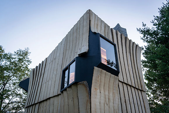
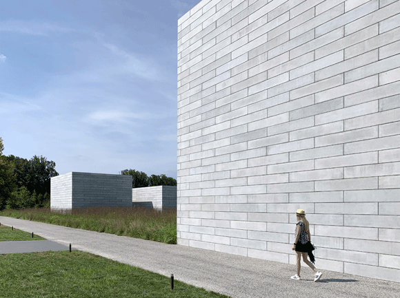
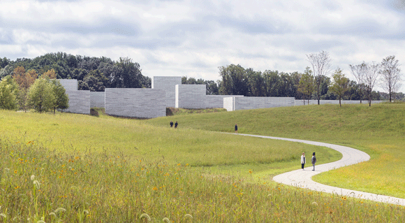
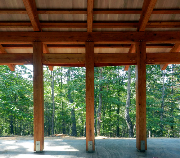
Ashen Cabin, Ithaca, New York, by HANNAH (photos by Andy Chen, HANNAH)
Before the advent of technology, architects used tools that supported their Old School activities, like sketching and making physical models—all done by hand. Today, items such as a T-square, circle template, or X-acto blade have been replaced by tools of our digital age, for example, Revit and 3D printing. Yet, most of our leading designers—consider the practicing Pritzker Prize laureates—are only familiar with their old tools of the trade. Limited even.

Though such famous individuals have a staff engaging current technology on a daily basis, I suspect these big name architects do not personally design with apps like 3ds Max and Maxwell. I doubt Rem Koolhaas, Frank Gehry, and Peter Zumthor are writing parametric algorithms on their laptops, or creating virtual structures through Building Information Modeling. These architects probably still use pencil on paper.

Meaning, if one person starts the process and others continue it, there is a disconnect between the original concept and its development. The principal architect maybe the creator at the start, but for the remainder of the process, he is but a critic, watching others create in his place, fleshing out ideas with the highest technology available.
Eventually, this disconnect will be gone, and the new processes will generate different results. The 30-something architect, who uses Grasshopper and Viz Render, will soon become the industry veteran. Then, the same mind and hands will work on the project from inception to completion. No disconnect. These future thought leaders will find no need to have others continue in lieu of an old-guy-boss lacking certain industry standard skills.
What will the industry and the resulting architect look like when these younger architects, who are facile in all the current tools of today, become the world famous designers? When the disconnect is gone, structures will be designed differently, constructed differently, and look different in the end. There will be notions, materials, and methods not even thought of yet.
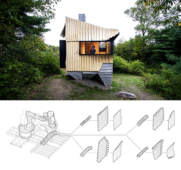
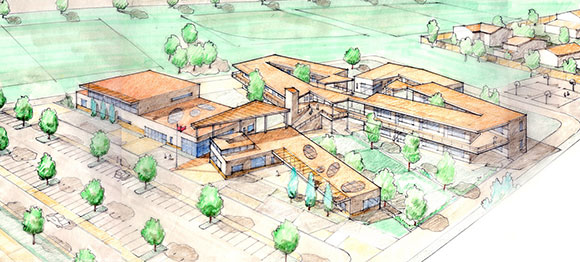
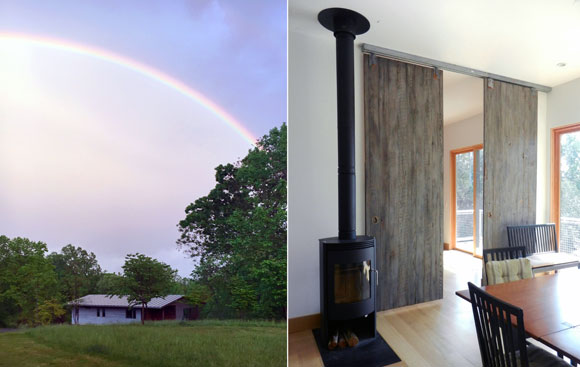
This recently completed house in Ithaca, New York, is a stellar work of sustainable thinking, digital design, and fabrication technologies. Using 3D scanning and robotics, the architects transformed a material typically wasted—infested Ash wood—into an exciting building material. Readily available, affordable, and green. Other innovations include the 3D-printed, concrete, feet-like base of the cabin.
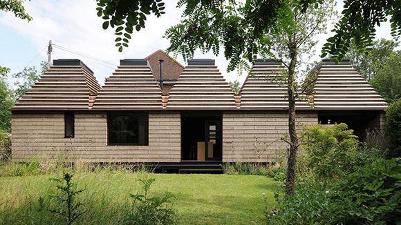
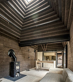
Another example of new minds and methods is the Cork House in Berkshire, England. The architectural pioneers offered a design of 1,268 cork blocks sustainably harvested from the bark of a cork oak tree. The blocks are intended to be efficiently dismantled and reused—or recycled. Both walls and roof comprise this single bio-renewable material. With a structure of engineered timber, the cork modules require no glue or mortar, while providing insulation to the house.
Merriam-Webster defines “brave new world” as “a future world, situation, or development.”