Tag Archives: RICHARD MEIER

THE CURIOUS THING ABOUT STYLE, PART 1 OF 2

December 31, 2015

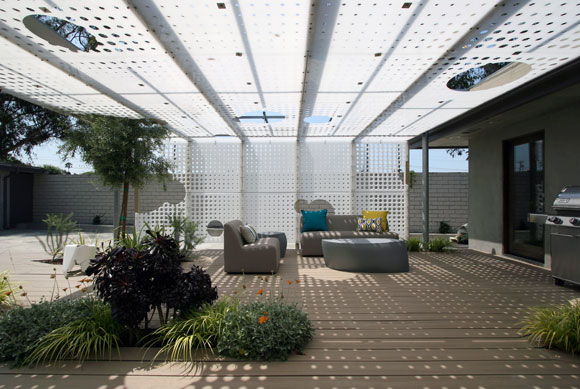
For this food blogger’s residence in Pasadena, we juxtaposed the technology of parametric algorithms on to polyethylene, the material used to make household cutting boards.

Recently, I was asked by an interviewer, “What is your style?”

This question is often asked, and not just of architects, but creatives of all sorts: fashion, graphics, advertising, cuisine, etc. The media typically aims to capture one’s design philosophy in a sound bite digestible by mainstream readers.

Many interior decorators have a packaged response. I hear words like “eclectic,” “warm and welcoming,” “contemporary yet timeless.” I am not sure what kind of design results from this mash up of clichés.

Architects have a hard time speaking of their style. Hugh Hardy, one of my past employers, argued that once you answer the dreaded question, your critics will constantly be assessing your work to see if you have lived up to your declarations.

What is style after all?

With extensive education, a higher degree and a 250-page graduate school thesis, many architects simply can’t and won’t summarize their creative philosophy in 20 words or less. For some, “style” is a bad word, and it shouldn’t be an elevator pitch.

upper left: Federal National Council’s Parliament Building, Abu Dhabi, United Arab Emiretes by Ehrlich Architects; upper right: McNamara Alumni Center, University of Minnesota, Minneapolis, by Antoine Predock Architect Studio (photo by Bobak Ha’Eri); lower left: Dominus Estate, Yountville, California, by Herzog & de Meuron (photo by dominusestate.com); lower right: Nelson-Atkins Museum of Art, Kansas City, Missouri, by Steven Holl Architects (photo by Andy Ryan)

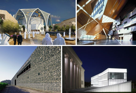
Some colleagues who talk about their architectural style do so with clever labels. Steven Ehrlich, based in Los Angeles, calls his work “Regional Modernism.” New Mexico architect Antoine Predock is a self-described “Cosmic Modernist.” Herzog & de Meuron of Switzerland has been coined, “Elemental Reductivists.” From New York, Steven Holl’s work involves “typology, phenomenology and existentialism.”

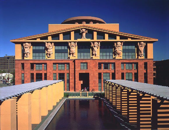
For architects such as Frank Gehry, Tadao Ando or Richard Meier, their style has been accused of being formulaic. Many would argue that all their buildings look the same. Is this so bad? Don’t all the Beatles’ songs and Beethoven Sonatas sound similar? (This topic of formula will be discussed in an upcoming blog.)

Oscar Peterson Trio (photo by Paul Hoeffler)

So now it is my turn to answer the universal question of style. My response should not be trite, but rather complex—but not pretentious.

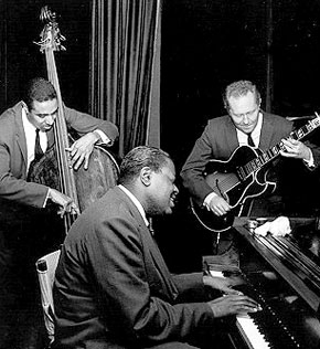
I answered in two parts: Process and Product. My Process is inspired by jazz—the spontaneity and the improvisational spirit. (More another day.)

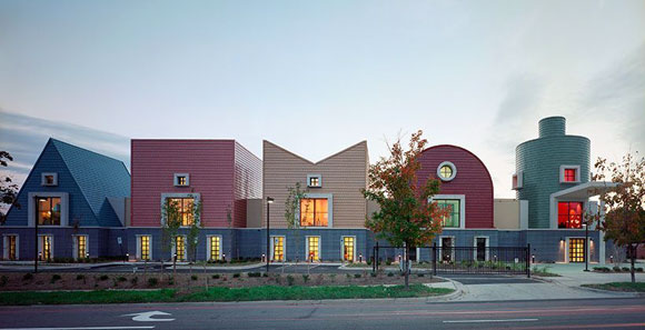
My Product, meaning the final structure, say a house or school, is driven by juxtaposition. I enjoy combining things together, either comfortably or awkwardly, to see what might arise: the modern and the traditional, the hand crafted and the machine made, the broad strokes and the finicky details, just to name a few.

Meditation Retreat House, Blue Ridge Mountains, Virginia, by Poon Design

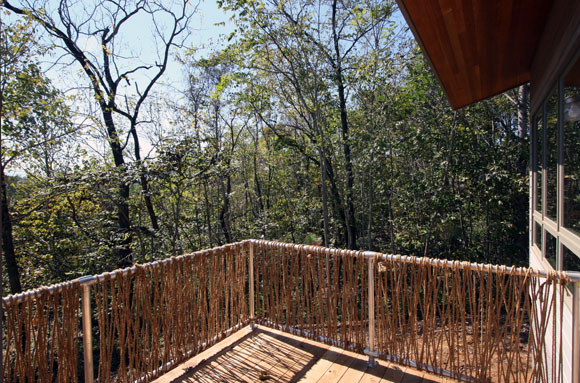
For a Buddhist meditation retreat in Virginia, Poon Design created a guardrail that juxtaposed a galvanized off-the-shelf steel frame with natural twine made from hemp. Yes, you can smoke it.

Student Center, University of California, Riverside, by Anthony Poon while w/ HHPA (rendering by Gilbert Gorski)
Student Center, University of California, Riverside, by Anthony Poon (w/ HHPA, watercolor by Gilbert Gorski)

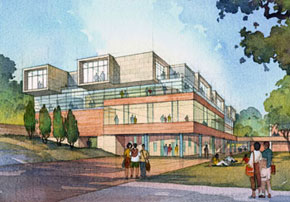
For the University of California, our student center combined traditional campus brick and limestone, with sleek glass curtain wall and over-scaled weathering zinc shingles.

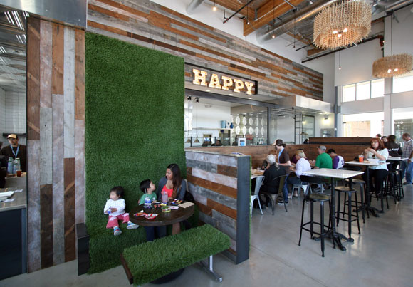
At Mendocino Farms, we blended a funky old school vibe, such as chalk board walls, vaudeville signage, clothespins, and industrial piping, with high-end luxury, such as Carrara marble, walnut planks, stainless steel trim, and custom furniture.

Mendocino Farms, Los Angeles, California, by Poon Design

Juxtaposition is not just my artistic approach, but the interests in my life as well. I like Brahms and I also like American Idol. I like Rembrandt and Pop Art. I like omakase sushi with a Coke, as well as McDonald’s with sake. I wear Gucci with the Gap. Love Nan Goldin and commercial photography. I read biographies, but also comic books. I like watching ping pong and the Superbowl. Reality shows that follow CNN.

I like the diversity and the messiness. I like unexpected results.

TRIBUTE: MICHAEL GRAVES INSPIRES (1934-2015)

July 3, 2015

Team Disney Building, Burbank, California, by Michael Graves (photo by MGA&D)

Writing my business plan for Poon Design Inc. decades ago, a small paperback on entrepreneurship suggested that I think about an existing company that might be a model for my future company. The topics at hand were not about the business model, profits, size of staff, or geography—or even design style.

Rather, the topic was about design culture. What kind of design culture did I envision for Poon Design, and what architectural firm inspired me?

The answer was a New Jersey company: Michael Graves Architecture & Design.

St. Coletta of Greater Washington, Washington, DC, by Michael Graves (photo by MGA&D)

My interest did not have anything to do with Michael Grave’s colorful Post Modern buildings with their whimsical motifs and cartoonish proportions. My interest was in what Grave’s entitled “Humanistic Design.”

Graves designed for people. He did not design for headlines and critics, for academic debates, or for personal legacy. Designing for people—sounds obvious, right? It is no easy task to make good on this philosophy, as well as build a culturally impactful, artistically significant, and prolific career around designing in this basic manner. For people.

Toaster for J. C. Penney, by Michael Graves (photo by J.C. Penney)

Graves and his team applied this belief system to every aspect of design, from hotels to houses, from office buildings to toasters, from university research centers to the design of a wheelchair. Sure, many architects believe their repertory is this broad. During his time, Graves was a pioneer in designing without borders.

Late 1980’s, beginning my young adult life in Manhattan, I was a fan of the New York Five. For a national conference with a seminal follow up book, the Museum of Modern Art assembled five architectural voices. All five held a common interest in Modernism and the landmark architecture of Le Corbusier (1887-1965). The five architects became instantly celebrated: Peter Eisenman, Charles Gwathmey, John Hejduk, Richard Meier, and of course, Michael Graves.

Though I was fascinated with the (mostly unbuilt) work of Hejduk (1929-2000), Graves was the individual that I studied, even as he abruptly departed the New York Five. He rejected the Five’s philosophical Modernist common ground. In a heralded crusade on the intellectual battlefields, Graves led a Post Modern movement that was diametrically opposed to the repertory of the New York Five (now Four). Alongside him stood other leaders, such as Robert Venturi and my past employer, Robert Stern,

A new chapter for him, Graves used bright colors instead of stark whites. He used classical elements such as pediments and columns, instead of abstract forms and zero ornamentation. He used humor and wit, instead of severe Bauhaus rationalism.

Hotel Michael, Sentosa, Singapore, by Michael Graves (Photo by MGA&D)
Hotel Michael, Sentosa, Singapore, by Michael Graves (photo by MGA&D)

In the late eighties, I was fortunate to be invited to Graves’ 25th anniversary celebration at Princeton University, where he was the Professor of Architecture Emeritus for 39 years. As a young architect in my twenties, I joined the most influential voices of our industry to honor a man of artistic virtuosity and commitment.

Michael Graves passed away in March of this year. All of us who work in his shadow, are standing in an impressively long shadow.

© Poon Design Inc.