It’s not something I usually do—review a book, that is. Critically speaking, I wouldn’t call this a book review. It is more of an architectural observation. Reading and experiencing Mark Z. Danielewski’s 2000 debut novel, House of Leaves, is an encounter through space and time. Yes, a physical phenomenon—much more than simply turning pages.
House of Leaves, pages 144-145
Of this bestseller translated into numerous languages, Amazon states, “The mind-bending cult classic about a house that’s larger on the inside then on the outside. A masterpiece of horror and an astonishingly immersive, maze-like reading experience that redefines the boundaries of a novel.”
House of Leaves, pages 336-367
House of Leaves is difficult to summarize. More than a tale within a tale, it is a fictional story:
about a man, Johnny Truant,
who is reading an academic critique by a dead man named Zampano,
about an autobiographical documentary film, The Navidson Record, about a haunted house,
created by photojournalist, Will Navidson.
Sure, the fact that this book is about a house makes it inherently architectural, but the story explores many themes in the design lexicon, e.g., labyrinth, Piranesian space, Escher’s loops, size and scale, signifier/signified, palimpsest, material sampling, chiaroscuro, compression and contrast, zeitgeist, mazes, and so on.
House of Leaves, page 627
But it is the book’s graphic design that will confront the reader initially, starting simply with the word “house,” always printed in bright blue. The book’s design evolves from there with text in red but then crossed out, diverse fonts, a standard page of text vs. only one word per page, illegible paragraphs, upside down words, even music notation and Braille in graphic form. Several pages require the reader to turn the book in a spiraling pattern to read the words.
House of Leaves, pages 288-289
These graphic elements may appear at first indulgent, but they challenge the norms of book publishing and printing, testing the gravity of what we expect. Disorienting the reader, the presentation intensifies the terror of the story about inhabitants disappearing within the walls of a seemingly innocent small house. Within this home, hallways are miles long, a staircase descends forever, walking across a mere room can take days, and darkness is shiveringly cold. Yet on the exterior, the house is a conventional house. For example, page 122 reads, “It is not surprising then that when Holloway’s team finally begins the long trek back, they discover that the staircase is much farther away than they had anticipated, as if in their absence the distances had stretched.”
The tale is replete with footnotes, citations, interviews, and exhibits, all appearing rigorous and real (Stephen King, Jacques Derrida, Anne Rice, Stanley Kubrick, Hunter Thompson), but actually fictional. With the house suggested to be older than the Earth, I am enveloped, confronted even, with matters of risks, life and death, husband/wife love, family and children, obsession, ambition, fantasies and lastly, paranoia.
House of Leaves, pages 374-375
#141: SEATTLE HEROES AND ICONS
September 24, 2021
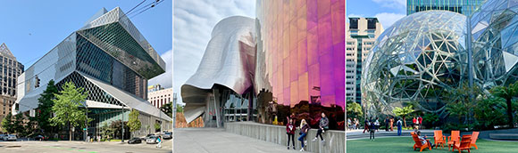
left to right: Seattle Century Library; Museum of Pop Culture; The Spheres, Amazon (photos by Anthony Poon)
Upon a visit to Seattle, I confronted three different buildings—all leaving a seductive imprint on the city and my memory.
– Seattle Central Library by Pritzker-laureate Rem Koolhaas,
– Musuem of Pop Culture by Pritzker-laureate Frank Gehry, and
– The Spheres at Amazon by corporate NBBJ.
The first two projects are by two of the most famous living architects on the planet. The third is by an anonymous company, one without the trappings of a sole Wright-ian genius which gives way to collaboration instead—for better or worse.
(Three disclaimers: Rem Koolhaas was my professor in grad school; I was employed by NBBJ in the 90s; and I did not have an opportunity to visit the interiors of The Spheres.)
THE SEATTLE CENTRAL LIBRARY
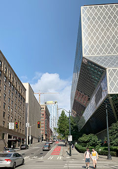
Seattle Central Library (photo by Anthony Poon)Library and its neighbor (photo by Anthony Poon)
The Seattle Central Library, designed by the Rem Koolhaas and shepherded by local Architect-of-Record, LMN, opened to the public in 2004—the winner of a lengthy design competition. The reviews of this 11-level, 363,000-square-foot building varied.
The international architectural scene claimed the design a heroic success. Others saw a design with a target on its back—and its front too. The Seattle Post-Intelligencer spewed adjectives: “decidedly unpleasant,” “relentlessly monotonous,” and “profoundly dreary.”
I side with the glorious praise hailed from the enlightened world. The library design comprises community spaces that engage the public on many levels, (literally) as well as a civic icon unlike anything seen before.
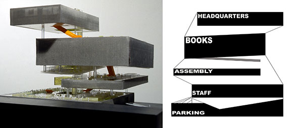
Conceptual model and section diagram (from archdaily.com)
As Professor Koolhaas taught us in school: Do not design simply in floor plan, meaning, not just one-dimensionally laying out an auditorium next to offices next to restrooms. Instead, design in section, meaning, three dimensionally as one places a library over a five-story high living room, then tucking parking under the auditorium.
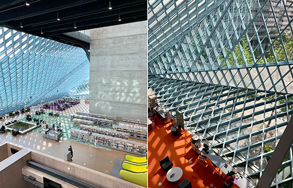
Library interiors (photos by Anthony Poon)
The library’s innovative and challenging (yes!) urban form, the diamond-patterned skin of glass and steel, a four-level spiral of books, a complex layering of space and experience, and so on—all this together convinces me that I have walked into one of the most exciting works of contemporary architecture.
THE MUSEUM OF POP CULTURE
Musuem of Pop Culture and the Seattle Center Monorail (photo by Hester Qiang on Unsplash)
The Museum of Pop Culture, coined “MoPOP,” opened in 2000 under the former name, the Experience Music Project—coincidentally also included the participation of the same Architect-of-Record, LMN. Frank Gehry’s design, though predictable and yet another variation-on-a-theme (nearly a career-long theme) offers passerby’s a composition of great risk and resulting beauty.
Museum of Pop Culture, various metal exterior skins (photo by Lucas Myers on Unsplash)
According to the client, “When Frank O. Gehry began designing the museum, he was inspired to create a structure that evoked the rock ‘n’ roll experience. He purchased several electric guitars, sliced them into pieces, and used them as building blocks for an early model design.”
Such tales subscribe to the mad artist genius syndrome. True or not, it makes Gehry sound like less of a thoughtful architect creating wonderful spaces for the public, and more like an awkward child who believes that the broken pieces of a guitar can represent a work of architecture.
Museum of Pop Culture, exterior stainless steel shingles (photo by Leif Christoph Gottwald on Unsplash)
Five giant building masses sit at the base of the Space Needle, each mass clad in enigmatic surfaces, like fire-engine-red stainless steel or fuchsia-fluorocarbon-coated aluminum—comprising a total of 21,000 individually cut metal shingles. As an object, as architectural sculpture, the composition is stunning. Does not disappoint. Having the monorail pass through the building is yet another daring move that delivers a thrilling creation.
But the 140,000 square feet of interior space underwhelms, fails to translate the exterior exhilaration to the indoors. Whereas the Seattle Central library sings with its visionary interior design, MoPOP falls out of tune. Aside from a few flourishes, like a dynamic staircase or a contorted lobby space, most of the museum’s inside is not much more than generic exhibit space. One might argue that a museum’s interiors should be flexible and so inherently boring, but I would then direct your attention to the Guggenheim Museum in Bilbao, also by Gehry.
THE SPHERES, AMAZON
The Spheres, Amazon (photo by Alexandra Tran on Unsplash)
You don’t need the singular vision of great artistic minds like Koolhaas and Gehry to deliver good architecture. Unlike the first two projects, NBBJ played the role of Design Architect and local Architect-of-Record, meaning both the creative lead as well as the development and production team.
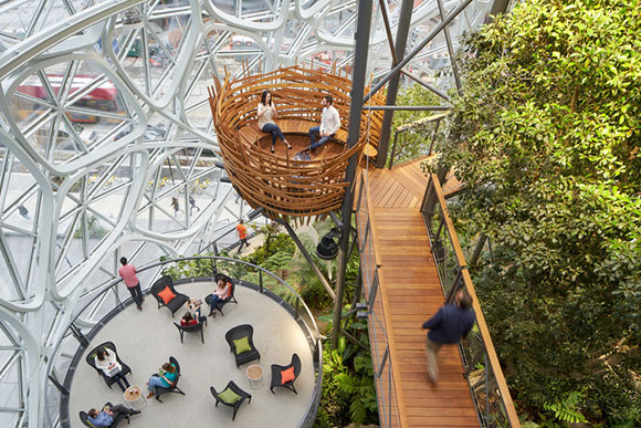
Aptly named The Spheres, Amazon’s new workplace and quasi-visitor center is made of three giant glass and steel spheres, colliding like a kid’s exhaled soapy water bubbles. Recently completed in 2018, Amazon claims, “The Spheres are a place where employees can think and work differently surrounded by plants.”
Interiors (photo by Fran on Unsplash)
Is it just another glamorized office? Just more “creative office space” glorified by real estate agents? But the phrase “surrounded by plants” fascinates me.
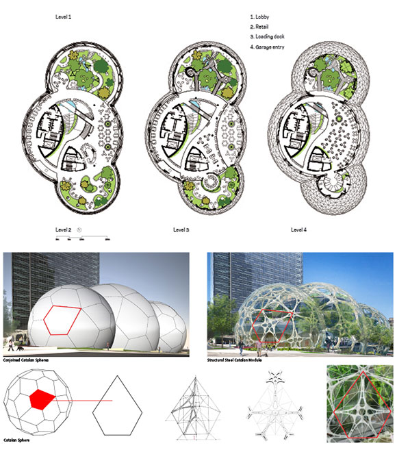
The spherical structures, conservatories actually, house 40,000 plants from over 30 countries. Within a meticulously engineered structure of 2,600 pentagonal hexecontahedron panes of glass alongside 620 tons of steel, I see one of the finest examples of biophilia. For reference, a past article, “Biophilic Design refers to our instinctive association to nature and the resulting architecture that enhances our well-being.”
Floor plans and diagrams (from archdaily.com)
Aside from the obvious design reference to Buckminster Fuller’s utopian geodesic domes of the 60s, the Amazon Spheres offer a new narrative for office space, retail, café, and meeting places. NBBJ has shed the dogmatic aim of developers to maximize floor area. Similar to Koolhaas, NBBJ celebrates the magnificence of volume, as in cubic footage (or in this case, spherical footage) and the capture of air, light, and a more productive work culture.
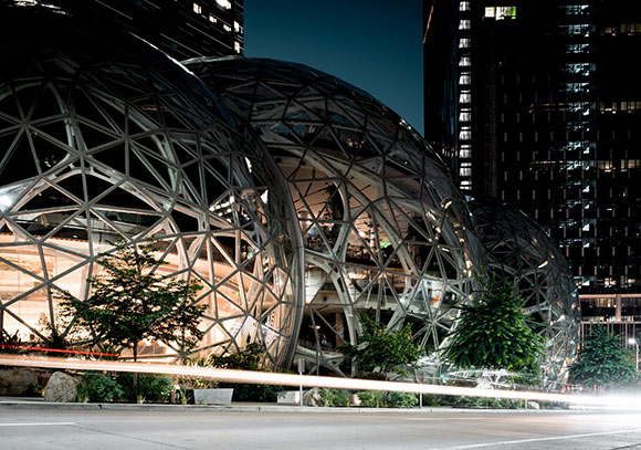
Exterior at night (photo by Patrick Schneider on Unsplash)
The total result is impressive, likely to be a local fan favorite and on every city tour guide. The design is good, even great, but is it inspired? Will it change the world? Probably not.
But the Seattle Central Library has already influenced the way architecture students think, the way teachers teach, the way professional architects design. Most of Rem Koolhaas’ projects deliver new ideas beyond form-making, embracing social engagement and re-inventing the meaning of living, shopping, or learning.
Frank Gehry, on the other hand, seems to be playing the same note over and over again. But is that wrong, especially if this one note is sheer genius played with virtuosity?
Hearing intriguing tales of being an architect, friends conjure up ideas like, “You should have a reality TV series,” “You should go on a talk show,” “You should blog about it,” or “You should write a book.” The first two suggestions are absurd. The third: Done.
Trapped in the Riyadh customs line at the King Khalid International Airport: an eight-hour wait, armed guards, no sitting, no talking, no food, no water, no sleeping, no restroom, no joking (photo by Anthony Poon)
So I chose the fourth one.
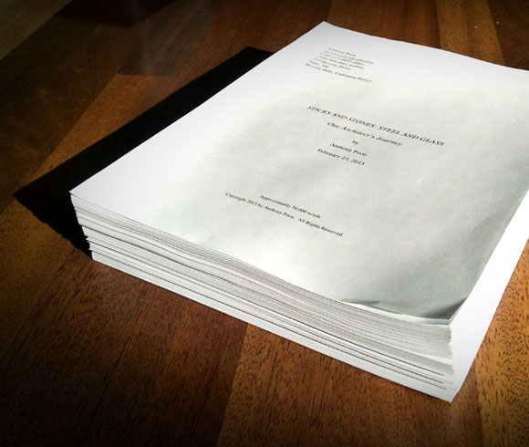
After a construction visit in Riyadh, Saudi Arabia, I was stranded in the Frankfurt airport for an afternoon. It was here that I started writing down some of my tales. By the end of the flight home, I possessed an overwrought flurry of 25,000 words and twenty chapters. A month later, 50,000 words.
Another month later, I had completed an 80,000-word, 450-page manuscript. I also connected with an editor in Chicago and another in New York, Carl Lennertz, also my book’s marketing director. Not long after came my agent, Bond Literary Agency, and my publisher, Unbridled Books.
Initially inspired by Anthony Bourdain’s Kitchen Confidential, I thought: Hey, I could do that—write a tell-all sordid saga about the underbelly of architecture. The audience was there. Architecture was already everywhere . The world was brimming with endless television shows on design, a gazillion style magazines, websites and blogs, design brands and celebrity fans, passion plays like going green and prefab homes, design as lifestyle, “design-thinking” in everything from business school to scientific research, and Hollywood’s infatuation with architects .
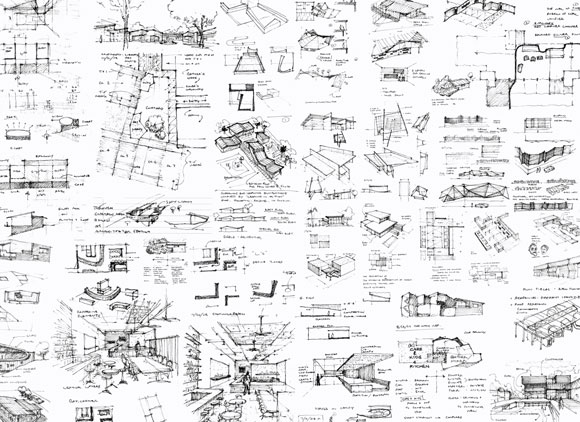
My sketches and musings
But I realized that though a few outbursts and secrets would be entertaining, my book should not be a career-killer. So enough of that. No outrageous Bourdain “pirate” attitude for me. The noble and artistic side of architecture deserved something else.
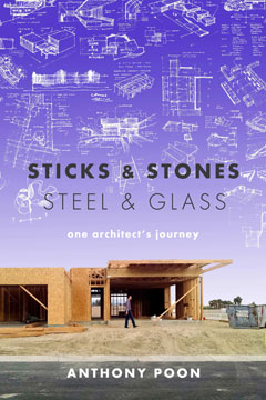
Entitled Sticks & Stones | Steel & Glass: One Architect’s Journey, my book is part critique, part behind-the-scenes, and part auto-biographical—examining the role of architecture and its creative process in daily life.
The publisher cites, “In this personal and revealing book, we are taken on a creative journey inside a purposive yet open mind always hoping to ‘design it all,’ to weave together light and material, culture and commerce, music and design, a good meal and the joy of gathering to share it.
“In these pages, we engage the artistic processes of a thoughtful and intense architect whose works—public and private—strive to enhance his clients’ stories and identities. In every building designed by Anthony Poon, art is shelter and architecture is a social good.”
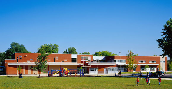
Greenman Elementary School, Aurora, Illinois, by Anthony Poon, awarded the National Grand Prize from Learning By Design, AIA and National School Boards Association, also received awards from KnowledgeWorks Foundation, DesignShare, IASB, IASA, IASBO, School Planning and Management, and American School & University Magazine (w/ A4E and Cordogan, Clark & Associates, photo by Mark Ballogg)
My book is not a memoir (too pretentious), although it is somewhat the trace of chapters of my life. This book is not a catalog of my work, not a marketing puff piece, not a Taschen-style glossy coffee table book. I do examine some projects that have most engaged me across my career—schools, a homeless shelter, and even a chocolate factory, and the artistic processes that delivered them.
Vosges Haut-Chocolat Factory, Chicago, Illinois, by Poon Design, Recipient of the 2013 Award of Excellence for the Industrial Redevelopment of the Year, from the National Association of Industrial and Office Parks (w/ Ware Malcomb, photo by Anthony Poon)Pondering my second book (photo by Mikel Healey)
As for the title? “Sticks and stones may break my bones . . .” opens the famous childhood rhyme. And despite what the public, media and colleagues say of my work and me, “Names will never hurt me.”
Additionally, just as sticks and stones are primitive building blocks, steel and glass are today’s elements of expression. In designing architecture, I have endeavored to find balance in the rough and the smooth, the solid and the ephemeral. So too with Sticks & Stones | Steel & Glass.