#56: IS TV FOR REAL? PART 2
Potential clients have come to my office asking for three free designs from which to pick—“the way we saw it on HGTV.” My anger aside from how reality TV twists reality, the client’s request compromises the integrity of the architectural process. (This article is a follow up to my past one, Is TV for Real?)

When I design for a client, I don’t draw three random schemes in a vacuum. I listen to the client first—their goals and dreams. When I show preliminary concepts, the client provides feedback on what they like and what they don’t. Through this back-and-forth process, a design develops, and is then refined. Not ever in a vacuum, the creative process is an exciting and thoughtful journey.
Okay, time for me to confess. Here and there, I have learned a few things from TV about color coordinating, selecting furniture, and being creative on a budget. I confess!
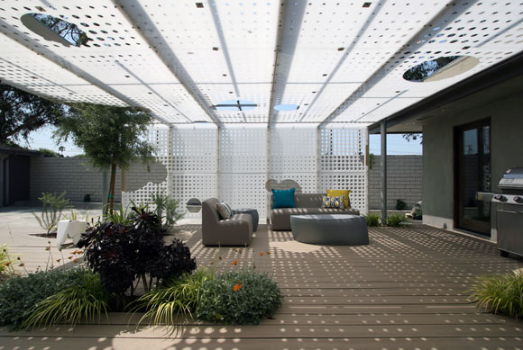
Also, the reality TV DIY shows have brought design to the forefront, that a well-crafted, nicely-styled life is desirable and achievable. In 15-minute bite size servings, these shows have delivered architecture to the mainstream.
In some distant past, clients were under the impression that design was a mysterious, closed-loop process. Now, many are conscious of how accessible good design advice is, whether from an award-winning architect or, yes, a charismatic TV personality.
I enjoy meeting with clients who already understand the concepts of an open floor plan, for example. Good or bad, these clients come prepared with Pinterest pages on style. Thank you reality TV. The clients and I can hit the ground running, proceeding with a shared foundation. Knowledge is power, after all, even in choosing paint colors.

Once was a cocktail debate between architects: “Who is the most influential voice in our industry?”
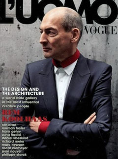
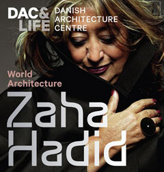
The usual suspects were tossed out as conversational sacrificial lambs. Local big names like Steven Ehrlich and Eric Owen Moss. Pritzker Prize winners like Zaha Hadid and Frank Gehry. A safe go-to is naming the senior leaders like I.M. Pei and Renzo Piano.

Another angle is to suggest famous architects no longer living, but believed to be still influential today, i.e., Frank Lloyd Wright or Le Corbusier. Pretentiously, you can also try the obscure, though no less significant, such as Wang Shu, Sverre Fehn or Paulo Mendes de Rocha.
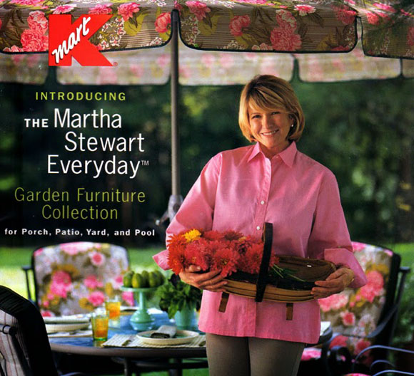
My contribution that night stopped the discussion. I proclaimed, “Martha Stewart!”
At the time, Martha Stewart utilized avenues of outreach in all forms, and was better known than any other designer in the country, maybe even in the world. If she stated with a quiet breath that “pink is to be used at table settings this season,” you could count on millions of dining tables across America set with something pink.
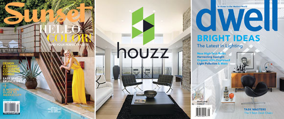
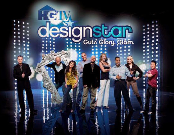
Let the debates and cynicism rage on. It’s all for the good. Martha, HGTV, Sunset, Houzz, Dwell, Wayfair, the plethora of magazines and blogs, etc.—all of it deserves gratitude from architects everywhere. To the widest audience, these mainstream entities deliver the concept of wanting good design. And for that, I say thank you.